Tag Archives: painting

MA250 Sidewalk Art Tour (Greenfield, MA)

Date of Visit: July 25, 2026

Location: Greenfield, MA (2 hours northwest of Boston, MA or 1 hour north of Hartford, CT)

Cost: Free

Parking: Metered parking is available throughout the city

Summary: 10 murals celebrating America’s independence have been painted on the sidewalks of Greenfield, MA

Website: MA250 Sidewalk Art Tour

There have been incredible celebrations and memorials throughout this year all of New England in celebration of the country’s 250th anniversary. And the sidewalk art in Greenfield, MA, is another example of how art can be used to be celebrate our country’s independence.

The ten murals, which are painted on the sidewalk rather than walls, celebrated a different aspect of our independence.

While all of the murals are located in or near Greenfield Center, you will have to drive to a few of them. I am listing them as they appear on the website. But, I didn’t photograph them in this order. Some of the addresses are approximations since some of the locations, like a cemetery, don’t have an actual address. Also, some of the locations are near certain areas, like the intersection of Meridien and Deerfield St. So, it’s important for you, or preferably a passenger, to look at the sidewalk while driving to some of these locations.

Since most of the descriptions use the artist’s own descriptions of the works of art, I copy and pasted the descriptions from the website as I wanted to represent the artists’ descriptions in their own words. Plus, it made it easier for me. So, it was a win-win!

“Liberty is Unfinished Work” – City Hall, 14 Court Square by Danielle Lucier
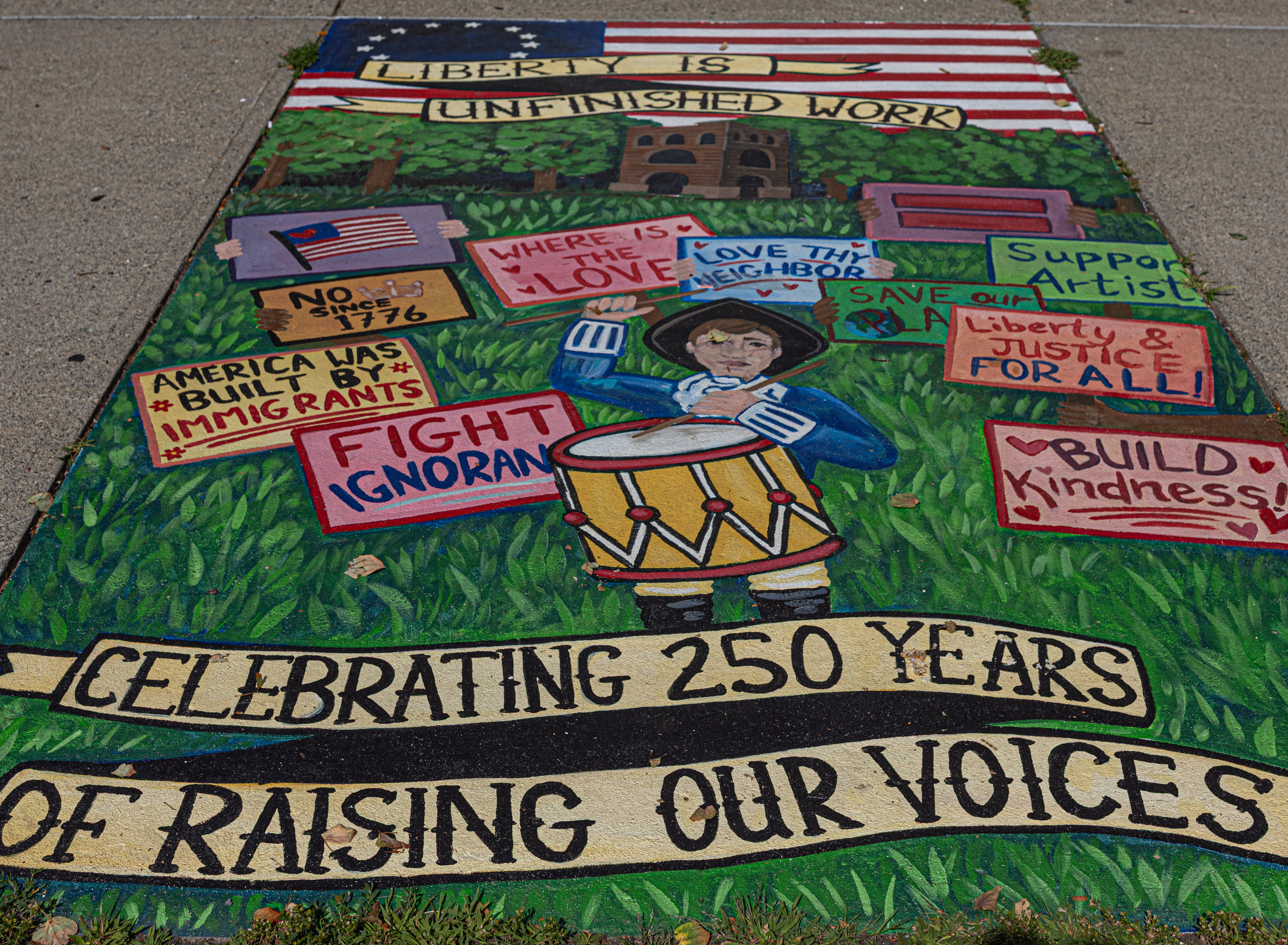
Sometimes photography can seem simple. Just point, adjust settings, sometimes repeatedly, and click. However, sometimes it’s not so easy or straightforward. Since this mural was painted vertically on a sidewalk and it was difficult to read all the lettering, I actually photographed this mural on a step stool. By photographing it from a higher angle and looking down, I was able to photograph it with all of the worlds visible and legible. I did have to duck a little so my shadow didn’t appear though.

Created for the 250th anniversary of the American Revolution, “Liberty is Unfinished Work” reflects on the ideals that inspired our nation’s founding, while also acknowledging that liberty is an ongoing project that we work towards every day. My piece depicts a Revolutionary War drummer boy leading a group of present-day marchers with modern signs, connecting the spirit of civic action that shaped the American Revolution with the ways people continue to advocate for their rights, communities, and futures. By putting the drummer with modern day marchers, I also wanted to give viewers a way to relate their work back to history- and to feel like a participant in an ongoing story rather than a distant observer of a historical event.

When designing this piece, I thought about the Revolution not only as a defining historical event, but also as the beginning of a conversation about liberty, representation, and self government. The American Revolution was driven by ordinary people who believed they had the right to make their voices heard. So instead of portraying a moment in the past,  I wanted to explore things like who had a voice, who was included, and how those people worked together to create change- and create a piece that felt relatable as a person existing 250 years later.

As an artist reflecting on the 250th, I felt both contemplative and celebratory. It gave me this beautiful opportunity to honor courage, aspirations, and sacrifices that shaped our nation- while also recognizing that liberty isn’t a finished achievement. This anniversary serves as a reminder that each generation inherits the responsibility to expand, protect, and redefine freedom in its own time. This mural was made to celebrate the continuing work and the people who carry it forward.

Visual description: a tall rectangular sidewalk square with banners at the top and bottom. The banners say “Liberty is Unfinished work. Celebrating 250 years of raising our voices”. In between the banners is a green hilly landscape with Poet’s Seat Tower at the top. A revolutionary drummer boy leads a crowd of modern-day protesters with bright, colorful signs standing up for what they believe in.

“What Holds Us Together” – Transit Station, 11 Olive St by Cameron Schmitz
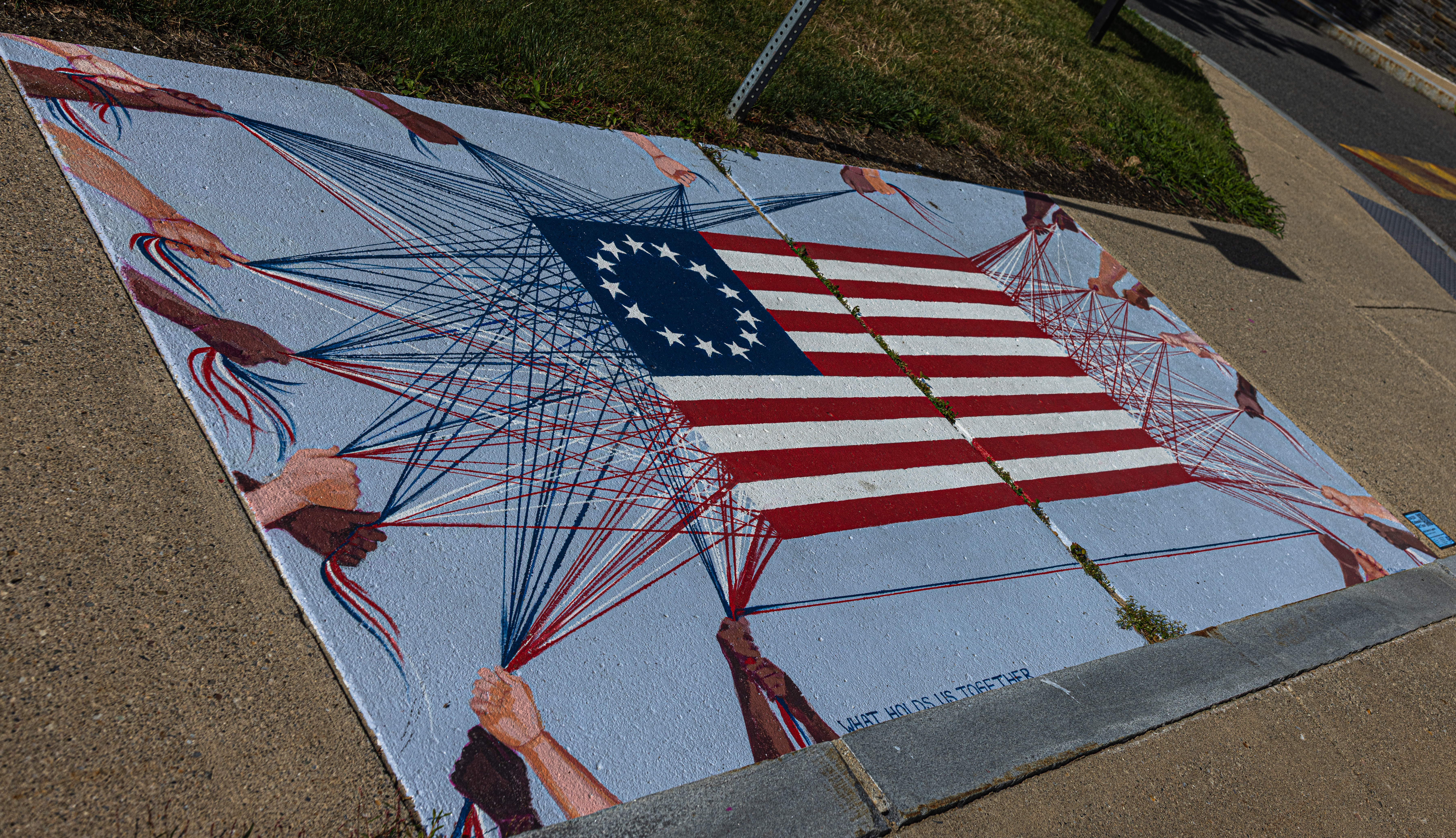
Painted in honor of the 250th anniversary of the American Revolution, my mural, “What Holds Us Together”, celebrates the diverse people whose contributions, sacrifices, and shared efforts have been essential in shaping our nation from its founding to present day.

Suspended in the center of the mural, the original thirteen-star American flag appears to emerge from a web of intersecting threads, its fibers extending outward, held together by the hands of many different individuals. Like a woven tapestry, overlapping strands of red, white, and blue extend outwards, interweaving and converging into an intricate network of connection. The diverse hands which collectively hold the flag’s fibers together, represent people of different backgrounds, cultures, ethnicities, and generations, each contributing to the ongoing work of strengthening the fabric of our nation.

My inspiration for this mural is rooted in an often-overlooked truth about the American Revolution itself. Traditional depictions of the Revolutionary era have frequently centered on white colonial figures, leaving many other contributing members largely absent. Yet the struggle for independence was shaped by people from a wide range of backgrounds. African American men, both free and enslaved, served as soldiers, sailors, laborers, messengers, spies, and support personnel throughout the war. African American women contributed as caregivers, laborers, messengers, camp followers, and community builders whose efforts helped sustain both military and civilian life during the Revolution.

Indigenous nations also played significant and complex roles throughout the Revolution. Native soldiers, scouts, diplomats, guides, and leaders influenced military campaigns, intelligence networks, and political alliances, while Indigenous women often held important roles in diplomacy, decision-making, and sustaining their communities through a time of profound upheaval. The choices made by Native nations shaped both the course of the war and the future of the continent.

The story of American independence is far more diverse, interconnected, and nuanced than it has often been portrayed. By depicting hands of different skin tones collaboratively supporting the flag, this mural recognizes the countless individuals whose labor, sacrifice, and participation have been vital in weaving our nation into being. It serves as a reminder that diversity is not a recent addition to the American story, but is in fact, an essential part of it. The strength of our nation has never rested in a single people, culture, or perspective, but rather, is the result of contributions of many individuals whose lives and efforts have become interwoven across generations.

The hands of this mural do not simply hold the flag together—but are also being held together in unison as its maker. Some hands overlap, some press intimately against one another, and others work side-by-side, symbolizing the trust, collaboration, and shared responsibility that is necessary in sustaining our democracy.

Two hundred and fifty years after the Revolution, the ideals of liberty, self-determination, and democracy remain unfinished work. Like the threads of the flag itself, these ideals must be continually strengthened and held with care by each generation.

“What Holds Us Together” invites viewers to recognize the many people who have been—and continue to be—an essential part of the fabric of our nation, and to reflect on the relationships, care, and collective effort that binds us together.

The strength of our nation lies in the spirit of cooperation that made the American Revolution possible, and in the many hands that continue to work together to hold, weave, and sustain our democracy and our shared future.

“The Pen and the Press” – Justice Center, 43 Hope St by Althea Keaton
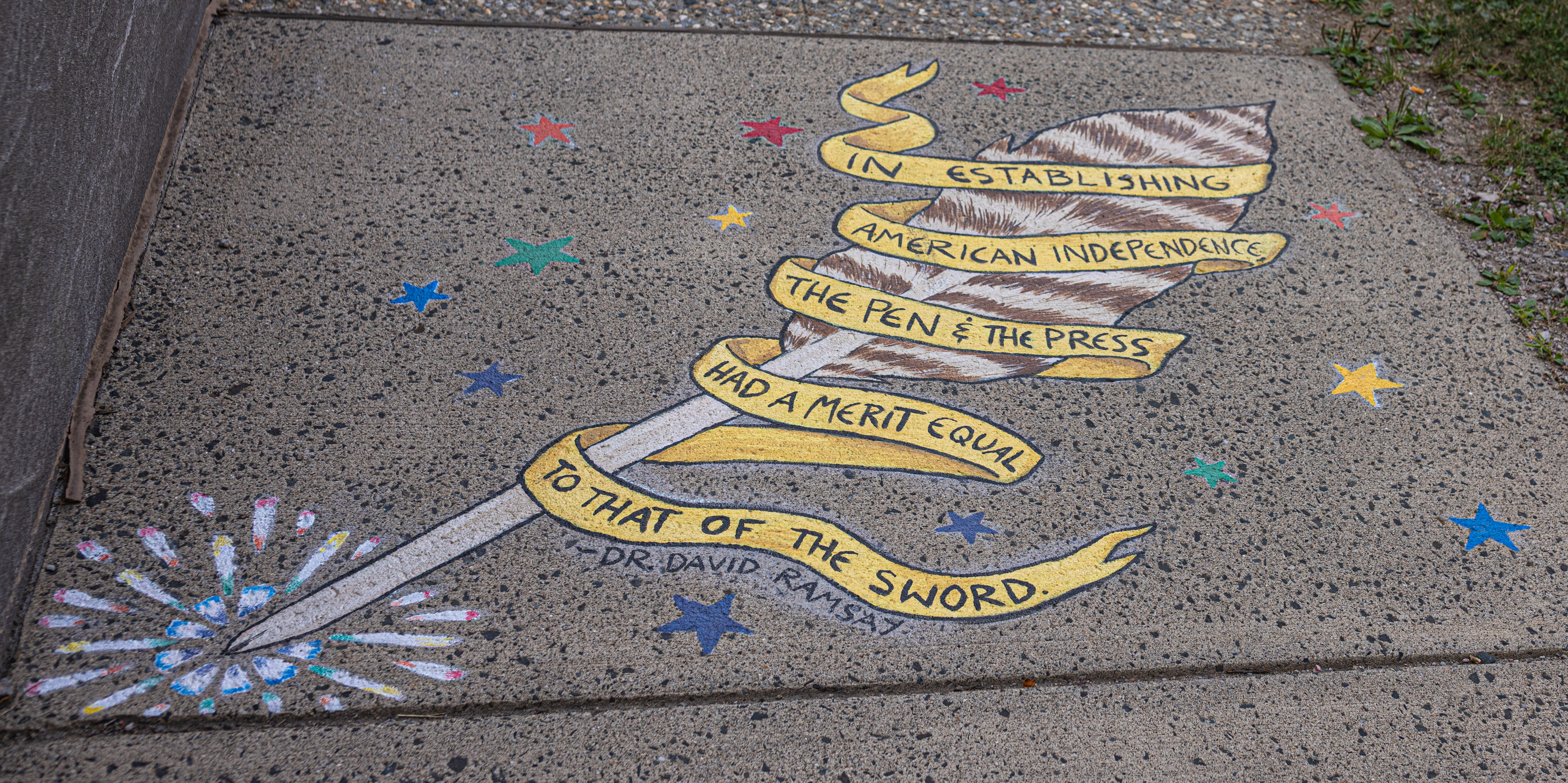
“In establishing American independence, the pen and the press had a merit equal to that of the sword.” – Dr. David Ramsay

Dr. David Ramsay was one of the earliest major historians of the American Revolution, as well as a politician and author. He served as a field surgeon during the American Revolutionary War until he was captured by the British army and imprisoned for a year. He wrote many well-respected volumes on American history, both more broadly and specifically about the Revolution. This quote of his reflects his direct experience of the Revolution, both as a writer and as someone who served on the battlefield.

During the U.S. Revolution, newspapers played an essential part in shaping public opinion. At that time, newspapers were the most effective means of mass
communication. They spread not only the news, but political ideas, propaganda, foreign dispatches, official documents, and more. Massachusetts in particular was a hotbed for newspapers, with Boston establishing the United States’ first regular newspaper, the Boston News-Letter. By the time of the Revolution, there were numerous Massachusetts papers vying to influence public opinion, the majority of them Patriot papers advocating for independence.

A revolution is not won only with weapons, but with words and ideas. Although the quote this mural is structured around specifically references the American Revolution, it is relevant beyond that corner of history. Freedom of speech and freedom of the press – two of our First Amendment rights – are essential to maintaining a functioning democracy. We may no longer typically exercise these rights via quill or letterpress, but they are still vital.

The barred turkey quill pictured in this mural is a literal depiction of the kind of writing implement commonly used in the 1700s, but it is also a symbol of ‘the pen’ as a concept. Today’s ‘pen’ may be a stylus, a smartphone, or any number of devices. The specific implements may have changed, but they are still potent tools, and they can reach farther than anyone could have possibly imagined in 1776.

Visual description: A barred turkey quill is set at a diagonal, as though writing. A yellow ribbon winds around it bearing the quote, “In establishing American
independence, the pen and the press had a merit equal to that of the sword.” – Dr. David Ramsay. At the tip of the quill, there is a firework-like burst. Thirteen stars sparkle around the quill in red, orange, yellow, green, blue, and purple.

“Let Virtue Reign” – Greenfield Library, 412 Main St by Youme Nguyen Ly
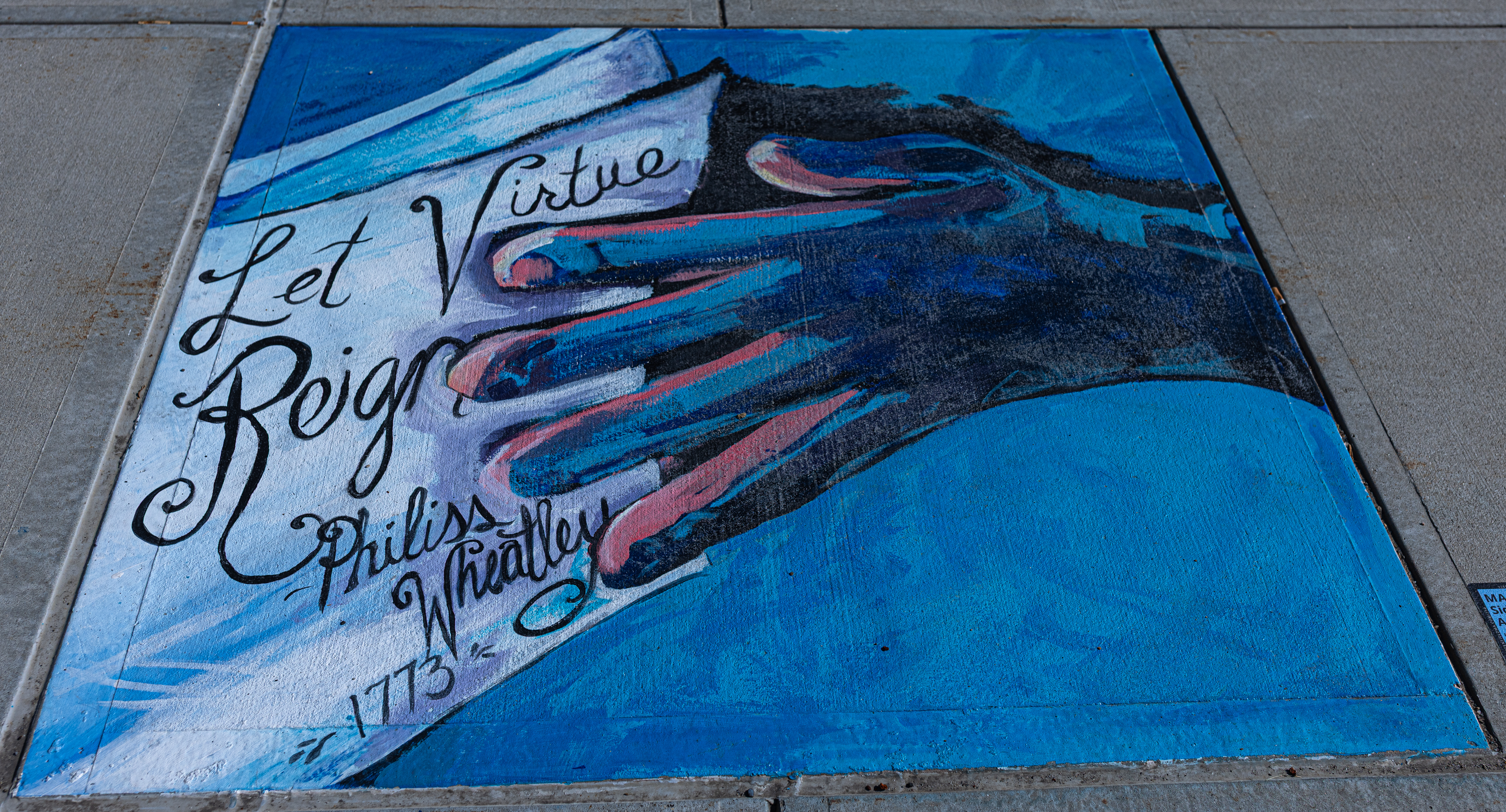
Let Virtue Reign is painted in front of the Greenfield Library. A dark blue hand holds a stack of papers, the topmost of which reads, “Let Virtue Reign 1773 Phillis Wheatley”.

The hand represents Elizabeth Freeman, the first African American woman to successfully file a lawsuit for freedom in the state of Massachusetts, less than a year after the adoption of the Massachusetts State Constitution. Her case would ultimately lead Massachusetts to outlaw slavery.

Phillis Wheatley was one of the best-known poets in pre-19th century America. Born in West Africa in 1753, enslaved as a child in Massachusetts. She learned to read and write and was emancipated in 1773, the year her collection “Poems on Various Subjects, Religious and Moral”, was published. She wrote in support of anti-slavery movements. “Ode to Dartmouth”, the quoted poem, was written to encourage Dartmouth’s abolitionist work.

This painting celebrates two Black women who were actively working in Massachusetts and beyond, 250 years ago to make the future better for everyone.

“Free Press” – Main St & Sears Ave by Althea Harris
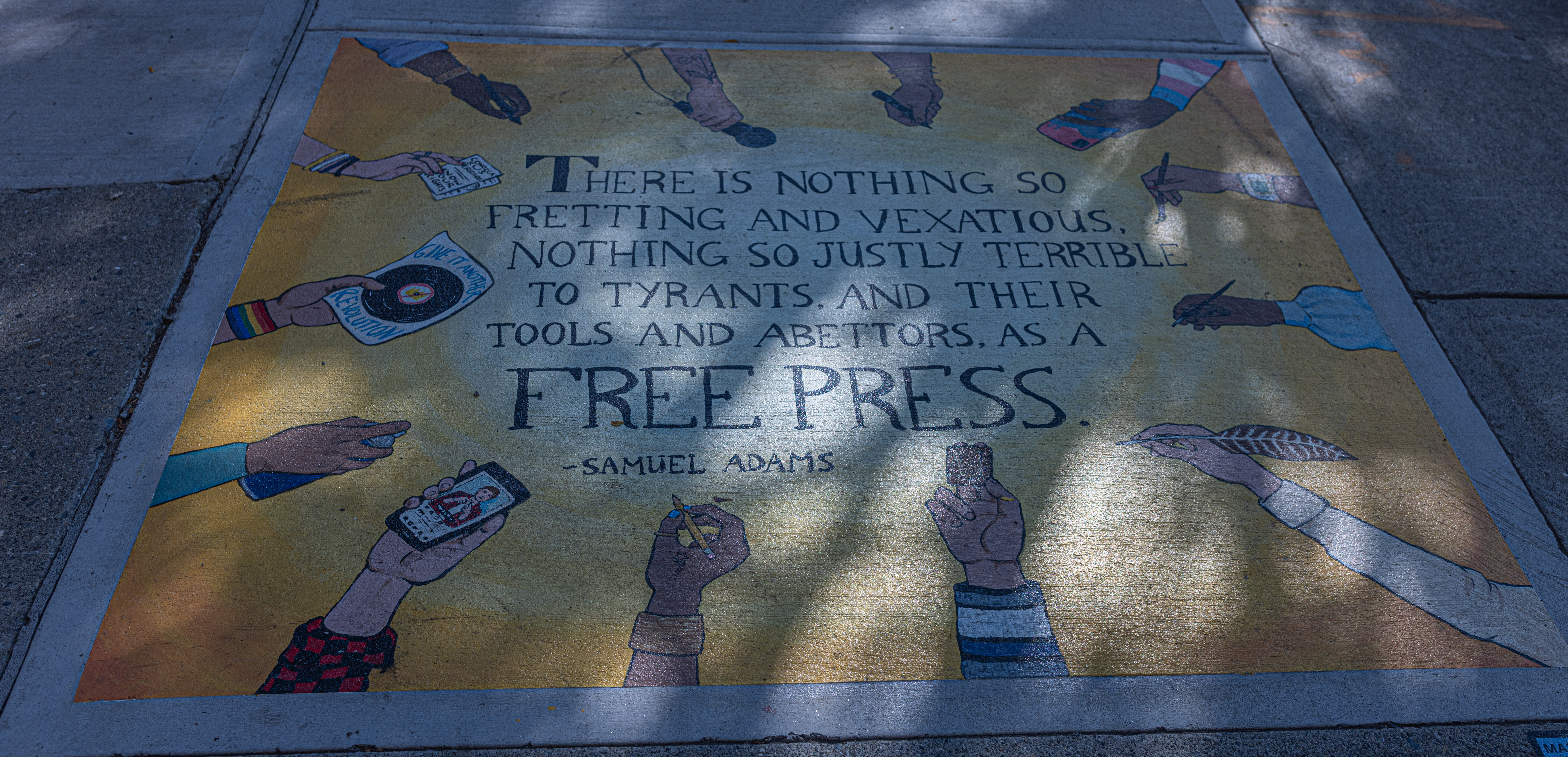
“There is nothing so fretting and vexatious, nothing so justly TERRIBLE to tyrants, and their tools and abettors, as a FREE PRESS.” – Samuel Adams (from his statement on freedom of the press in the Boston Gazette, March 14, 1768)

Founding Father, signatory of the Declaration of Independence, and colonial Massachusetts politician Samuel Adams was, as you may have guessed from this quote, a strong proponent of the role of a free press in ensuring freedom from tyranny. Adams actively used the press as a tool to advocate for colonial rights and independence, criticizing British rule and promoting his political ideals through essays and letters in colonial newspapers, especially the Boston Gazette. With its weekly publication and its circulation of approximately 2,000, this paper had a significant reach for the time period. By the 1770s, Massachusetts had numerous newspapers – most of them Patriot-led – and Adams was far from the only person to take advantage of this medium of mass-communication and its ability to push the tide of public opinion in favor of revolution.

The appearance of the press has changed significantly over the past 250 years, but the importance of a free press has not declined. A newspaper with a circulation of 2,000 has much less clout in the U.S. of 2026 than it did in the pre-revolution colonies, but the dissemination of news, political thoughts, and opinions is still an essential (and Constitutionally protected) right. This mural is a celebration of a free and active press as it has evolved over the years, and it is also a call for the viewer to support freedom of the press in its many forms.

For this mural, I felt it important to celebrate not only a revolutionary past but also the revolutionary present and future. Independence is not something that was won once in 1776 and need never be fought for again, but something we as a country continue to strive for and evolve towards. Rights have been hard-won, some only recently won, and some even more recently revoked. Freedom of the press is encoded in our Bill of Rights, and true freedom of the press cannot belong in only the hands of a few. It needs to come in many forms and from many people.

Free press is still a potent tool for shaping public opinion as well as for spreading journalistic news. Think pieces still come in newspapers and magazines, but they are also found in social media feeds, pinned on bulletin boards, spoken or sung aloud at open mic events. In times when rights are being infringed upon, find people who are impacted and listen to their voices, read their words. Seek out multiple journalistic sources. Fact check and dig deep rather than trusting AI summaries. Use your own voice to speak out against the silencing of journalists. And don’t be afraid to pick up a pen, paintbrush, or microphone and speak your own truth.

We need all hands on deck to keep this ship moving forward.

Visual description: Thirteen hands reach in from the edges of the sidewalk panel holding various implements of communication from the 1800s to today, including: a quill, a paintbrush, a letterpress block, a zine, a microphone, a smartphone, and more. They are set against a bright yellow background, which fades into an off-white glow in the middle to emphasize the quote the hands surround. “There is nothing so fretting and vexatious, nothing so justly terrible to tyrants,
and their tools and abettors, as a free press.” – Samuel Adams

“Old Friends” – Fiske Ave Pocket Park by Youme Nguyen Ly
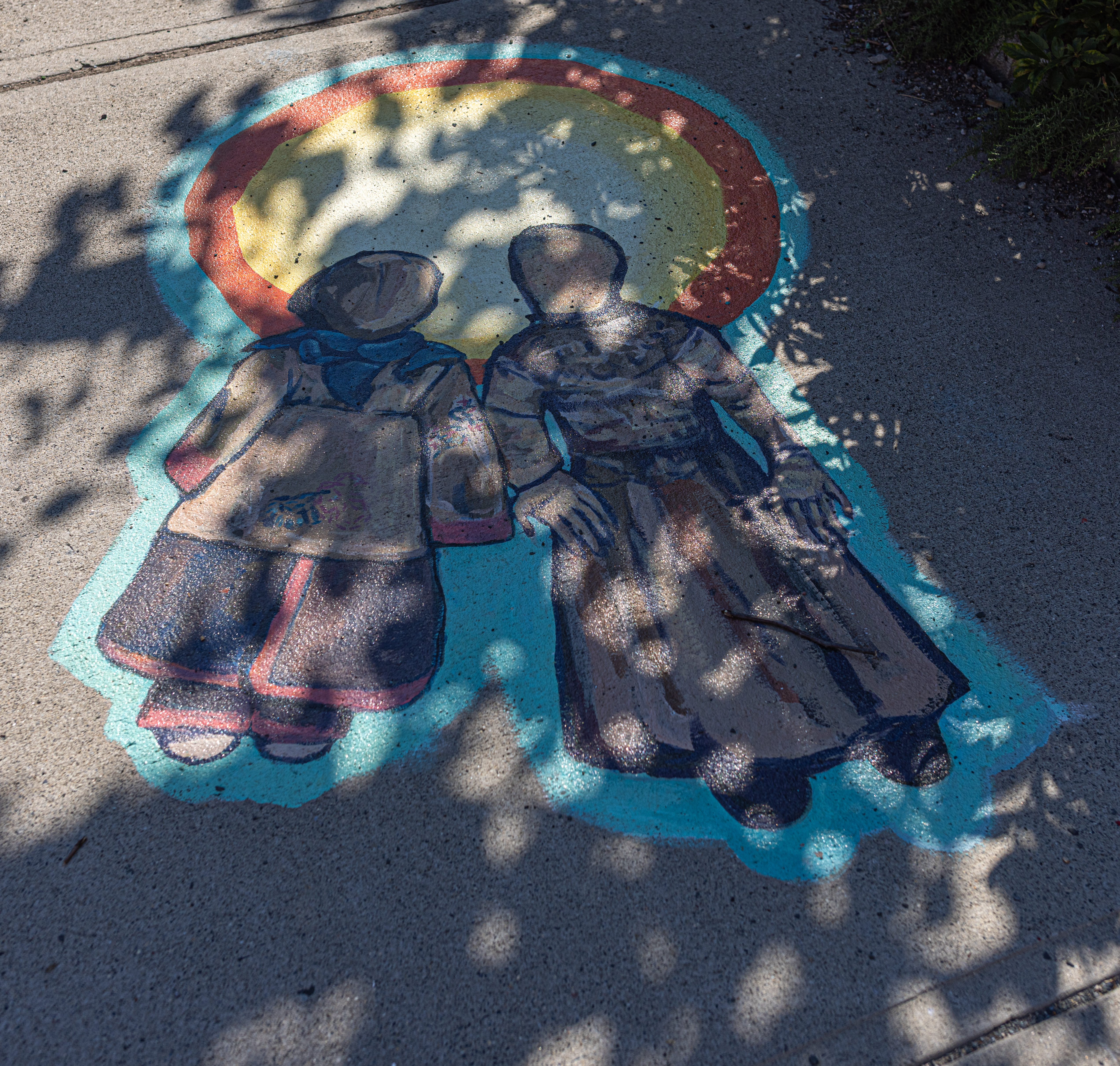
Old Friends depicts two dolls with a shared sun radiating behind them and a bright outline of sky. On the left a traditional corn husk amsute’kan made in New England.

A traditional story tells that Corn Spirit created the cornhusk amsute’kan for children to enjoy and to watch over them. Originally, she had a face, when she became distracted by her own beauty, her face was taken away to remind us not to focus on our own looks so much that we forget to care for others. On the right side, one of the oldest surviving ragdolls in this country, named Bangwell Putt. She belonged to Clarissa Field of Northfield, Massachusetts. Clarissa was born blind in 1765. The doll’s carefully constructed fingers suggest the importance of touch. In my depiction, the dolls have been friends for over 250 years and carry the respect and gratitude for Indigenous and Non-Indigenous friendships, past, present and future. This piece further serves as a tribute to the importance of children and the essential role of childcare.

“Essential Pieces on the Tapestry of a Revolution” – Historical Society, 43 Church St by Danielle Lucier
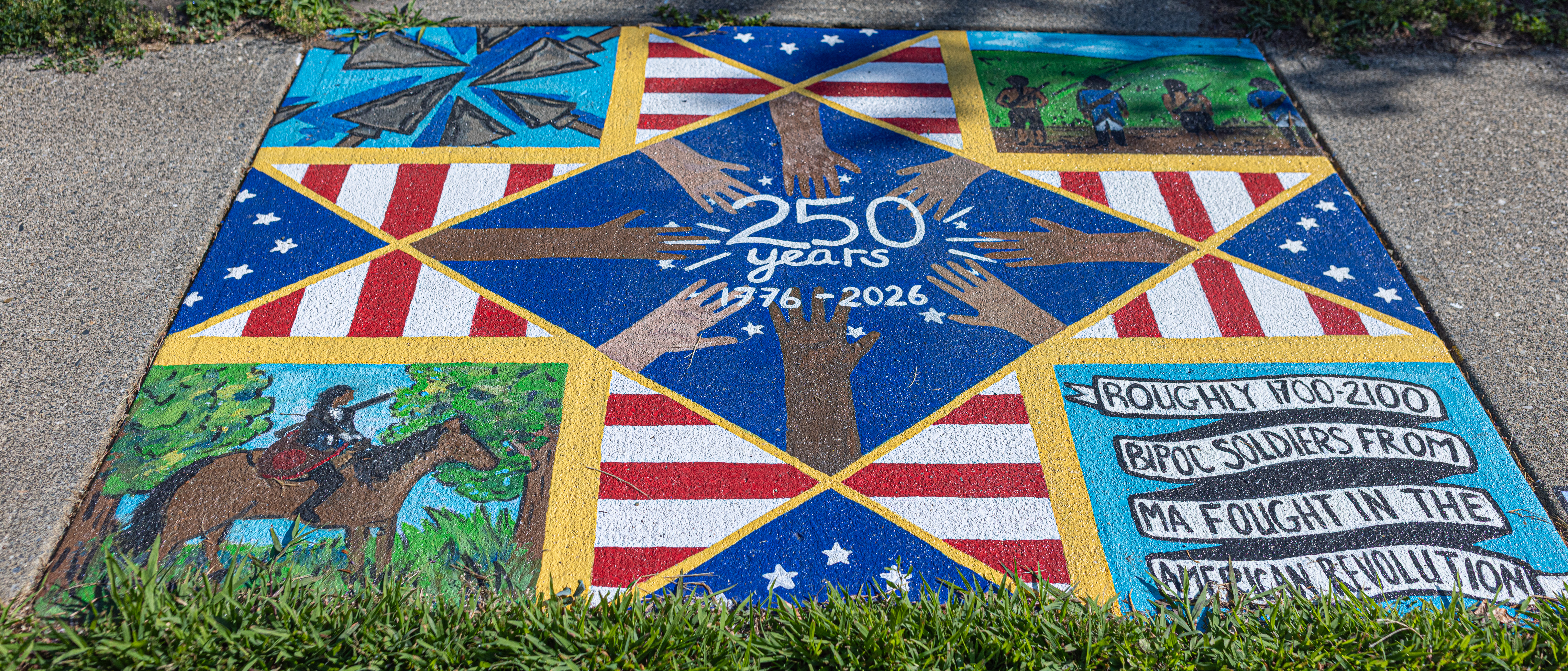
This piece, created within the shape of an American traditional quilt square, is a celebration of the diversity of the American Revolution that often gets overlooked throughout historical representations of the war. This quilt square is built of pieces of the original thirteen-star American Flag, pieced together with imagery representing BIPOC roles in the Revolution- all coming together to form one solid piece of our historical tapestry.

In doing research for this piece, everything I found online was vastly misrepresentative of the actual people who worked together in the American Revolution. Most information available showed Colonial white figures- and mostly men at that. Yet upon deeper research at the Historical Society of Greenfield, I found many books and references referring to BIPOC soldiers, spies, messengers, and laborers (free and enslaved) – all in the same positions as these colonial white men. This sparked something in me that felt like a piece of this historical quilt was missing – and inspired my quilt block design. I wanted to pay honor to these hardworking BIPOC people who fell through the cracks in the history books, who didn’t get the credit and honor they deserved.

I found out that roughly 1700-2100 BIPOC men from Massachusetts served as soldiers and sailors throughout the war- and BIPOCwomen worked to build communities, sew soldiers clothing, serve as caregivers, and when not traveling with the camp – they also helped to hold up life at home taking on their duties and the duties of the men who were off fighting.

“Essential Pieces of the Tapestry of the Revolution” is a piece dedicated to African American and Indigenous soldiers and war contributors. Our history is so much more diverse than representation has ever shown – and having this chance to create a piece that tells more of the real story was a true honor. Work and decisions made by BIPOC war contributors played such a large role in the history of our independence- a history that is so much more multicultural and diverse than history texts have led us to believe. It takes hands from all backgrounds coming together to work for a common cause – to create a successful revolution.

Visual description: this square sidewalk tile is broken up into 9 smaller squares to represent an american traditional quilt block. Pieces of the original 13-star flag, and red and white stripes come together to form a pointed star-like pattern, and imagery of Indigenous and African American soldiers are in opposing corners. The center says “250 years 1776-2026” and has hands of all skin colors reaching towards the center of the piece. A banner in the bottom corner says “roughly 1700-2100 BIPOC soldiers from MA fought in the American Revolution”.

“Roles of Children During the American Revolution” – Federal Street School, 125 Federal St by Jill Strait
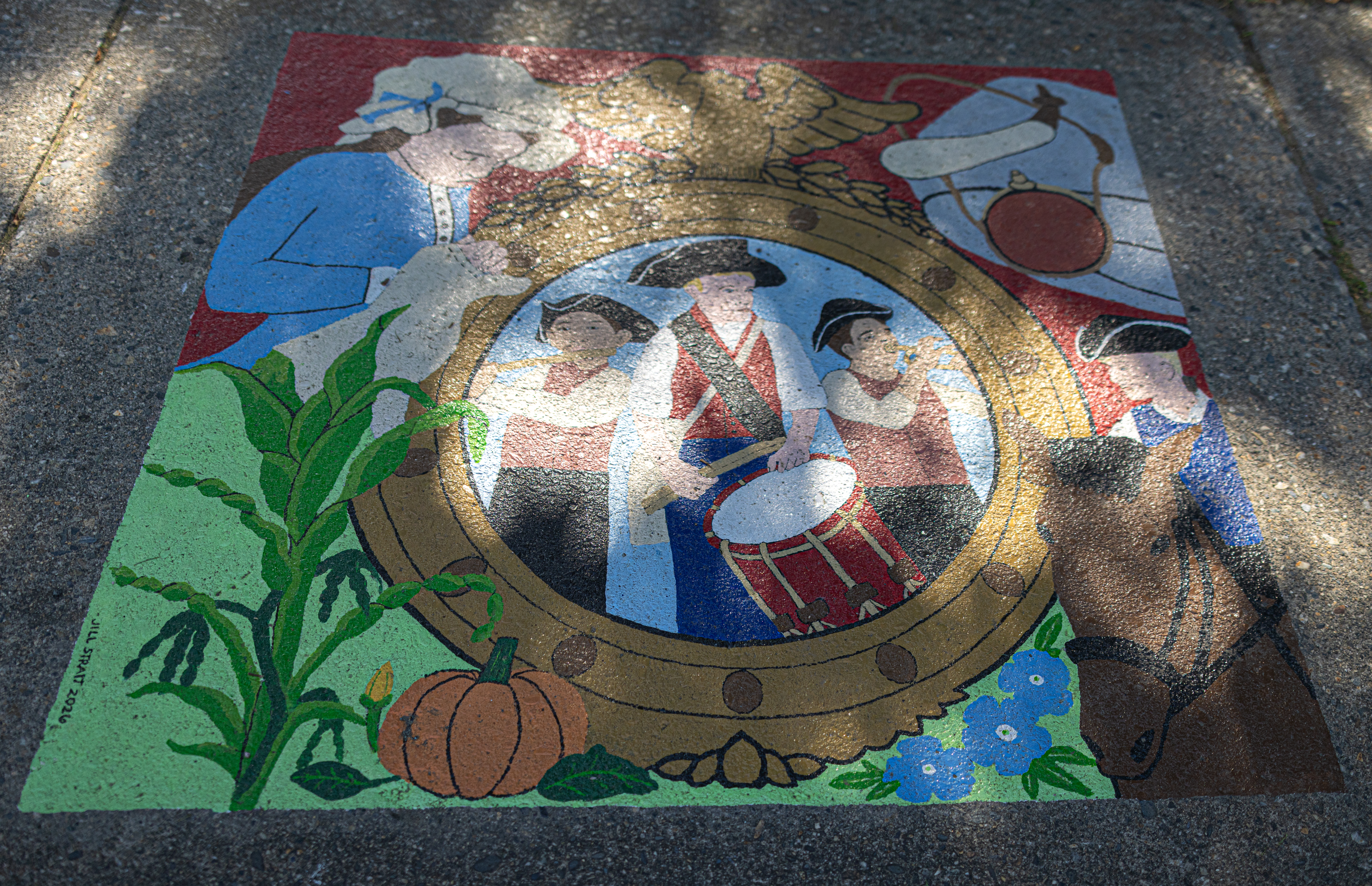
This mural depicts the various roles children played during the Revolutionary War, a time when the absence of child labor laws meant young people often set aside their education to assist with adult duties. I especially wanted to highlight musicians, who were often in their teens or younger, so they are featured in the center of the piece playing the bugle, drum and fife. Clockwise from left is a young girl hand-sewing a garment, as children worked on uniforms and helped with mending. They often brought essential supplies where needed, on the top right there is a folded blanket, powder horn and a canteen of water. Below that is a teen on a horse, serving the role as messenger. And lastly, farming was a role that kept children occupied, represented by the “three sisters”—squash, corn, and beans—in the lower left corner.

“Caregivers” – Federal Street Cemetery, 175 Federal St by Joe Pye and Ginseng by Youme Nguyen Ly
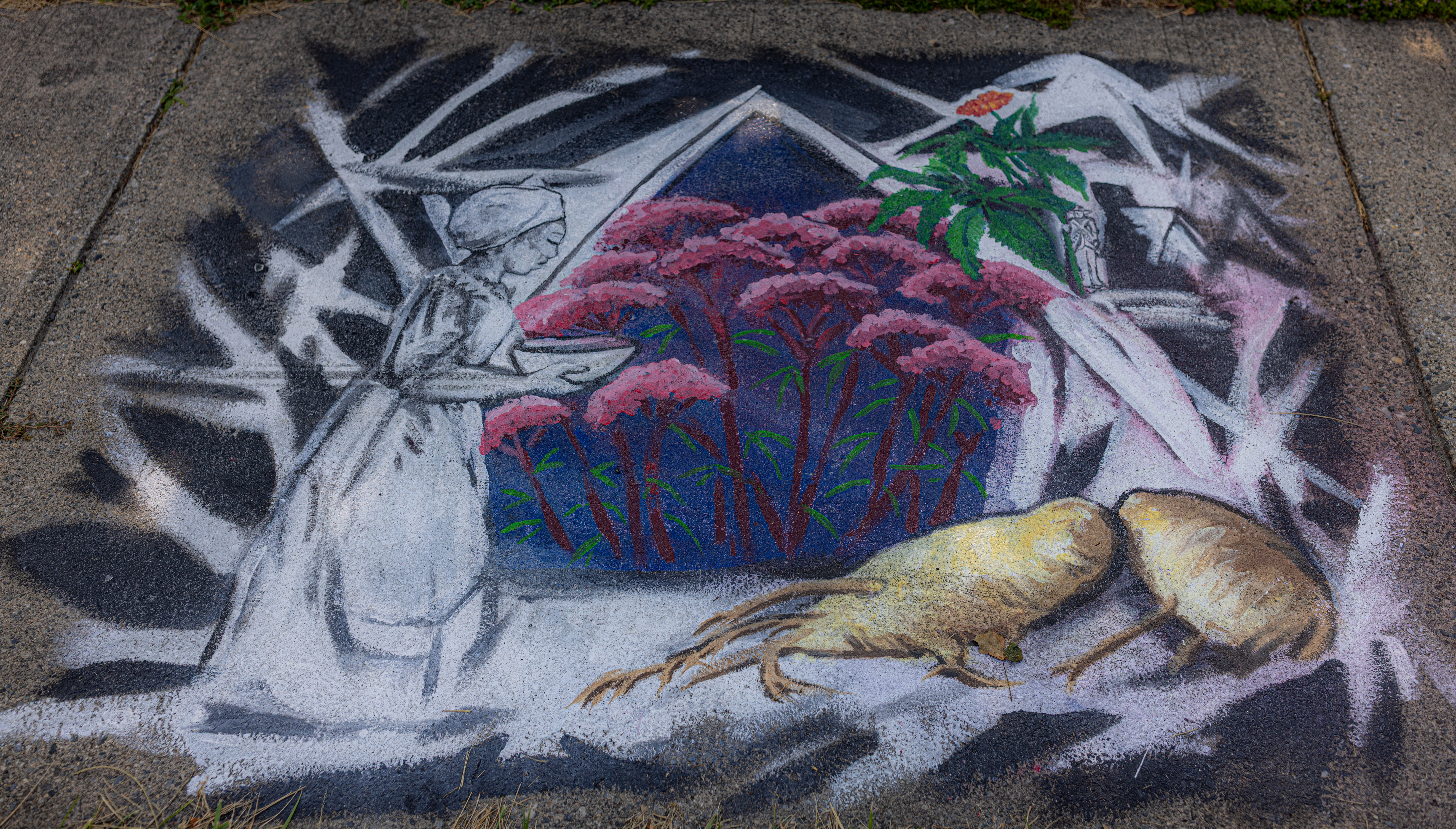
Caregivers, Joe Pye and Ginseng, shows a black and white tent with abstract pink flowers, red stems and green leaves of Joe Pye weed growing from within. A woman arrives to the tent with a healing bowl of soup. In the abstract black and white background, a tiny black and white revolutionary soldier holds the green living stem of a full color red and green ginseng plant instead of a weapon. Two large ginseng roots are depicted in full color golden yellow, at the base of the illustration.

American ginseng is a medicinal plant native to North America. Income generated from gathering and selling wild ginseng influenced the early history of this country. Local ginseng use and trade stretches back much further than the Declaration of Independence. Long before North America was colonized, various Indigenous peoples used ginseng in medicine.

The story of how this plant came to be called “Joe Pye Weed” has evolved over time. Stories tell of Zhopai, an Abenaki medicine man who treated typhus with this plant. Some researchers believe “Joe Pye” was what white settlers called Joseph Shauquethqueat, a Mohican. Shauquethqueat was a sachem and selectman. It’s believed that white colonists saw Shauquethqueat healing with the plant Pkuwiimakw and named the plant after him.

I painted this with healing in mind, healing that nature offers everyone if we can listen for it. I am also honored that it was chosen for the cemetery location, as those that came before us are part of who we are now and who we will become.

“Crossing the Dela-Western Mass” – Riverworks Park, 250 Deerfield St, just past Meridien & Deerfield St by Youme Nguyen Ly
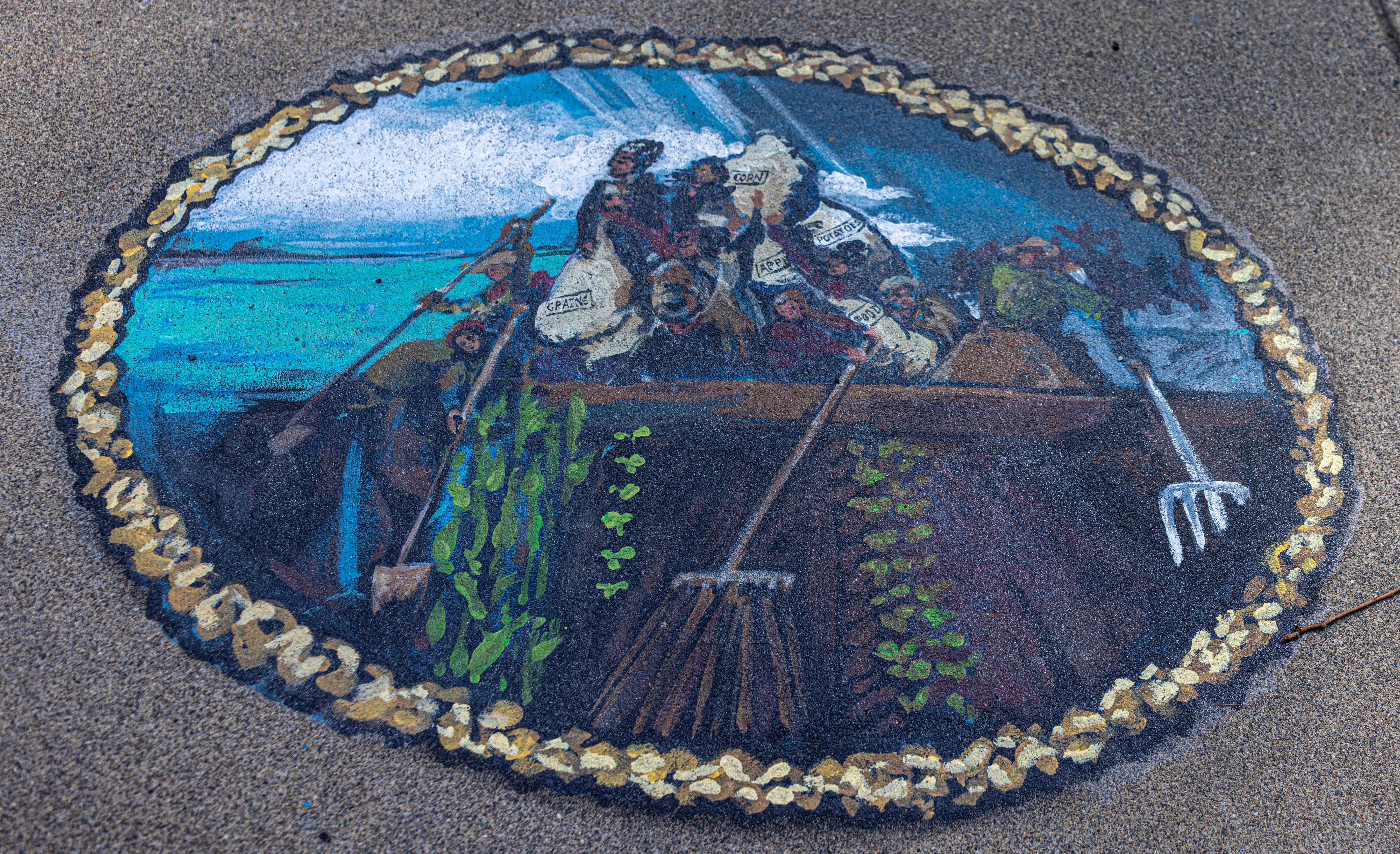
The Crossing of Dela-Western Massachusetts, references a famous painting of Washington Crossing the Delaware by Emanuel Leutze. In the original painting, George Washington stands at the front of a small boat crowded with thirteen individuals, mostly soldiers, but also a farmer, and a merchant. In my painting, the diverse figures are farming land instead of rowing, what was once an oar is now a shovel. The people are transporting giant sacks of potatoes, corn, one bag simply labeled food.

I wanted to honor the farmers, female, male and non-binary, of all who lived in Greenfield 250 years ago, and grew food which fed the revolution.

What I loved most of these uniquely artistic works of art is how they each showed a different creative display of our fight for freedom and liberty and how that fight continues.

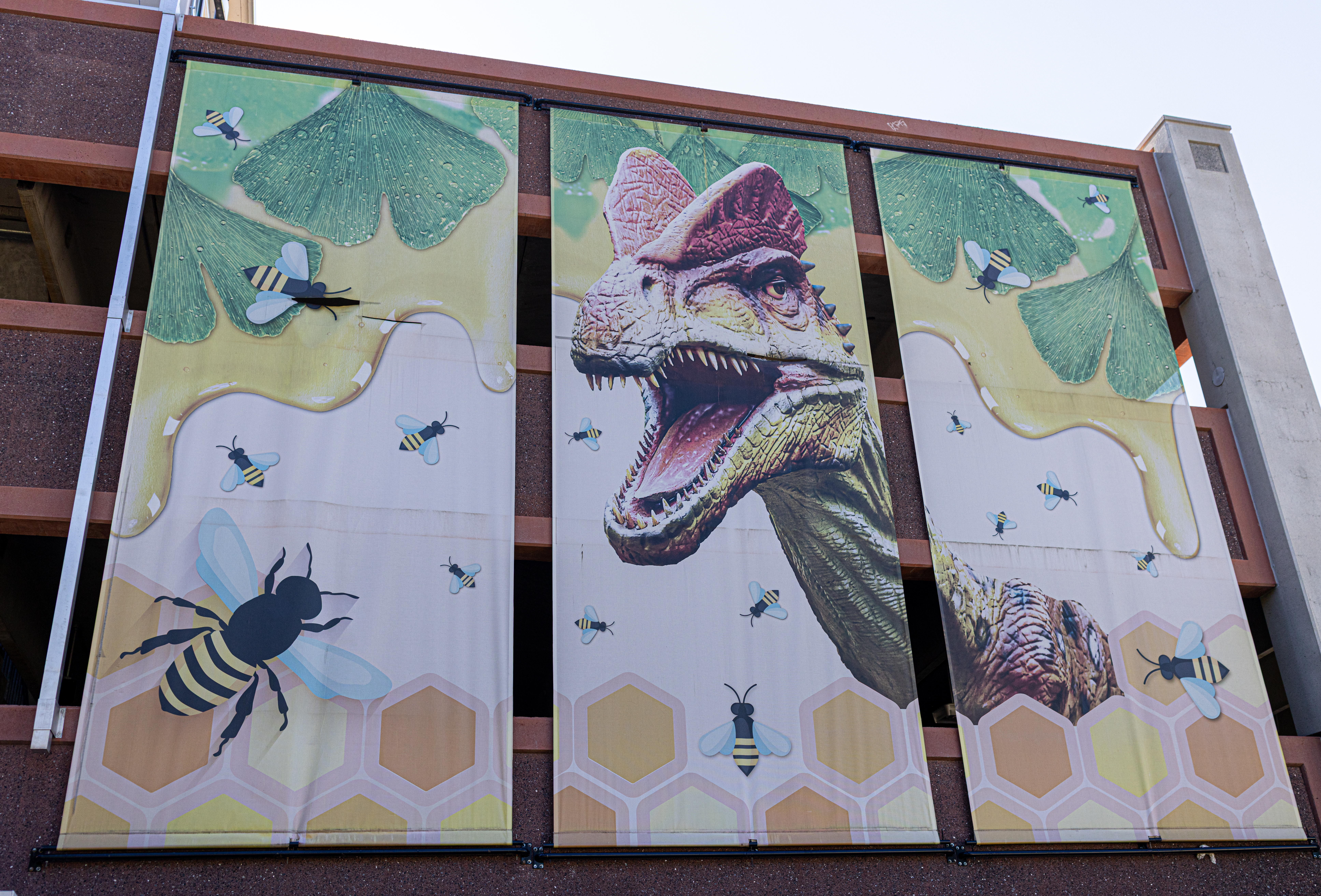
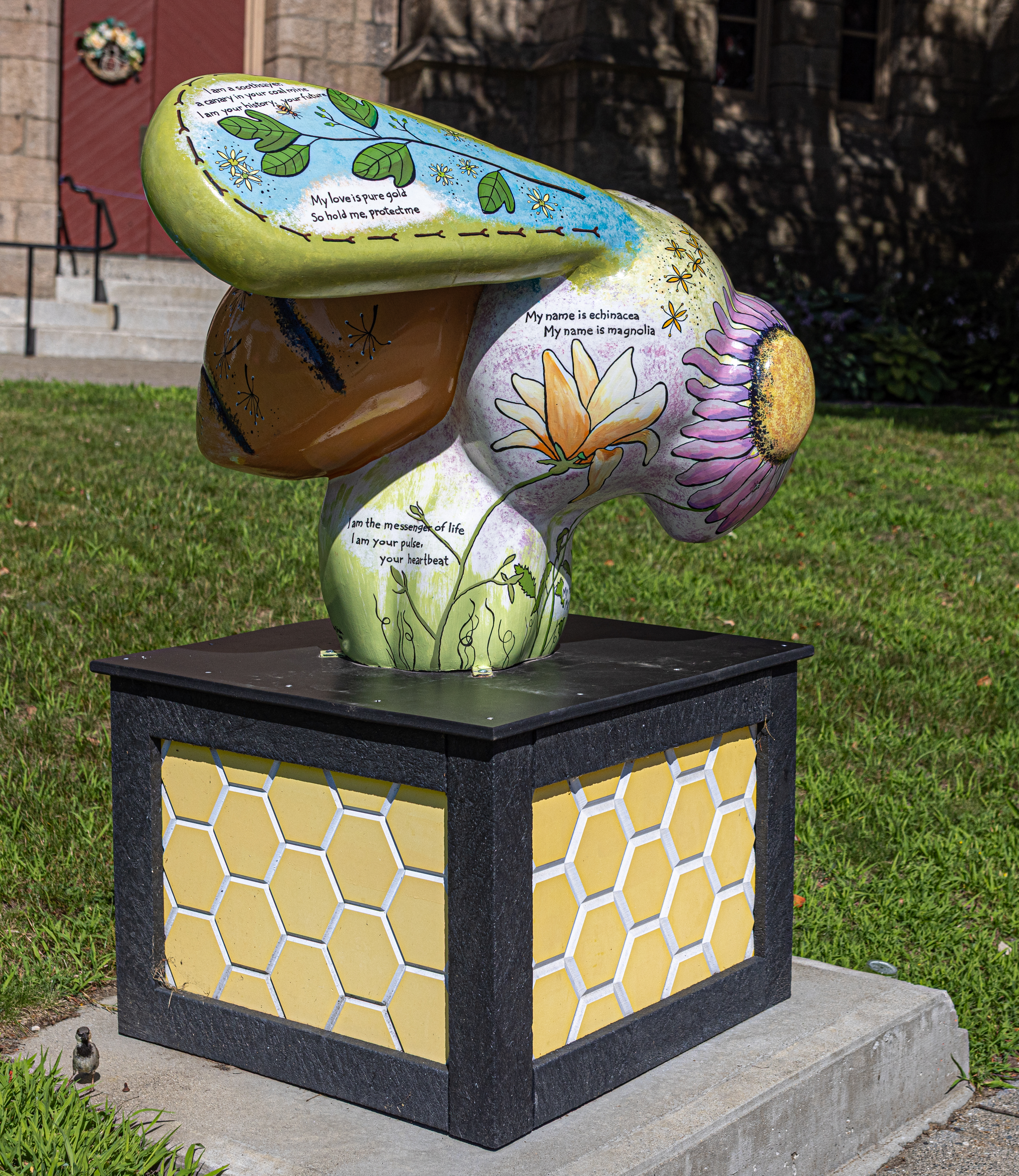
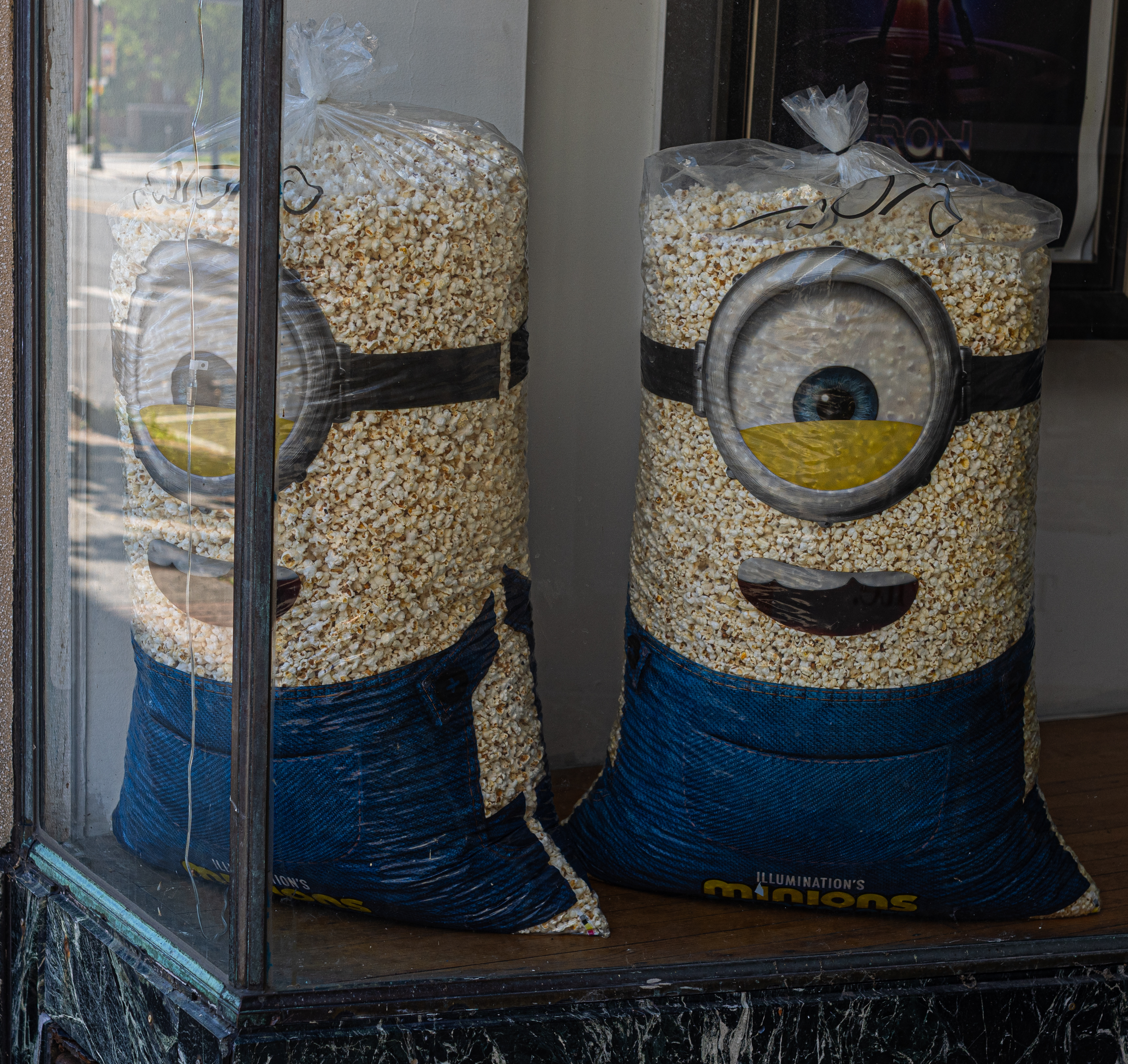
There were many other interesting and fun things to see and do in Greenfield. From industrial sized popcorn bags made to look like Minions to bees (which has a story that deserves their very own post), parking meters painted to look like cultural icons and other murals as well as a nod to dinosaurs, Greenfield has so many more interesting things to see! It’s definitely worth another visit.
2026 Springfield Museums Flower Festival (Springfield Museums, Springfield, MA)

Date Of Event: April 12, 2026

Location: Springfield Museums, 21 Edwards Street, Springfield, MA 

Summary: Springfield Museums held their annual flower festival event last month. Each flower arrangement at the exhibit resembled or was influenced by works of art or books.

Art can take many forms. And the 13th annual Flower Festival at Springfield Museums is a great example of this.

The festival, which included dozens of flower arrangements, used books (specifically their cover art) or works of art or even vehicles or ideas as inspiration for their arrangements. There were dozens of arrangements at the festival. So, I hope you like flowers!

All of the flowers in the first section of the Festival of Flowers exhibit were inspired by children’s books. I use the terms loosely because many of the books still warm the hearts of adult readers as well!

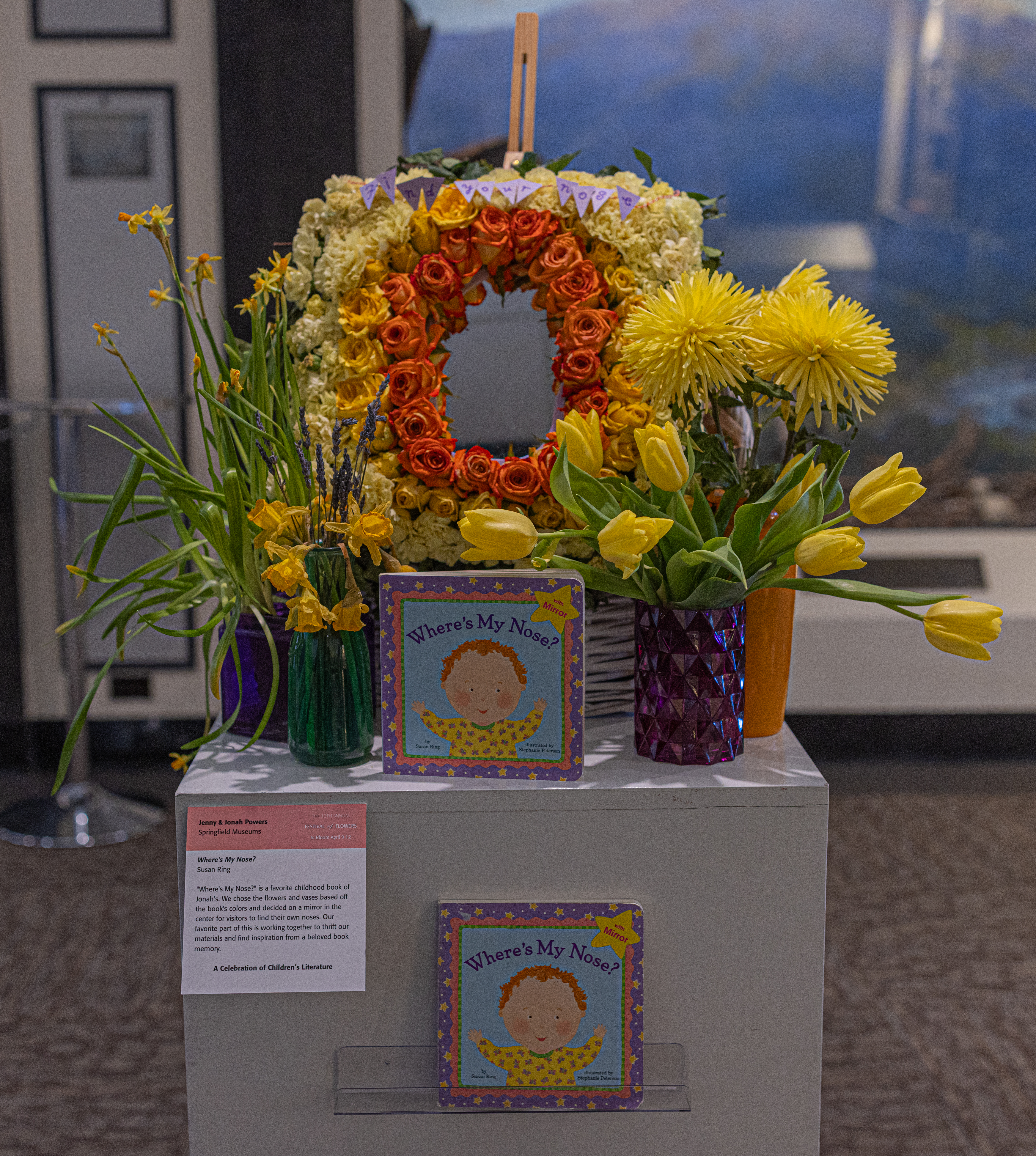
The first example of the flower arrangements imitating art is this arrangement is this arrangement based on the book Where’s My Nose? by Susan Ring. This book is a childhood favorite of Jonah Powers who arranged these flowers and vase with Jenny Powers. They chose the colors based on the book’s colors and decided to put a mirror in the center for visitors to find their own noses. Their favorite part of this flower arrangement was working together to thrift their materials and find inspiration from a beloved book memory. So, can you find your nose? I’ll wait. Ok, now, we can move on to the next arrangement.
The next flower arrangement was based on a book from a local author. The Very Hungry Caterpillar by Northampton, MA, author Eric Carle is the basis for this arrangement. Sadly, Eric passed away in May of 2021.
Elizabeth Tongue of the Springfield Garden Club and grandmother of 5 children, thought The Very Hungry Caterpillar would be fun to emulate so her grandkids could to help her make and see the finished product.

Floral foam wrapped with green plastic was used as the basic caterpillar. She used small green mums and other greens to build the body. Other small colorful flowers were added to signify what he ate as he moved along through the week.

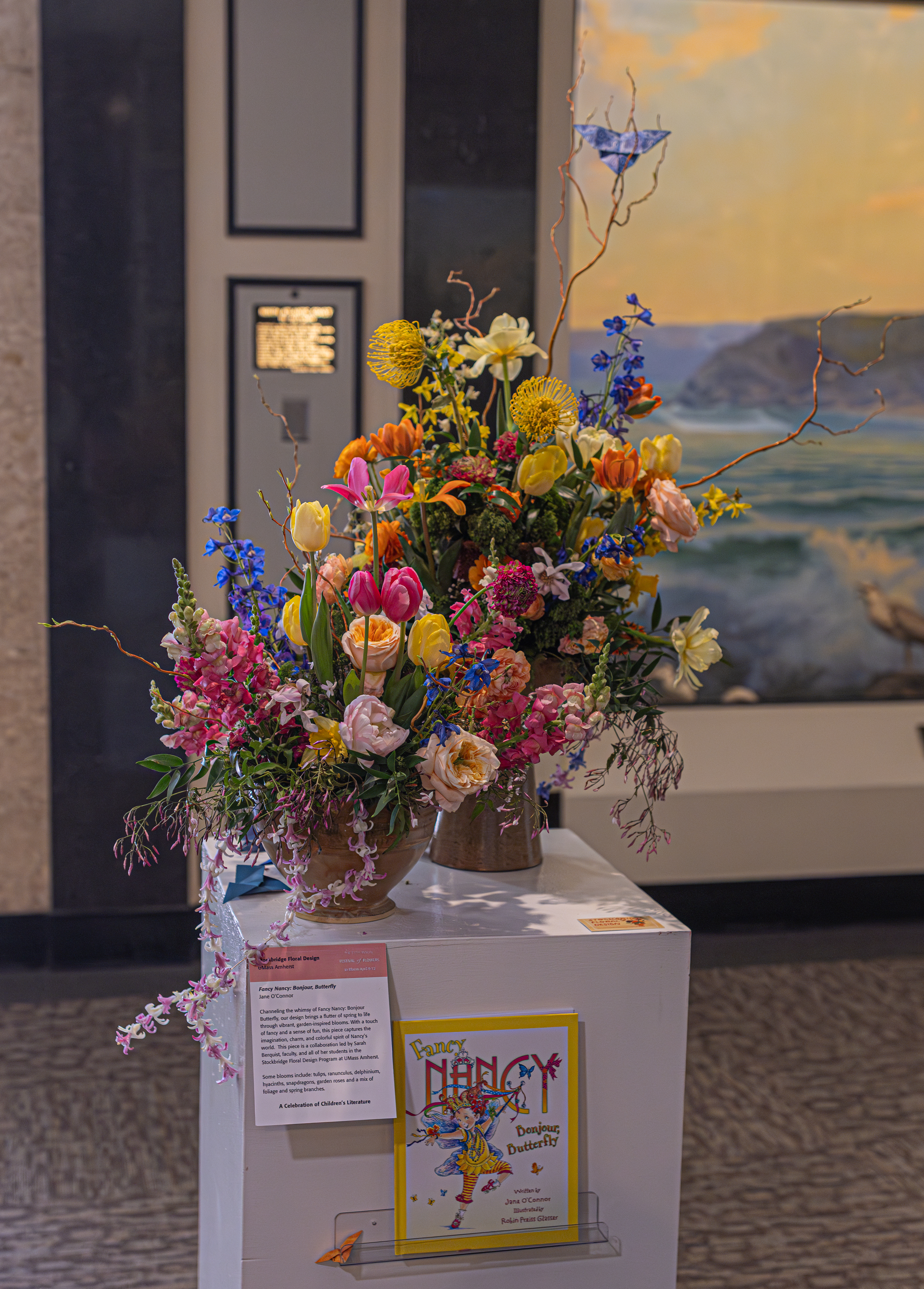
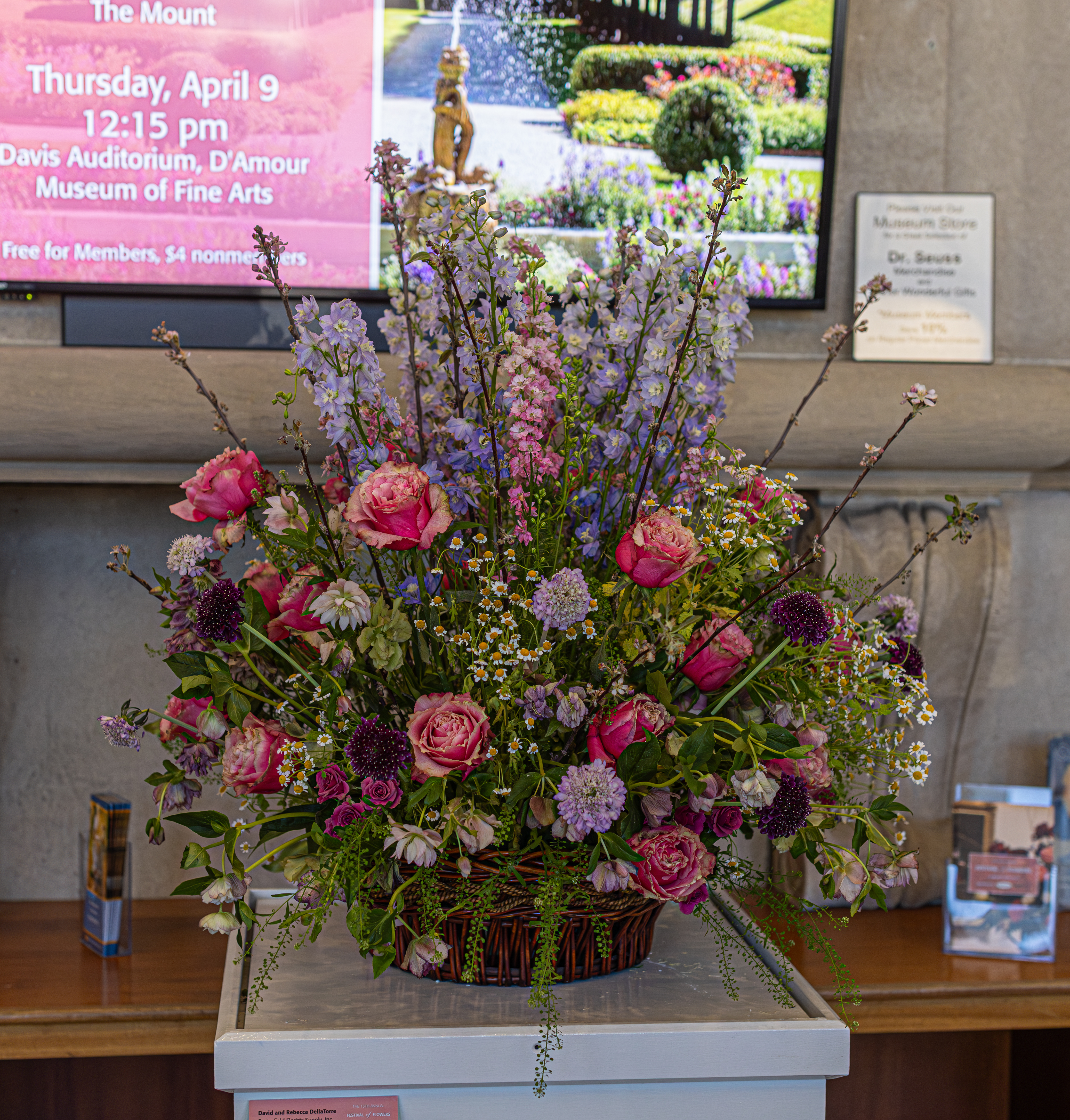
Stockbridge Floral Design created this floral design based on the book Fancy Nancy: Bonjour, Butterfly. Channeling the whimsy of this book, the design brings a flutter of spring to life through vibrant garden-inspired blooms. With a touch of fancy and a sense of fun, this piece captures the imagination, charm and colorful spirit of Nancy’s world. This piece was a collaboration of Sarah Berquist, faculty and all of her students in the Stockbridge Floral Design Program at UMass Amherst.

Some blossoms include tulips, ranunculus, delphinium, hyacinths, snapdragons, garden roses and a mix of foliage and spring branches.

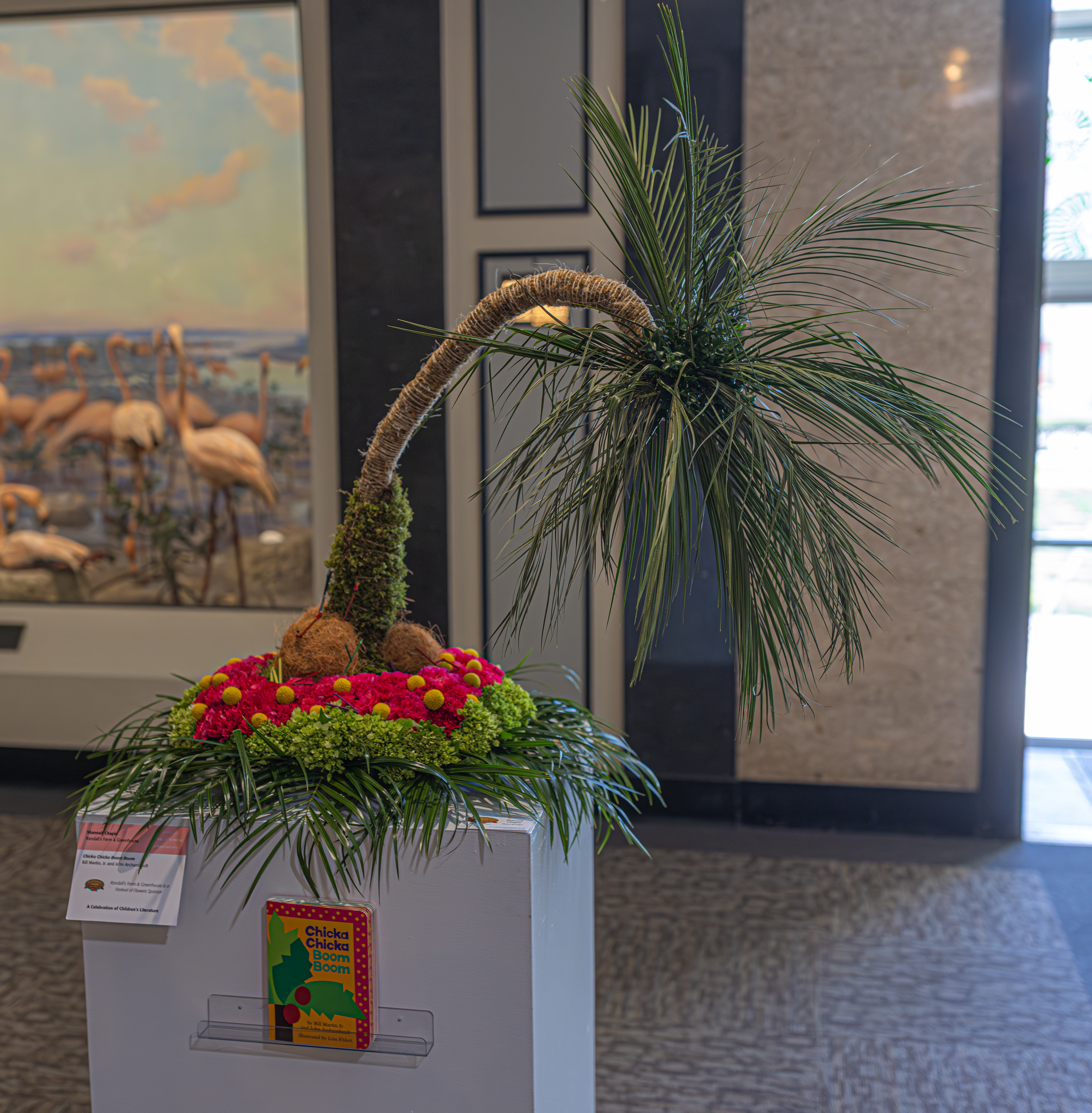
Chicka Chicka Boom Boom by Bill Martin Jr and John Archambault was the inspiration for this arrangement. It was designed by Shannah Chapin at Randall’s Farm & Greenhouse.

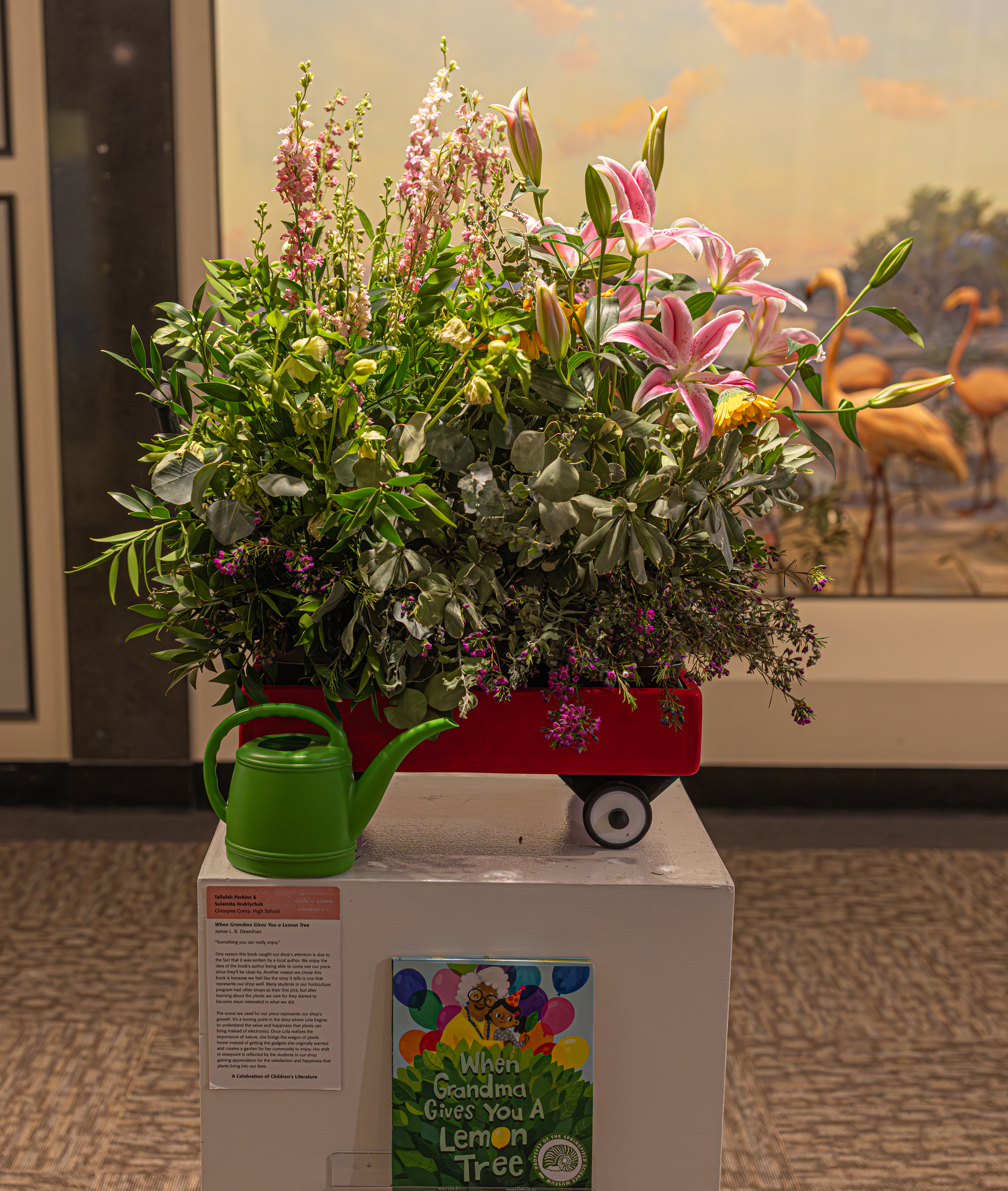
The next arrangement was inspired by the children’s book, When Grandma Gives You a Lemon Tree by Jamie L.B. Deenihan.

Tallulah Perkins and Sulamita Andriychuk from the Chicopee Comp. High School made this arrangement. They used the phrase “Something you can really enjoy” in the description of their arrangement.

One reason this book caught the shop’s attention was the fact that it was written by a local author (Jamie lived and worked in western MA until her recent move to Connecticut). They enjoy the idea of the book’s author being able to come and see their piece. Another reason they chose this book is because they feel the story it tells is one that represents their shop well. Many students in the horticulture program had other shops as their first pick, but after learning about the plants they care for they started to become more interested in what they did.

The scene they used for their piece represents their shop’s growth. It’s a turning point in the story where Lola begins to understand the value and happiness that plants can bring instead of electronics. Once Lola realizes the importance of nature, she brings the wagon of plants home instead of getting the gadgets she originally wanted and creates a garden for her community to enjoy. Her shift in viewpoint is reflected by the students in our shop gaining appreciation for the satisfaction and happiness that plants bring into our lives.

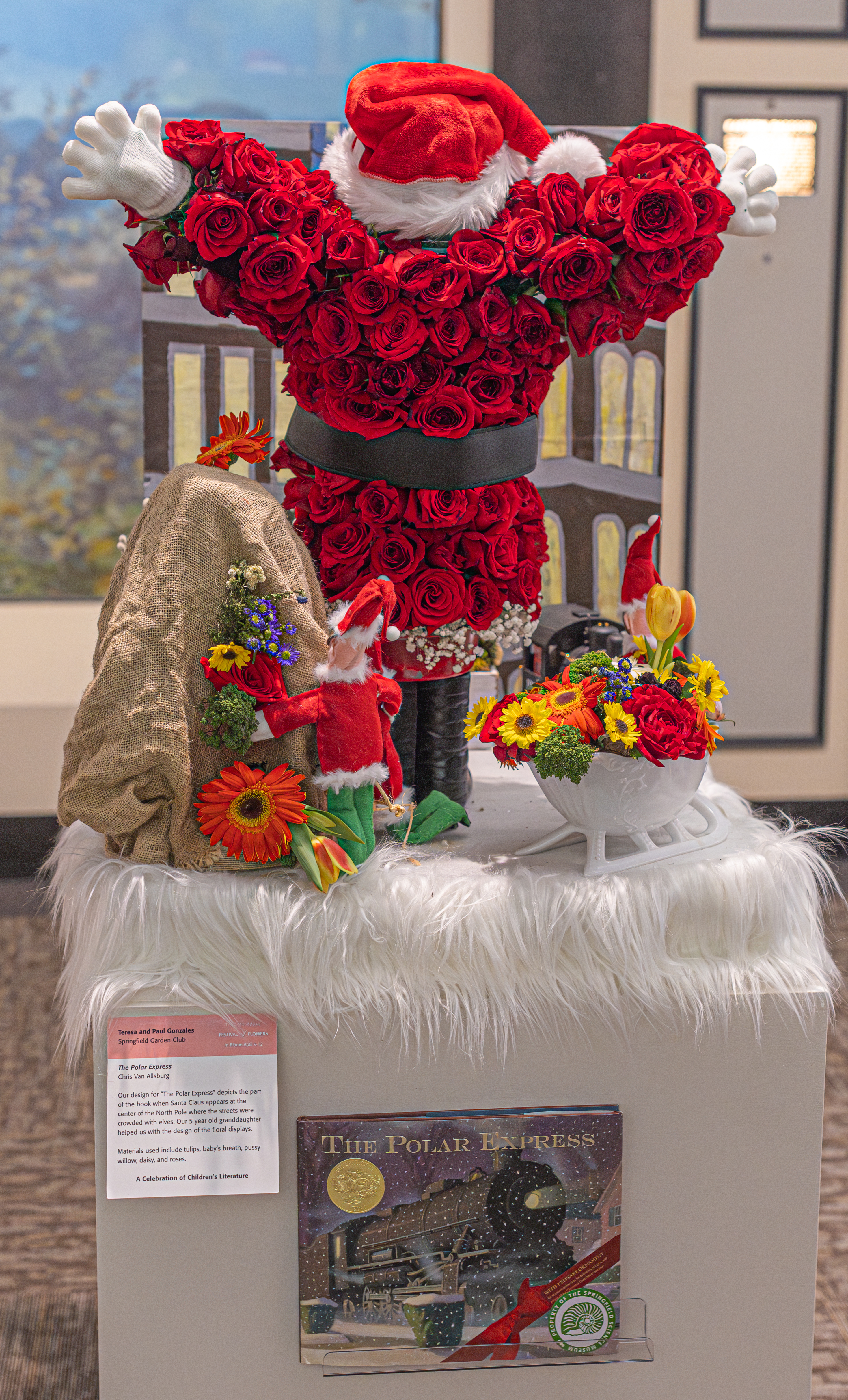
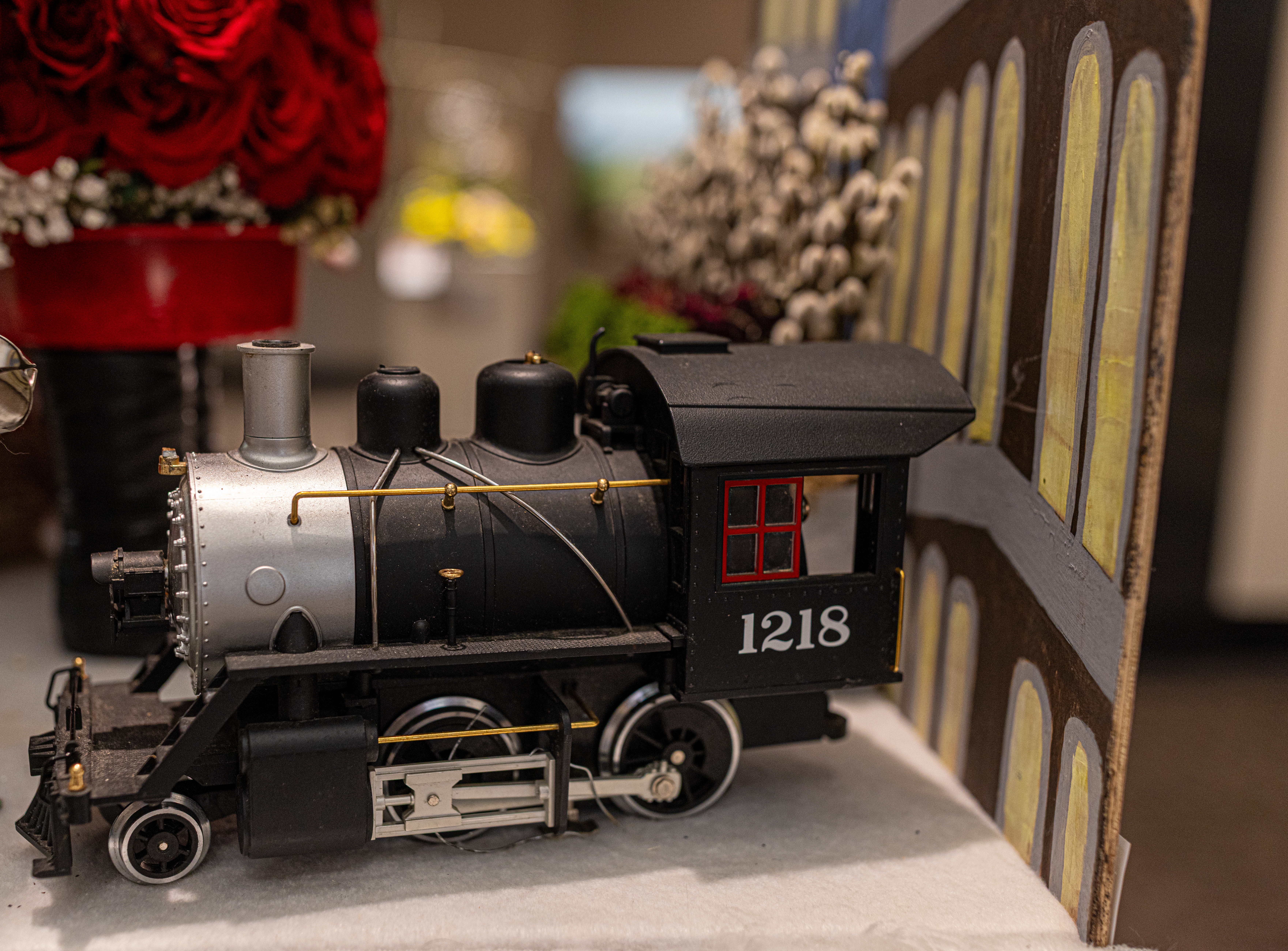
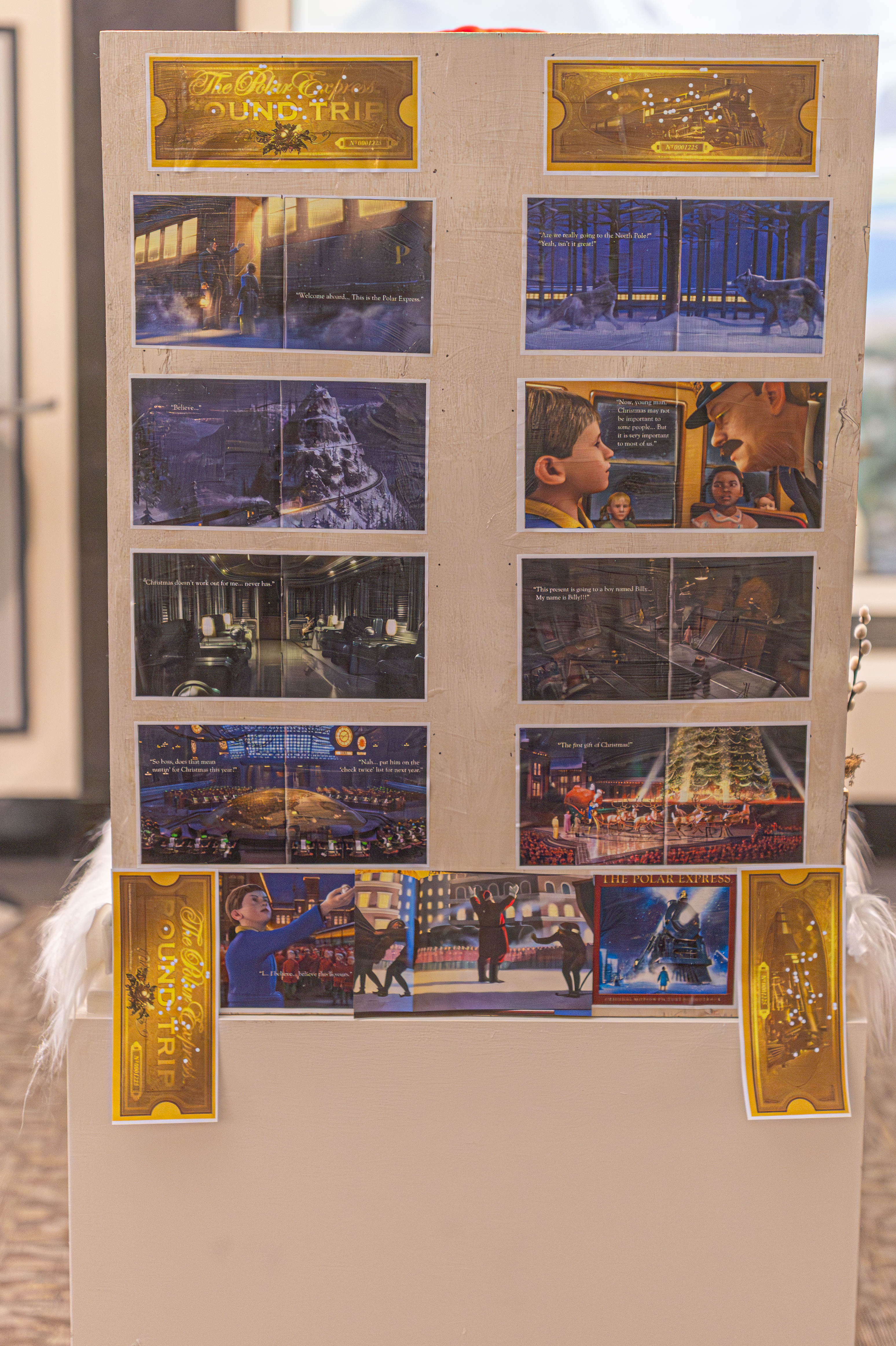
The Polar Express by Chris Van Allsburg is another childhood favorite that was used as an inspiration for the flower festival. Teresa and Paul Gonzales of the Springfield Garden Club created this arrangement to depict the part of the book when Santa Claus appears at the center of the North Pole where streets are crowded with elves. Their 5 year old granddaughter helped design the floral display. Materials used include tulips, pussy willows, baby’s breath, daisies and roses.

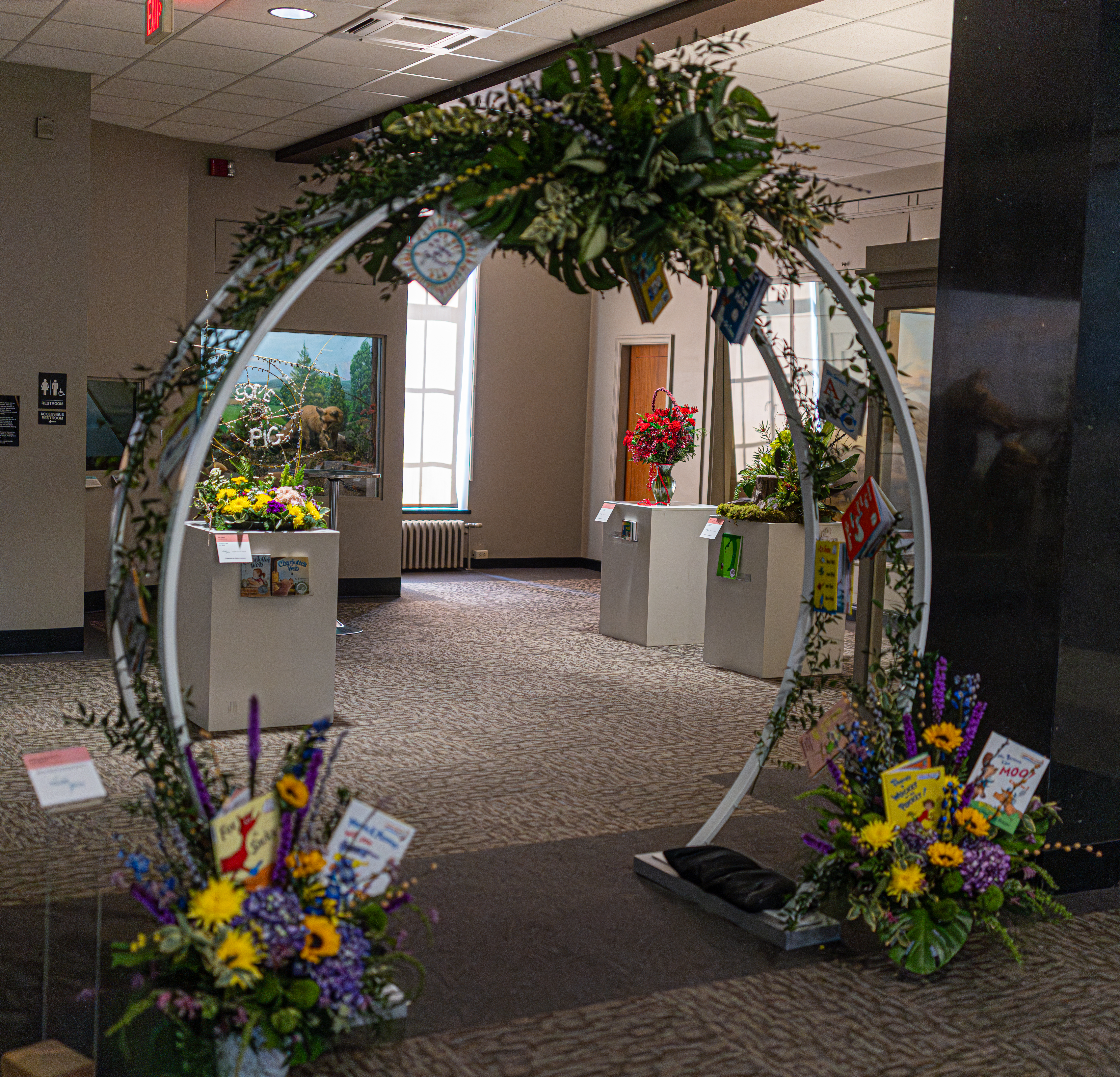
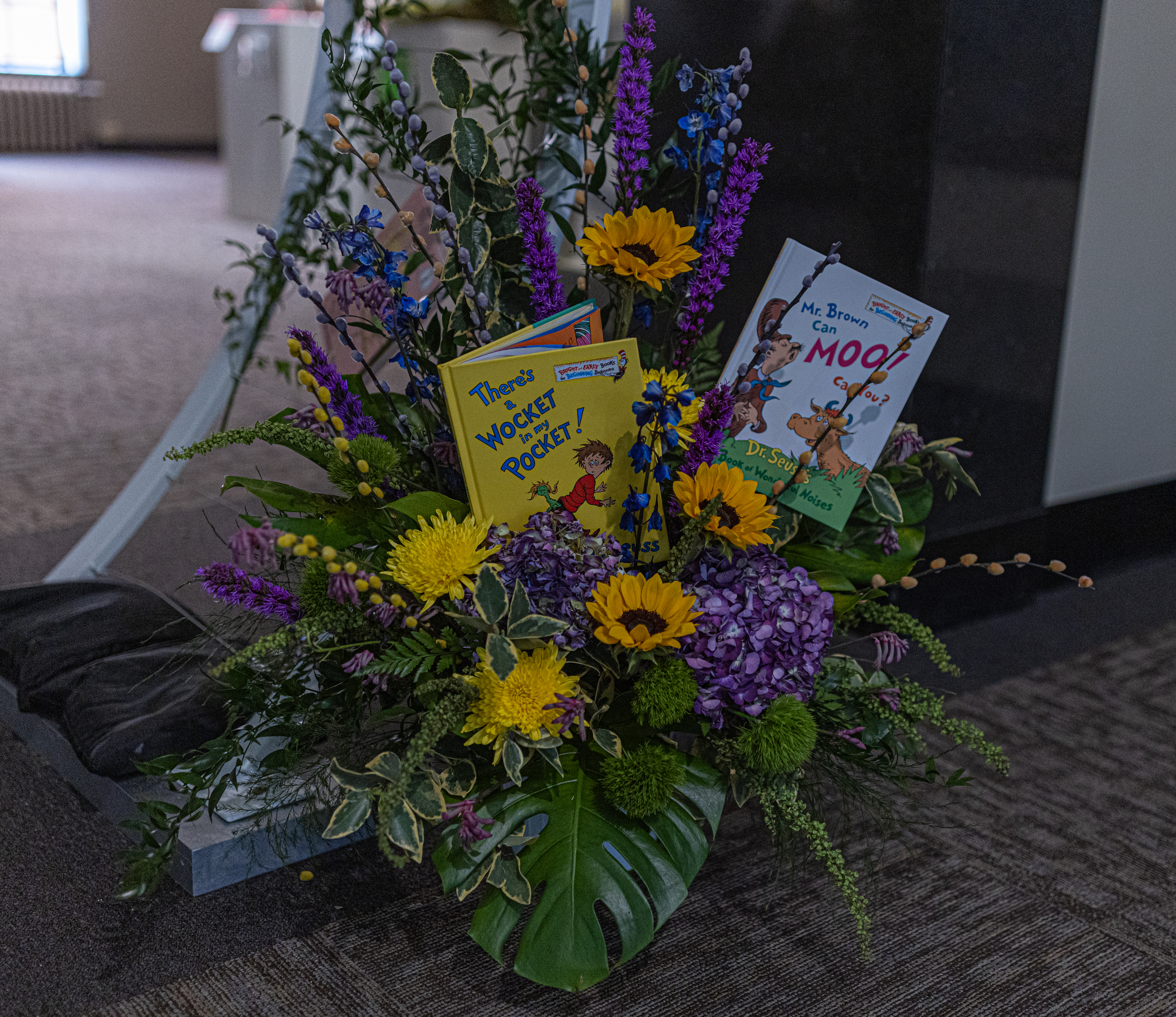
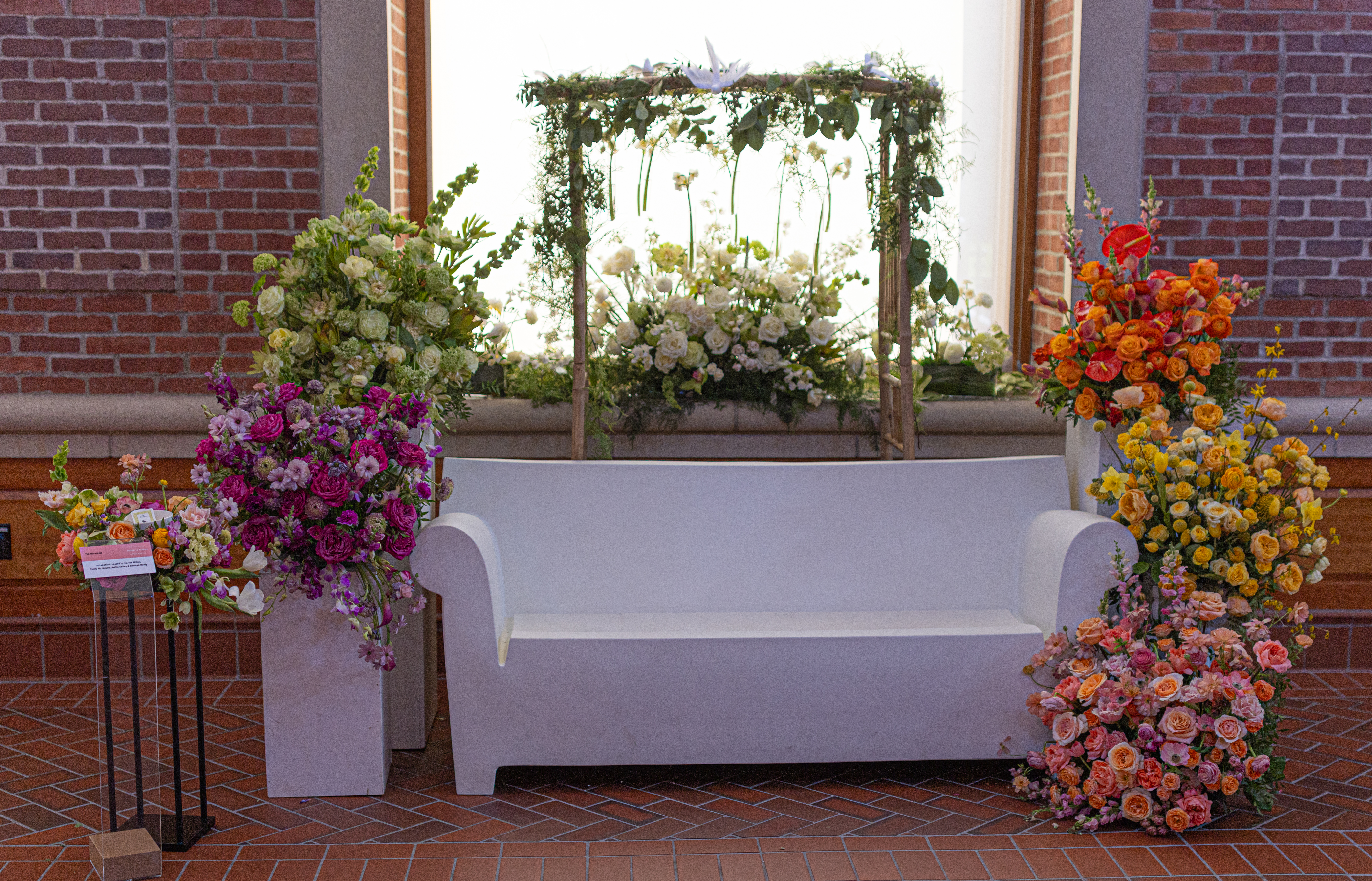
This archway, which was tastefully decorated with books from local Springfield, MA, author Theodore Seuss Geisel (aka Dr. Seuss) separated the floral arrangements. You may recognize one or two!

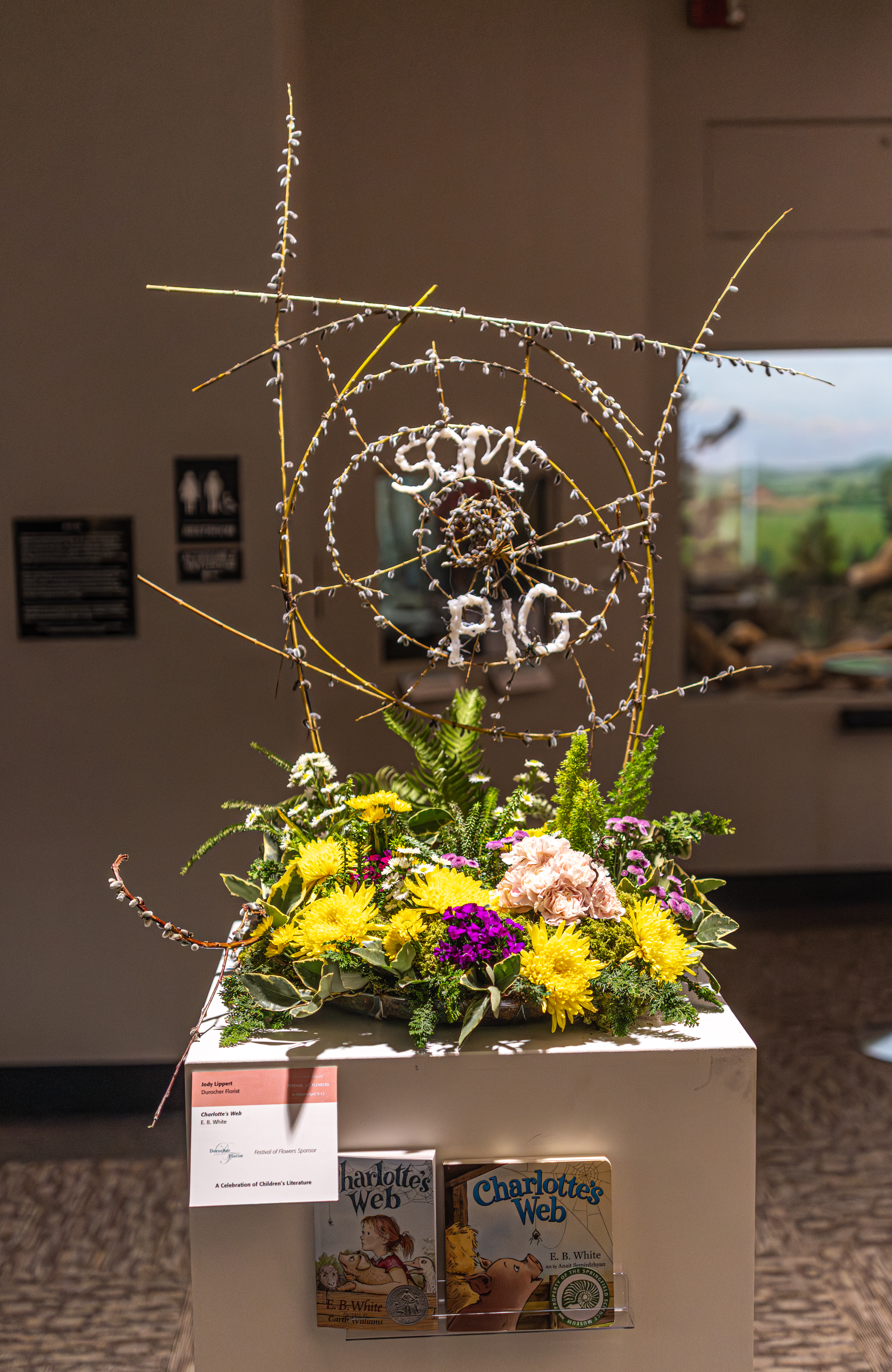
Of course, what children’s book display would be complete without Charlotte’s Web by E.B. White? This display was arranged by Jody Lippert at Durocher Florist.

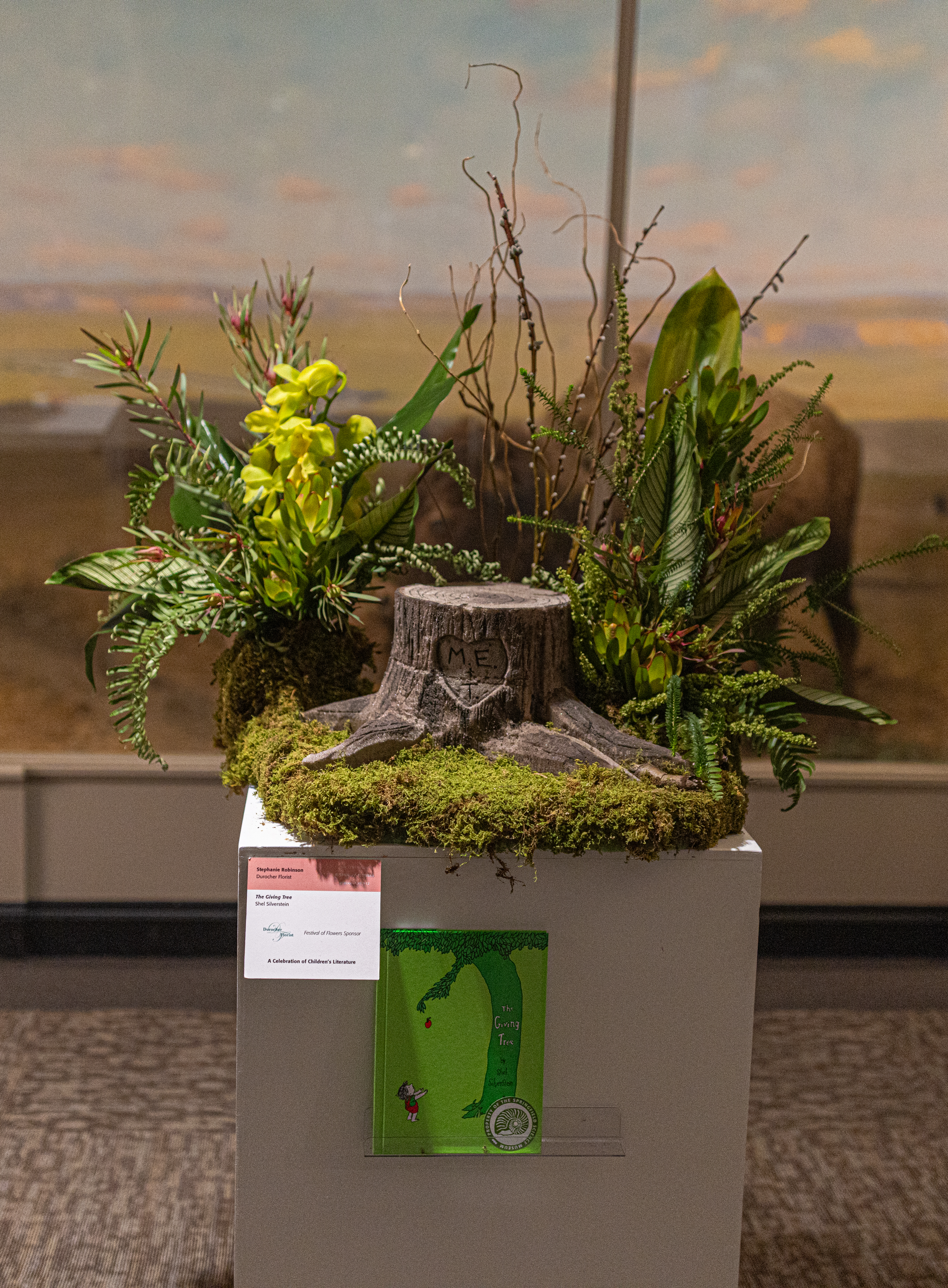
The Giving Tree by Shel Silverstein was the basis for this arrangement by Stephanie Robinson at Durocher Florist. Spoiler alert: it doesn’t end well for the tree.

Nichole Pelletier of Durocher Florist designed this arrangement based on Goodnight Moon by Margaret Wise Brown.

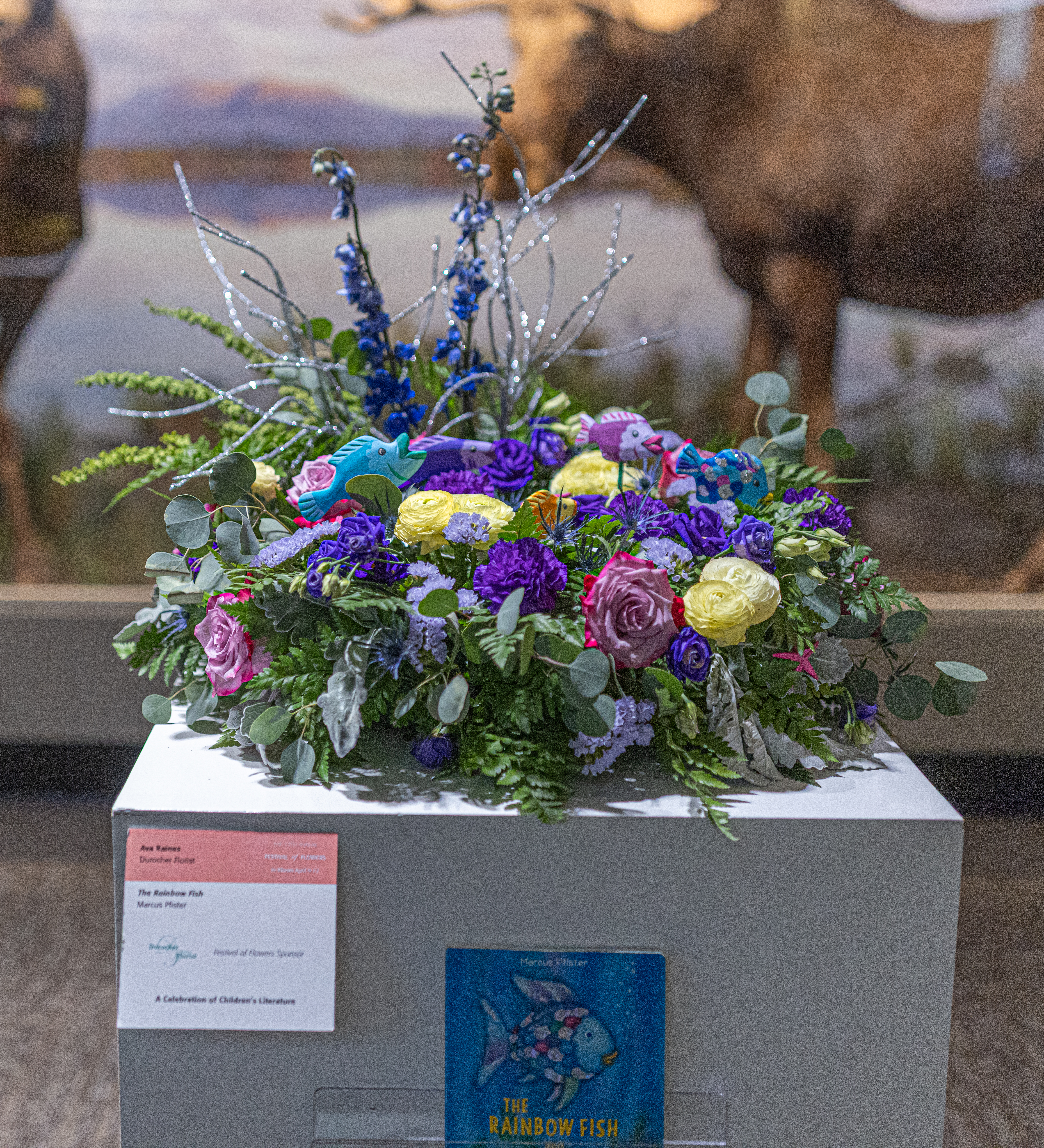
This arrangement was based on Swiss author Marcus Pfister’s The Rainbow Fish. It was arranged by Ava Raines at Durocher Florist.

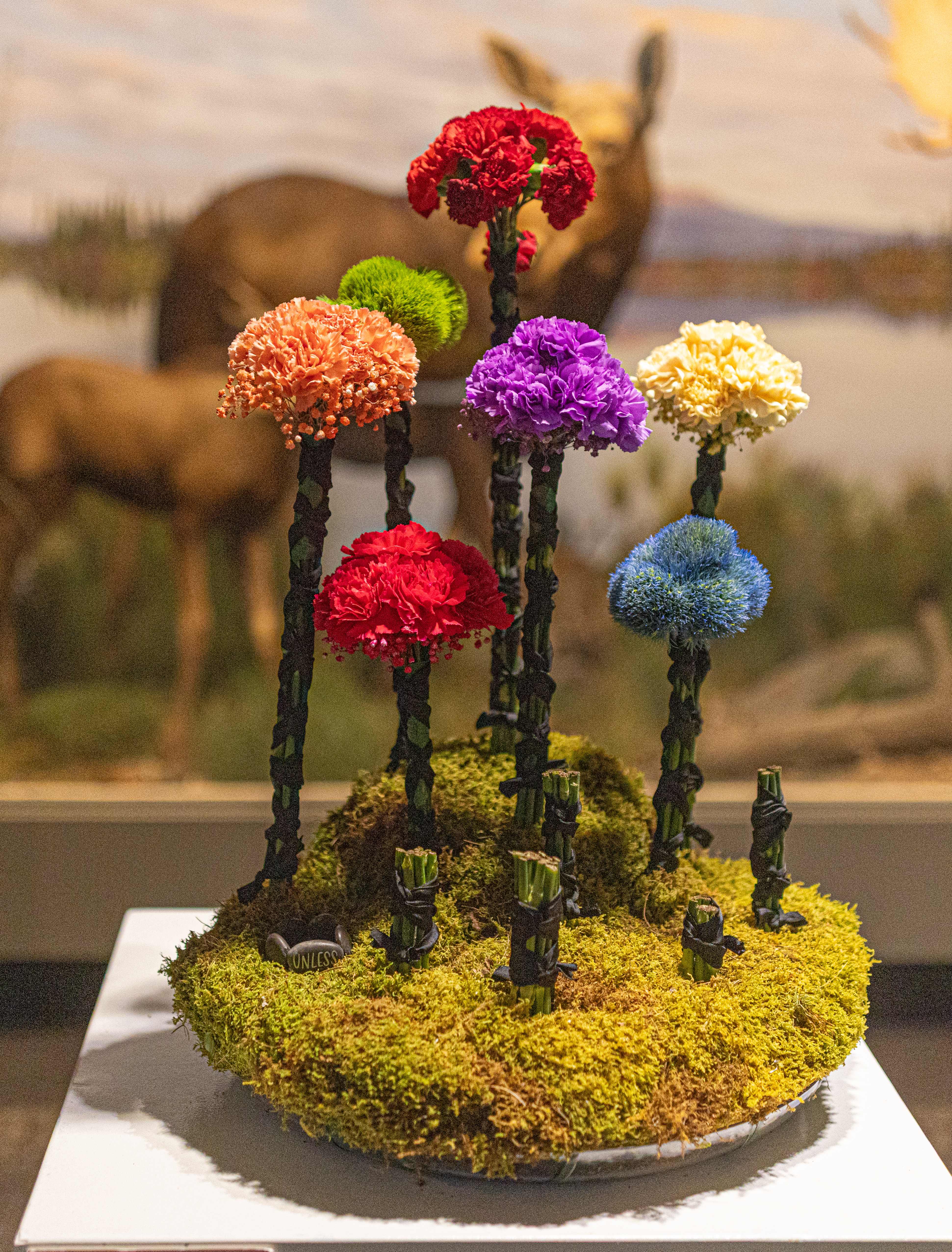
This arrangement was inspired by another book by local legend Dr. Seuss, The Lorax. It was created by Alexis Landry at Durocher Florist.

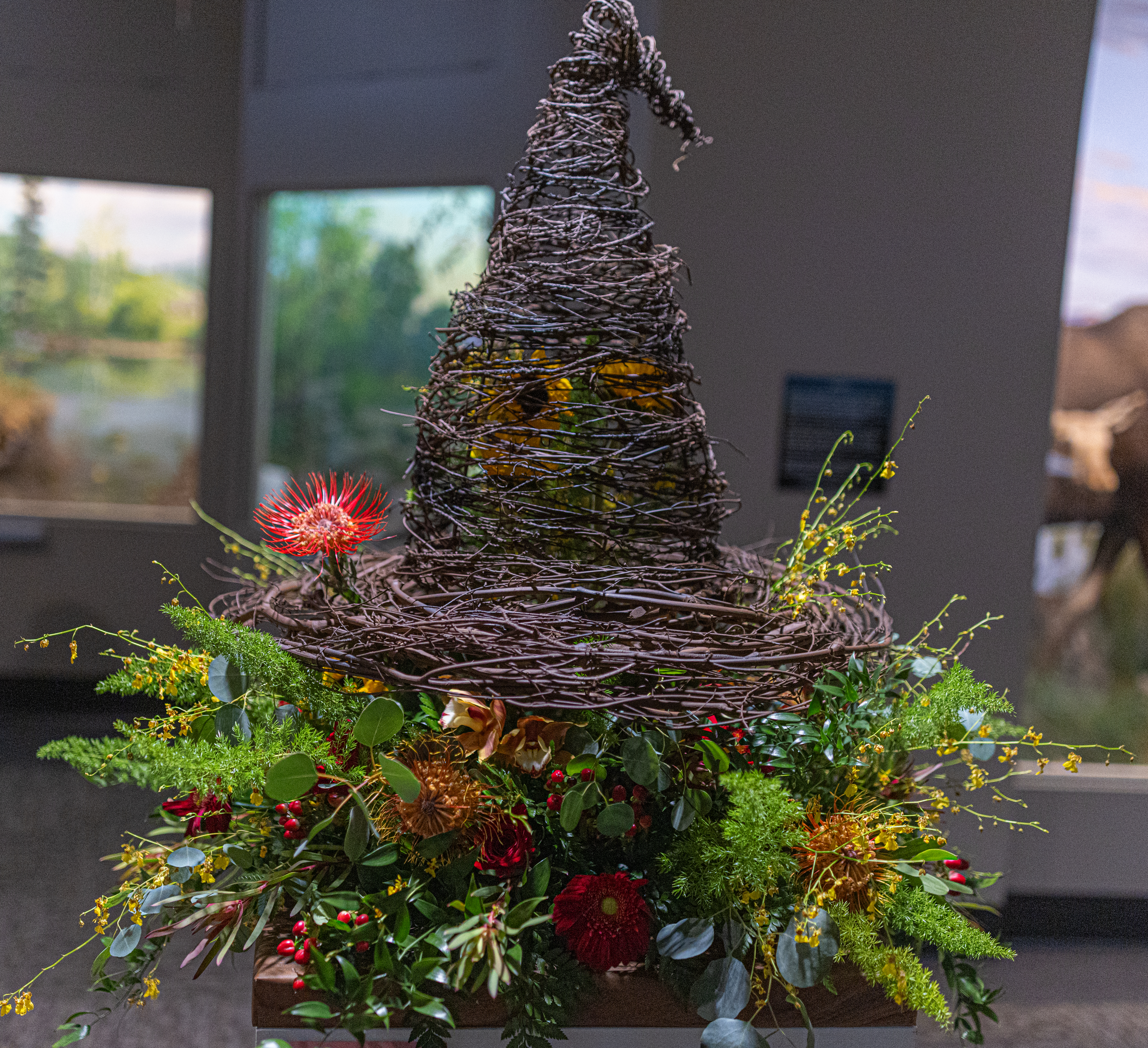
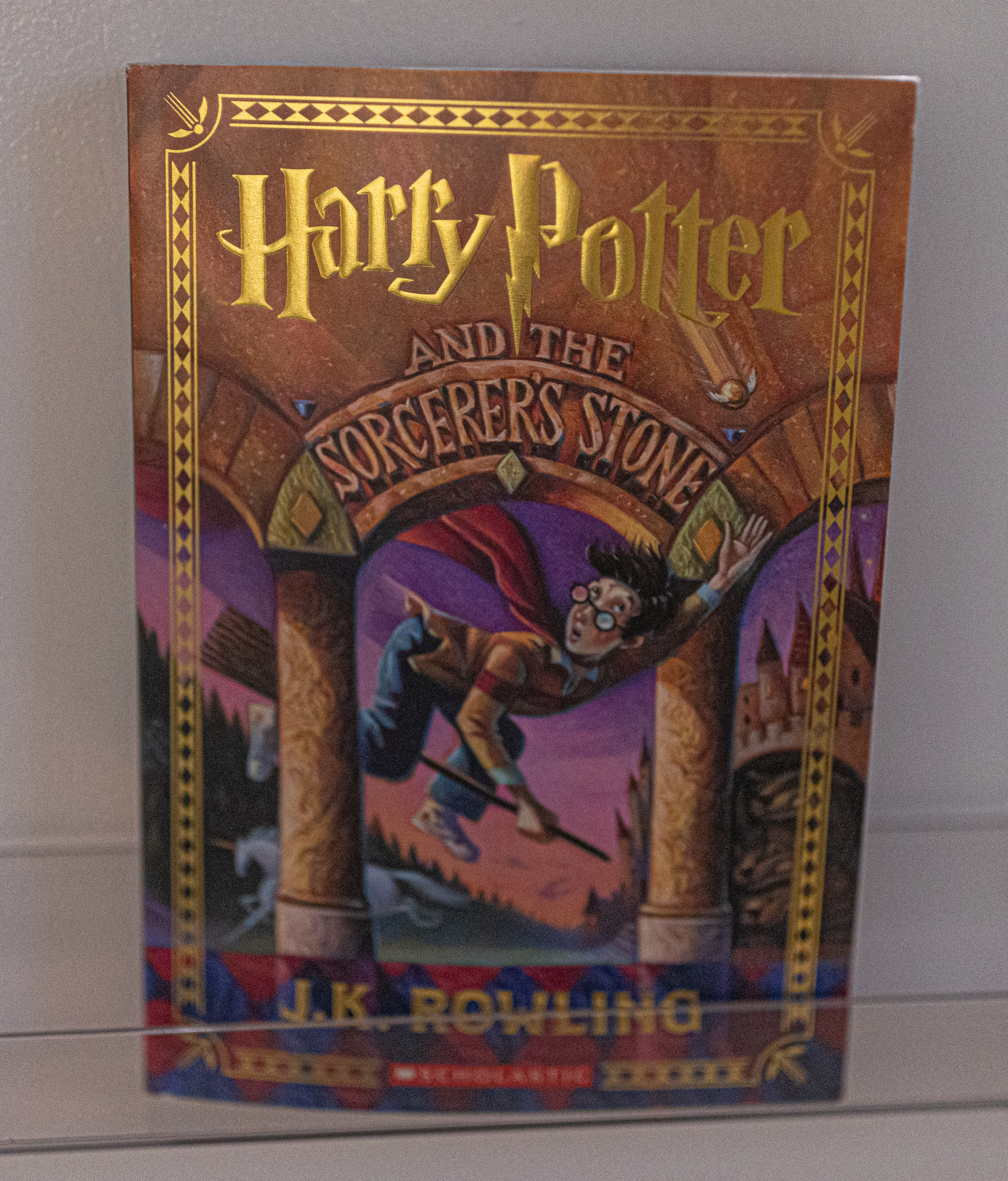
You may have heard of this book before. This floral arrangement and design for Harry Potter and the Sorcerer’s Stone by J.K. Rowling was made by Amanda Wright at Durocher Florist.

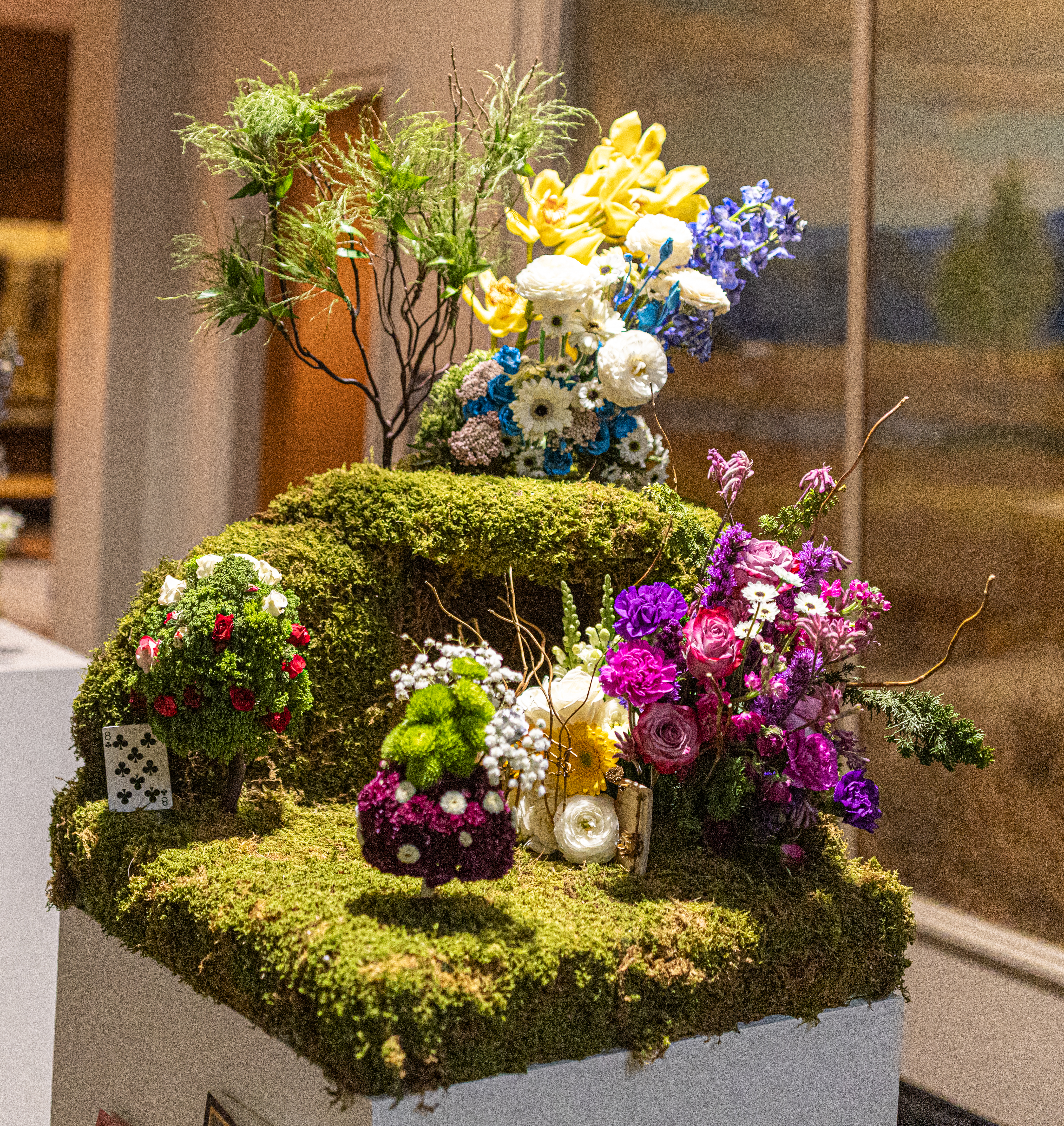
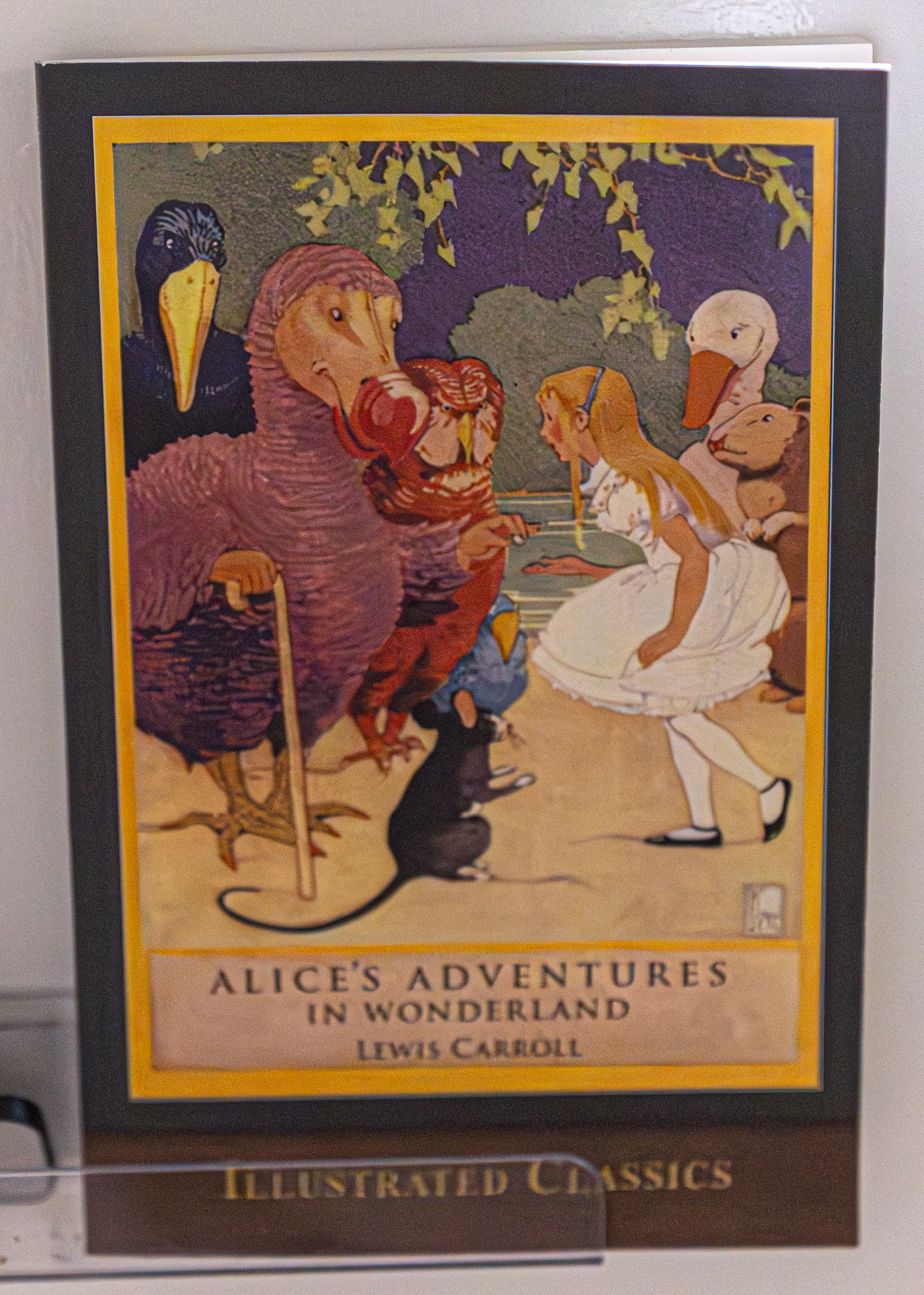
Alice’s Adventure in Wonderland by Lewis Carroll inspired this floral design by Sandra Bushey-Soule at Durocher Florist.

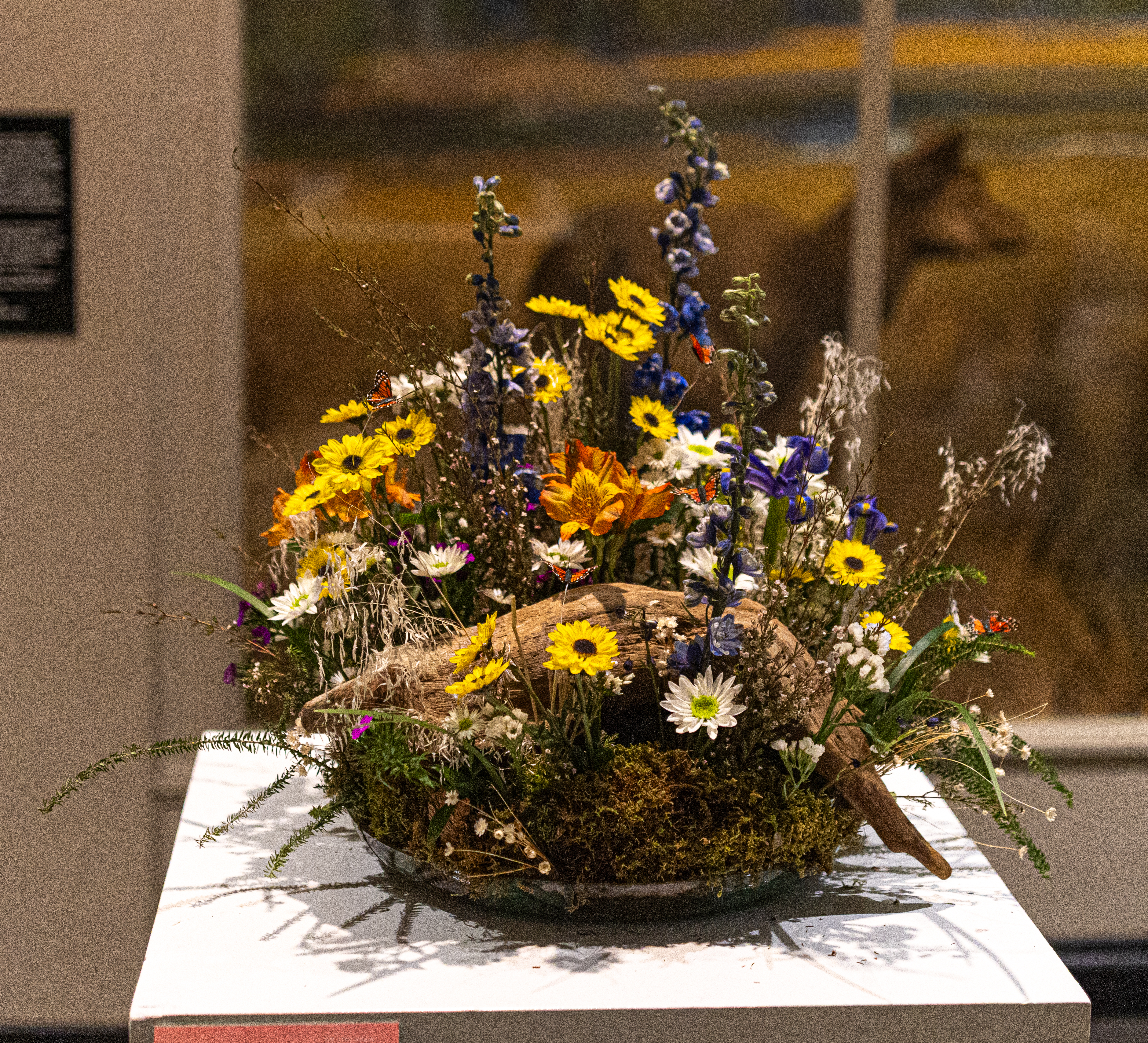
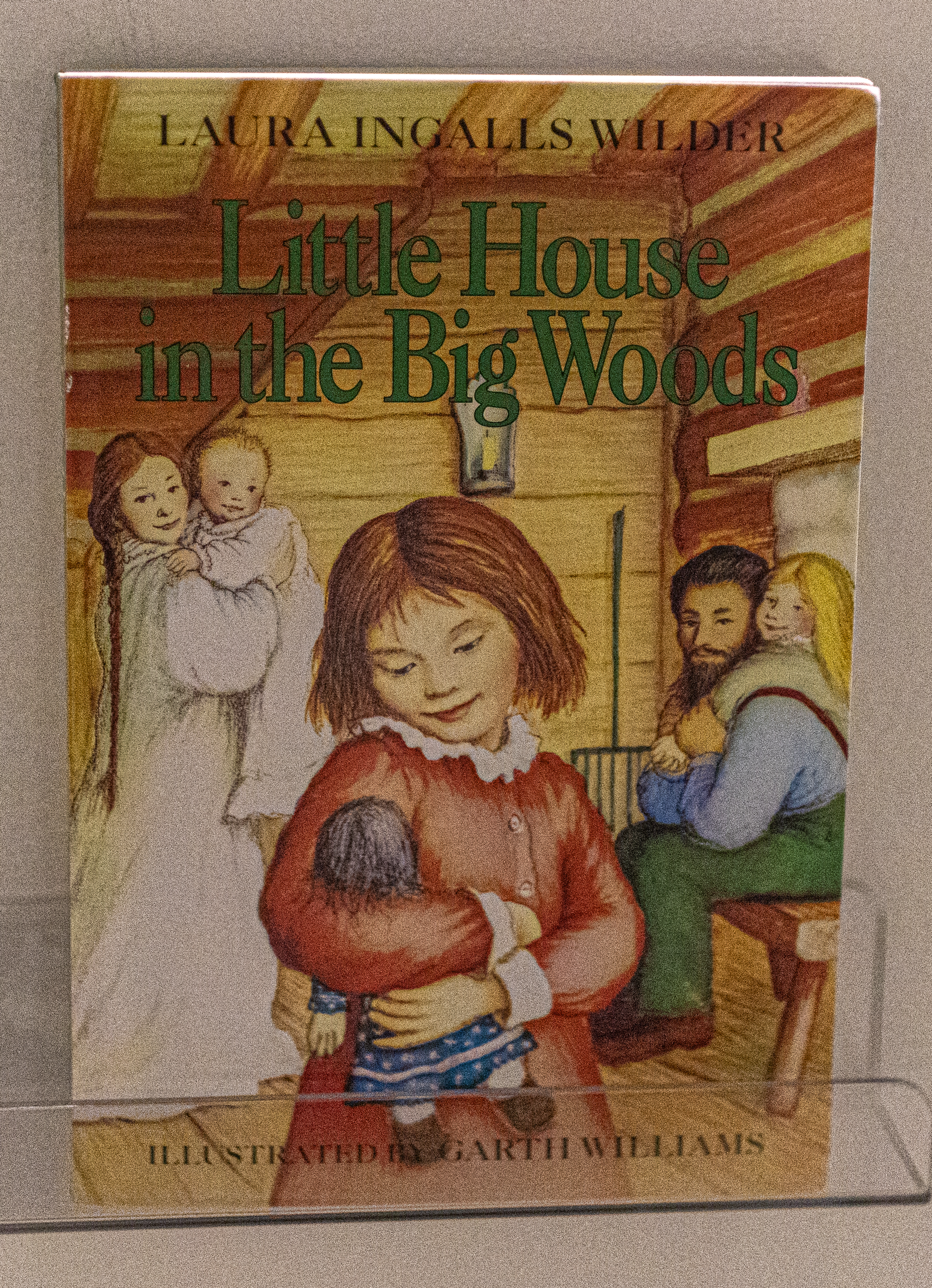
The next floral design which was inspired by the book Little House in the Big Woods by Laura Ingalls Wilder was designed by Julie Rolandini at Durocher Florist. This arrangement brought back memories as it is one book in a series of Little House books that would later become a famous TV show when I was younger. Yes, they did have TV back then.

While the floral arrangements in the Science Museum were based on books, the floral arrangements in the Michele and Donald D’Armour Museum of Fine Arts were based on works of art. In fact, in some of the photos of the floral arrangements, you can see the work of art it was based on.

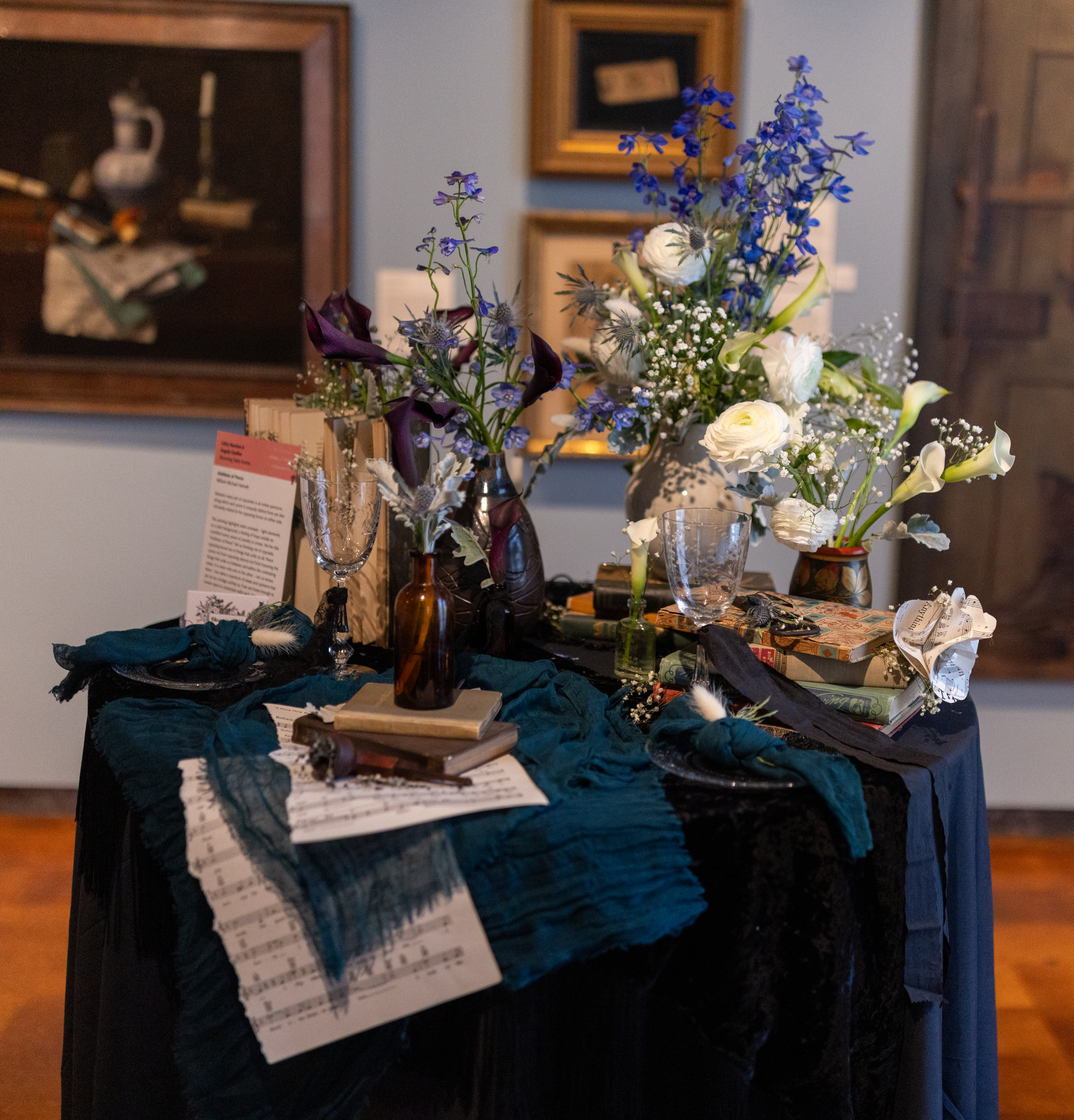
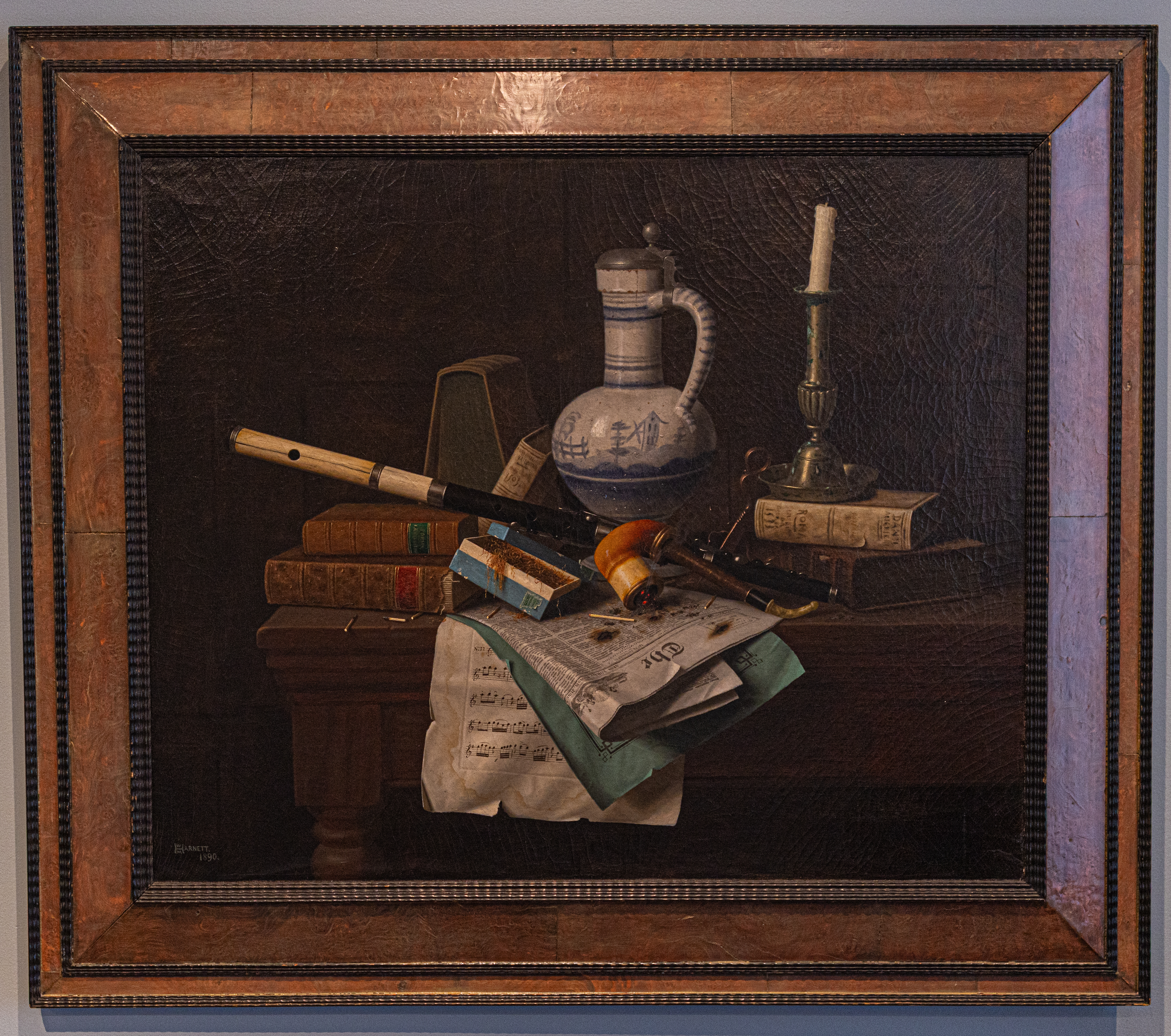
This particular arrangement by Libby Meehan and Angela Chaffee at Blooming Tables Events was based on the art of work called Emblems of Peace (1890, oil on canvas) by William Michael Hartnett.

Libby and Angela said the theme =of this arrangement was opposites. Between every pair of opposites is an entire spectrum, along which each point is uniquely distinct from yet also intimately related to the opposing forces on each side,

The theme of opposites is highlighted by the stark contrasts of a dark background and light elements which create a feeling of hope amidst an unsettled scene, peace vs anxiety or unrest. Yet the title “Emblems of Peace” left them thinking not of opposite, opposing forces but of things that unite us all. Peace comes not from opposing stances but from honoring the things that unite us between and within the contrasting views, It is never one or the other – not us versus them – but rather a spectrum of views and opinions that can act as a bridge uniting us, if we are all brave enough to remain open to connection with each other.

They used white and dark calla lilies to symbolize peace, harmony, balance and new beginnings.

The work of art is considered both unsettling and hopeful. Drawing on a traditional still life theme, Hartnett uses the painting to symbolize the transience of life. The still life is reminiscent of the popular vanitas paintings that were prominent in the Netherlands during the 16th and 17th centuries. Images created in the vanitas style were intended to remind viewers of impermanence, the futility of pleasure and the inevitability of death.

Hartnett used the burning candles and aging papers to suggest deterioration and contribute to a melancholy mood. He has also included items that celebrate love and redemption. A medieval volume by Dante is pictured and suggests Christian salvation n life and death. Additionally, the sheet music featured is “Papageno’s Song”, a love song from Mozart’s The Magic Flute.

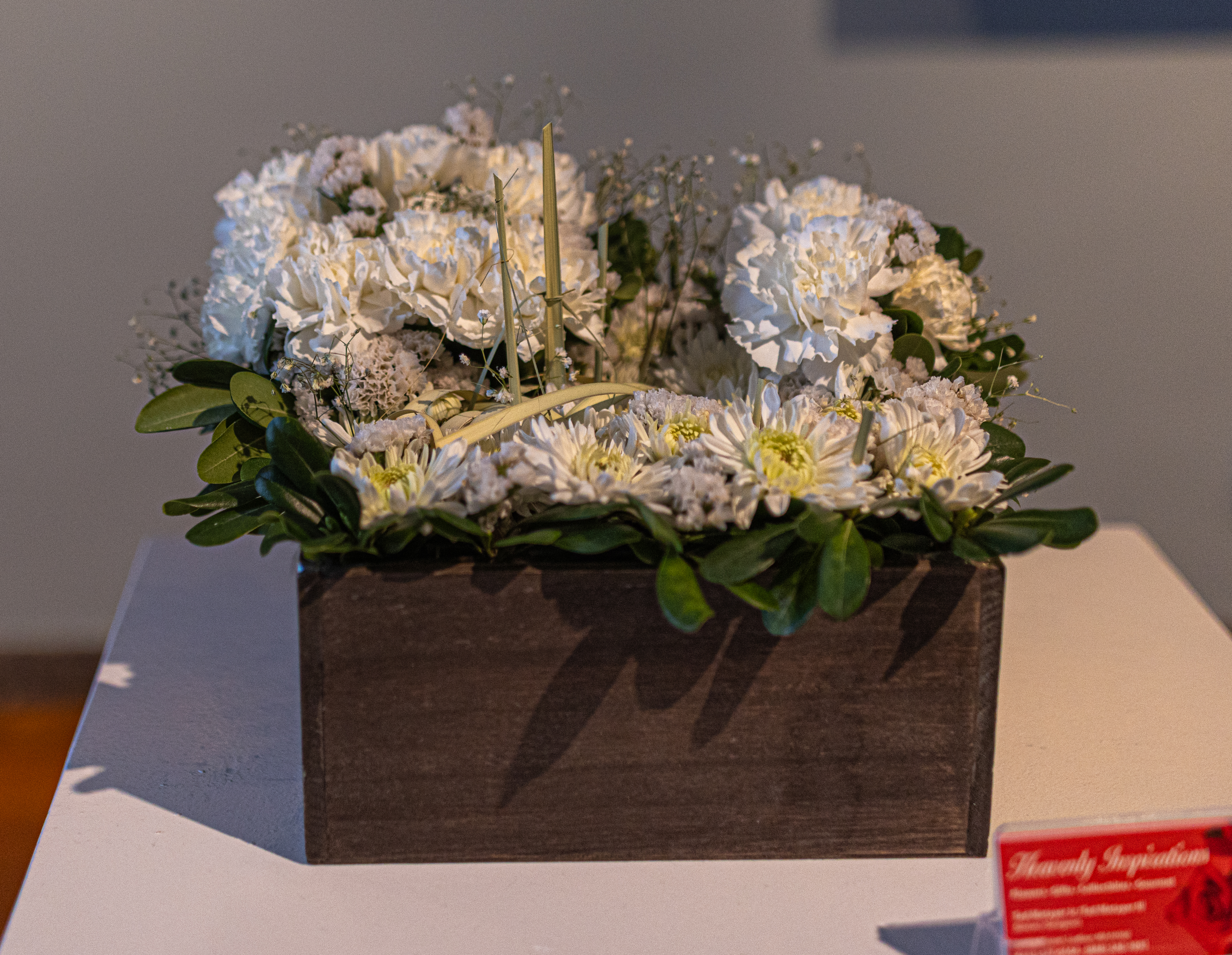
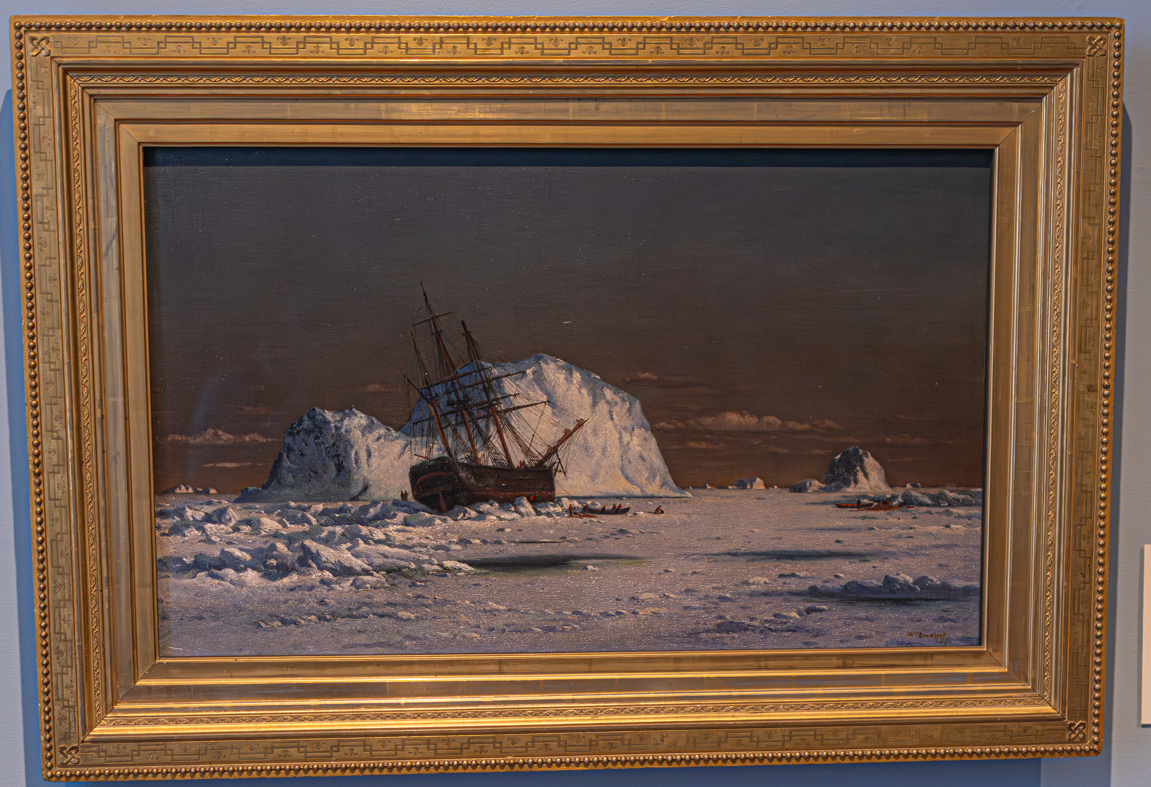
Theodore Metayer III of Heavenly Inspirations Flower and Gifts based this floral design on the painting Icebound Sealer Under the Sun (oil on canvas, 1877) by William Bradford.

At first glance, I thought the painting was a photo. But, Icebound Sealer Under the Sun is indeed a painting. It was painted by William Bradford who was considered the premier artist of the Arctic region. He produced numerous paintings, sketches and photographs taken or created during his at least six trips to the North Pole. Bradford’s enthusiasm coincided with “polar passion”, a popular interest in the region during the Victorian era. Bradford was intrigued by the area after reading various accounts of Arctic exploration. He later recalled that he was, “seized with desire, which became uncontrollable, to visit uncontrollable, to visit the scenes they described and study nature under the terrible aspects of the Frigid Zone.”

Bradford began his career at the whaling village of New Bedford, MA. He earned a living painting “portraits” of the whaling vessels and other ships docked at the bay.

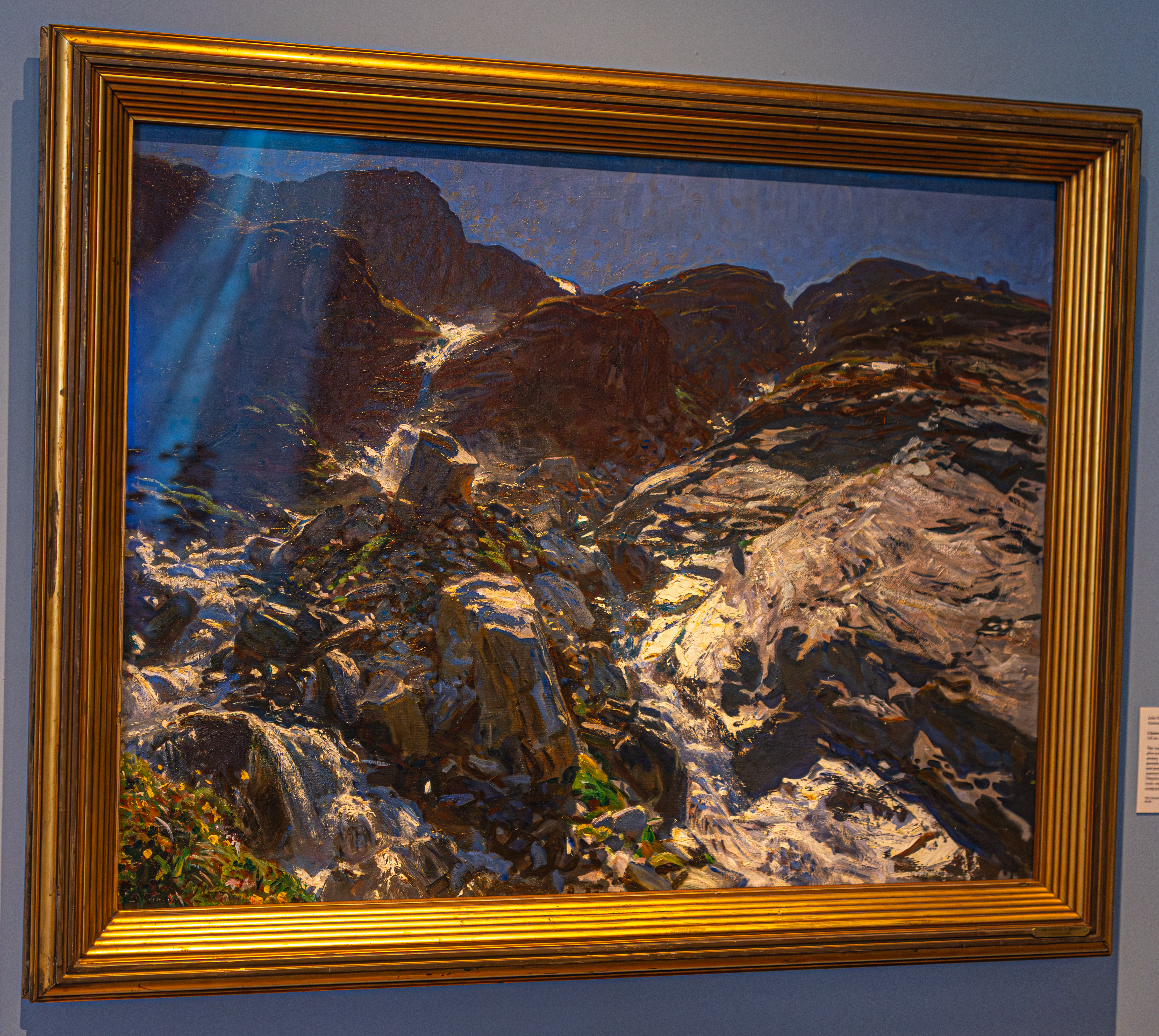
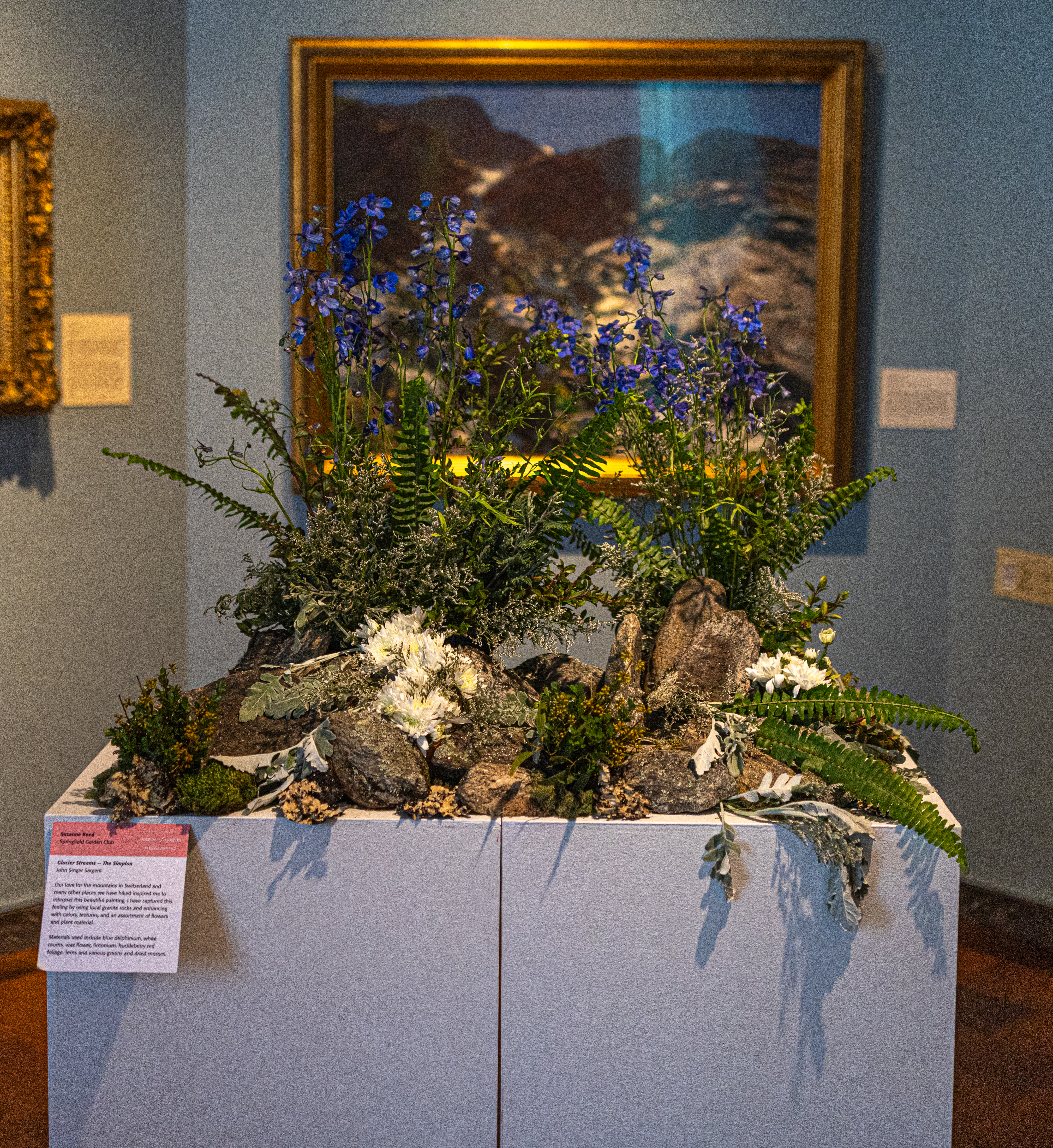
Suzanne Reed of the Springfield Garden Club made this arrangement based on Glacier Streams – the Simplon by John Singer Sargent. Suzanne said her love of the mountains and hiking inspired her to interpret this painting. She captured her feelings by using local granite rocks and enhancing it with colors, textures and an assortment of flowers and plant material. She used blue dephinium, white mums, wax flower, limonium, huckleberry, red foliage, ferns and various greens and dried mosses.

Glacier Streams is a circs 1910 lands ape painting by John Singer Sargent. Much like the Icebound Sealer, at first I though this was a photograph. But, this is indeed a painting. Sargent created this painting during his summer travels in the Swiss Alps, likely using watercolors. It depicts the rocky, bright and rapidly flowing water in the Simplon Valley, reflecting his focus on light and plein-air techniques (the act of painting on location, outdoors and not in a studio).

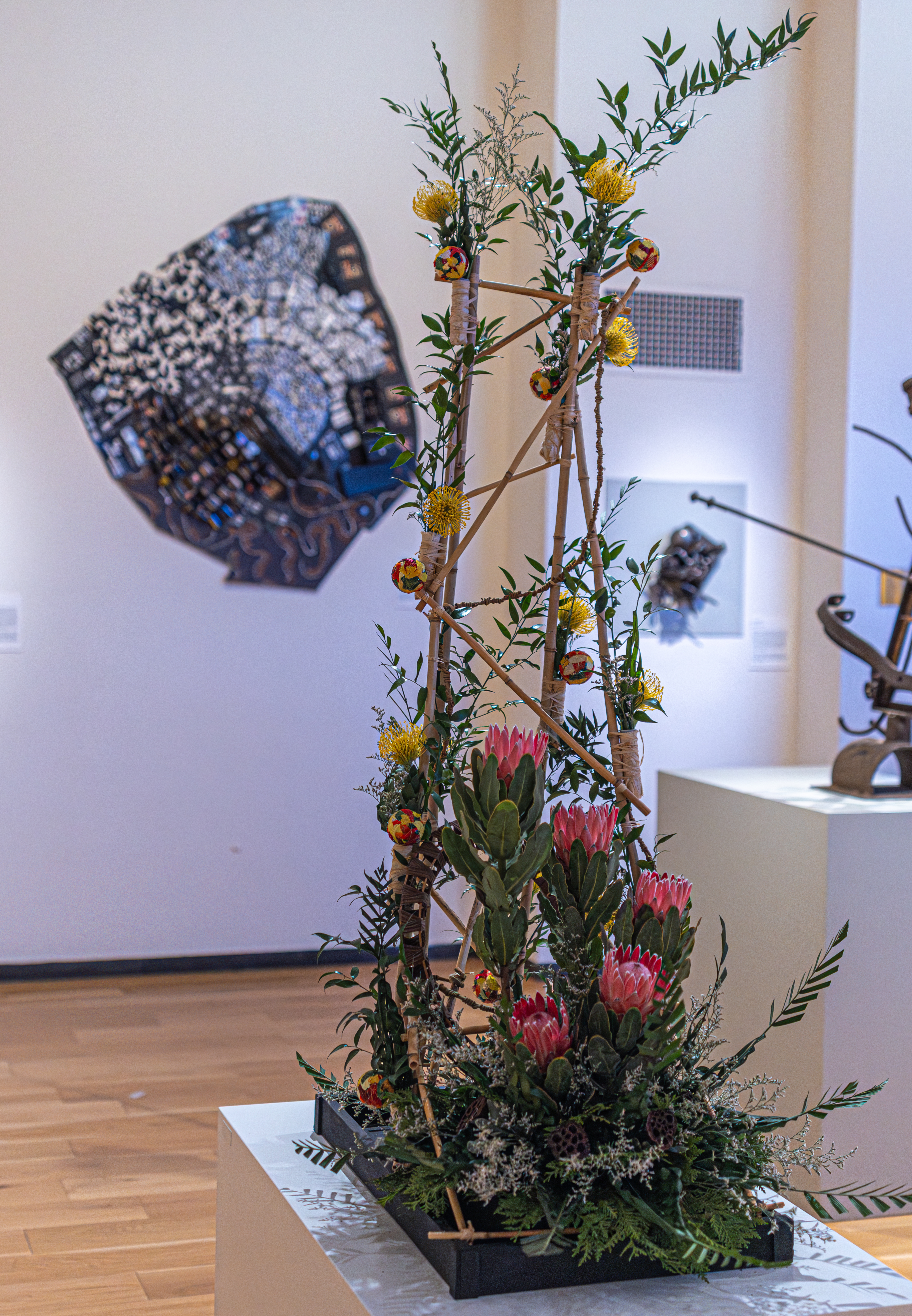
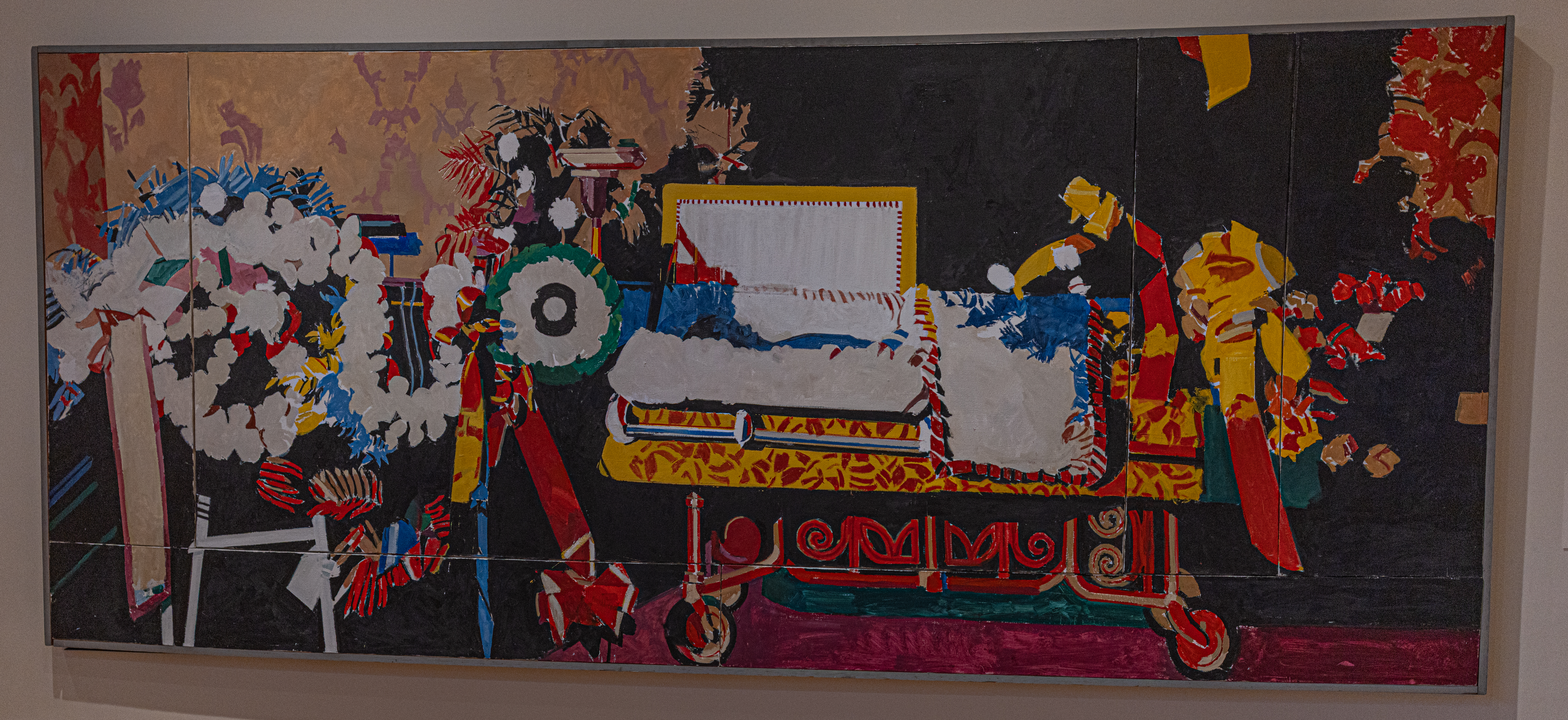
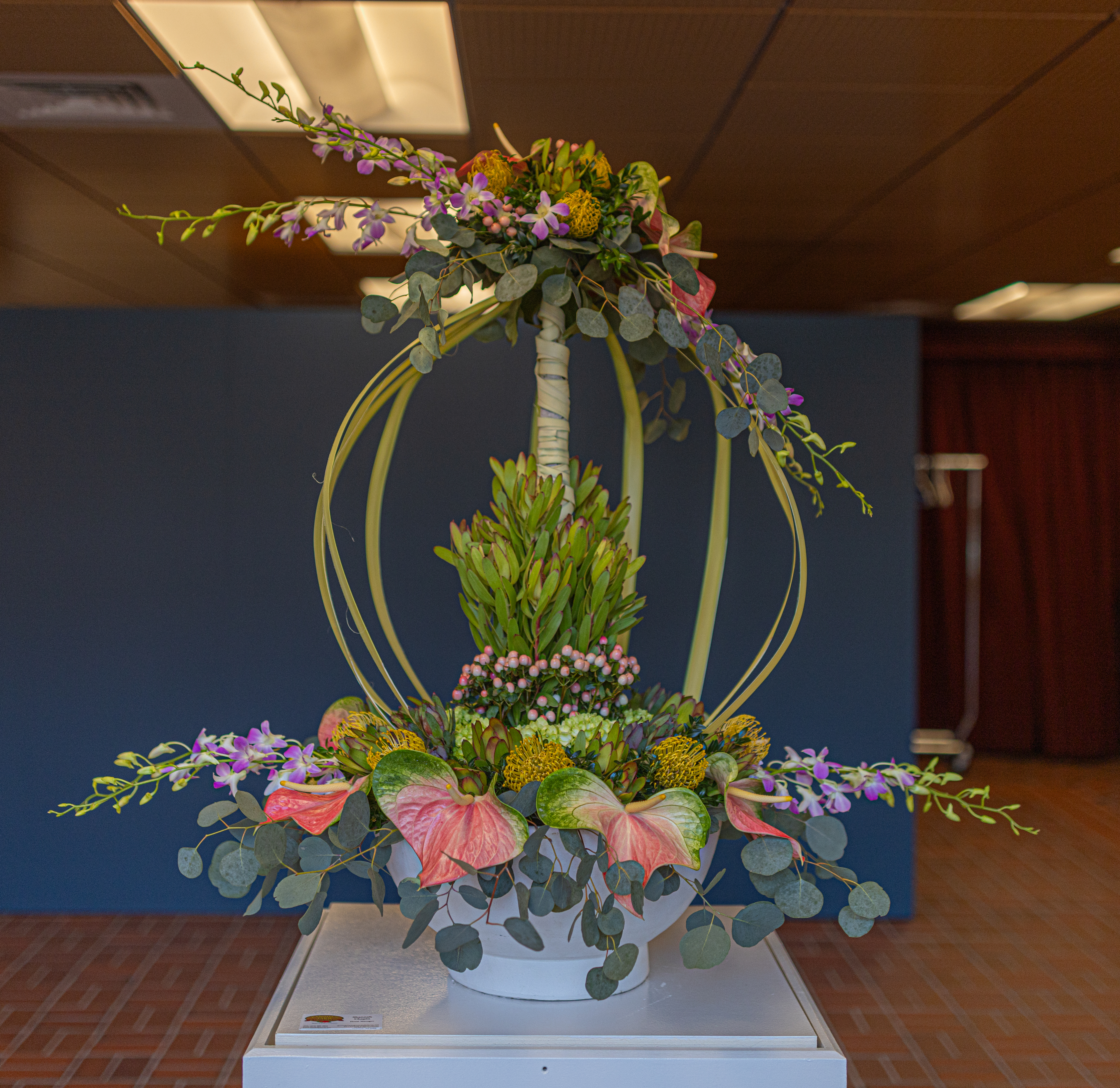
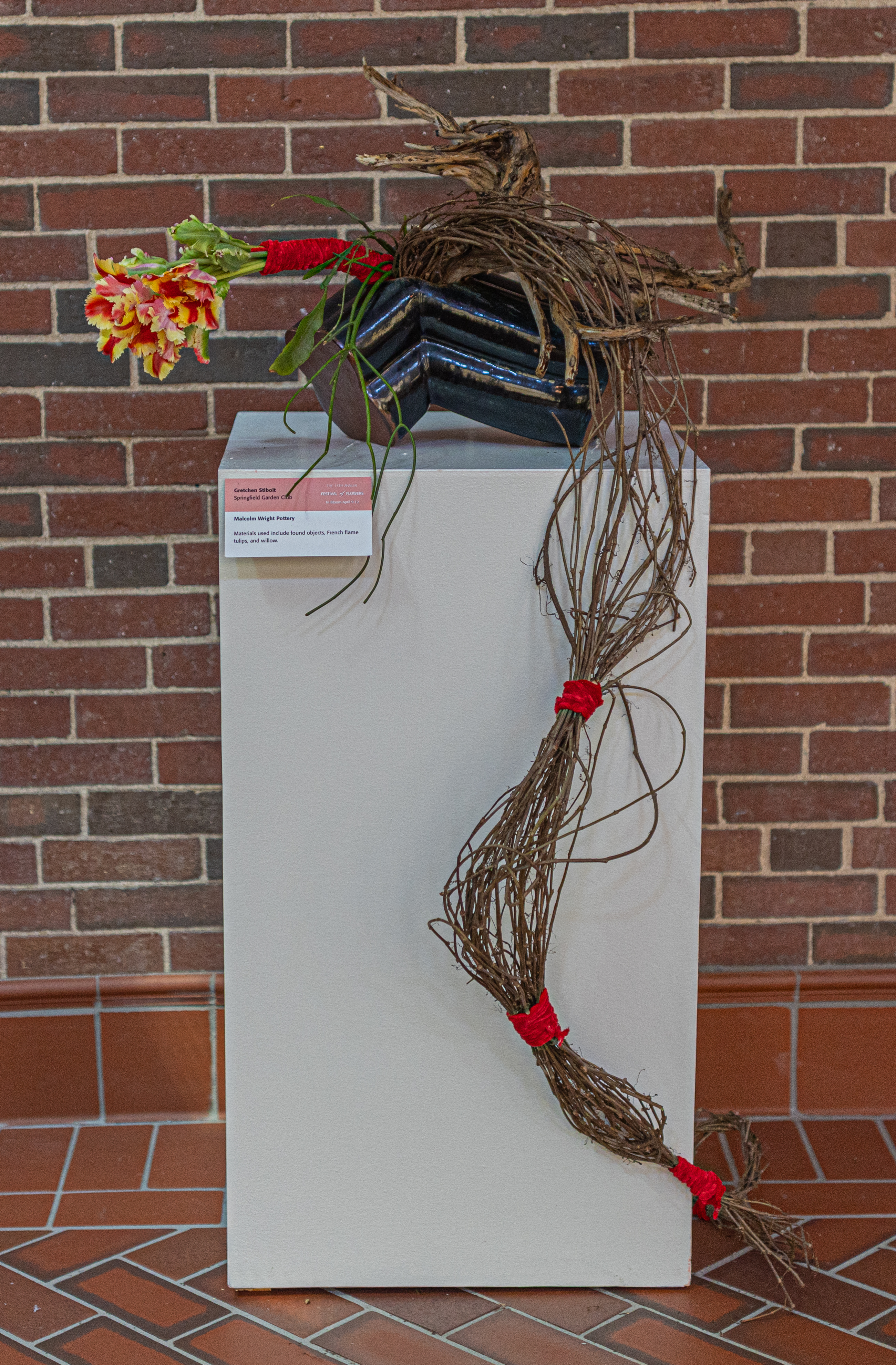
This floral arrangement by Bob Whitney of AIFD (American Institute of Floral Designers) was based on the painting Johnny’s Gone by Boston and Northhampton, MA, resident Richard Yarde. The painting represents the circle of life. The body remains but the spirit rises. The materials used for this arrangement are pink mink protea, pin cushion protea, Tee pee (braided) and Italian ruscus.

Yarde’s subjects include figures from the African American community that he knew personally or were his contemporaries. This large painting, titled Johnny’s Gone (circa 1975-1976), commemorates rhythm and blues singer Johnny Ace, who died at the height of his career in the 1950’s. It is composed of six canvases attached to each other. Lyrical swirling patterns of wreaths and garlands draw attention from the left of the work to the figure in the coffin. Yarde paints the body of Johnny Ace blue, a color used in Nigerian folk art to distinguish the dead from the living. Yarde’s bold use of color, size and pattern speak to the emotional impact that this event had on the artist.

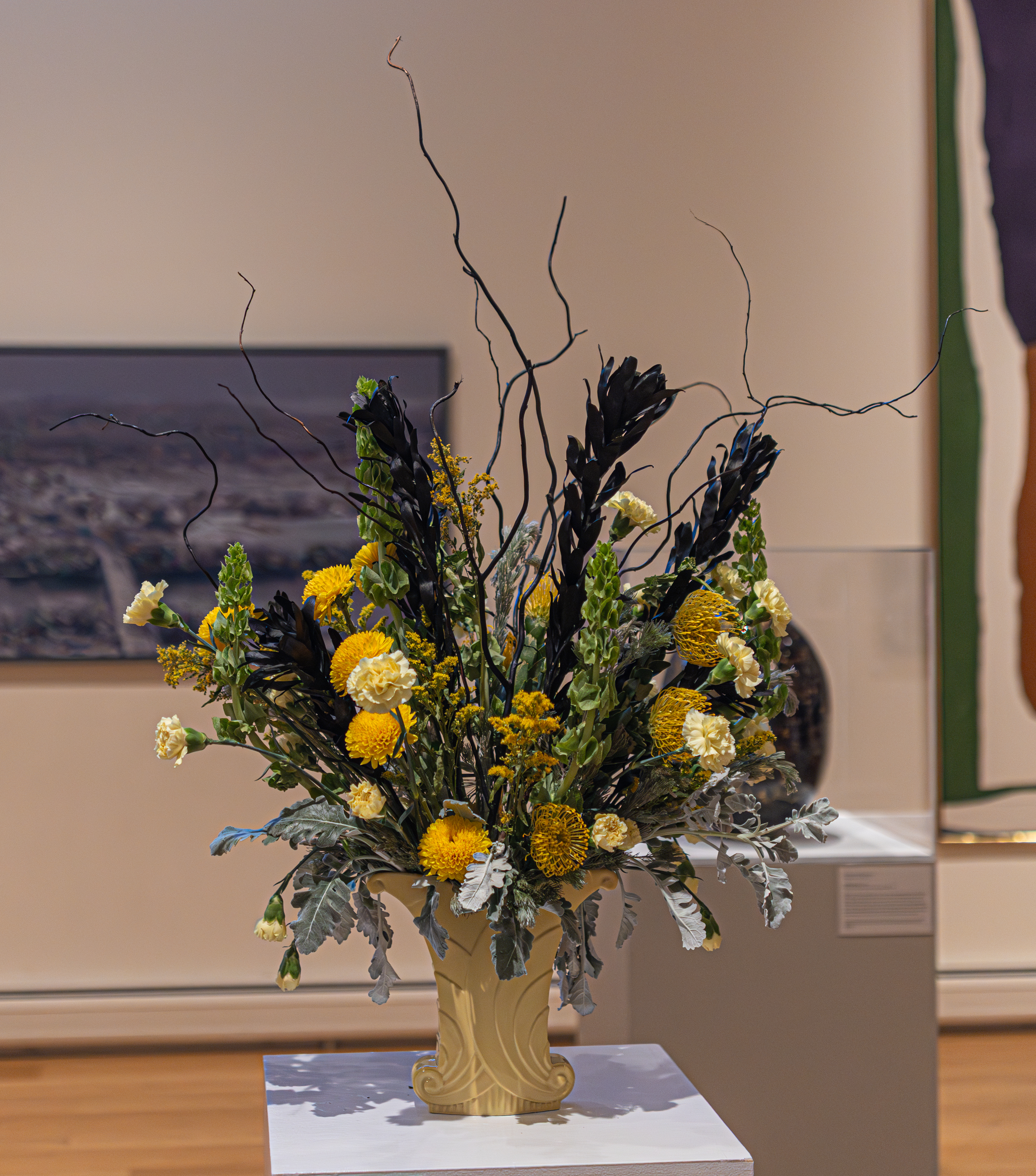
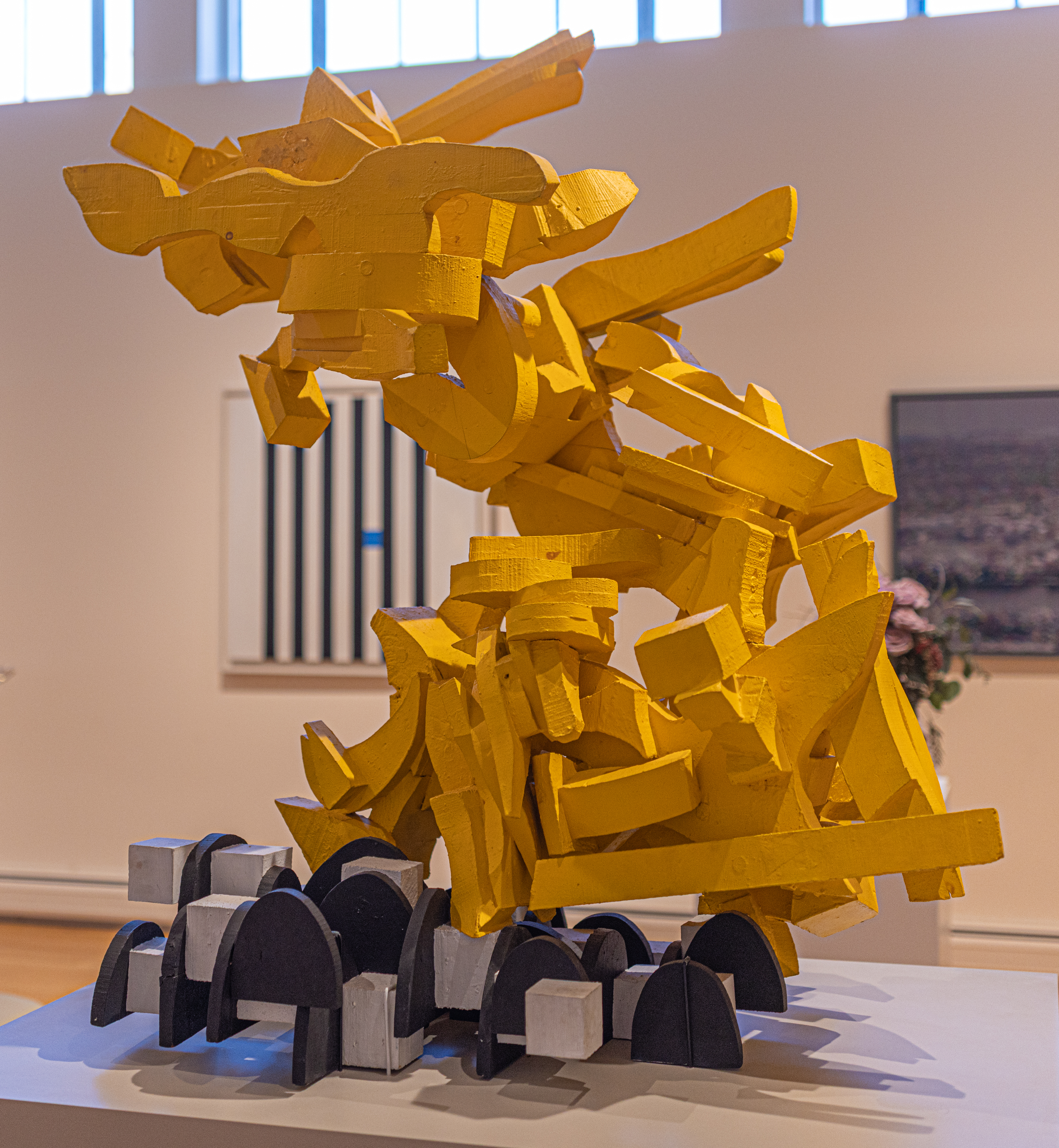
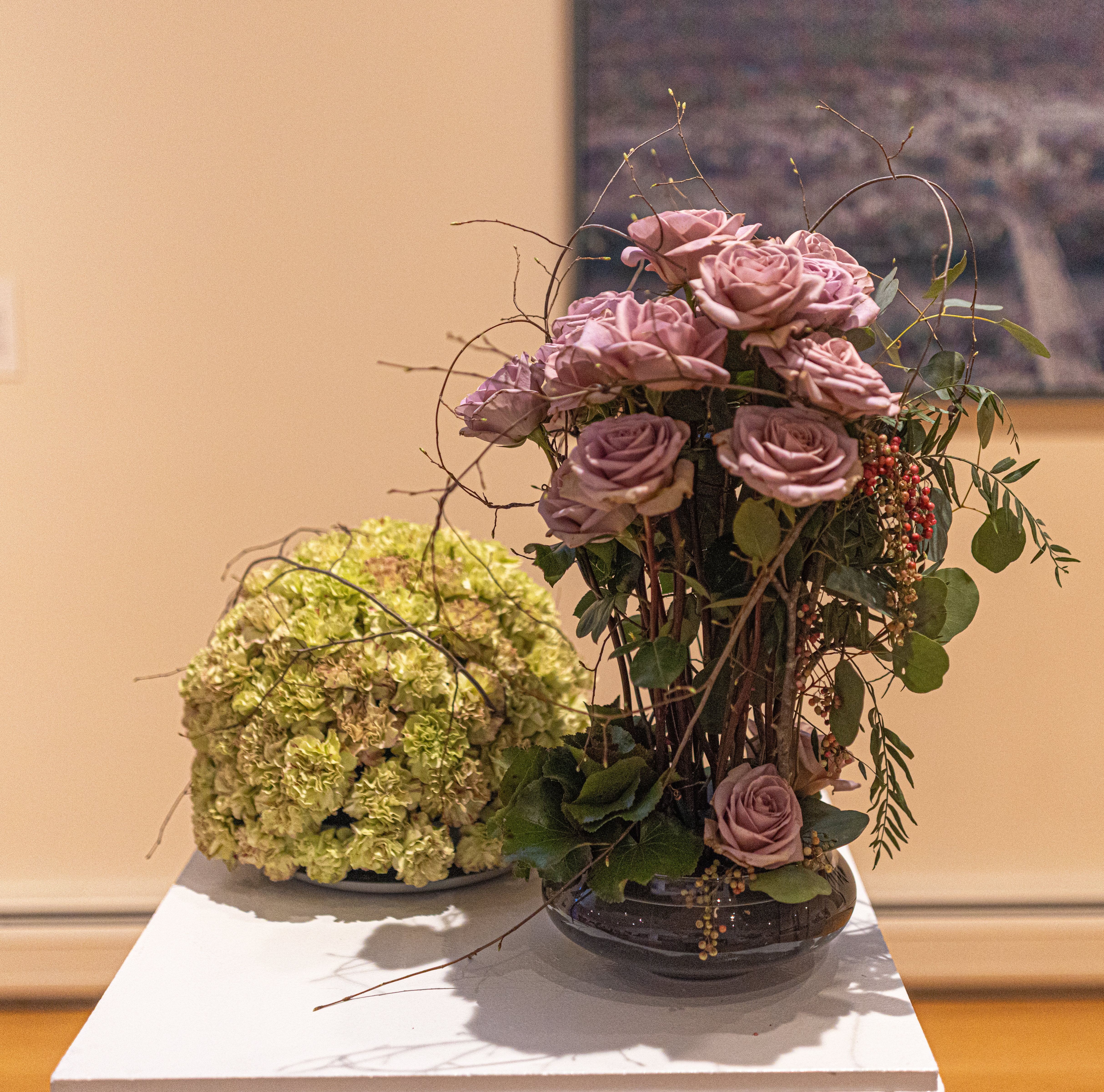
Wanda Roberge of the Springfield Garden Club created this floral design based on Fugue by Bronx native George Sugarman. Whether the artist wanted this work to be a musical idea or theme that is repeated and weaves in and out of whole piece like in a conversation, or a dreamlike state of altered consciousness that may last for hours or days, is a mystery. Wanda’s goal was to create a visual interpretation. Materials used include curly willows, protea and Bells of Ireland.

Born in 1912 in The Bronx, George Sugarman was an American artist working in the mediums of drawing, painting, and sculpture. Sugarman’s career is unique because despite his “late” start at the age of 39, his creative output was extensive. He began studying sculpture in Paris and was influenced by European art and architecture, especially from the Baroque period in Italy and Spain. He returned to New York in 1955 and began making abstract construction sculptures out of unpainted wood. Each sculpture is made up of many individual smaller sculptures placed together to create one entity which appears to move through space.

Sugarman was one of the first modern artists to experiment with painting his sculpture and Fugue is an example of this innovation. He uses paint to draw attention to the forms rather than the beauty of the wood and to make the forms appear heavier. The sculpture does not passively occupy space, but energizes the space. George Sugarman’s art, as exemplified in Fugue is a statement of his love of dynamic energy and his talent to express this exuberance through complex constructions of wood.

Fugue is one of many spectacular contemporary art pieces that can be found in the D’Amour Museum of Fine Arts.

Fugue (1963), George Sugarman (American, 1912-1999). Laminated wood, carved and painted. Museum Purchase with the aid of the National Endowment for the Arts. 79.S02.

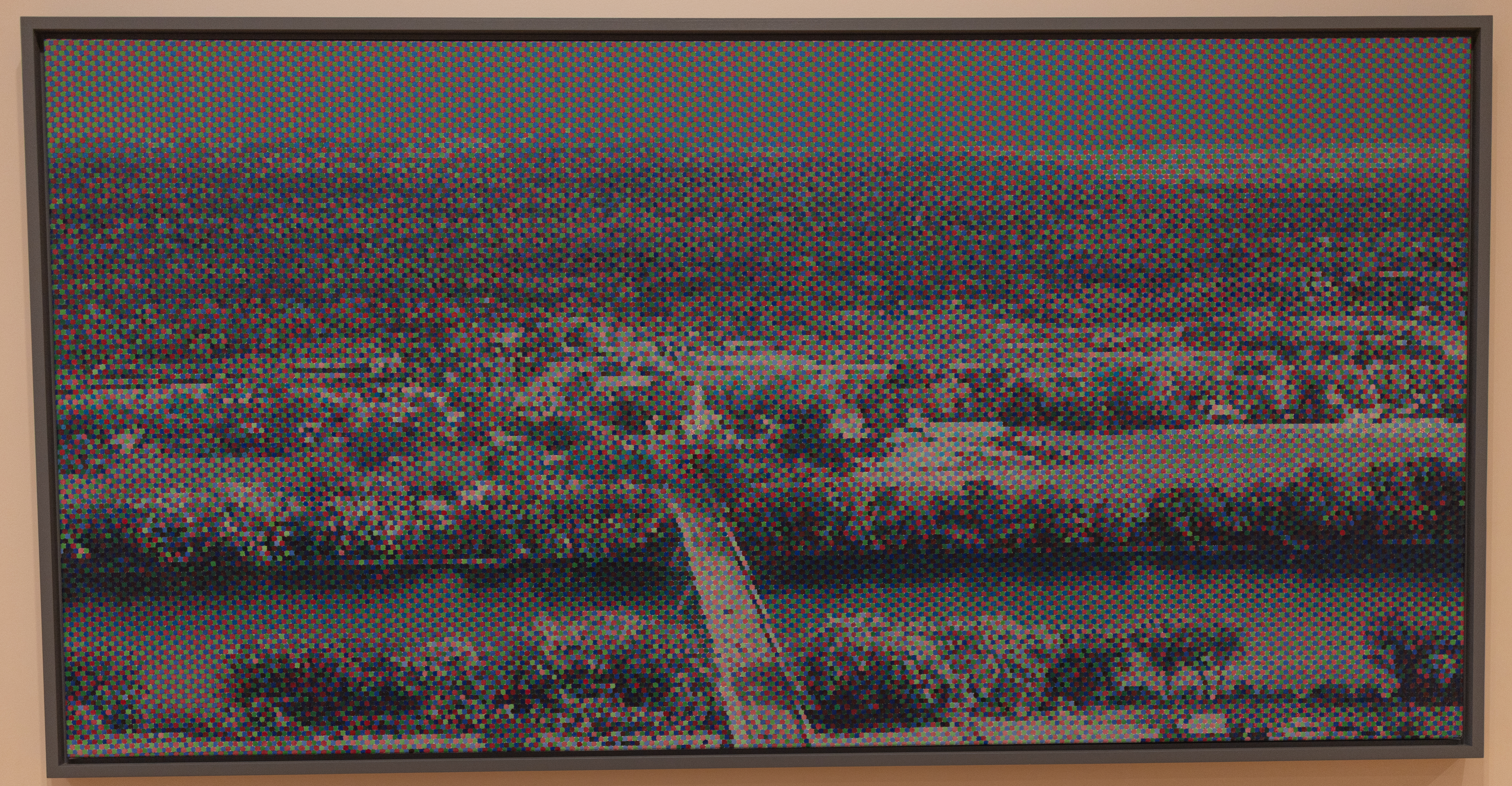
Cynthis Gorsky used the Bridge to Sunderland by John Roy as inspiration for her floral arrangement. She used artemisia, dusty miller, carnations and roses in her design.

In Bridge to Sunderland, Springfield, MA, native John Roy explores the way people see and understand color. Roy created this composition using the aid of a computer and the colors red, blue and green and then painting the pattern on the canvas. When viewed from a distance, the dots of color merge to reveal a bridge and surrounding landscape. When viewed up close, the landscape is lost and only the colors are visible. The landscape looks very much like a picture from the top of Mount Sugarloaf in Deerfield, MA. Since Roy was born and raised in Springfield, MA, he frequently visited and attended classes at the Springfield Art Museums. He also studied art at Yale University and became a professor at the University of Massachusetts at Amherst.

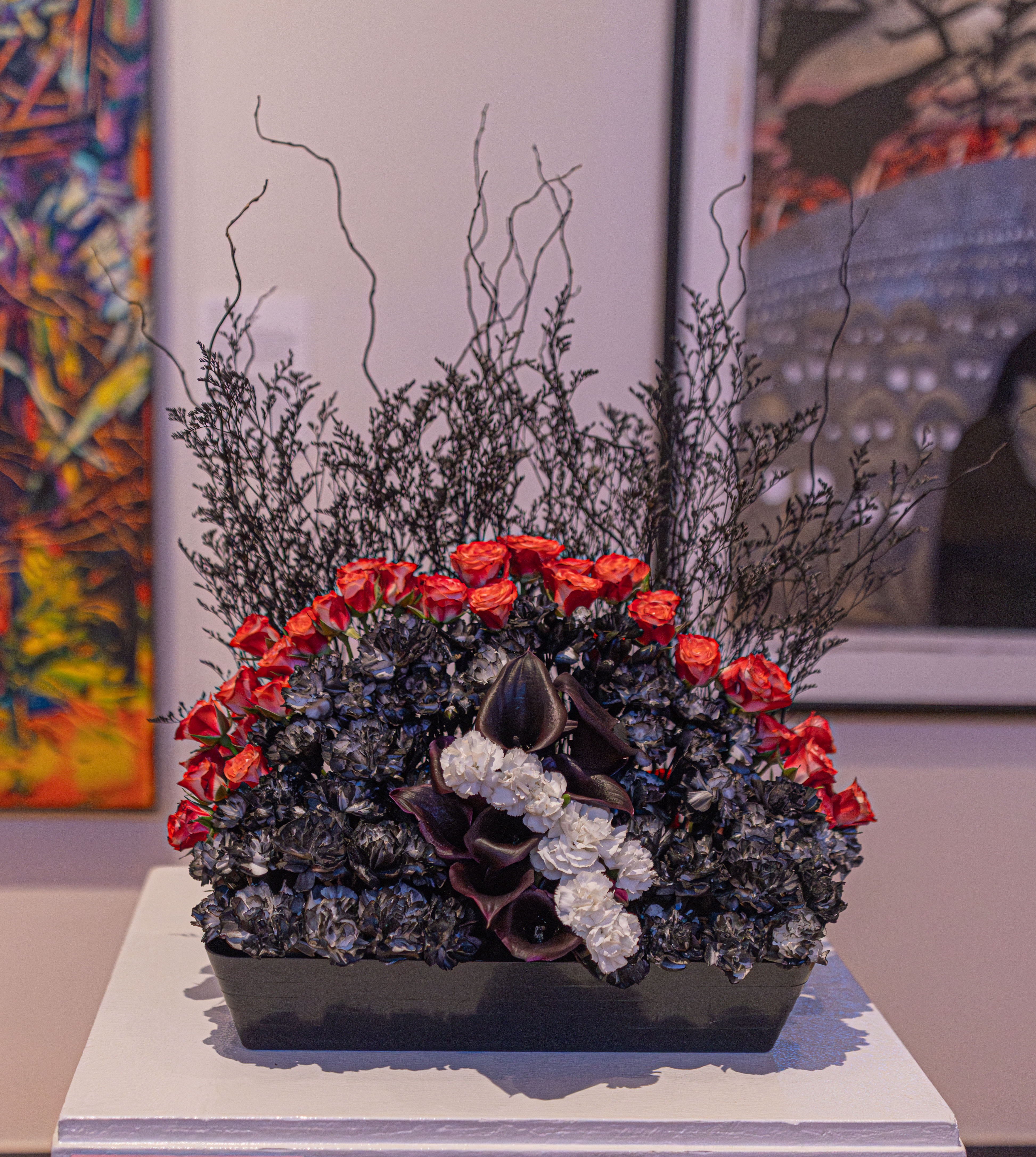
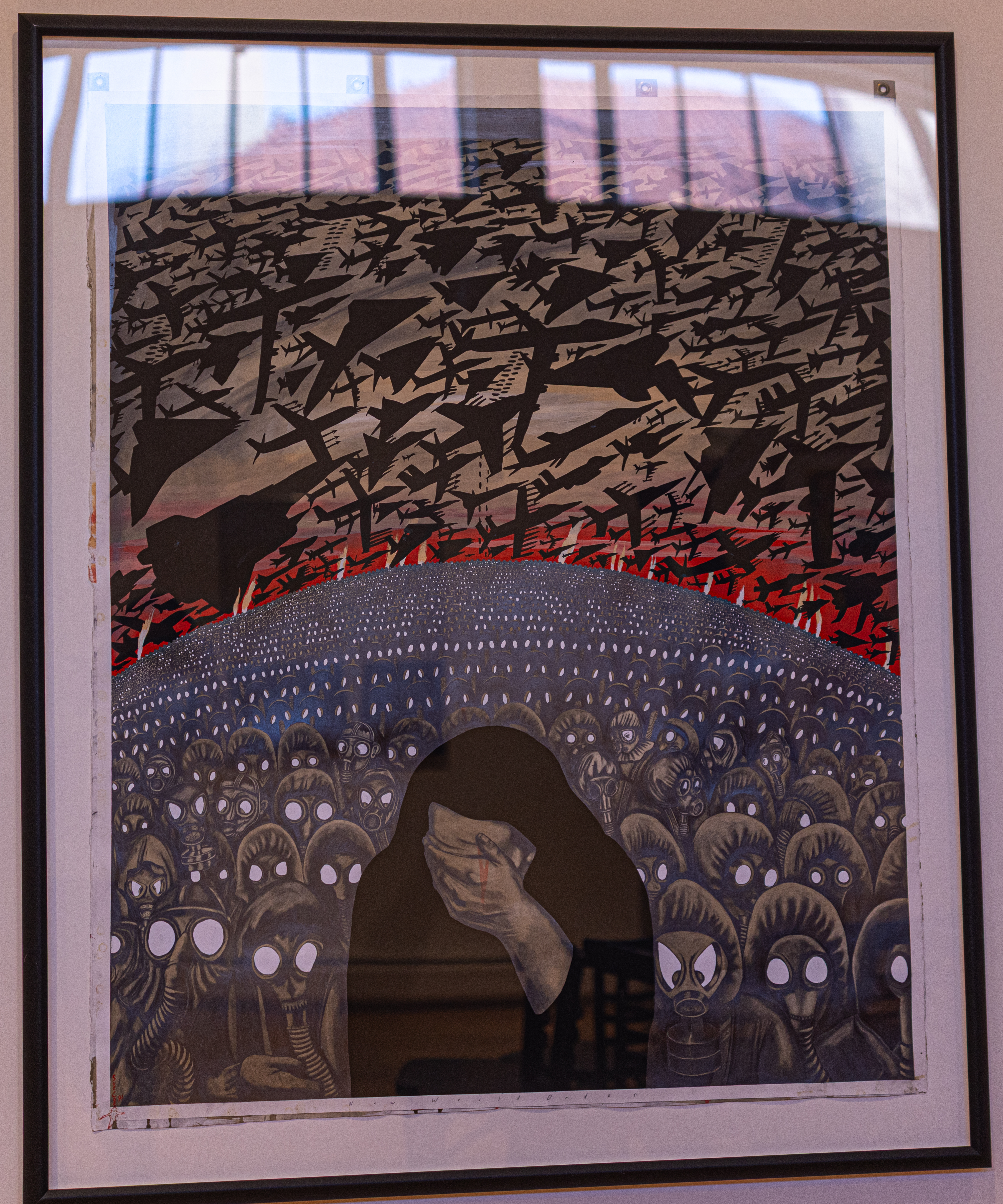
Janine Boland of the Springfield Garden Club used New World Order by Sue Coe as inspiration for her arrangement. Janine feels we live in a world of uncertainty, of fear and of horrific violence. She thinks our safety and that of our fellow humans is threatened everyday by forces seen and unseen, While our hearts are hurting, what can we do but face our worst nightmares, even if from behind a mask?

As one of the leading political artists of the 20th century, Sue Coe believes exposing the injustices in society can affect change. Her pictures compel the viewer to face issues of change. Her pictures compel the viewer to face issues of universal concern: economic oppression, sexual exploitation, AIDS, cruelty towards animals and war.

Coe studied commercial art at the Royal Academy of Arts in London and has lived in New York City since 1972. She has worked as an illustrator for the New York Times editorial pages, The New Yorker, Time and Newsweek. She refers to Herself as a journalist rather than an artist, even though her artistic work conveys its message more immediately than the written word.

As a statement on the Persian Gulf Crisis, New World Order comments on the nameless, faceless masses that experienced the bombing in Iraq. As with all of Coe’s work, a monochrome palette, somber lighting and bold figures empower her message. Touches of red on the horizon and a blood-like tear on the dark figure in the foreground are startling and reinforce the violent nature of the project.

Sara made this painting in 1981. She used gouache and graphite on white board.

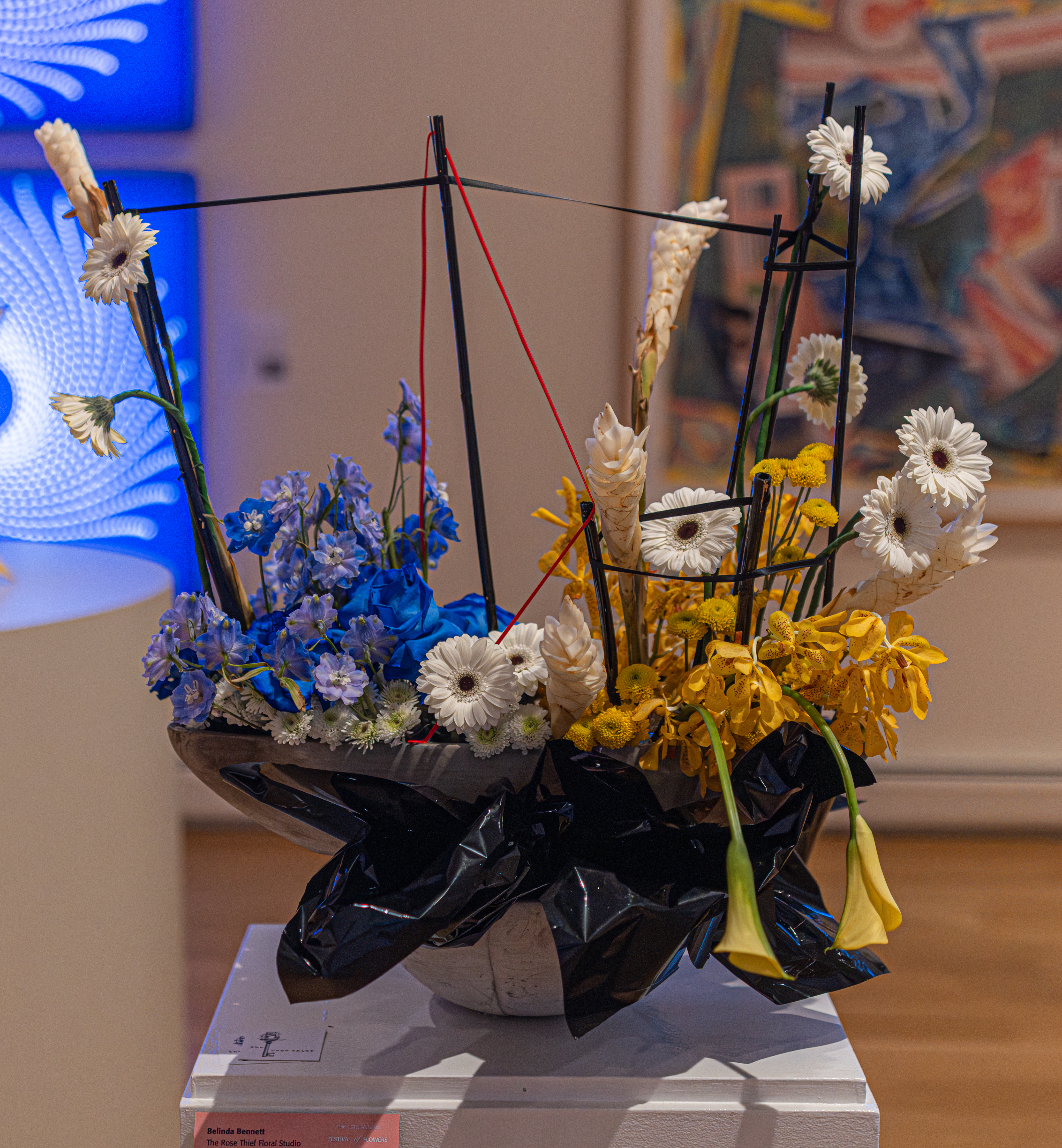
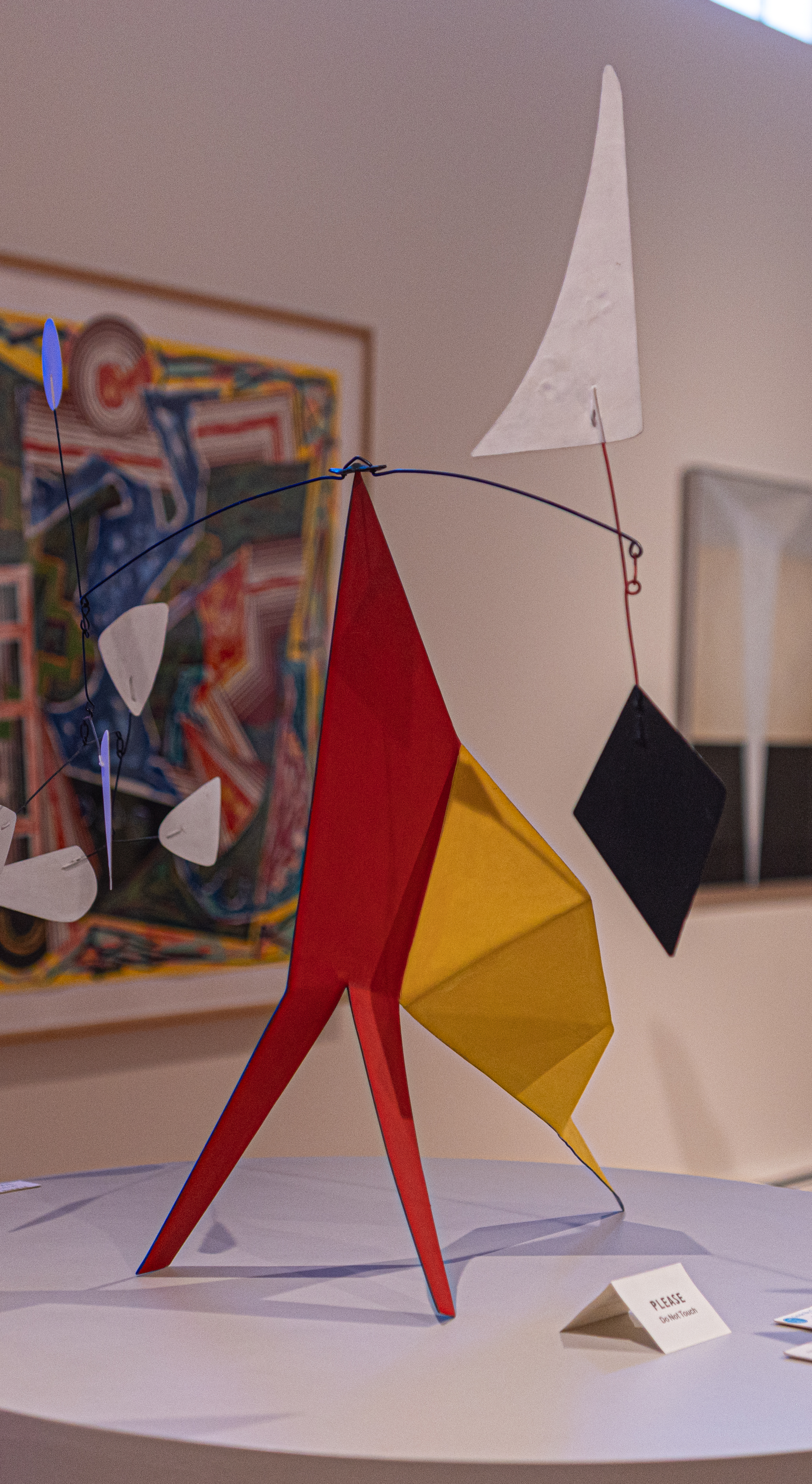
Black Diamond by Alexander Calder was the inspiration behind this flower arrangement by Belinda Bennett of the Rose Thief Floral Studio.

World-renowned for his whimsical, aerodynamic sculptures, Alexander Calder’s first solo museum exhibition took place at the George Walter Vincent Smith Art Museum in 1938. This piece, “Black Diamond” (1969), painted metal and wire sculpture, is from Calder’s “late” period when he was best known for recreating monumental public sculptures. In fact, in the same year as this sculpture, Calder created the first public artwork funded by the National Endowment for the Arts.

After receiving a degree in mechanical engineering and studying art in Paris, Calder experimented with new forms of sculpture. He invented the mobile in the 1930s, and later in the 1960s, a free-standing version of the mobile. The stabile form enabled Calder to create large sculptures for public sites in urban settings. Usually he created small-scale stabiles as models for his monumental sculptures. Black Diamond is unusual as it is not a model, but intended by the artist to be viewed as an independent stabile in its own right.

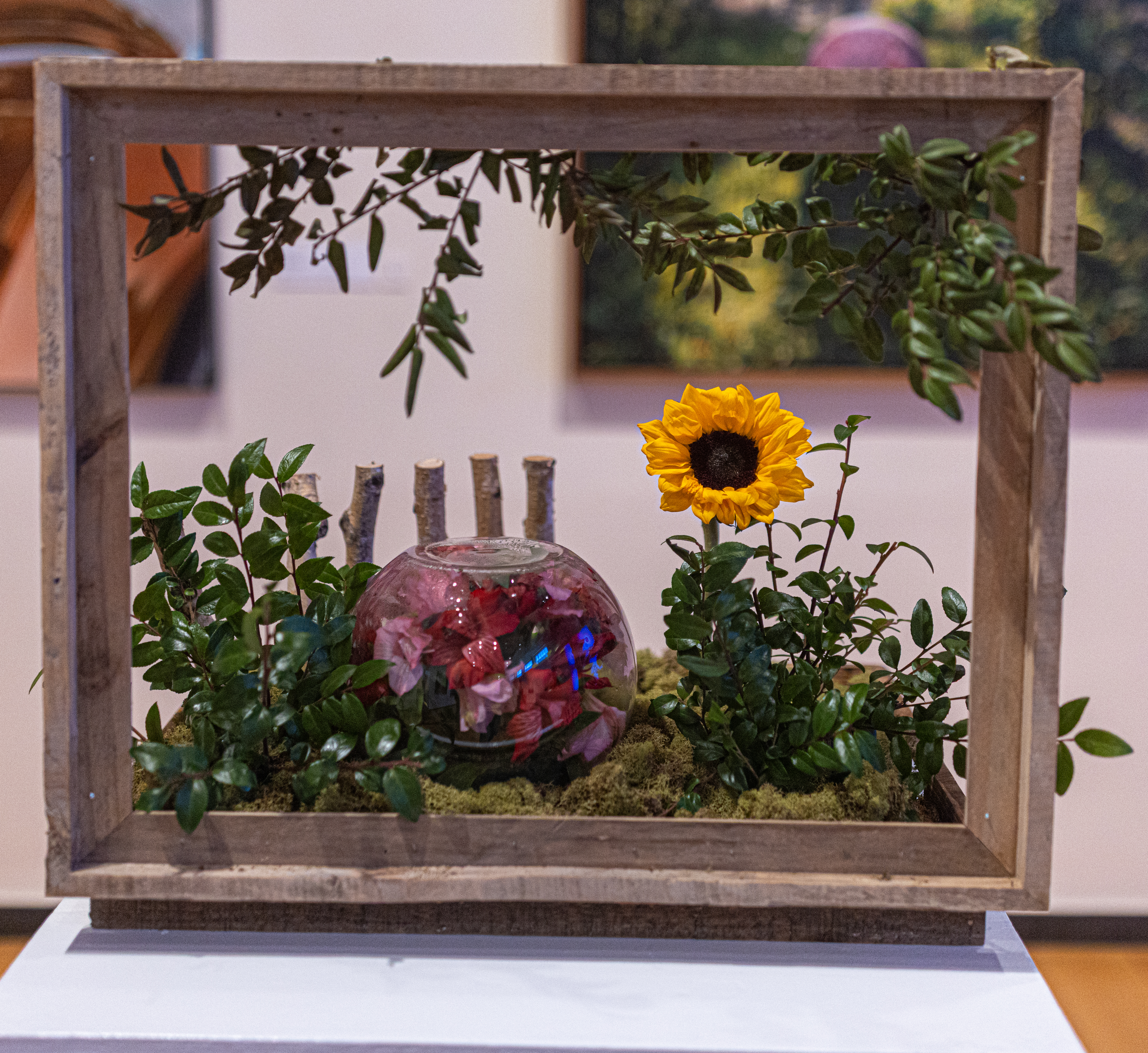
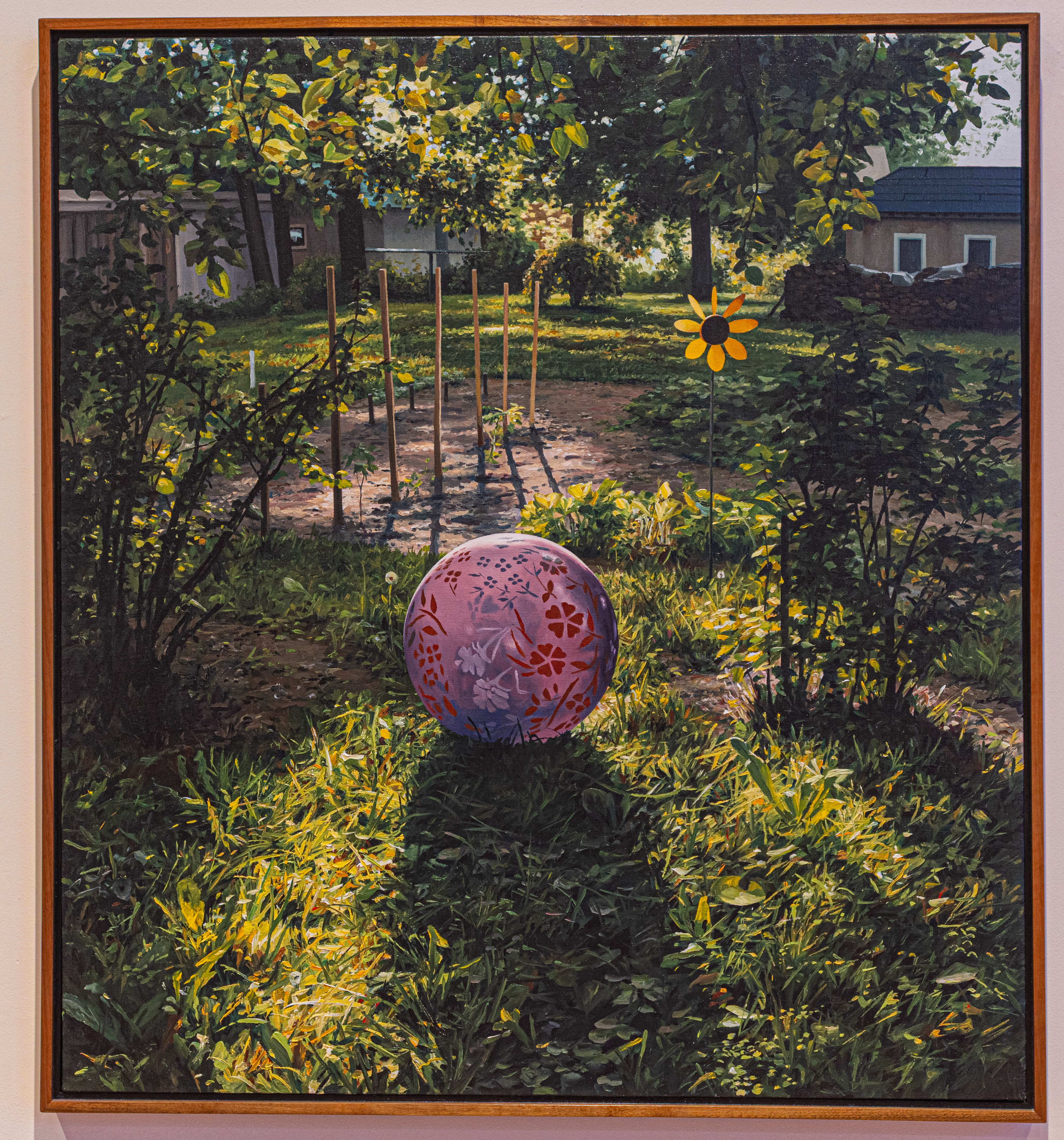
This floral arrangement was designed by Lauren Hufnagel at Love In Bloom. She based her arrangement on Ball At Sunset by Scott Prior.

Western MA resident Scott Prior is inspired by his family and everyday events. The artist works from life as well as photographs. He creates intimate magical scenes with ordinary objects, revealing that beauty can be found in the simplest moments.

The following floral arrangements were inspired by some of the older paintings at the museum. One thing you may notice is the colors, shapes and feel of the arrangements match the original work of art.

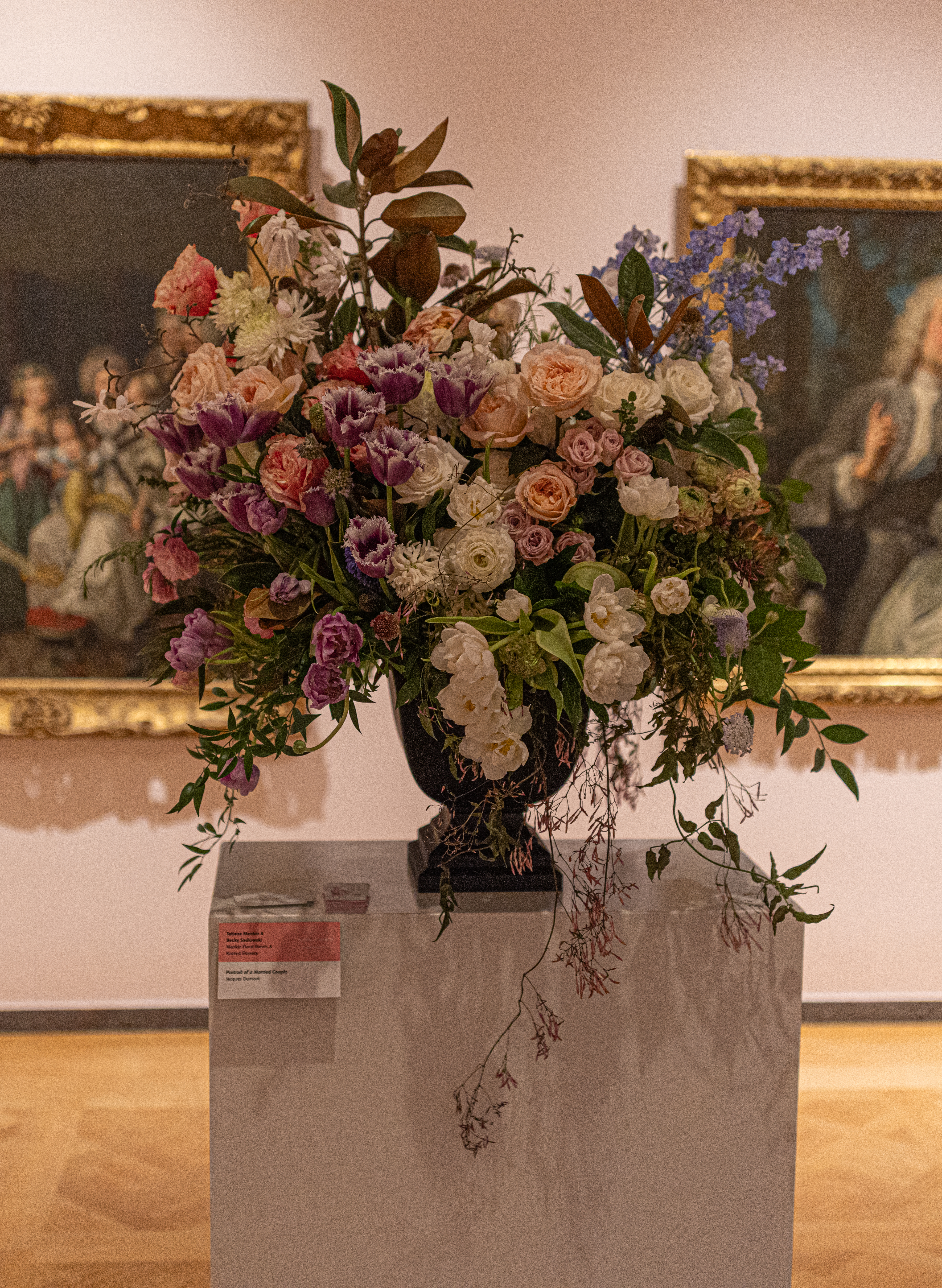
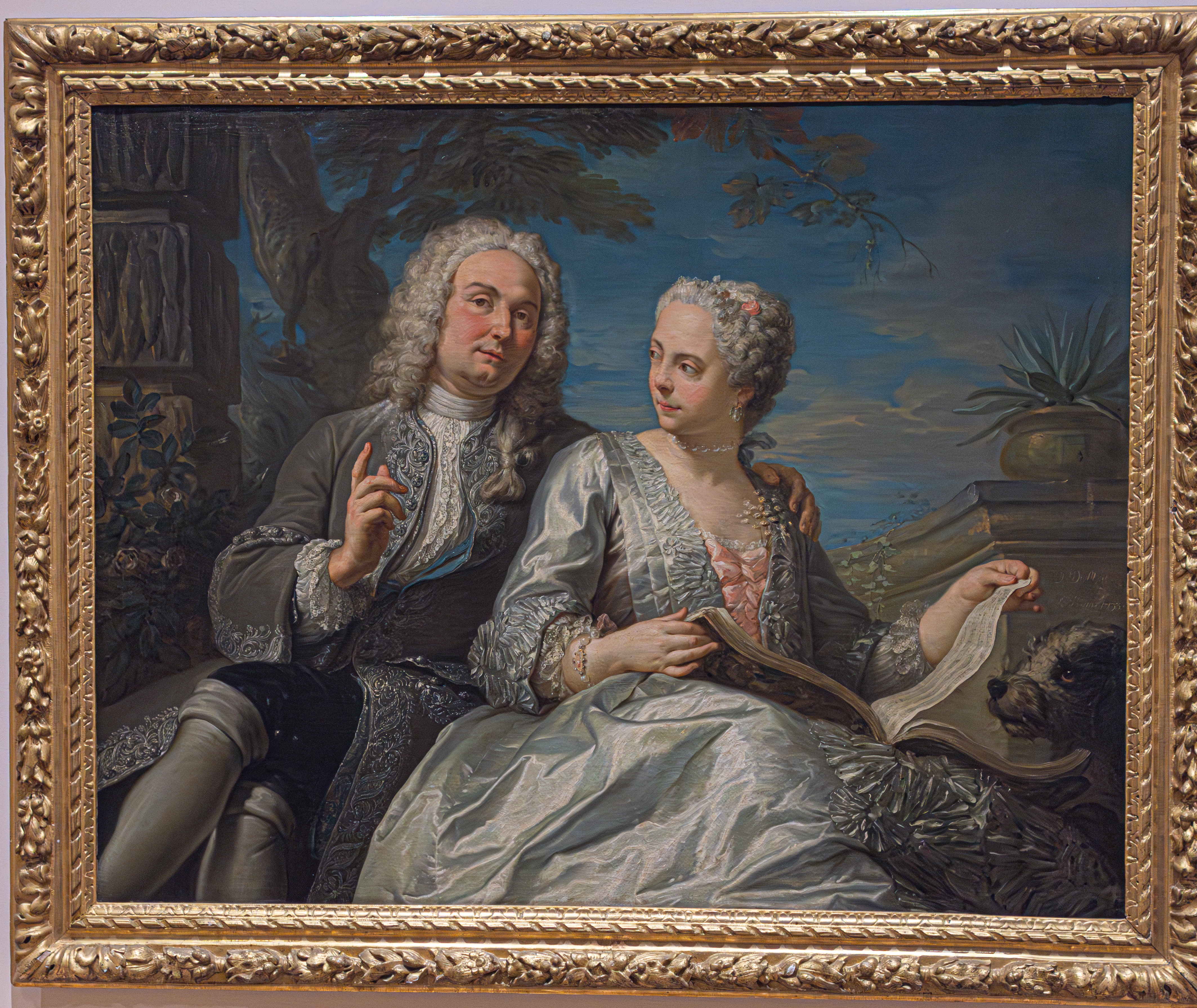
This arrangement was based on the painting Portrait of a Married Couple by Jacques Dumont, circa 1733. The oil on canvas painting is thought to have been a self portrait. French portrait painter and member of the Académie royal de peinture et de sculpture. Dumont was famously known for capturing the poise of a subject and bring that vivacity to life through brush strokes. Endearing love in celebration was a favorite theme of Dumont. This particular oil painting depicts his wife/collaborator in a comfortable setting, highlighting their partnership in science.

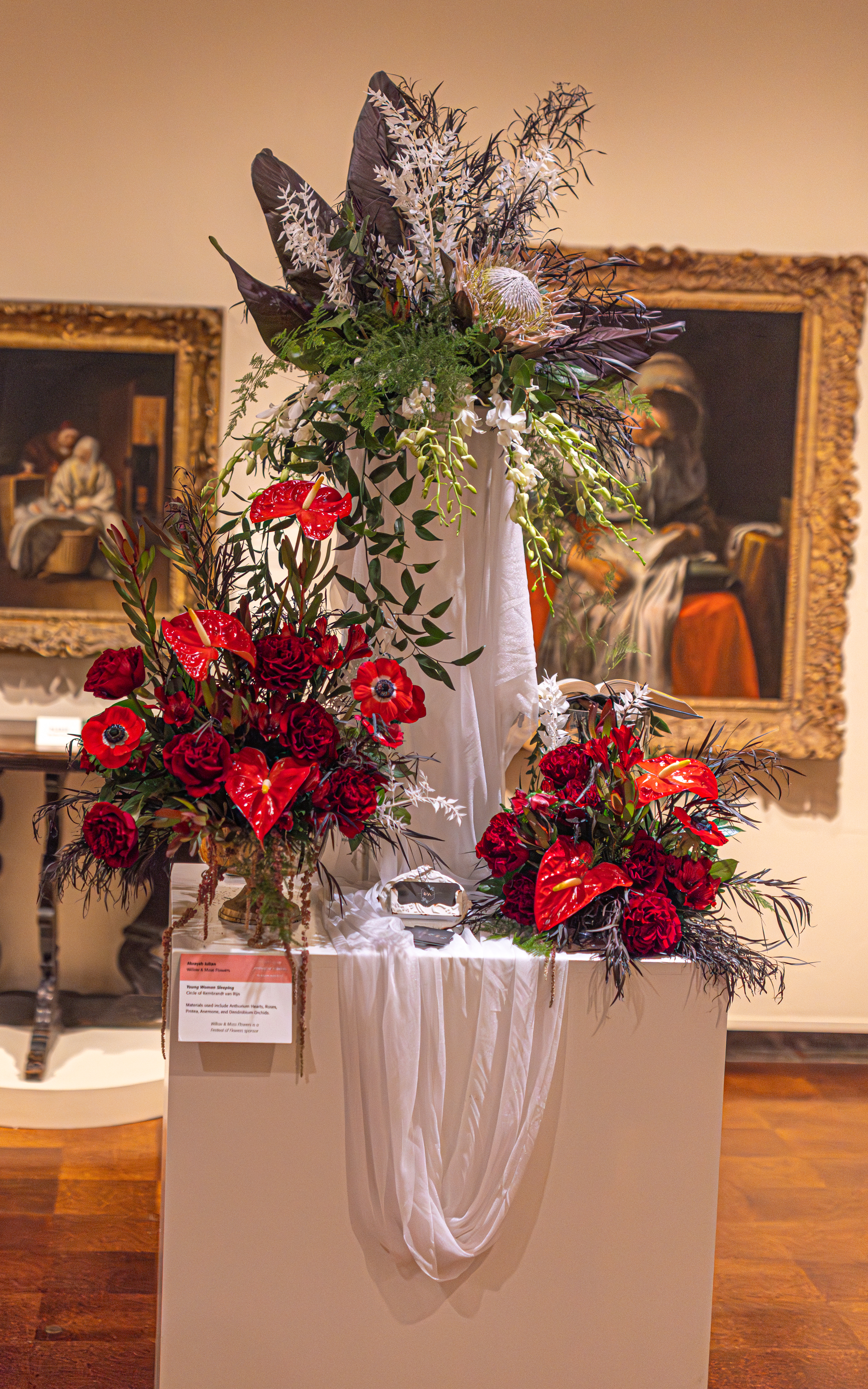
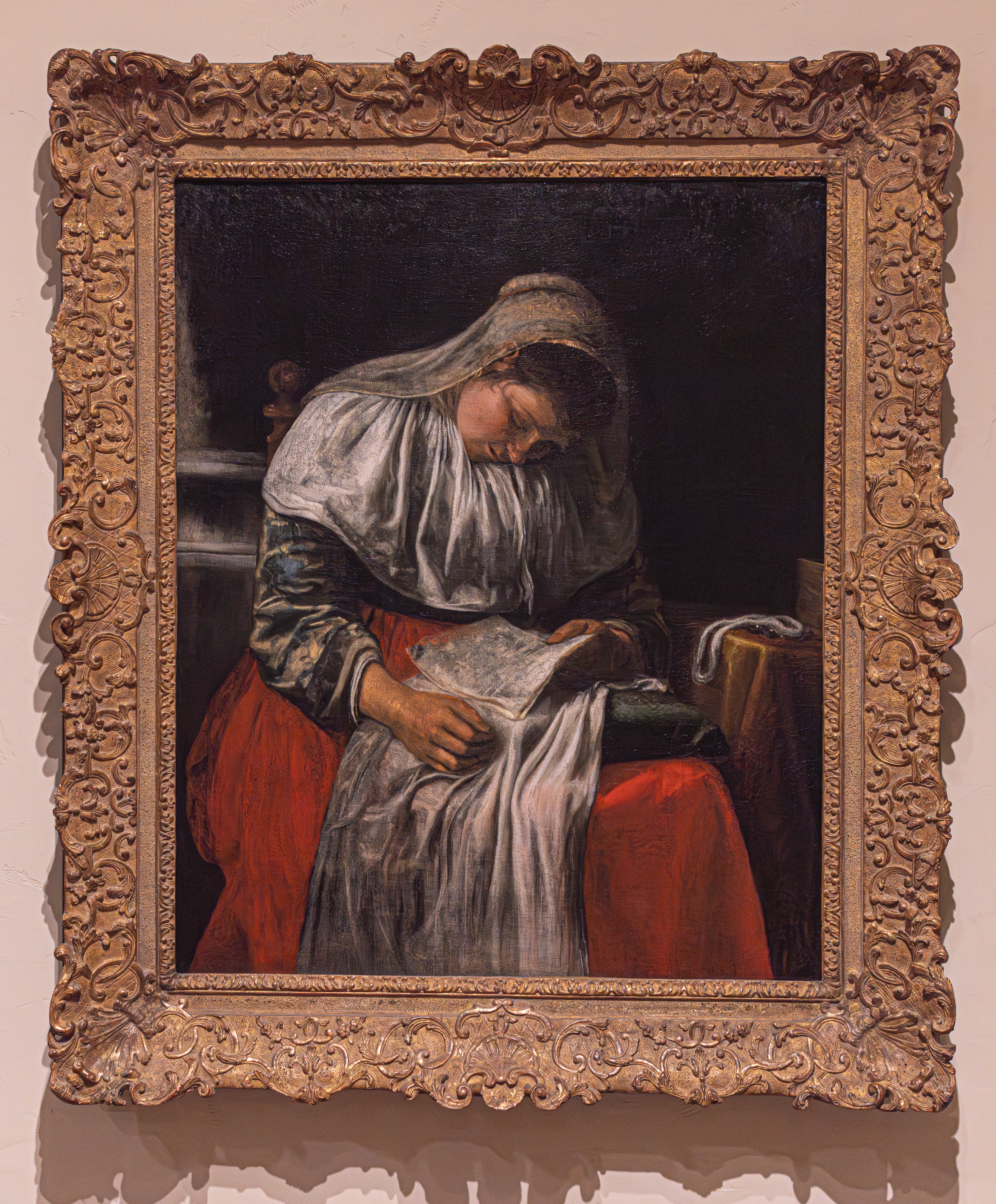
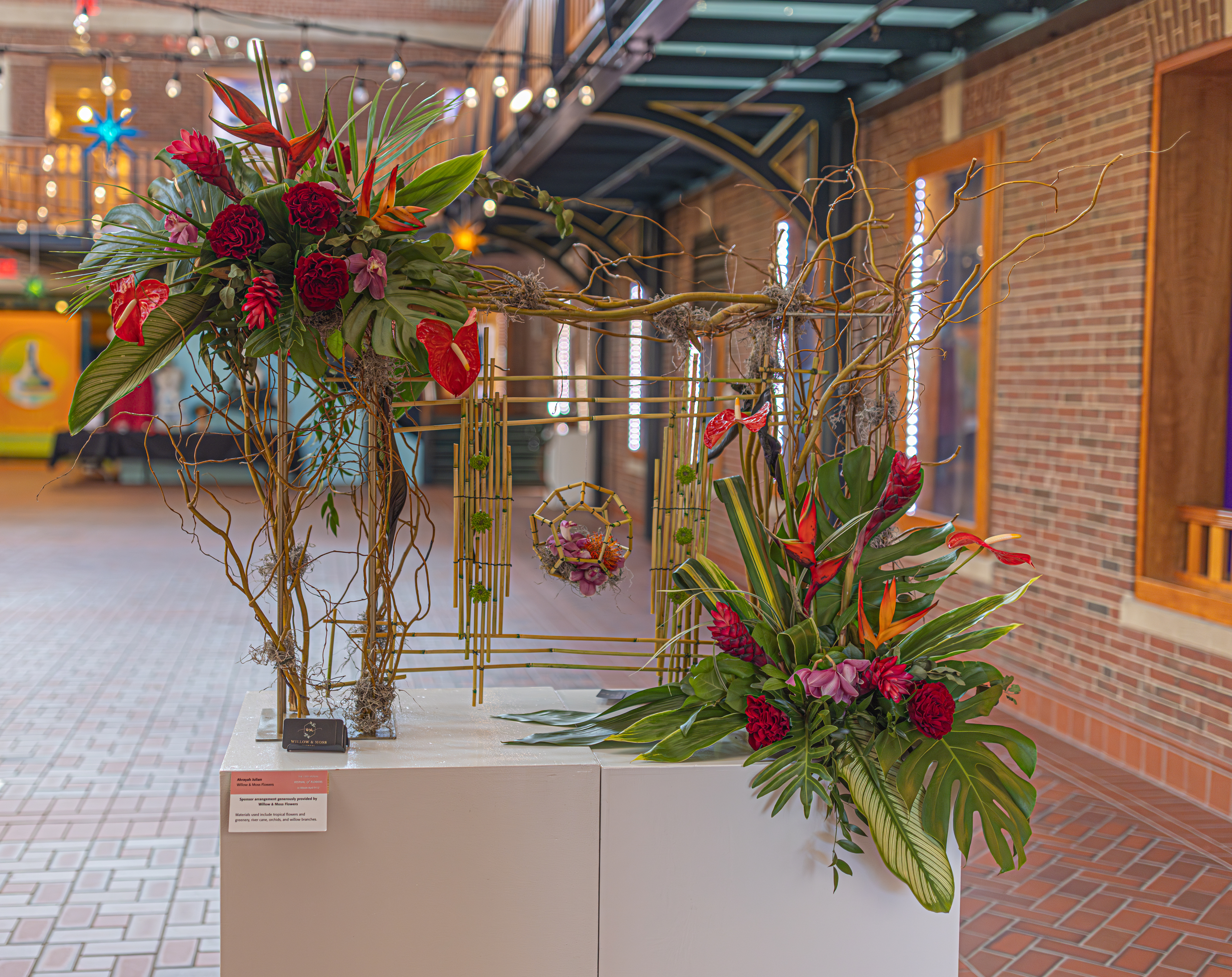
Ahrayah Julian at Willow & Moss Flowers created this arrangement based on the painting Young Woman Sleeping by Circle of Rembrandt van Rijn. The materials used for this arrangement were Anthurium Hearts, roses, protea, anemone and Dendrobium Orchids.

Rembrandt van Rijn, considered the most gifted Dutch artist of all time, influenced many painters, including the creator of our Young Woman Sleeping. In the 17th century, images of women engaged in sewing, reading letters, or sleeping often carried associations of love. Here, the letter and a faint smile on the woman’s face may indicate that the young woman is dreaming of an absent lover, from whom she has just received a note. Her prominent handiwork, a symbol of the virtuous housewife, may allude to her faithfulness and patience in waiting for her love to return.

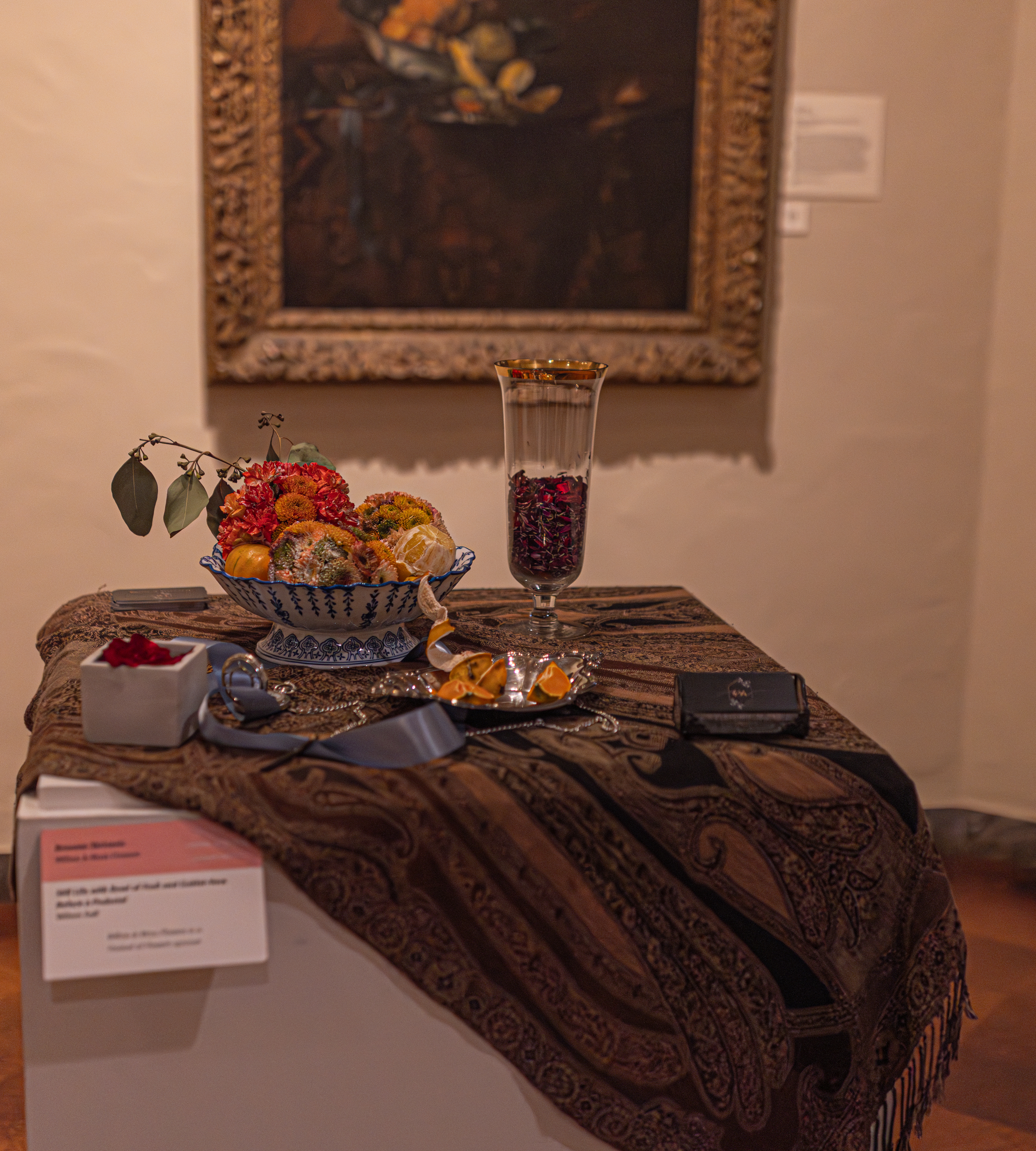
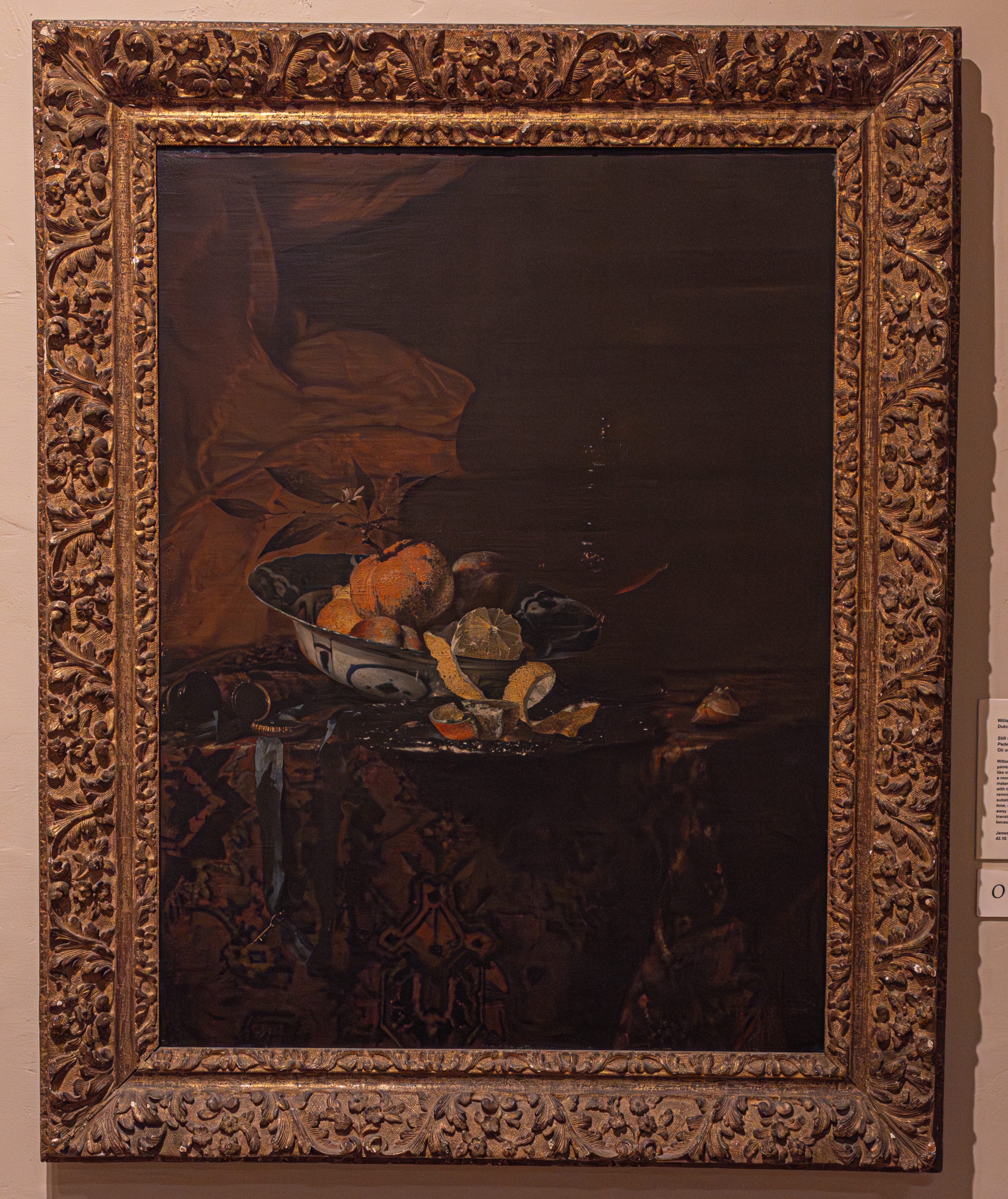
Breanne Skrivanic of Willow & Moss Flowers created this arrangement based on Still Life of Fruit and Goblet-Vase Before a Pedestal by Willem Kalf.

This oil on canvas painting, painted circa 1655, is an example of Kalf’s realistic descriptions of objects. One of the most celebrated 17th century still-life painters, Kalf, like many painters of his time, used his paintings to communicate a moral message about the transience of life and the emptiness of material existence. For instance, the box at the left, when filled with tobacco, was a warning against the sin of smoking and a reminder that earthly pleasures, like smoke, have no lasting substance. Similarly, the lemon and orange, expensive fruits at the time, signified original sin as well as the idea that luxury leads away from God. Finally, the watch served as a symbol of death or transience (time running out)but also represented moderation because of its regulated movement.

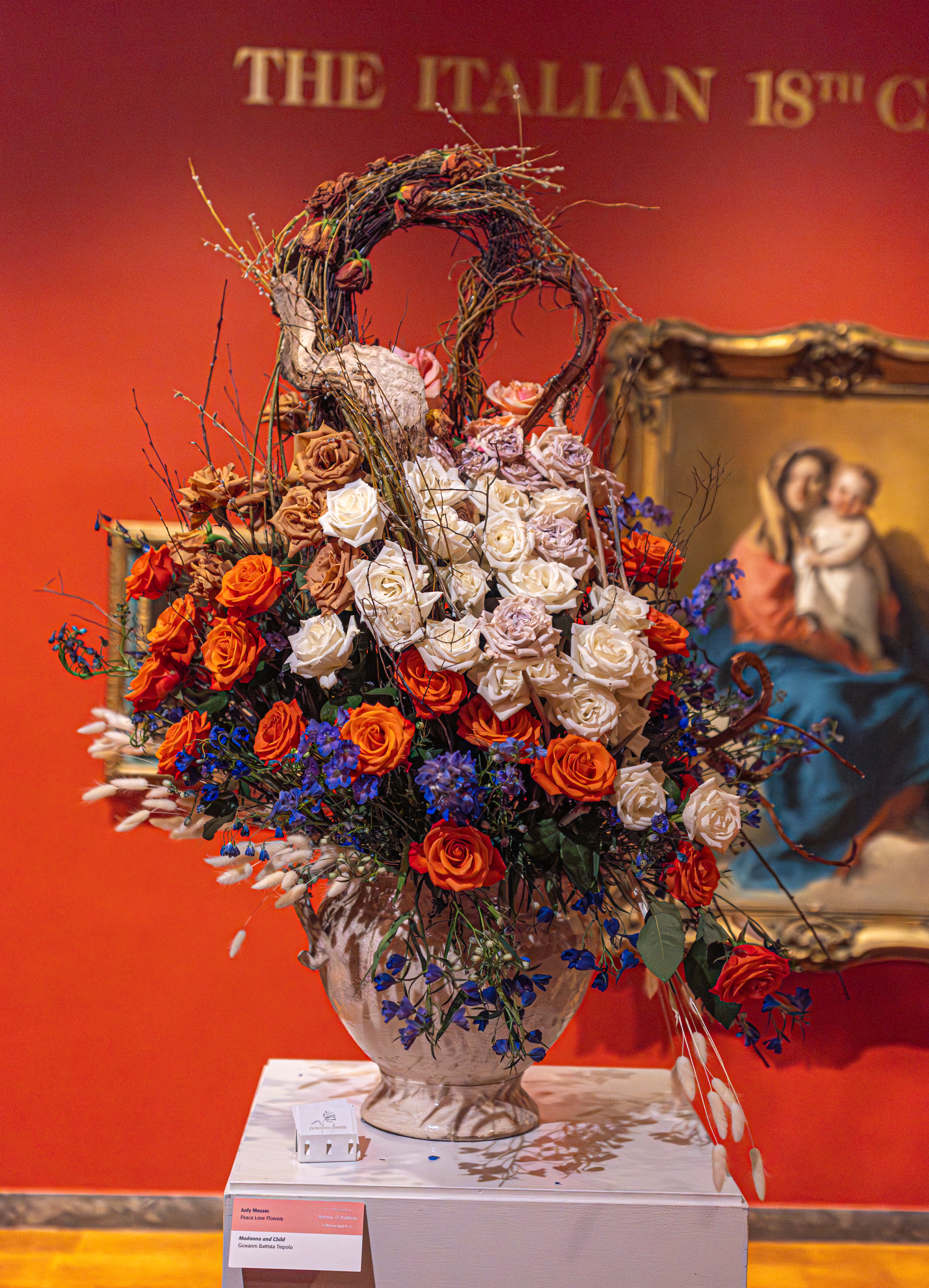
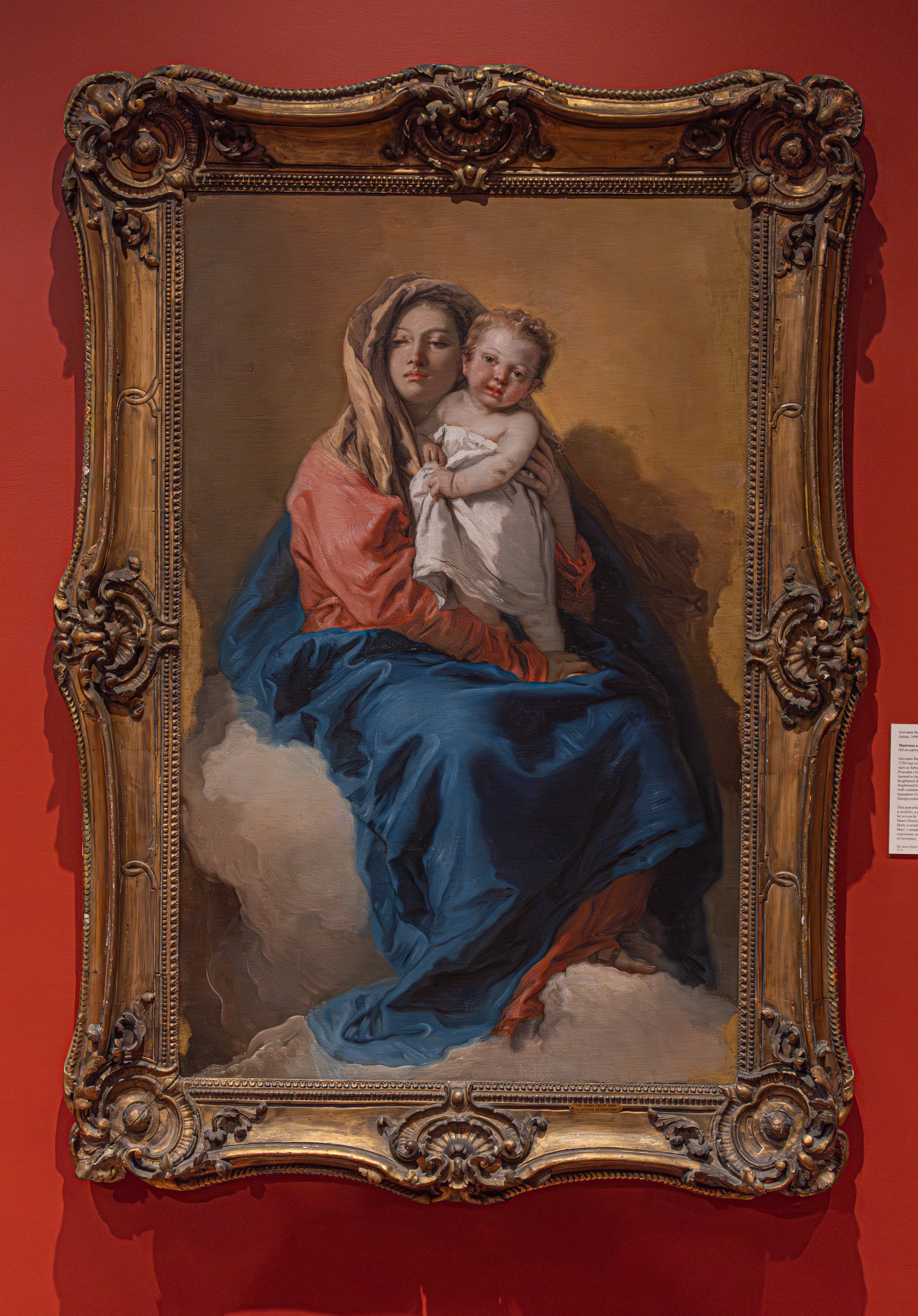
Judy Messer at the appropriately named Peace Love Flowers, created this arrangement based on the Madonna and Child portrait by Giovanni Battista Tiepolo.

Giovanni Battista Tiepolo studied under Gregorio Lazzarini but was strongly influenced by the art of contemporaries such as Sebastiano Ricci and Giovanni Battista Piazetta. It is from Piazetta and Ricci that Tiepolo Learned to handle complex shading. While his teachers created heightened drama through darkness and heavy colors, Tiepolo brightened his palette and illuminated his canvasses and frescoes with voluminous, revealing highlights. Tiepolo gained a popular reputation for decorative interiot painting, resulting in many foreign commissions.

This powerful rendering of the Madonna and Child was created as a modello, a preparatory oil sketch, for a silk and wool banner to be woven by Antonio Dini and hung in the church of Santa Maria Mater Domini in Venice. The simplicity of the composition is likely a result of the Painting’s purpose as a tapestry design. Mary’s sumptuous robes create an air of elegance and her dignified expression, as she sits atop the throne of clouds

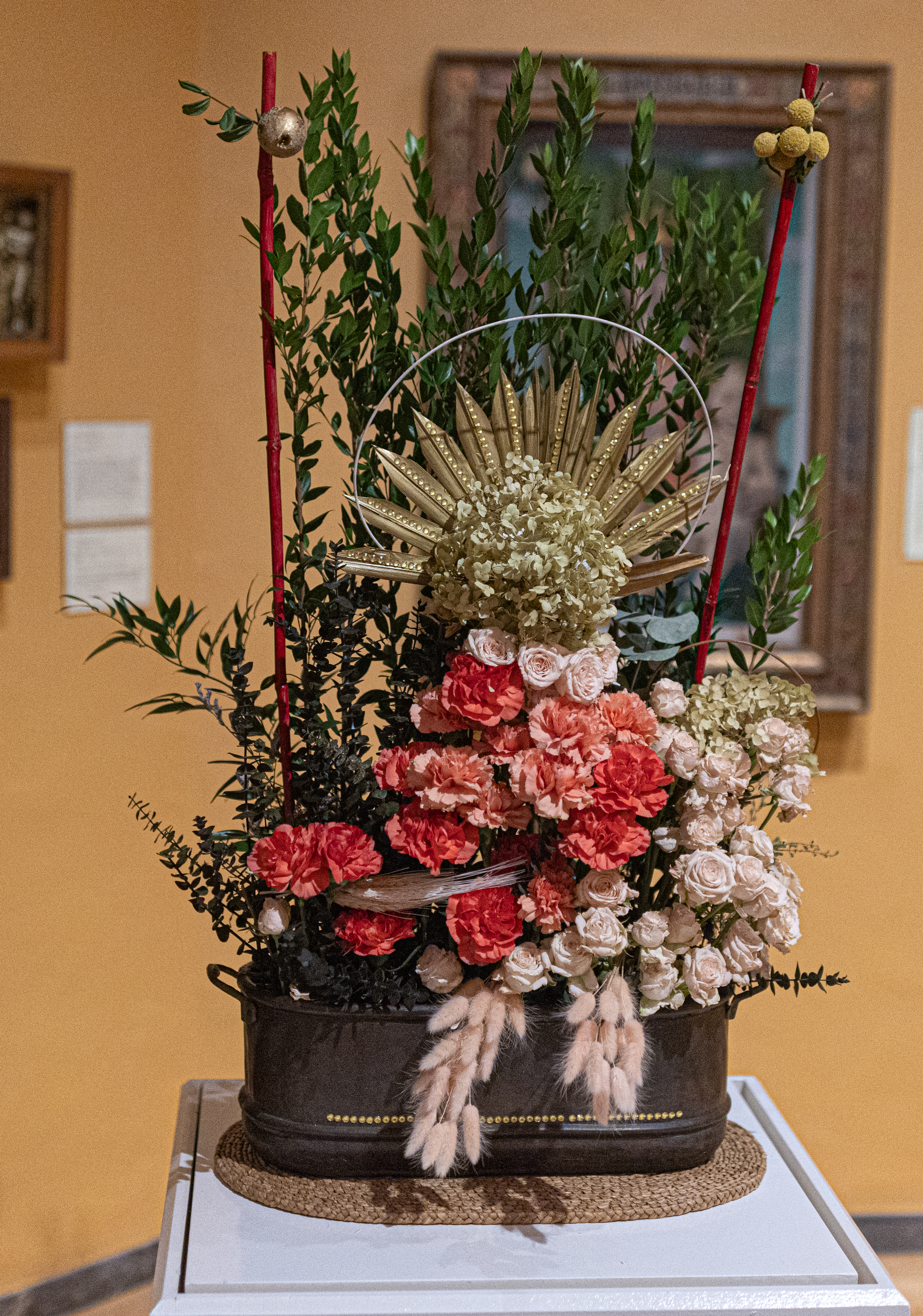
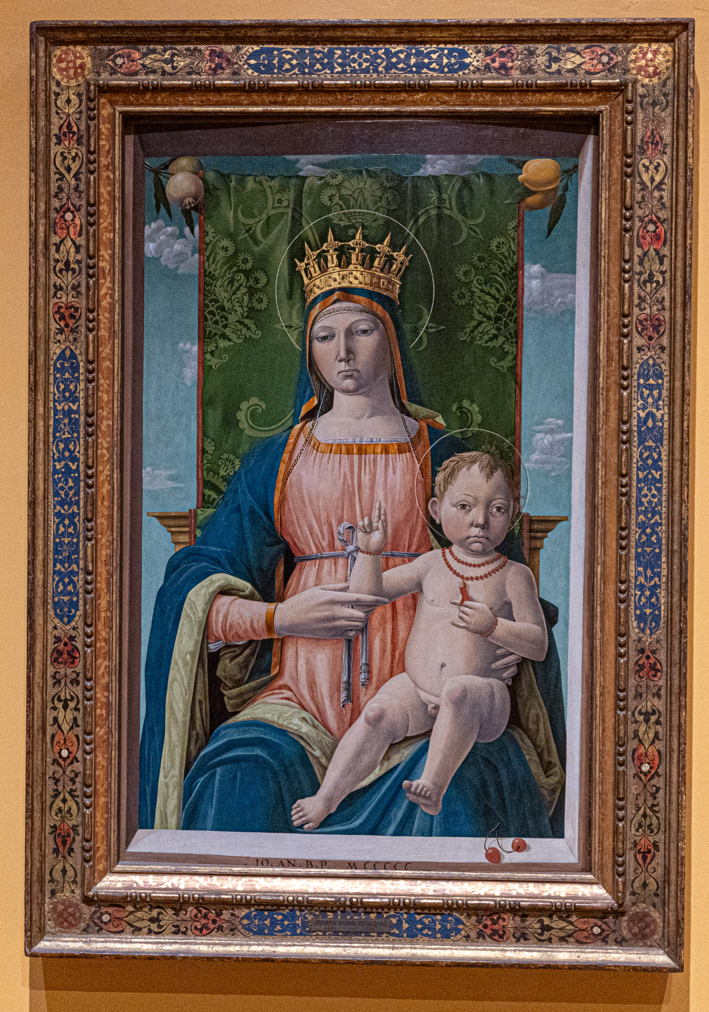
Sometimes confused with the Madonna and Child portrait, the Virgin and Child by Giovanni Antonio was the basis for this floral arrangement.

The painting features a gilded frame and depicts the Madonna wearing a crown, holding a key, while the Christ child wears a coral necklace.

The representation of the Madonna and Christ Child was extremely popular during the Italian Renaissance. Works of art such as this were probably for private devotional use. Most homes had at least one painting or sculpture with the image of Madonna and Christ Child. These served to stimulate devotion, as they could be reflected upon a daily basis.

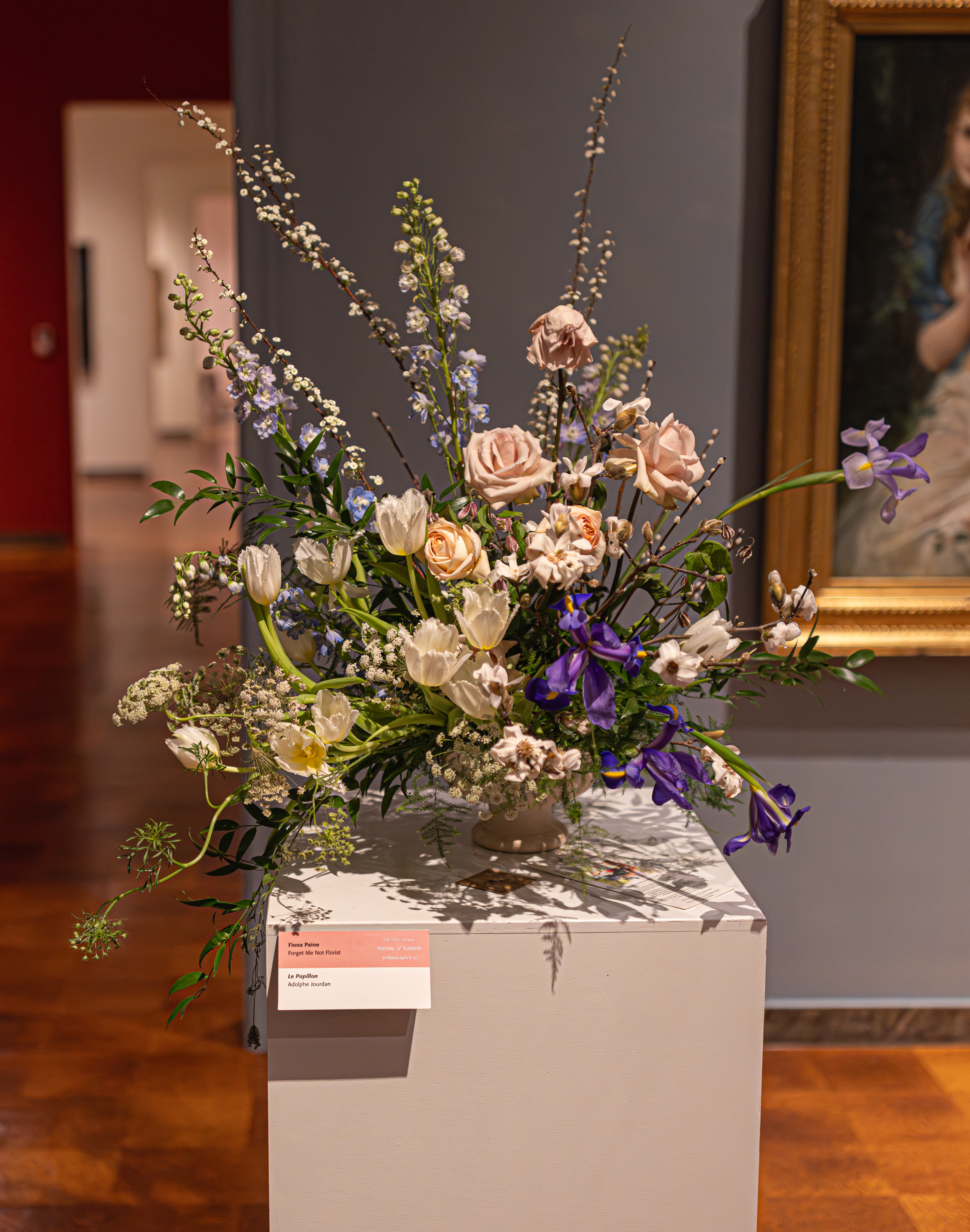
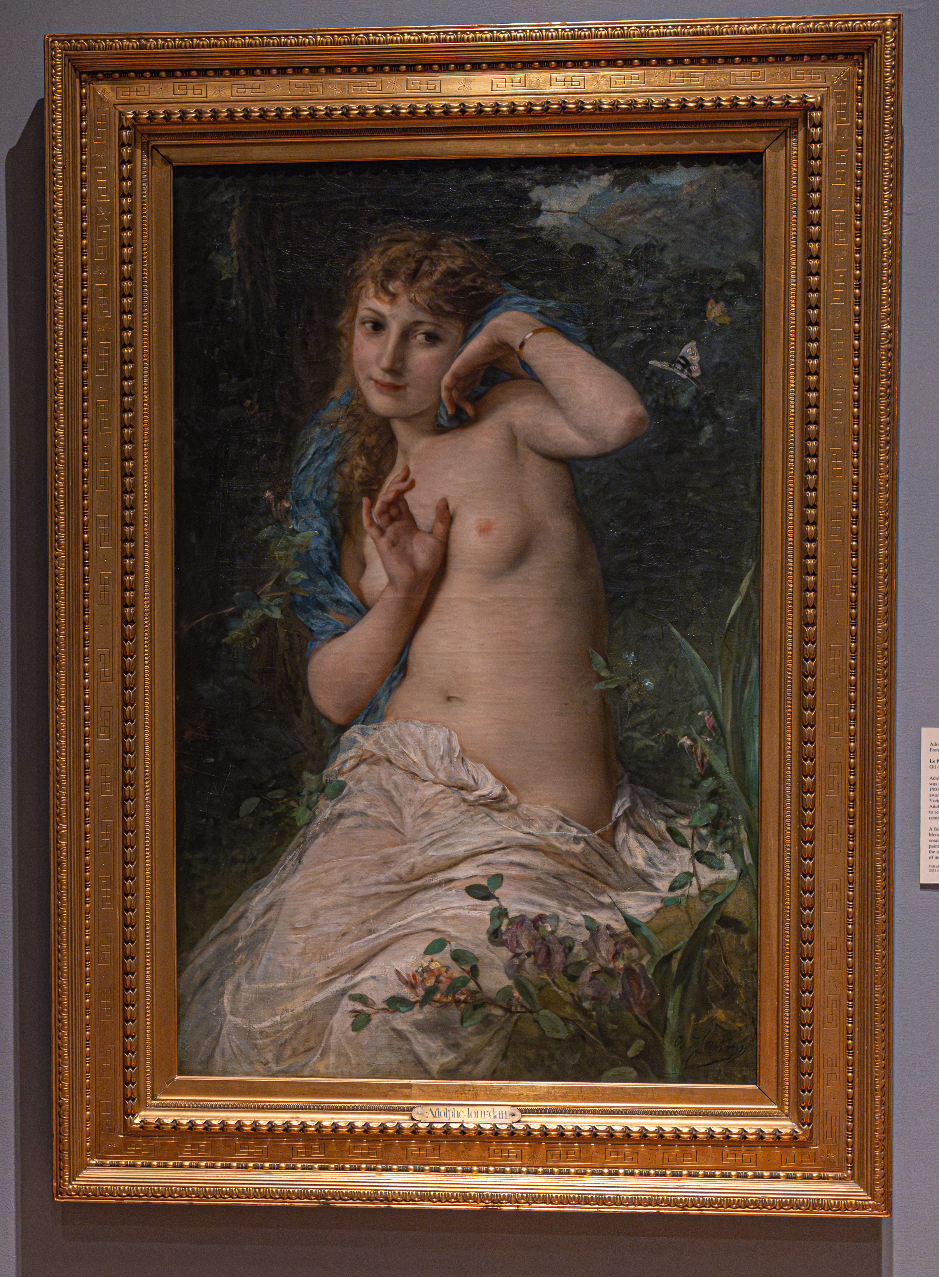
La Papillon (The Butterfly) by French painter Adolphe Jourdan was the inspiration for this arrangement by Fiona Paise at Forget Me Not Florist.

Adolphe Jourdan entered the Ecole des Beaux-Arts in 1844 and was a student of French Academic painter Charles Jalabert. Jourdan frequently in the Paris salons and won awards for his work in 1864 and 1866. He also exhibited in New York in 1876. The artist worked for art dealer and publisher Adolphe Goupil as a copyist and replicated paintings to serve as models for mass-produced engravings in the late 19th century.

A follower of William-Adolphe Bouguereau (apparently, Adolphe was a popular name in the late 1800s), Jourdan blended the style of his contemporary with his own training to create this excellent example of 19th century French romantic painting. The photographic realism depicted in the plants as well as the idealized classical form of the figure present a striking image of innocence.

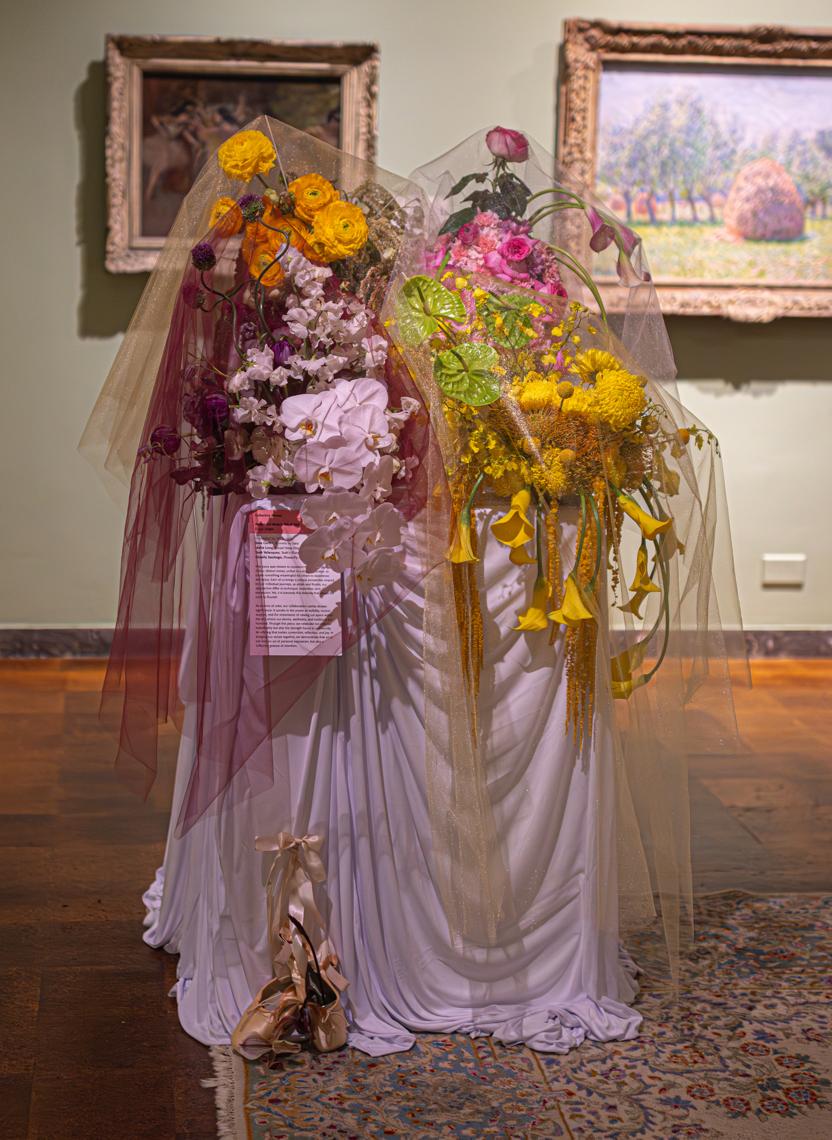
Collective Bloom created this arrangement inspired by Rehearsal Before the Ballet by Edgar Degas. They said the piece was chosen because of four distinct voices, united intention” to create something meaningful for others to experience and enjoy. Each of us brings our own journeys as artists and florists. Yet it is our diversity that allows the work to flourish.

As women of color, our collaboration carries deeper significance. It speaks to the power of visibility, mutual support and the importance of carving out space within the arts where our stories, aesthetics and traditions are honored. Through this piece, we celebrate not only our individuality but also the strength found in community. An offering that invites connection, reflection and joy. In bringing our voices together, we demonstrate that art is not only an act of personal expression, but also a collective gesture of intention.

Impressionist artist Edgar Degas is best known for his depictions of ballet dancers. The artist was inspired by ballet rehearsals and fascinated by the movement of dancers. Though his knowledge of human anatomy informed his drawings and paintings, Degas was more interested in capturing the essence or impression of a ballerina’s movements rather than realistically documenting the motions. In Rehearsal Before the Ballet, Degas offers the viewer a backstage preview, with some dancers poised on one toe and others stretching as they prepare for the performance. The sparkling costumes and suggestions of an audience in the background add to the anticipation of the moment before the curtain rises.

Degas worked in a studio in the Montmartre district of Paris for many years. His academic training was influenced heavily by the inventive compositions of Japanese prints which became available in Europe following the opening of trade with Japan in 1854. The artist never reconciled himself to being referred to as an Impressionist painter, yet he was one of the group’s founders, an organizer of its exhibitions and one of its most important members.

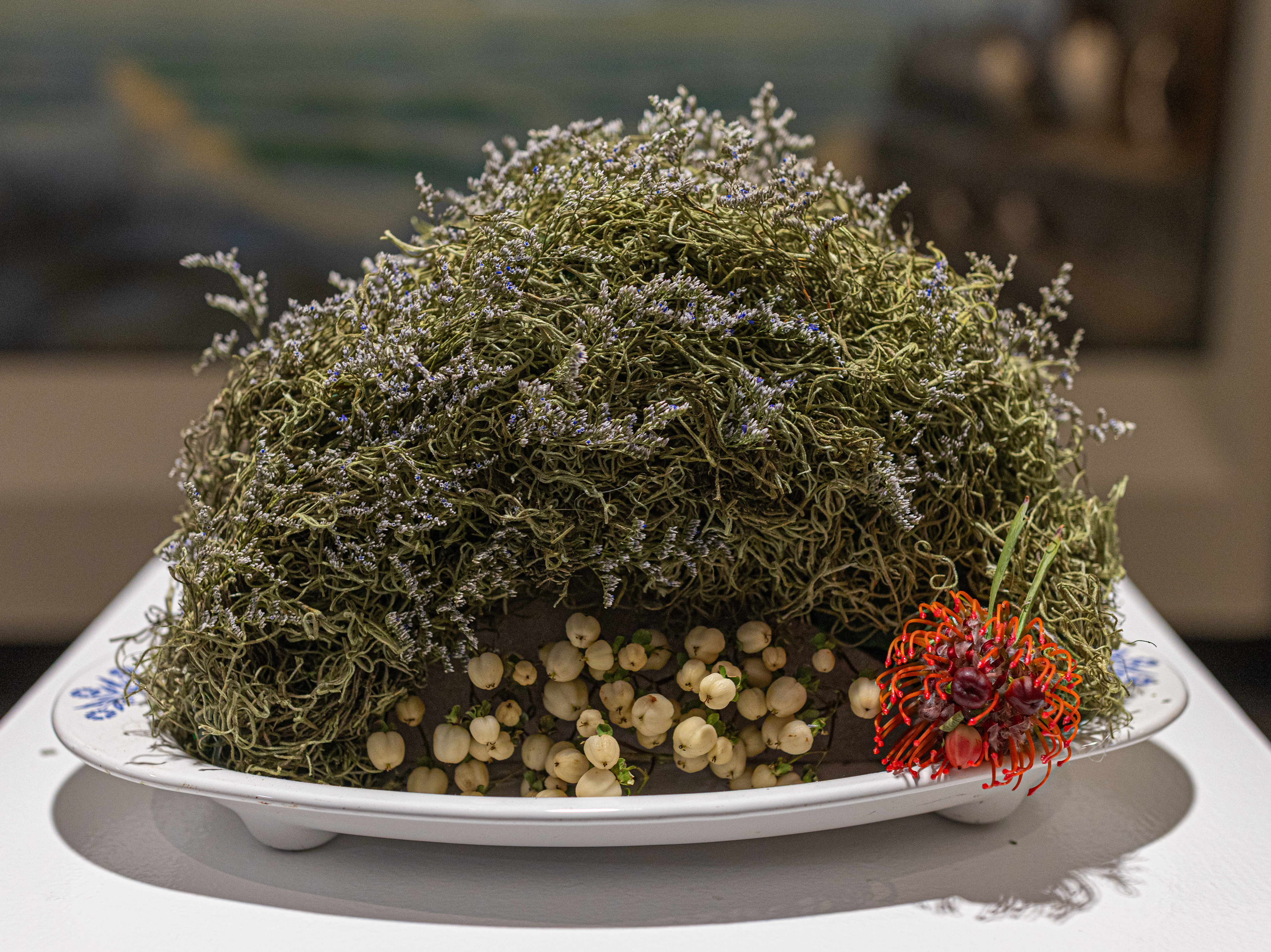
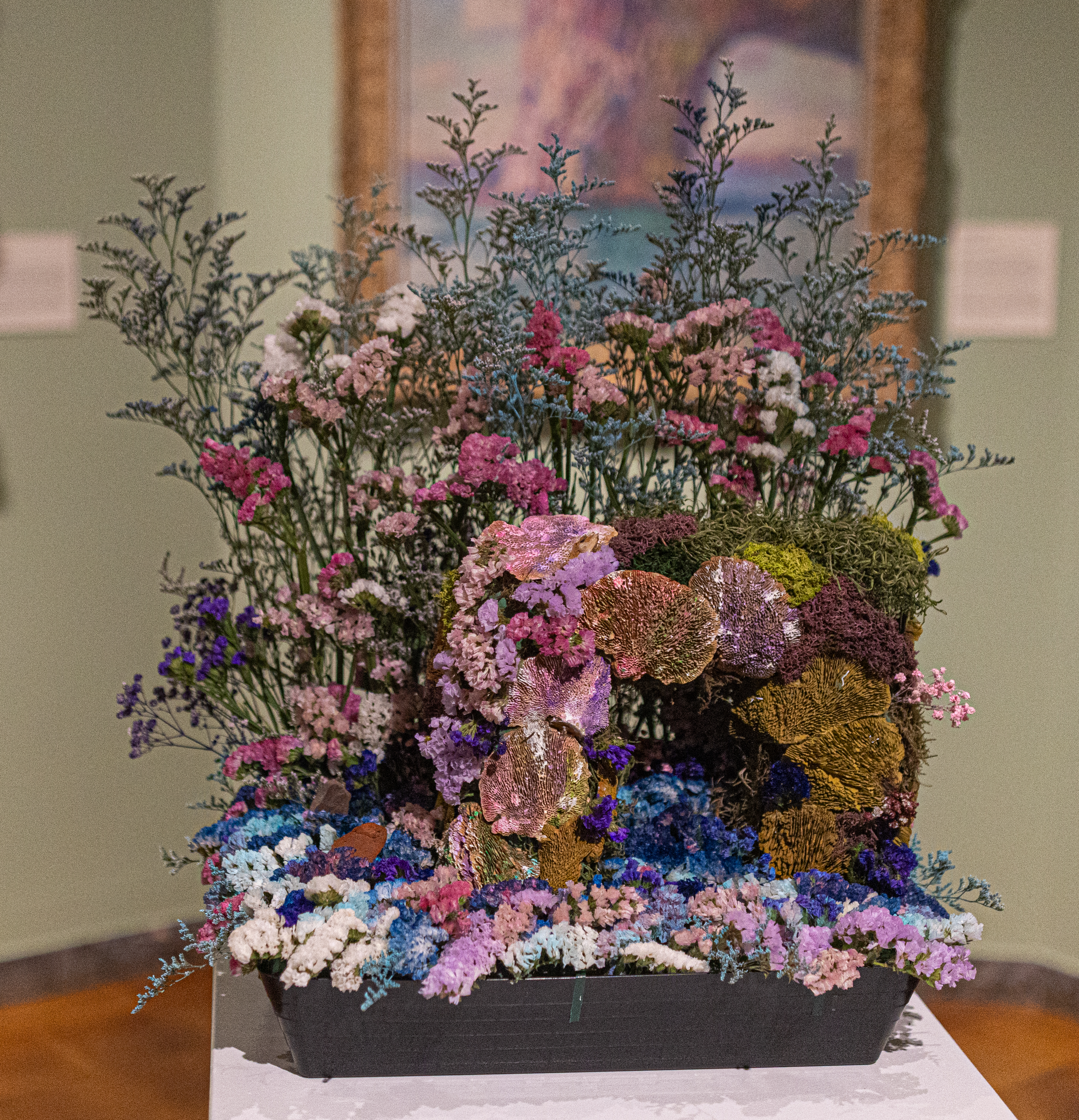
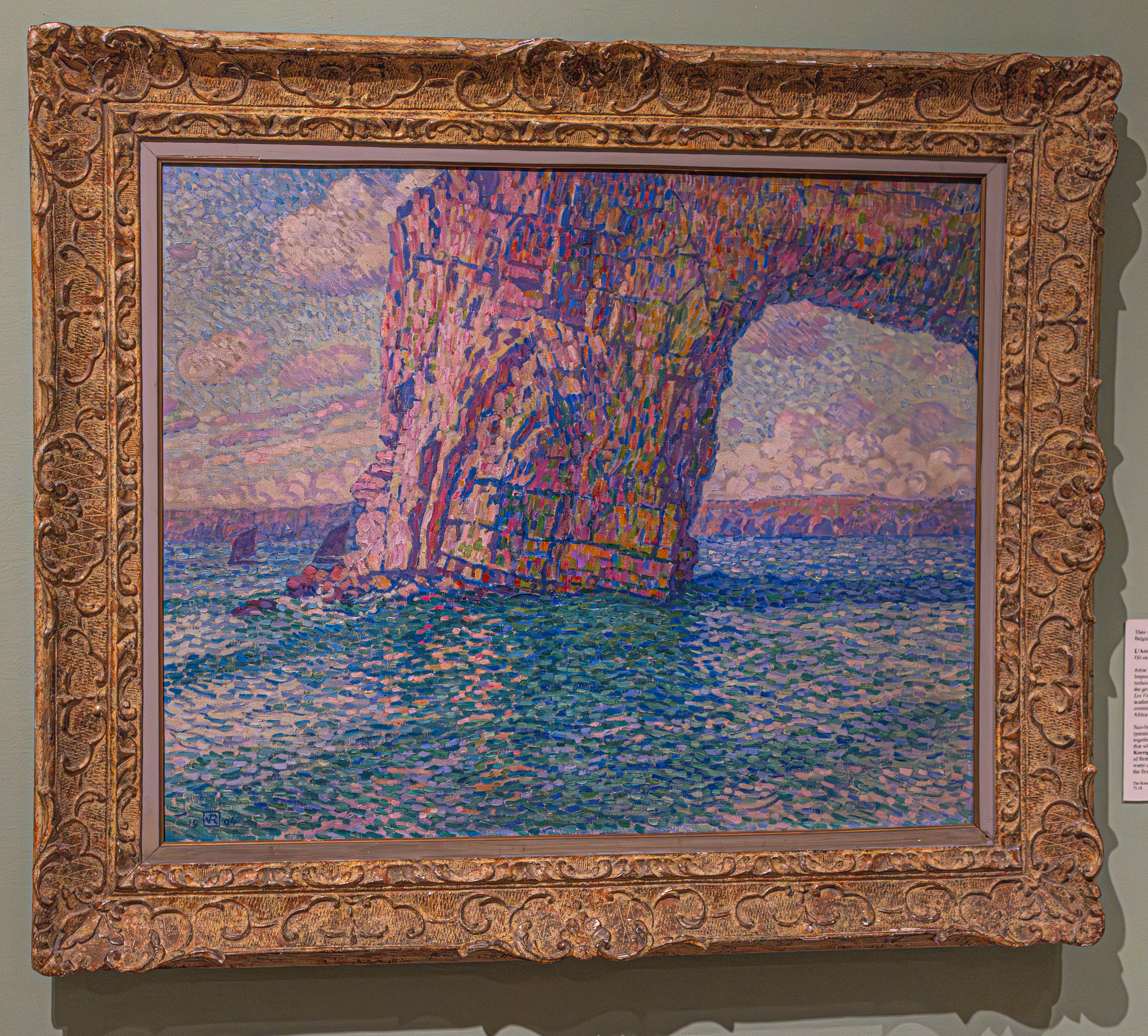
Nora Santourian at the Springfield Garden Club used L’Arche Korrigan a Dinard by Theo Van Rysselberghe as inspiration for her floral design. Nora said her travels to impressionist sites in France inspired her artwork. Her last trip included a visit to Etretat which she was drawn to due to Monet’s paintings.

As Nora walked into the French Impressionist Gallery, she was immediately drawn to Rysselberghe’s vibrant depiction of L’Arche Korrigan a Dinard, painted on the coast of Brittany. It is an exciting challenge for me to present this painting with flowers.

The materials used for this floral arrangement include Statice, Limonium, Baby’s Breath, Goldenrod and natural sponge mushrooms.

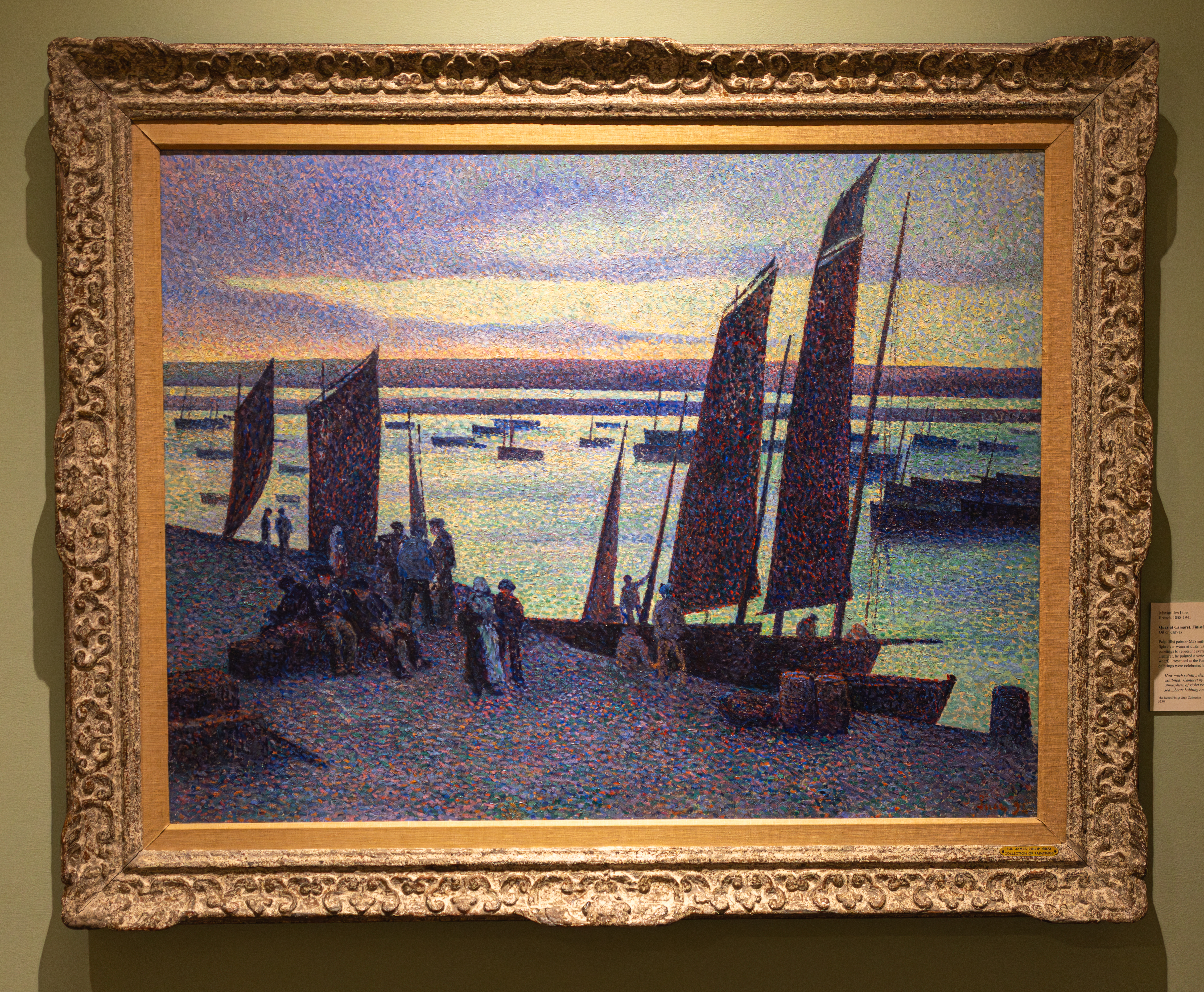
Artist Theo Van Rysselberghe was a leader of the Neo-Impressionist art movement. He introduced the Pointillist technique (a technique that creates images using thousands of tiny, distinct dots of pure color applied to canvas)to the art world in Belgium and played a major role in the group of avant-garde artists in Brussels known as Les XX or Les Vingt. Born in Ghent, Belgium, van Rysselberghe, studied academic painting at the Academies of Ghent and received a commission to copy paintings in Spain. He also visited North Africa where he created many academic landscapes.

Neo-Impressionists artists often used the pointillist method to achieve an even greater luminosity and vibrancy than that which had been achieved by the Impressionists. L’Arche Koprrigan a Dinard, an oil on canvas painting, was painted at Cote d’Emeraude, or Emerald Cost of Brittany. It shows the artist’s skill at capturing light and sparkling water using pointillism. The artist was also for being one of the first to use this method in portraiture.

Painter Maximilien Luce (1858-1941) was introduced to Georges Seurat in 1887, while exhibiting work at the third exhibition of the Society of Independent Artists in Paris, and soon after adopted the Pointillist style. Luce would become a successful proponent of Pointillism, though he admitted to applying paint with a healthy dose of artistic license. In one letter to a friend, Luce explained that when he could “see no way of applying the division of color” he would “just give free rein to my instincts.” While traveling to the seaside town of Camaret-sur-Mer in the region of Brittany, France, Luce was inspired to paint Quay at Camaret, Finistère, a scene featuring fishing boats and figures gathering near the coast at dusk. Although night is falling, vibrant purple, pink, and turquoise hues punctuate the dramatic sky. Enlarged details of the painting (below) elucidate the distinct colors that are more difficult to see from afar.

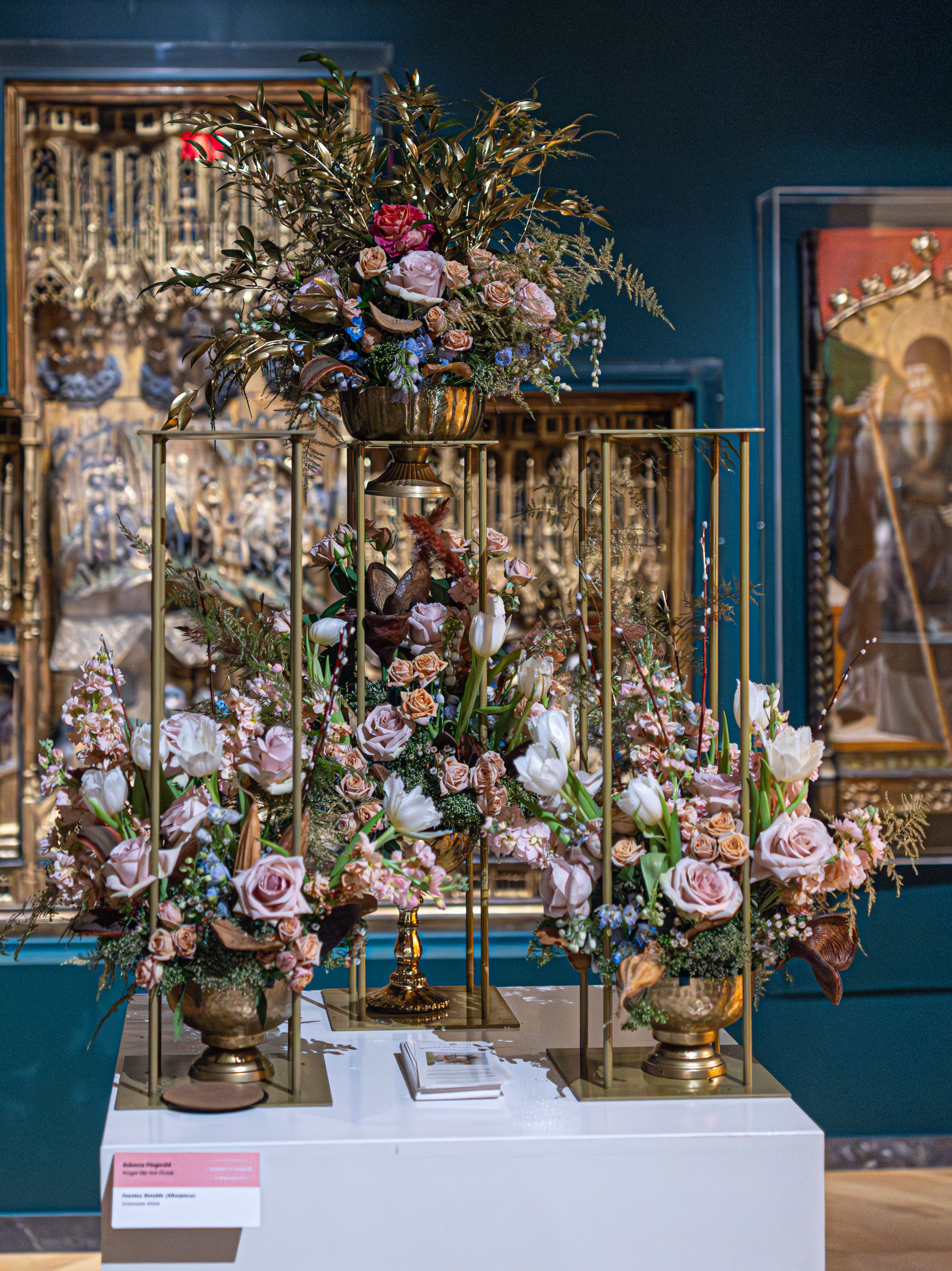
This arrangement Rebecca Fitzgerald at Forget Me Knot Florist is based on a very intricate piece of art. Fuentes Retable by and unknown artist or artists is one of the more creative and detailed pieces in the exhibit.

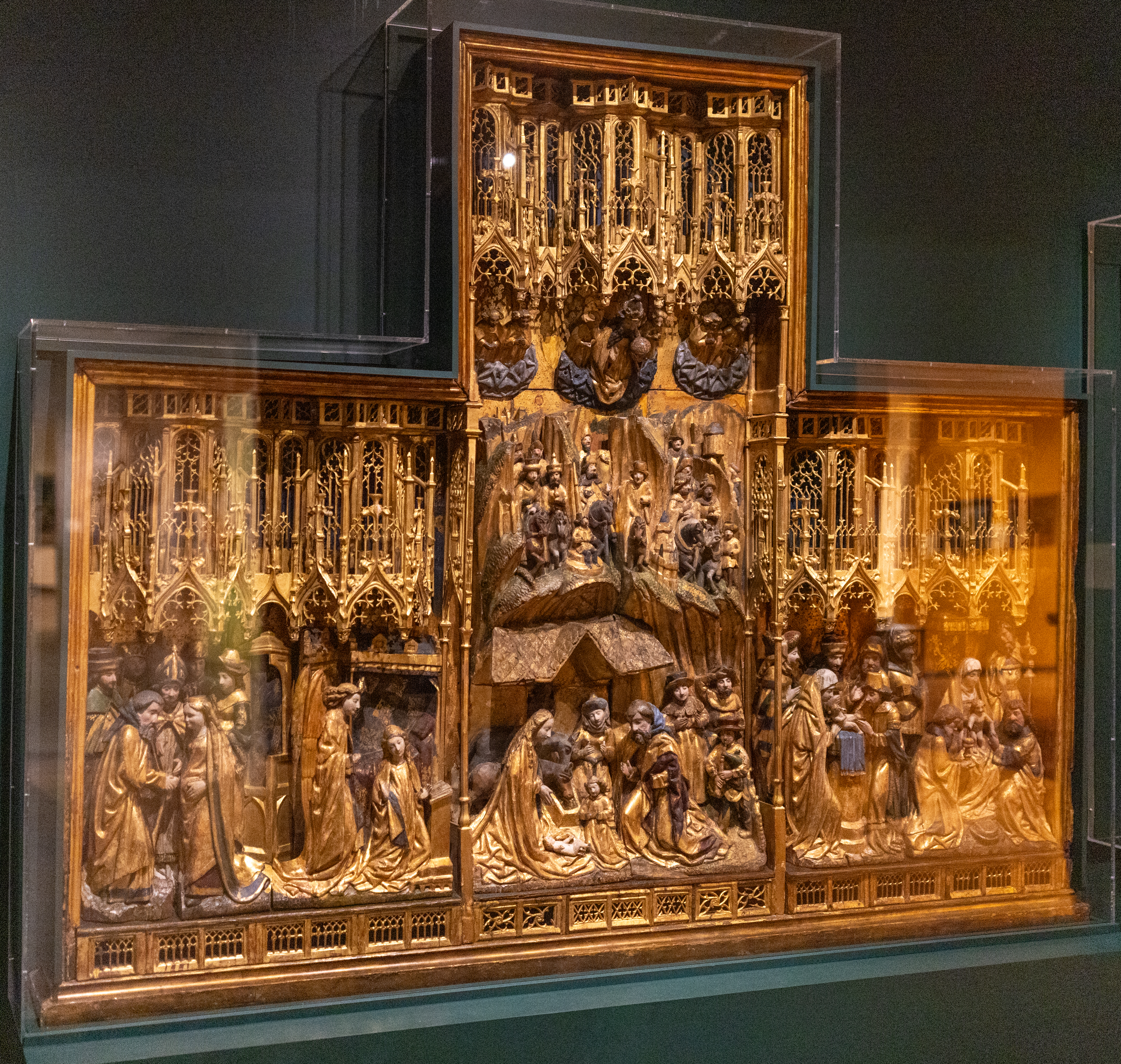
This finely carved retable, with a Brussels mark of manufacture on the back, is one of only 35 surviving altarpieces known to be imported from Flanders to Spain, and the single example found in an American collection. The altarpiece was made for the church in Fuentes, a small town no longer in existence, located near the city of Valladolid, Spain.

The altarpiece illustrates scenes from the life of Mary, Mother of Christ. The left panel shows the Betrothal of the Virgin to Joseph and the Annunciation with the Archangel Gabriel and the Virgin. The bottom of the central panel shows the traditional figures associated with the Adoration, including Mary who worships the infant Christ. In the mid-section are mountains, buildings and the three Wise Men and their followers. In the top portion God, holding the orb of the world in his hand, is flanked by angels. The right panel contains the Presentation of Jesus at the Temple and the Epiphany. Framing the entire composition is a canopy of delicate tracery. At one time the altarpiece had doors, now lost.

The altarpiece, both opulent and costly, demonstrates the strong devotion of a small, rural congregation. It was produced during the reign of King Ferdinand and Queen Isabella, great supporters of religion and the arts. The building of churches increased and artists were commissioned to decorate the new buildings with monumental altarpieces, statues and elaborate carvings for walls and facades. Many of the artists were from Flanders, a country which also supported Catholicism. Flemish craftsmen traveled to Spain to work in the expanded art market or fulfilled orders, such as for this altarpiece, in their native land. The altarpiece was then shipped to Fuentes and assembled and installed by Spanish craftsmen. Thus, the piece is not the work of a single artist, but rather the product of a team of people, each specializing in distinct stages of the altarpiece’s creation

Earth: A Glowing Cornucopia was made by the team at Flowers, Flowers! It used a sprinkle of many things. They described their aork of art as “a symphony of Earthly things.”

Some of the floral arrangements were not based on books or works or art, or anything in particular like these arrangements.

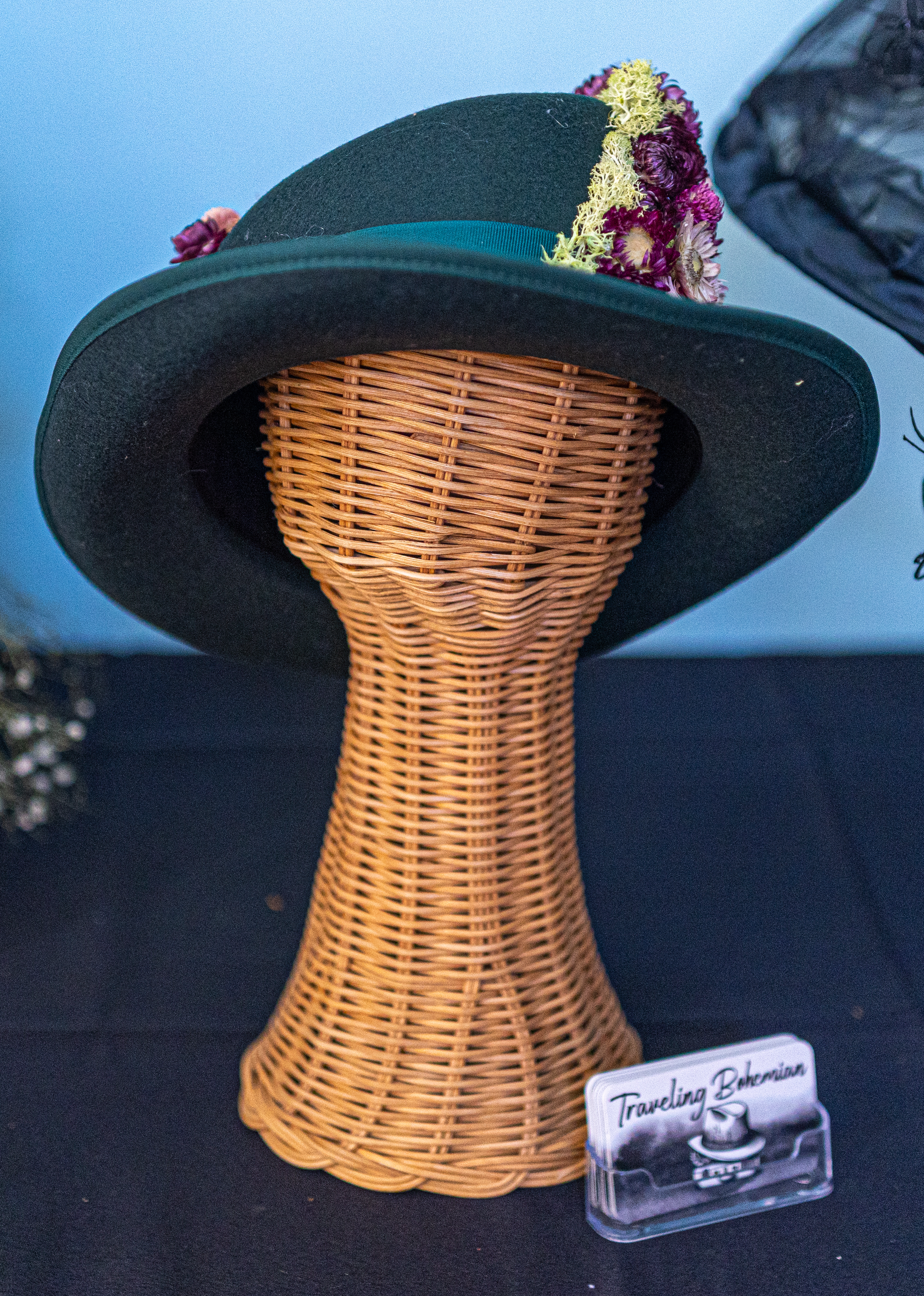
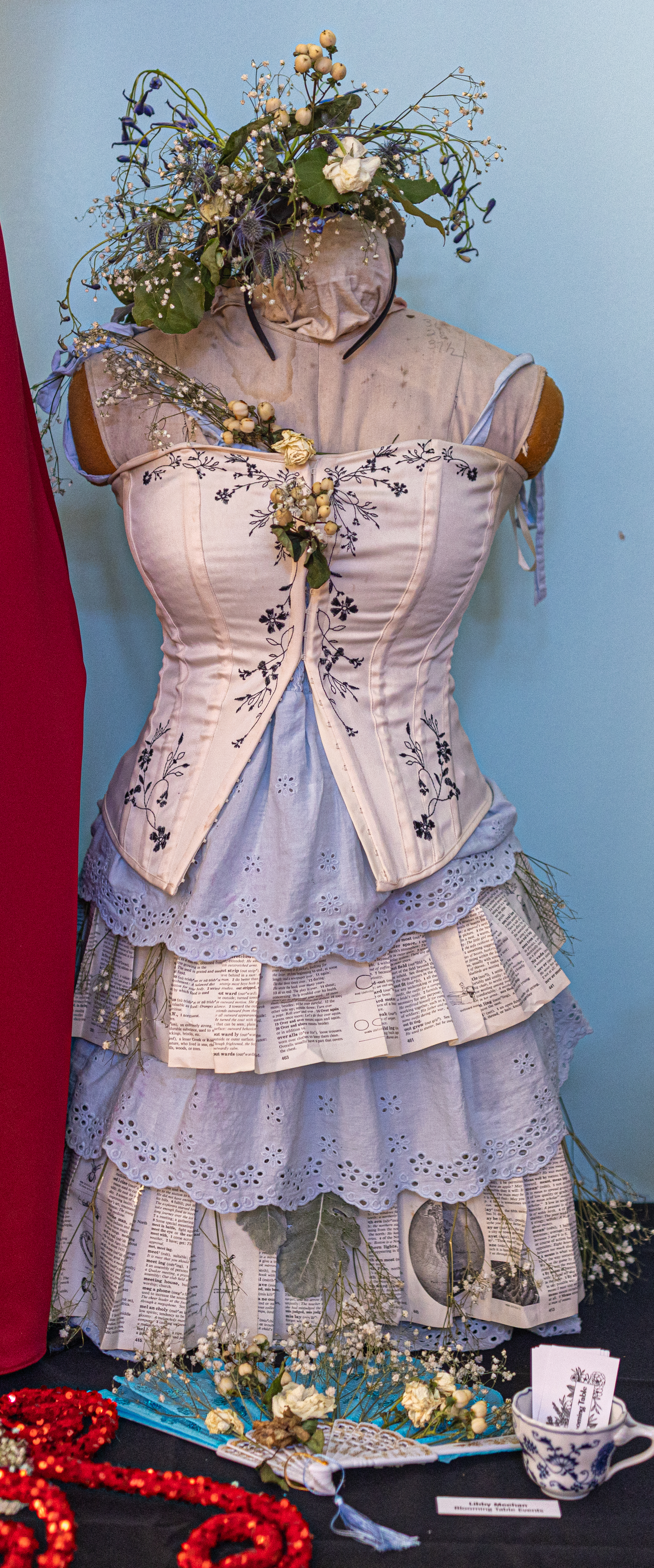
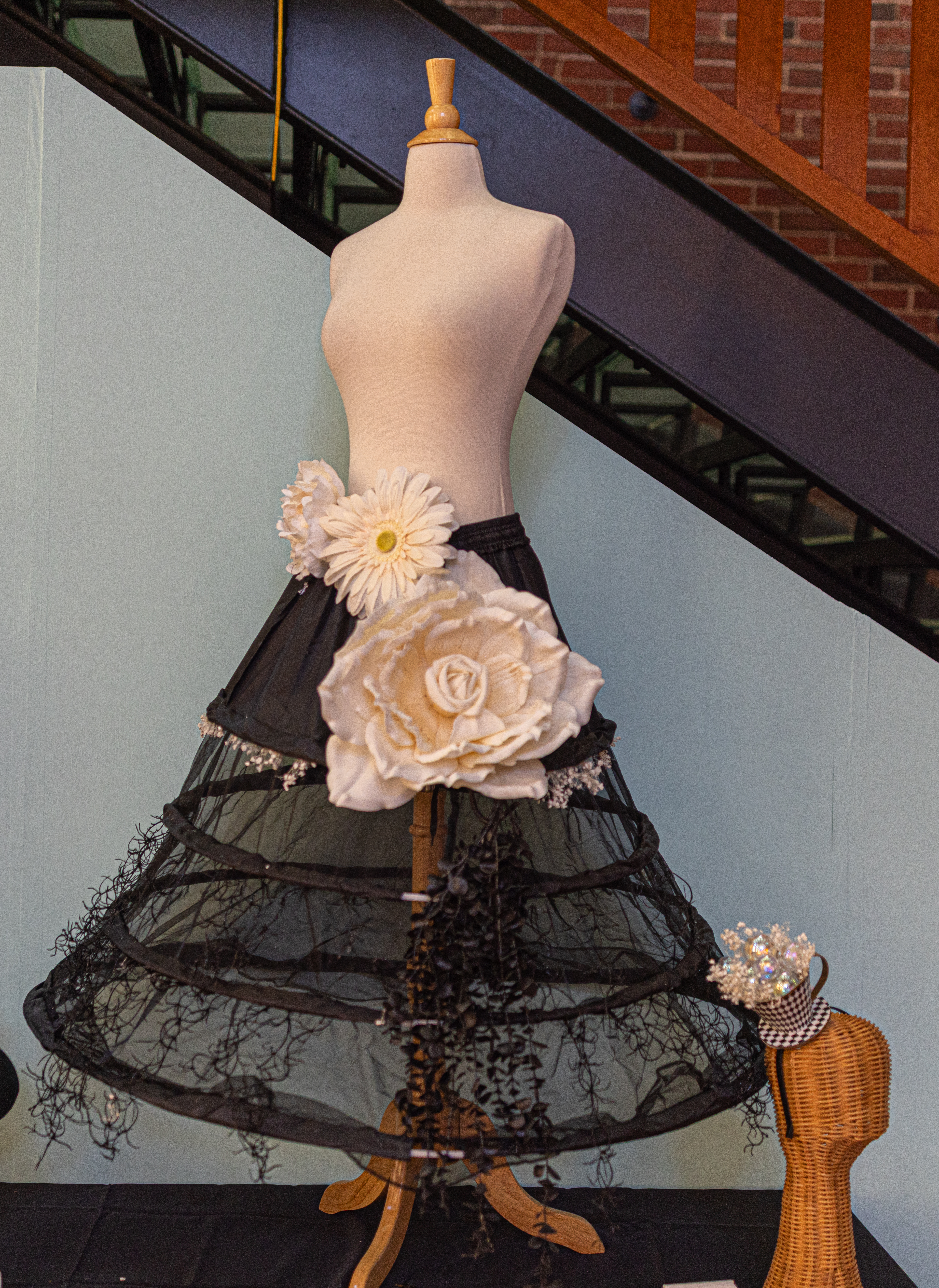
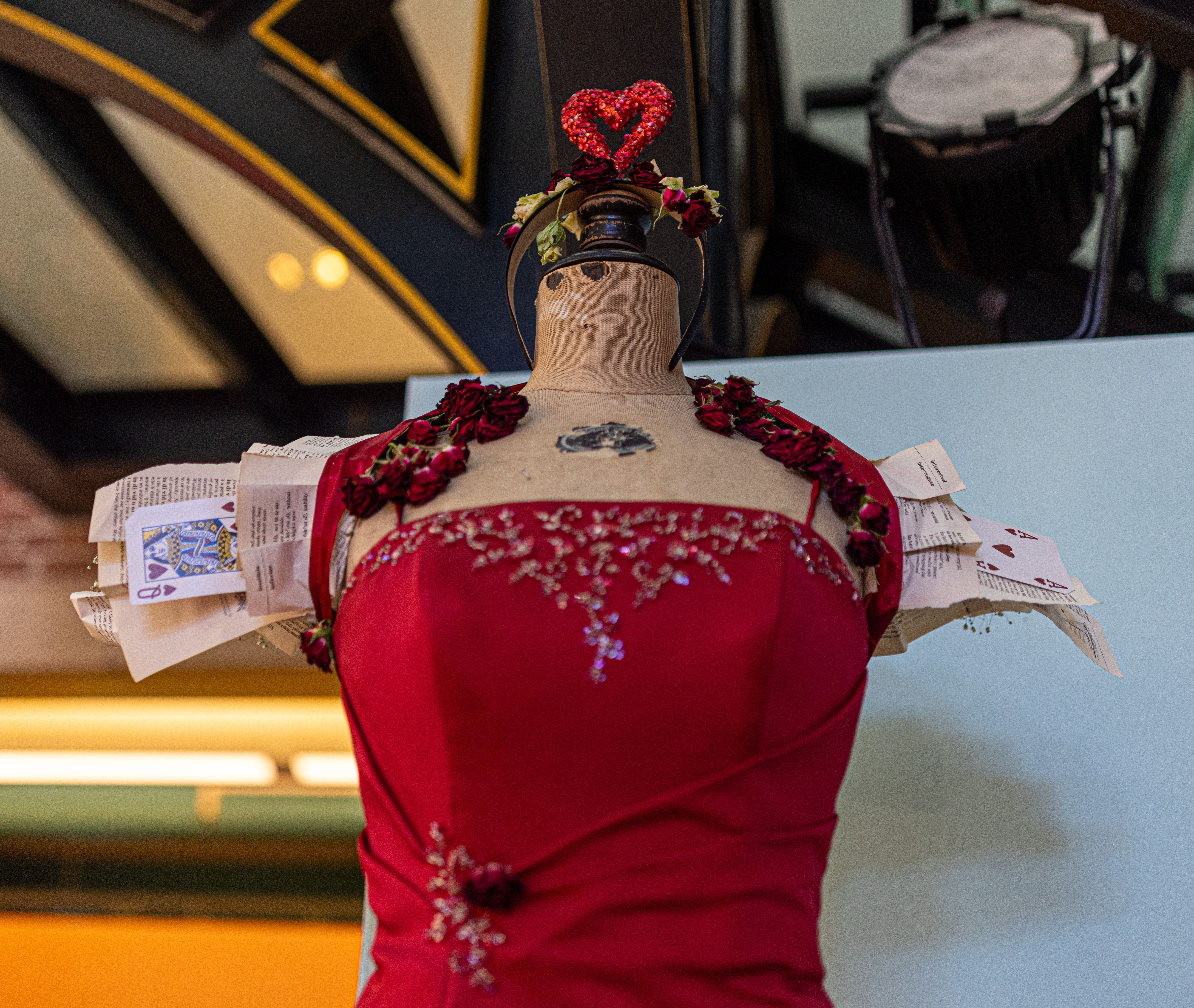
This work of art used flowers and other materials to make some unique fashion.

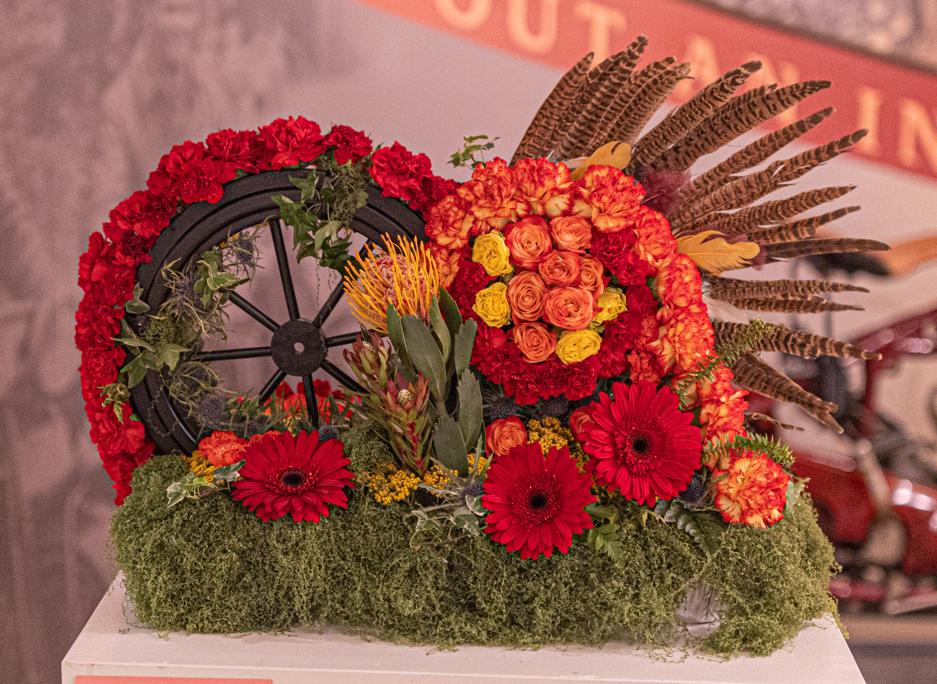
Not to be outdone, this floral design was modeled after a motorcycle. No, that’s not a typo!

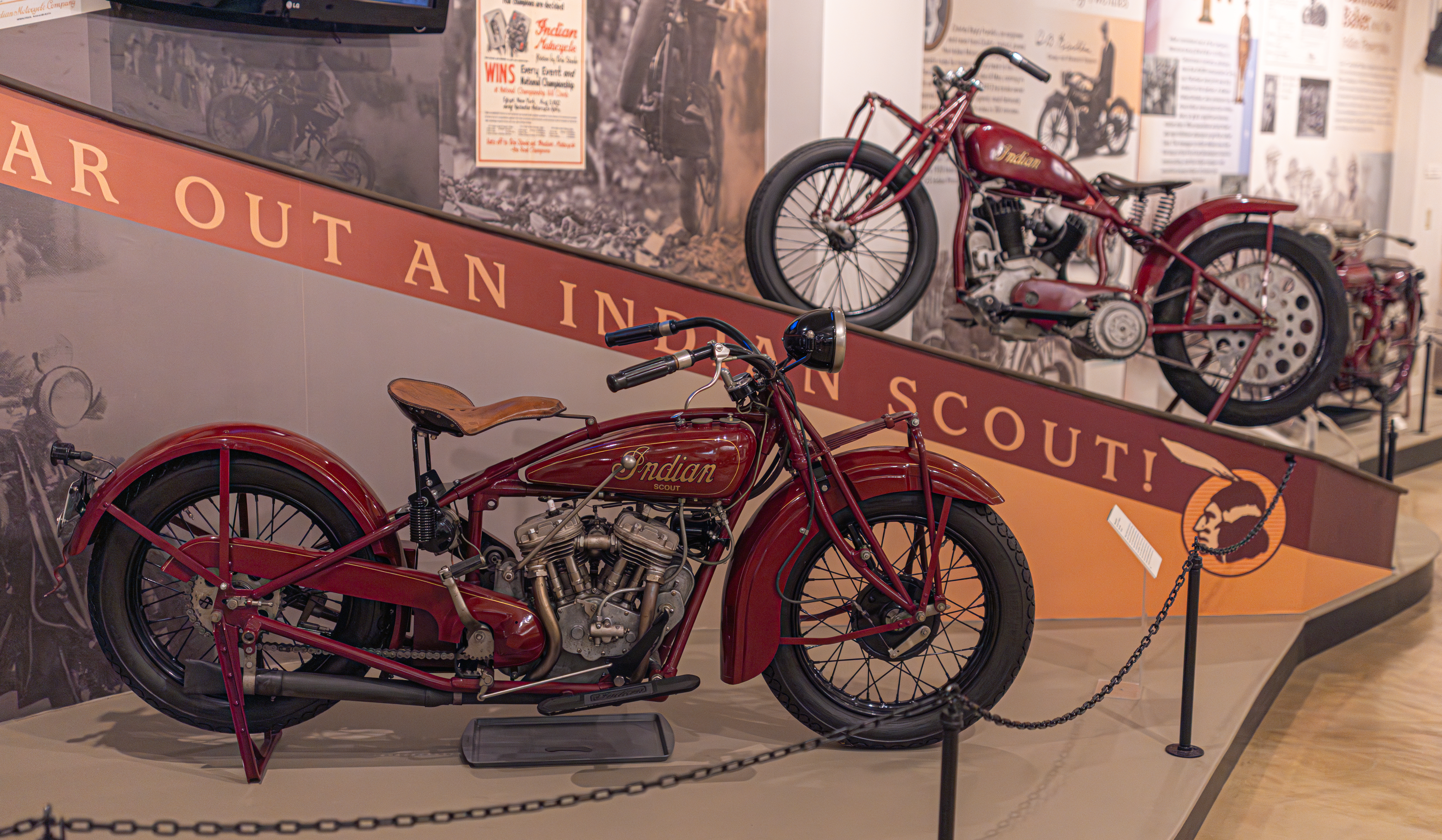
Springfield, MA. is home to Indian Motorcycle. And this piece pays homage to that history. In fact, it is the Scout motorcycle that is depicted here.

Responding to feedback from racers, the original Scout introduced in 1920 was updated with key modifications making the new Scout 101 one of the most popular models ever built. Charles Franklin tweaked his original design, creating a bike that for years was a favorite among racers even though actual production years were few due to the onset of the Depression. The Scout 101 had a stronger frame, larger wheelbase, an increased fork rake, a front brake and a low 26 and one quarter inch seat height.

There was also a section of the Wood Museum (one of the five museums that makeup the Springfield Museums) that had floral arrangements or works of art that celebrated America’s 250th anniversary.

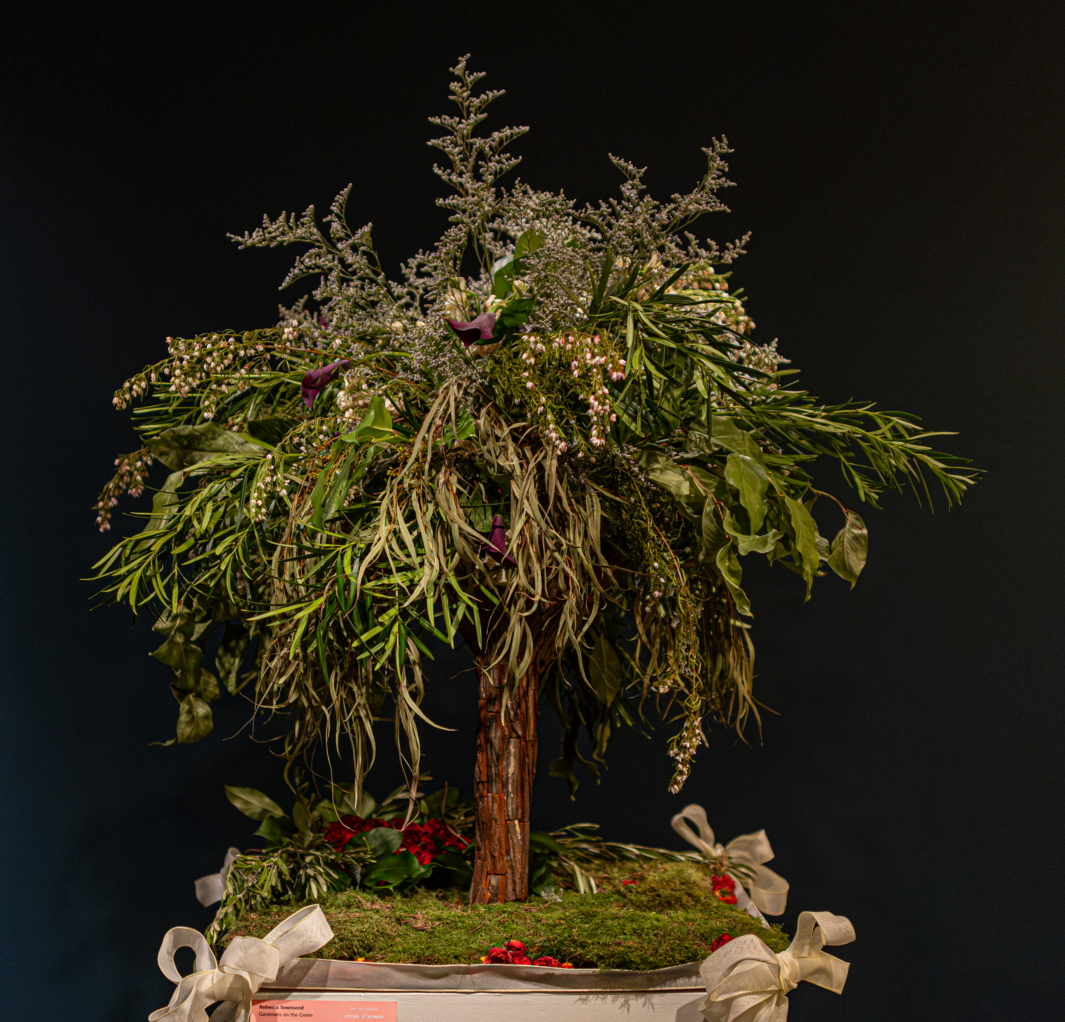
In observance of the 250th anniversary of American independence, Rebecca Townsend at Gardeners on the Green created the Tree of Liberty.

The “Tree of Liberty” has roots in the American Revolution. The Sons and Daughters of Liberty, formed in the 1760s in opposition to the Intolerable Acts, played key roles in the Revolution. Quite literally and Elm tree near Boston Common served as the meeting grounds for the protesters and gatherings of the Sons of Liberty. Massachusetts towns declared their independence as early as two years prior to July, 4, 1776 (October 4, 1774 in Worcester, MA), and they did so in part because the Massachusetts Government Act prohibited them from holding town meetings . People met and acted despite this. The Sons of Liberty included Samuel Adams, who noted that, “with ladies on our side, we can make every Tory tremble.” Daughters of Liberty, ;like Sarah Bradlee Fulton, played roles in the Boston Tea Party and in the War itself.

The design depicted here draws from the importance regular people played in the Revolution, with a tree as the gathering place, and people exercising political agency in the ways they could. Women made homespun linen as a means of economic boycott. Olive branches draw on the symbolism offered by the “Olive Branch Petition.” The Continental Congress adopted this in July, 1775 to avoid a war with Great Britain. Of course, this gestured failed. Then, on July 4, 1776, the Continental Congress resolved to create the Great Seal of the United States. The design featured an eagle turned towards its right talons, which grasp an olive branch. The red rose petals are a reference to Thomas Jefferson’s 1787 comment that the “tree of liberty must be refreshed from time to time with the blood of patriots and tyrants. It is the natural manure.”

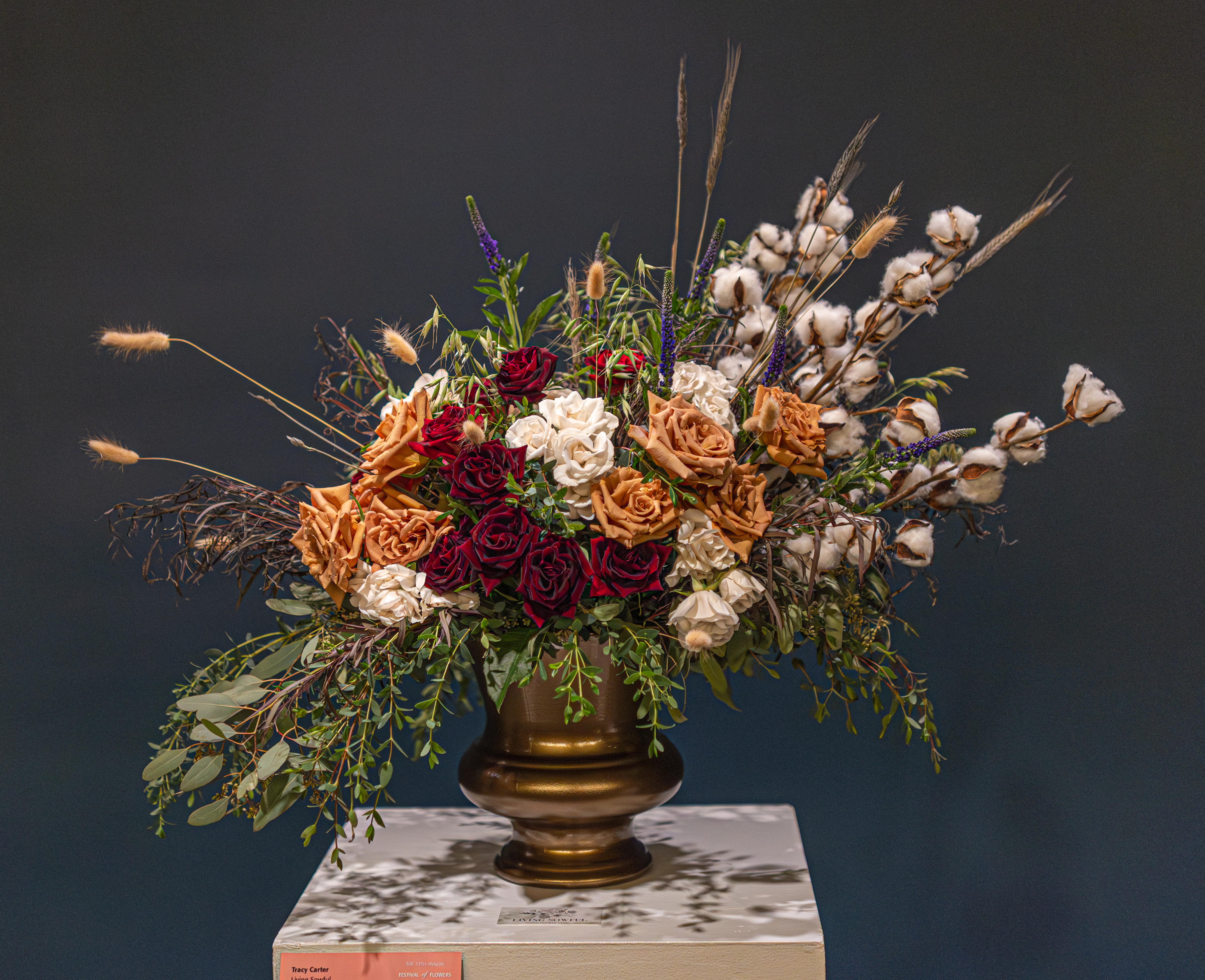
Tracy Carter at Living Sowful Micro Flower Farm. Her piece, “The People, Not Just the Promise” reflects the spirit of 1776 through the lens of everyday life. While the Declaration of Independence expressed bold ideals of liberty and equality, the nation was shaped by the diverse experiences of its people.

Layers of red, white and blue blooms are woven throughout the design to represent both aspiration and resilience. Cotton and wheat are included to honor the labor and hands that built and sustained early communities. The arrangement embraces movement and open space, suggesting the promise of 1776 continues to unfold over time, shaped by those who lived it.

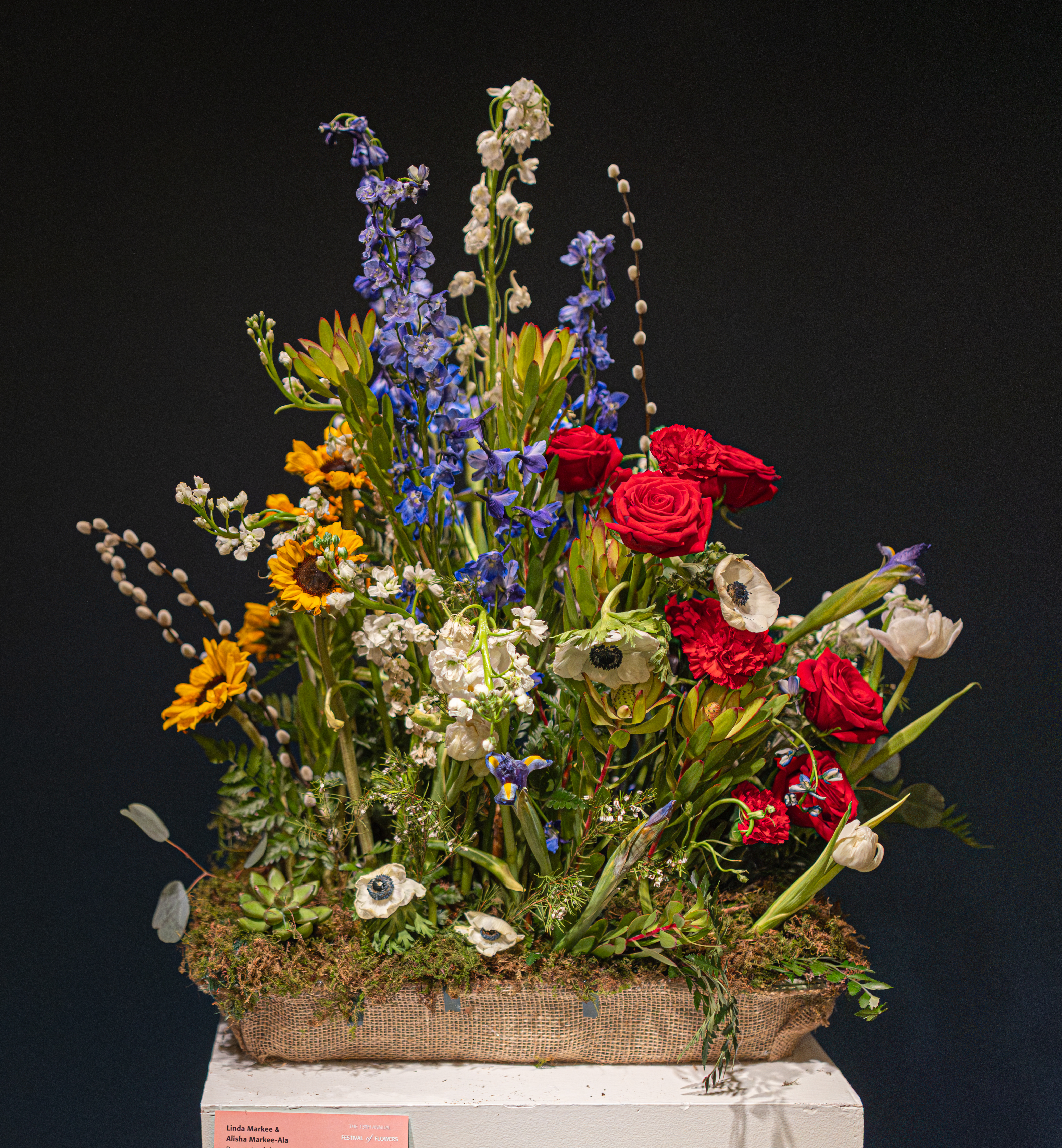
“WE THE PEOPLE” by Linda Markee and Alisha Markee-Ala from Bouquets of the Valley celebrated our independence.

The American garden has never belonged to one people. The tulip traveled from the Ottoman Empire. The rose from ancient Persia. The dahlia marigold from Mexico. The peony from China. The ranunculus from the Middle East. The protea from South Africa. The orchid from tropical Asia. The sunflower was already here, tended by the Native peoples of this land long before the republic was imagined.

They came with immigrants and refugees, With people who carried seeds in their pockets as the last remnant of home. They took root in unfamiliar soil and grew alongside everything else that was already there.

This arrangement does not separate by origin. It places them together as one living thing – because that is what they have always been. That is what we have always been.

Many roots. One harden.

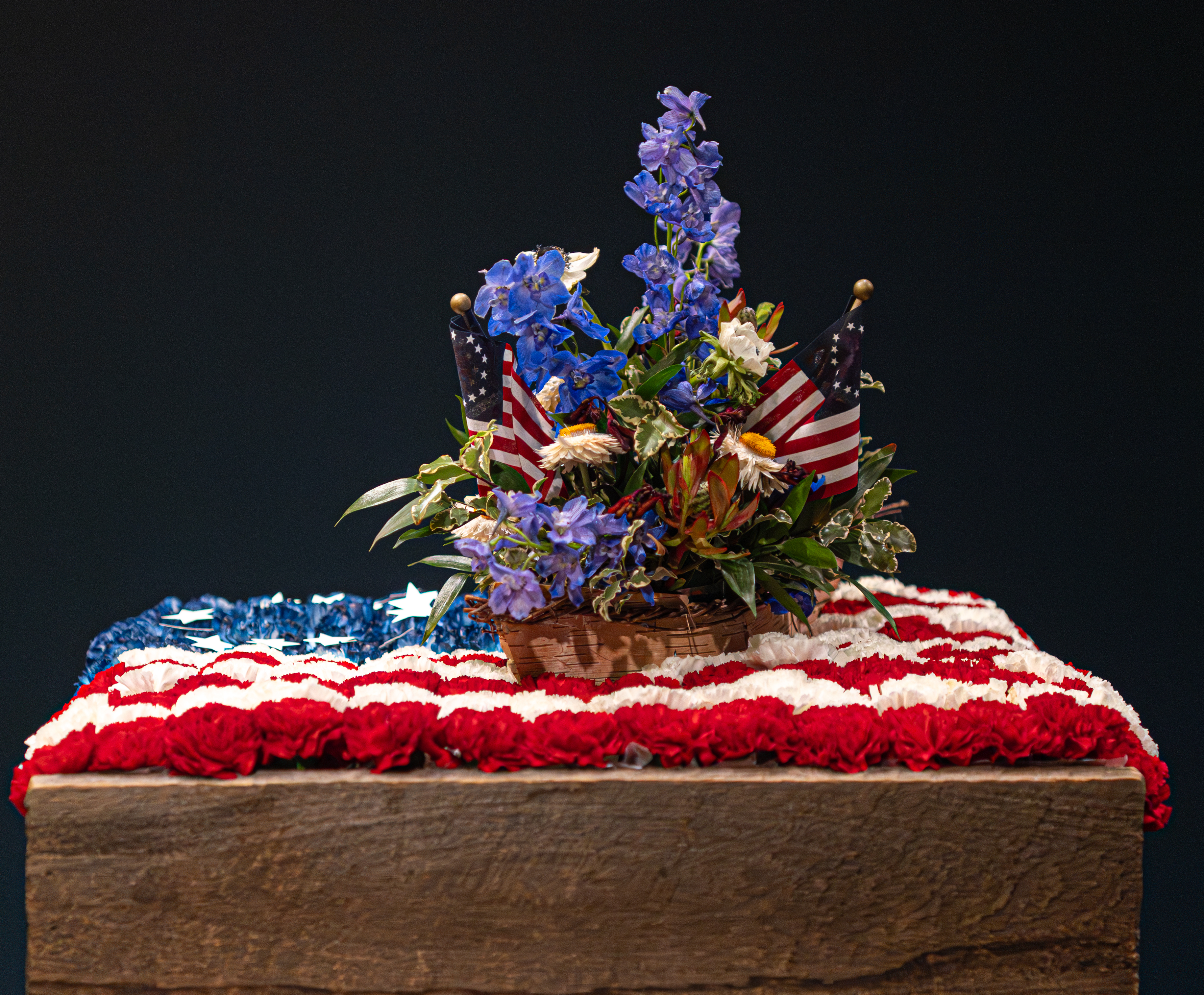
Joanne Teehan at Randall’s Farm & Greenhouse created this arrangement in spired by the 250th anniversary of our Independence.

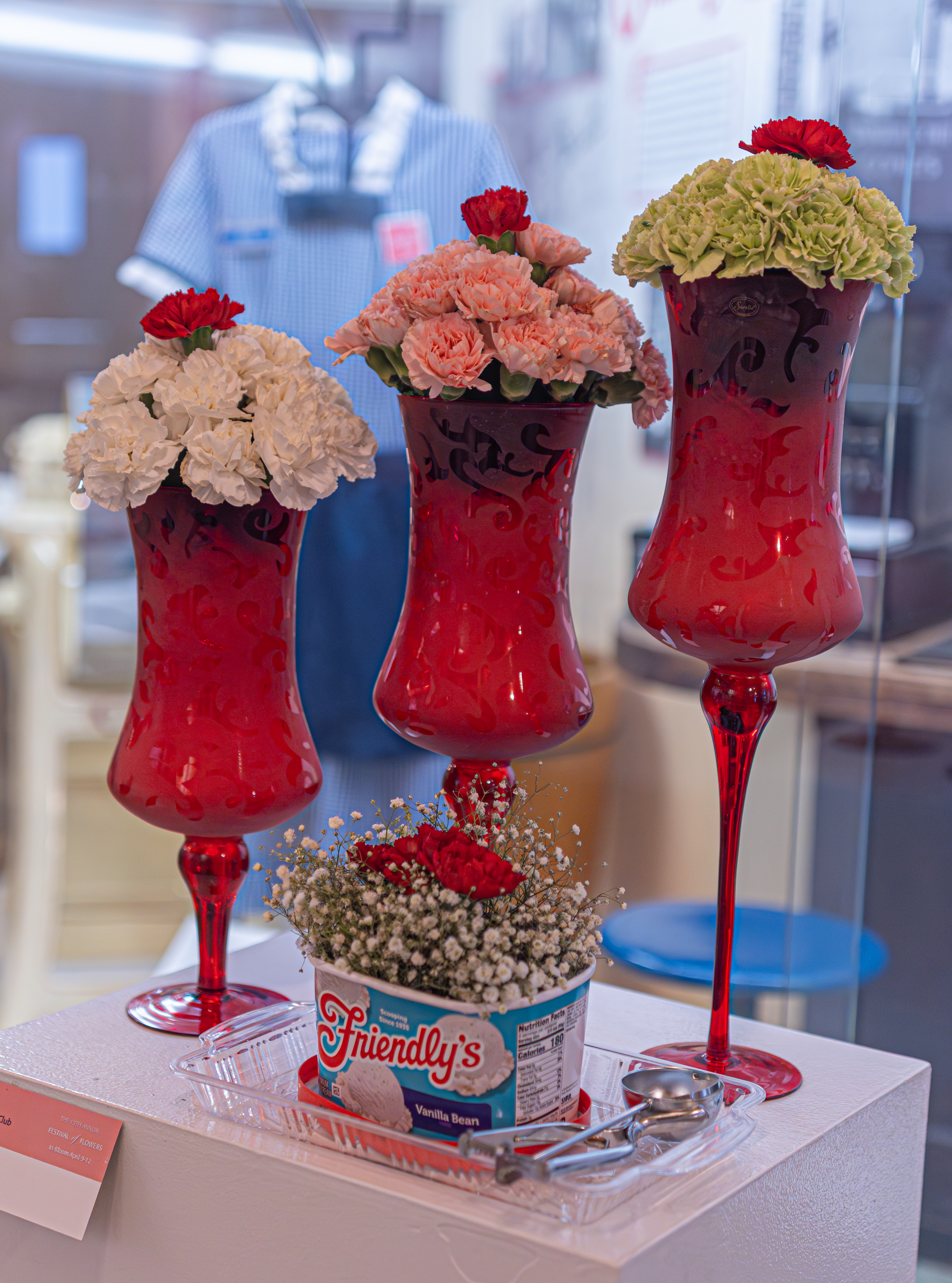
If you’re thirsty looking for all these arrangements and works of art, you can always have an ice cream of flower float. Friendly’s was founded in Springfield, MA, in 1935 and it has had a presence in many Massachusetts cities and towns, particularly western MA, although many of them have since closed.

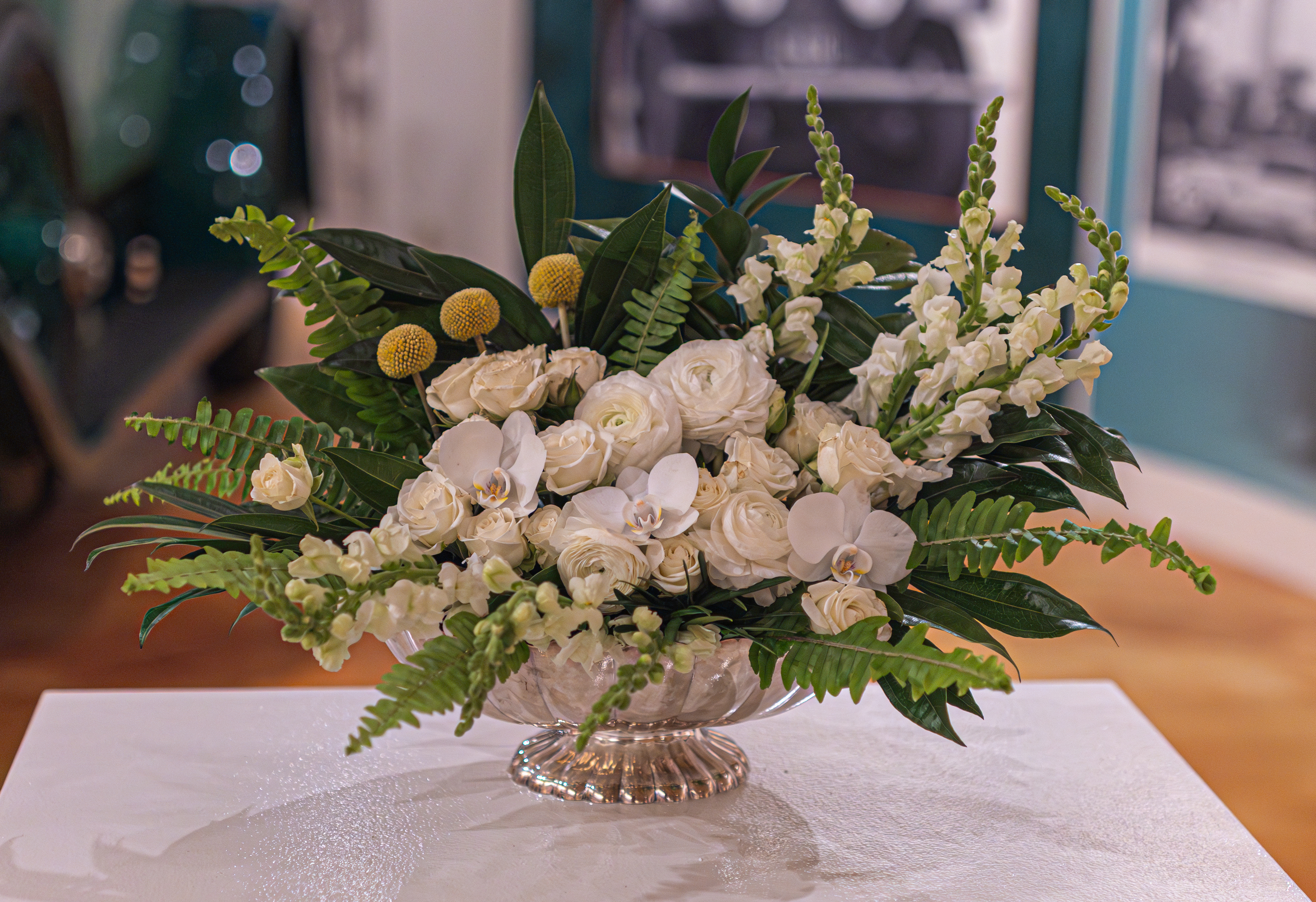
Kate Sobo fittingly from Gardeners on the Green made this arrangement based on my car. I’m kidding, of course. The arrangement is based on a 1928 Rolls-Royce Phantom I on display at the museum. The arrangement reflects the automobile’s deep greens, polished finishes and elongated, graceful lines. With ivory blooms set against structured greenery, it intends to evoke the quiet luxury of the late 1920s English countryside, channeling the atmosphere a Great Gatsby garden party – timeless, refined and subtly extravagant.

As you can see, flower arrangements can take many shapes and forms. Somewhat surprisingly, they can also make us nostalgic and make us think.


Roots | Raíces (Salem, MA)

Date Of Visit: September 28, 2025

Location: Peabody St, Salem, MA

Cost: Free

Parking: There is both metered parking and parking garages and lots in the area.

Summary: 17 new works of art adorn the walls on Peabody St in the “punto” area of Salem, MA

Salem, MA, is a diverse community . And the “El Punto” (“The Point”) neighborhood is proof of this diversity. Comprised largely of Latinx and other new immigrants, El Punto is the sight of many art projects by the Punto Urban Art Museum (PUAM), a program of North Shore Community Development Coalition.

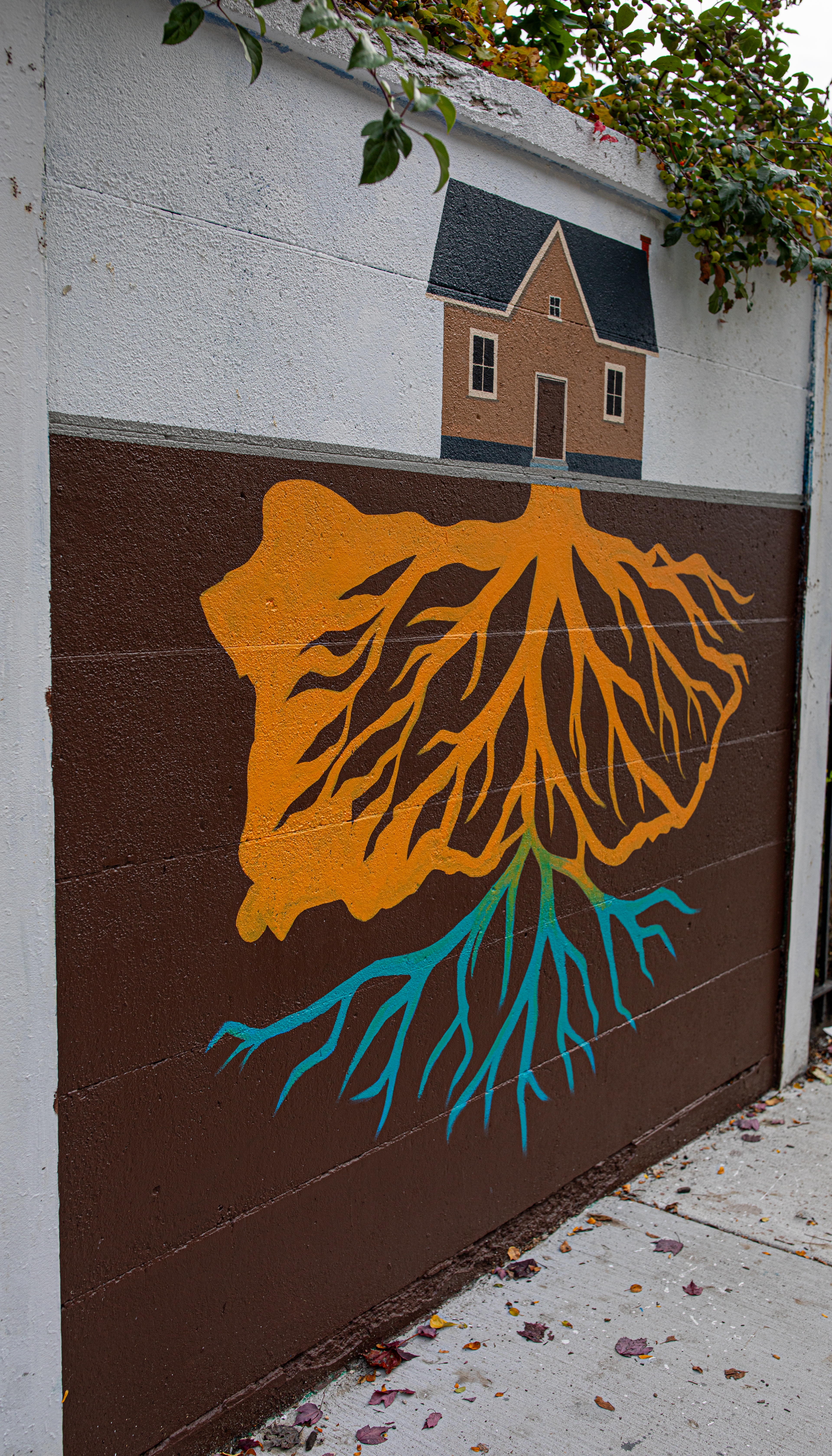
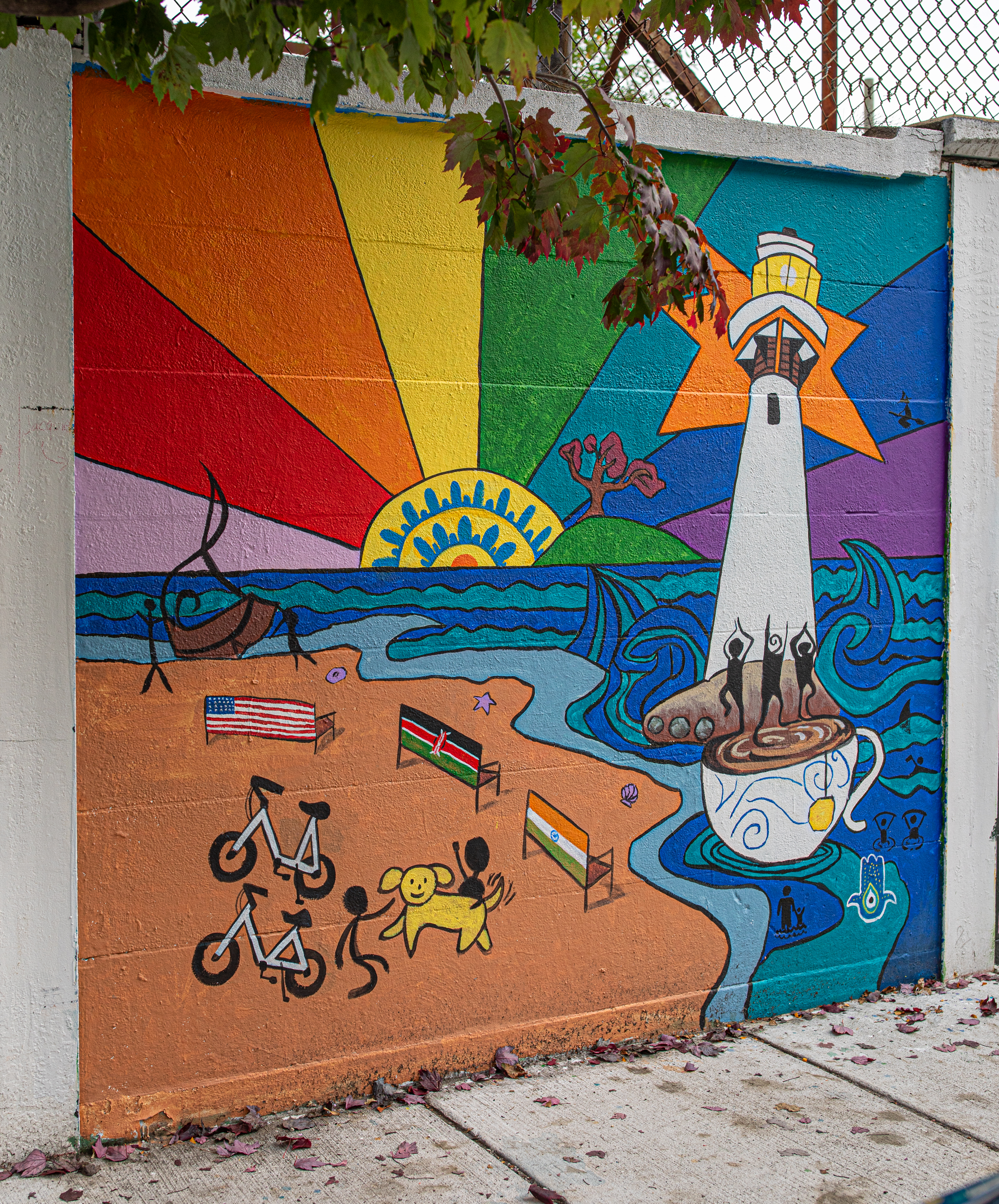
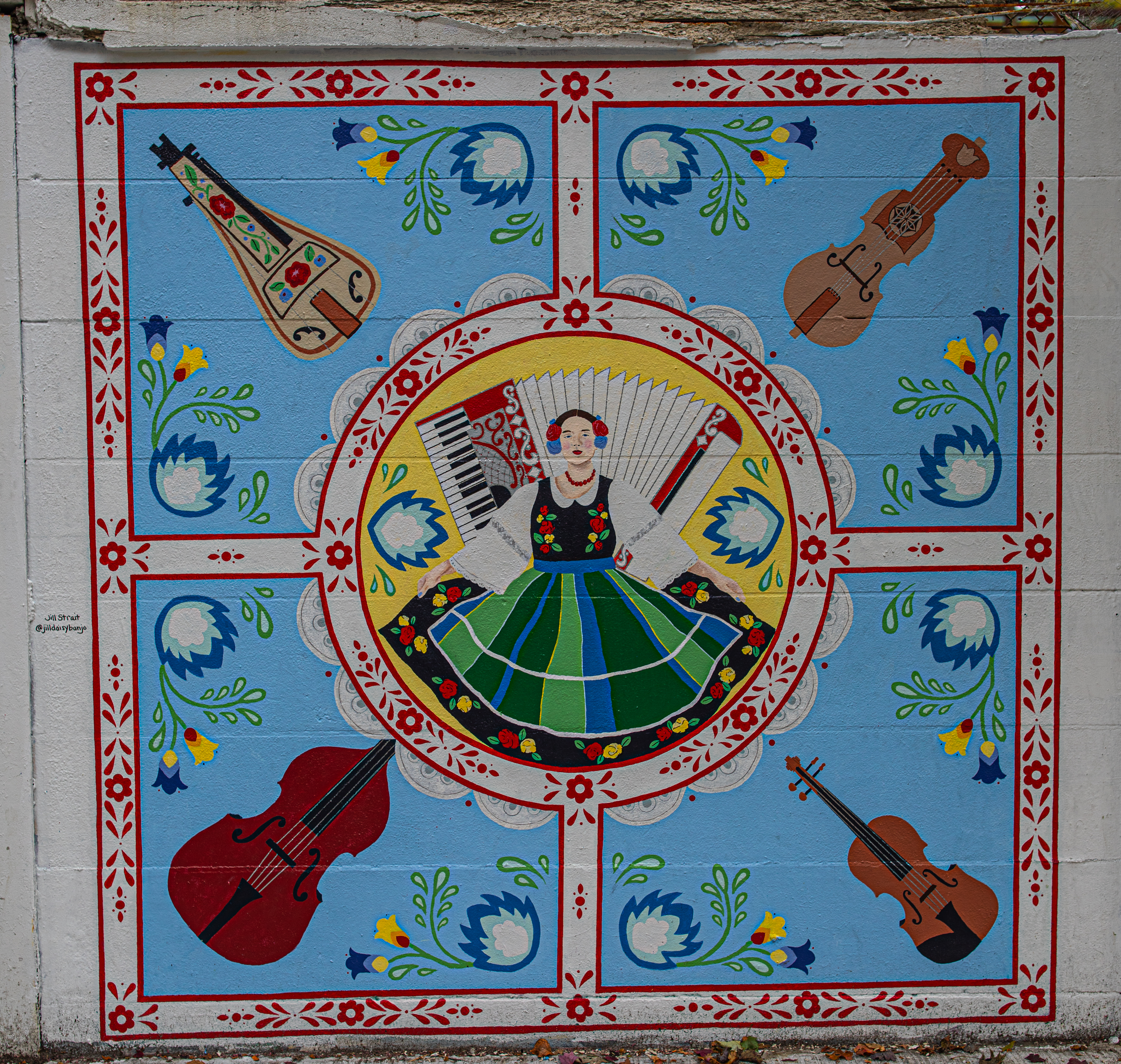
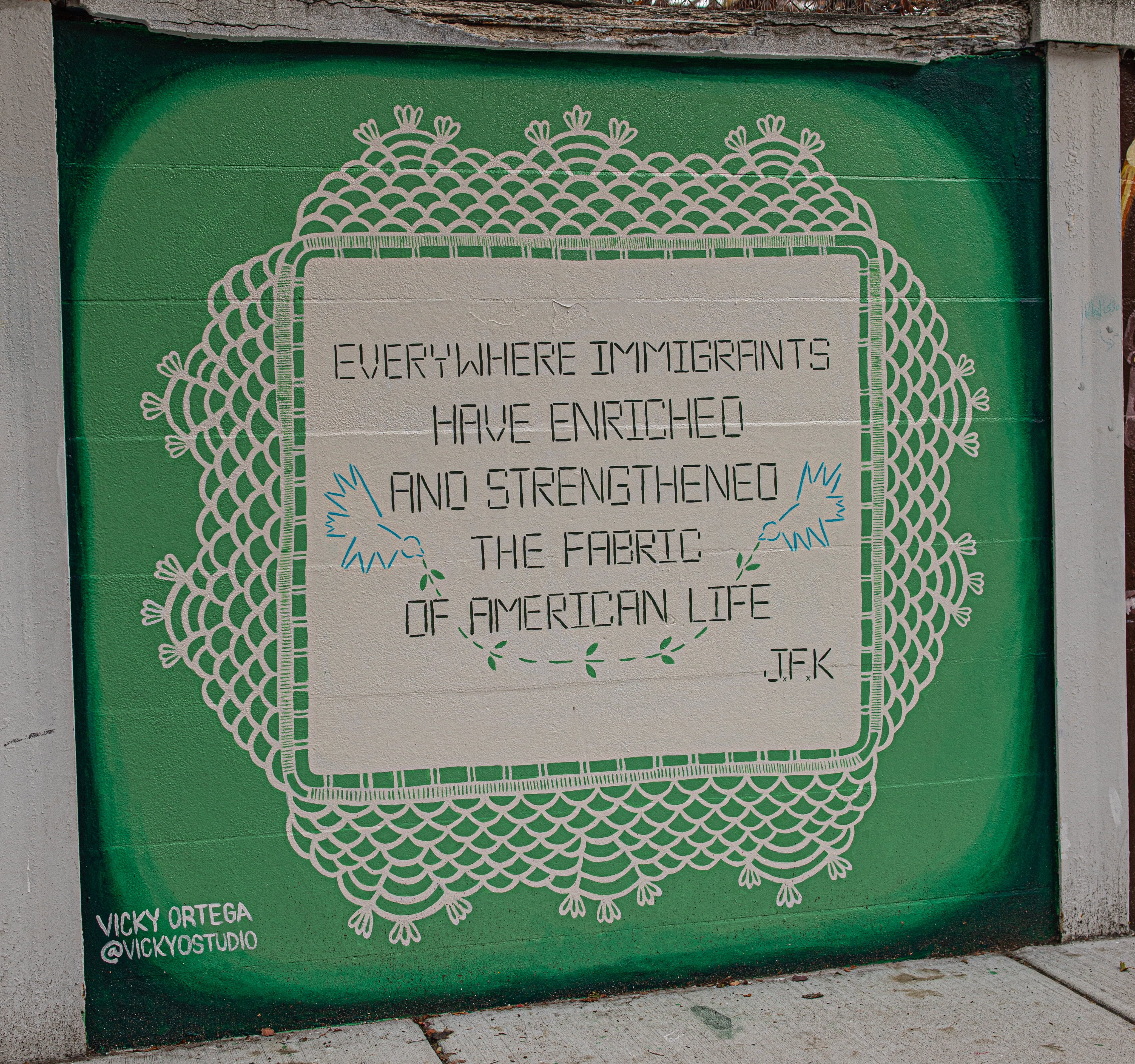
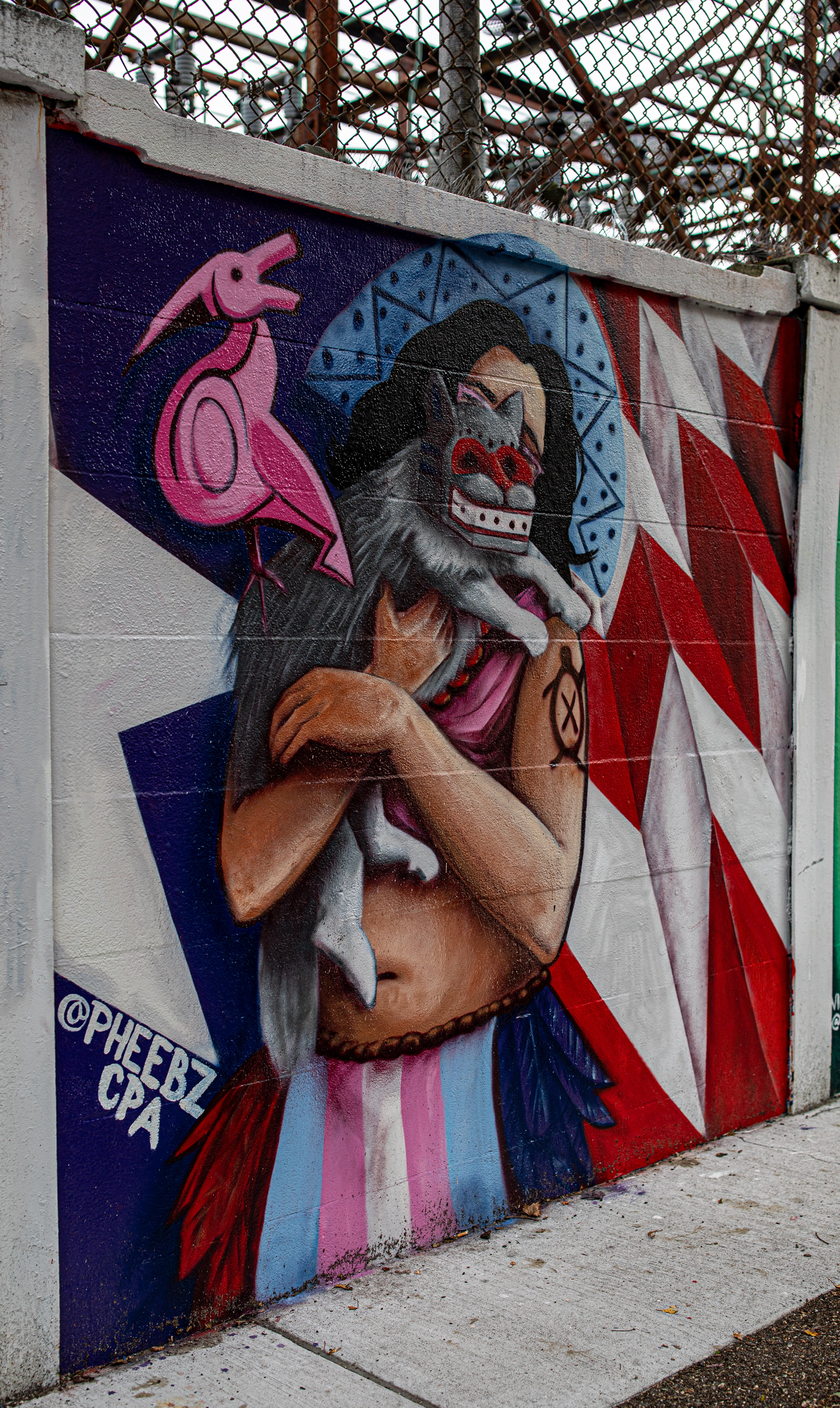
The Roots/Raices mural art project is meant to reflect on the layered histories of place and people. The aim of the project is to honor both the original inhabitants and the newer generations who have made Salem home.

The project, which is presented in partnership with Salem 400+, Salem Maritime National Historic Site, and the Peabody Essex Museum, unites arts, history, and community to honor Salem’s past while envisioning its future. Selected artists received a $1,000 stipend to create 8-by-8-foot mural works that will become part of PUAM’s semi-permanent outdoor collection. Artists were asked to share their stories and to seek out and bring together their different experiences and beliefs.

These murals are usually painted every year or few years. In fact, I photographed the last group of murals there which were part of a project called A Dream Called Home. The works of art do not have titles. But, most of the artists left their Instagram or other contact info in the artwork.

From the Old Salem Depot, the old Salem train that used to run through the center of the city, to the famous lighthouse (Fort Pickering Light) and the trolley which takes its passengers past all of the historical sites in Salem, some of the works of art pay tribute to parts of Salem and its history.


Muñeca Sin Rostro (Palmer Cove Park, Salem, MA)

Dates Of Visit: June 29 and Sep. 20, 2025

Location: Palmer Cove Park, 38 Leavitt St, Salem, MA (about 40 minutes northeast of Boston, MA)

Cost: Free

Universally Accessible: Yes

Dog Friendly: Yes

Parking: There is a small parking lot at the park for about 7 cars. There is also local on street parking and several parking lots and garages in the area.

Website: Muñeca Sin Rostro

Summary: 7 “faceless dolls” (Muñeca Sin Rostro) have been installed at Palmer Cove Park and Pioneer Terrace, Salem, MA. And, a special path has been installed to view the statues and reflect.

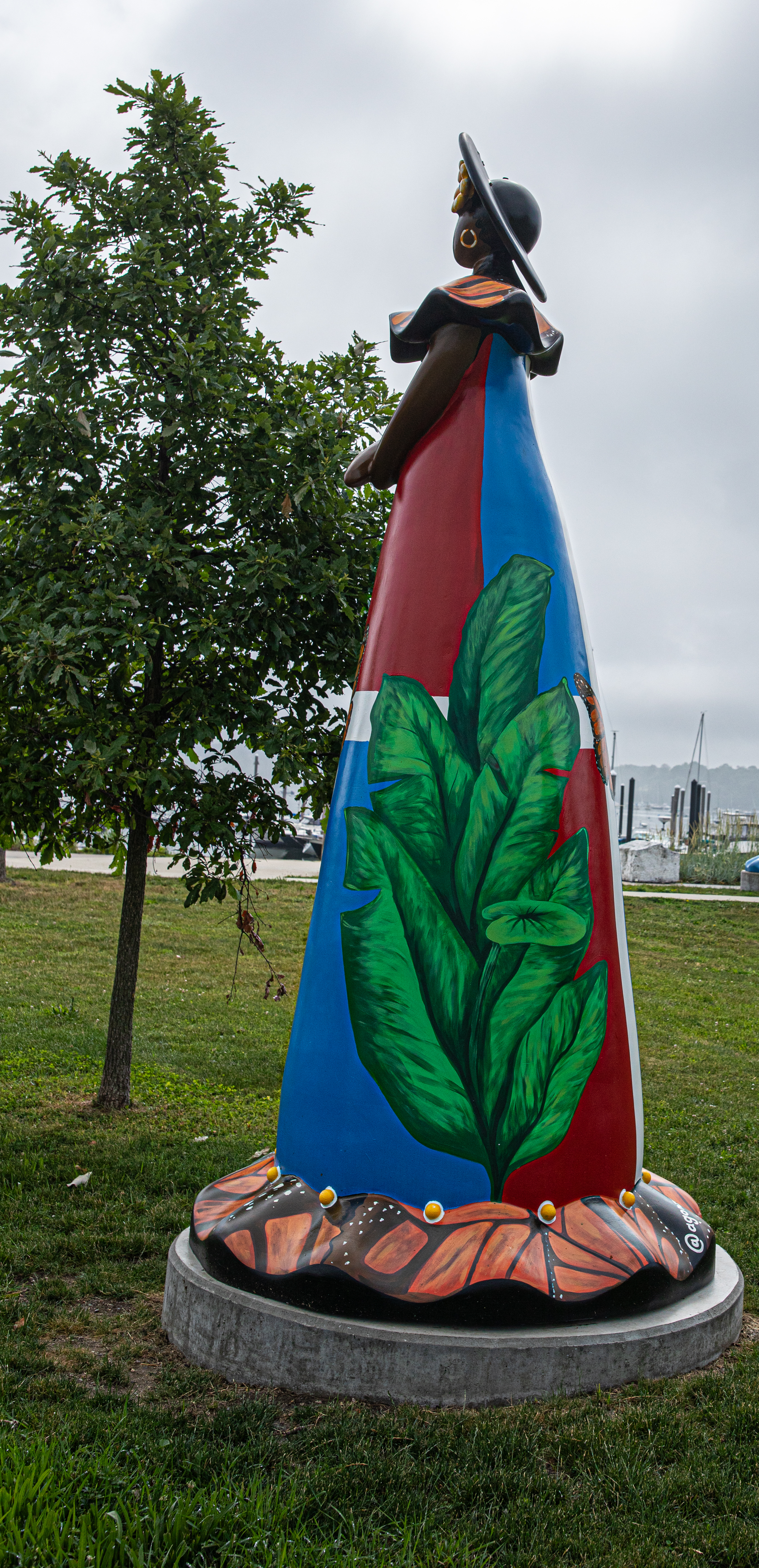
The Punto Urban Art Museum (PUAM) have found a way to mix art with an education. The seven 12 foot fiberglass statues were painted by a group of artists who used the statues for expression and storytelling.

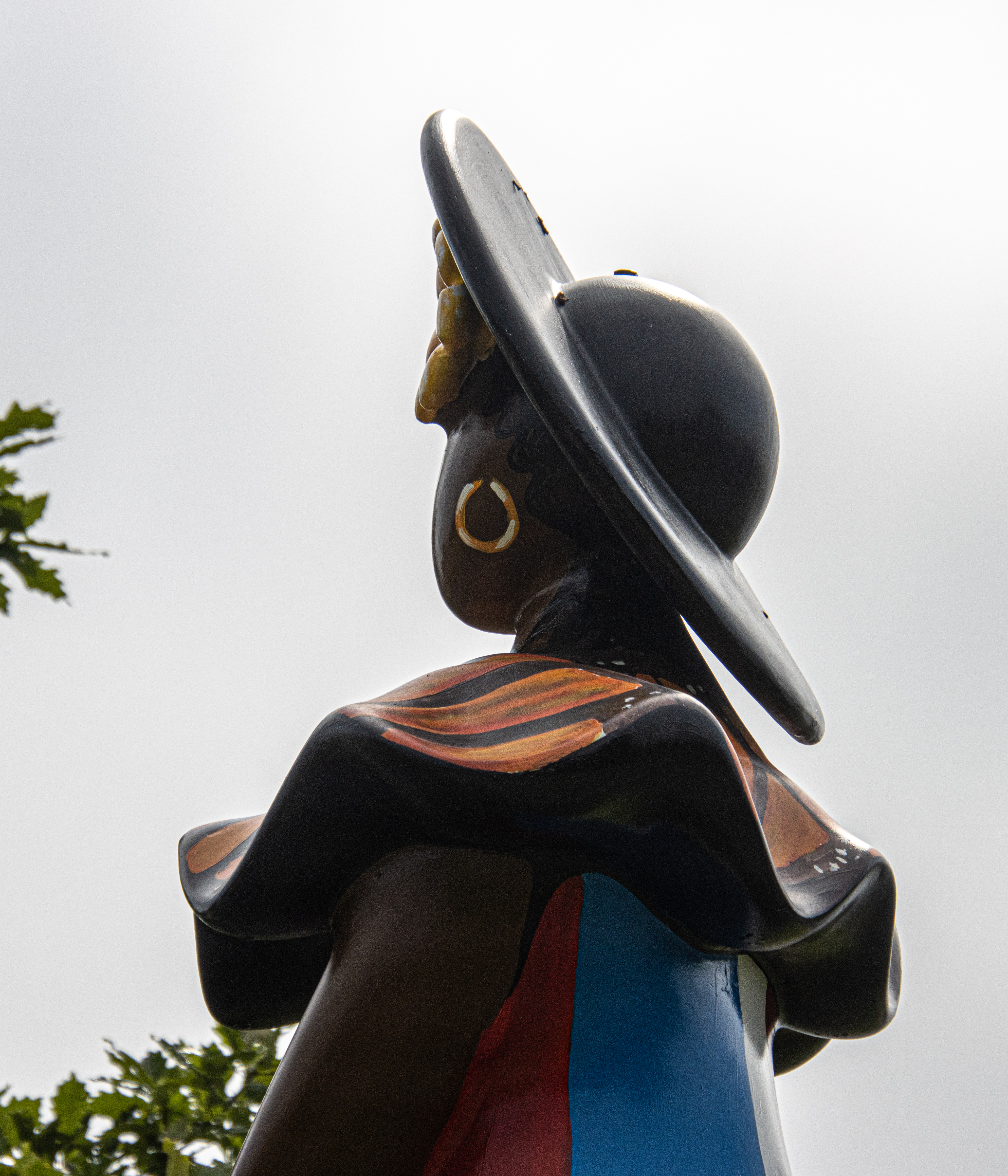
The ceramic Muñeca Sin Rostro (“faceless dolls”) were originally created by Liliana Mera Lime in 1981. Liliana, a pottery worker in the town of Moca, a province in the Dominican Republic, wanted to depict a small figure of a woman. However, she lacked the tools and molds to make a small ceramic figure. This would prove to be a blessing in disguise. The doll was handcrafted by hand on a potter’s wheel with elements like ruffles, baskets and hats and one distinct feature, or lack of a feature. The dolls all had a head with no facial features. These full-sized dolls, which were originally smaller figurines, have been replicated with each artist’s interpretation and messages.

There are 7 statues at Palmer Cove Park. I did have a hard time finding the 7th one on my list. In fact, I had to make 2 visits to find them all. So, don’t forget to go to the area by the public garden to find them all!

Another special part of the park is a walkway that was installed earlier this year as a memorial to those lost from Covid-19.

Salem

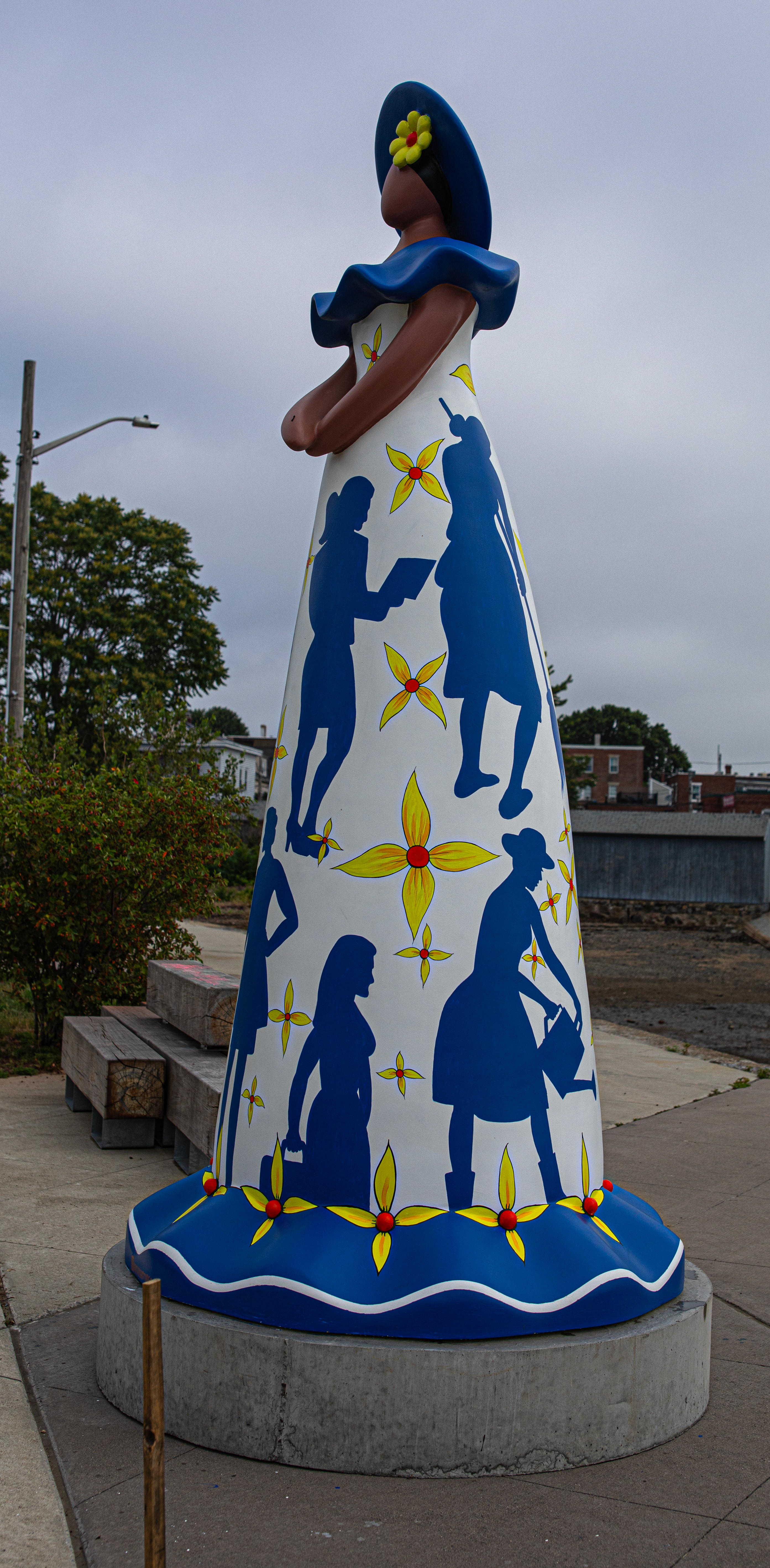
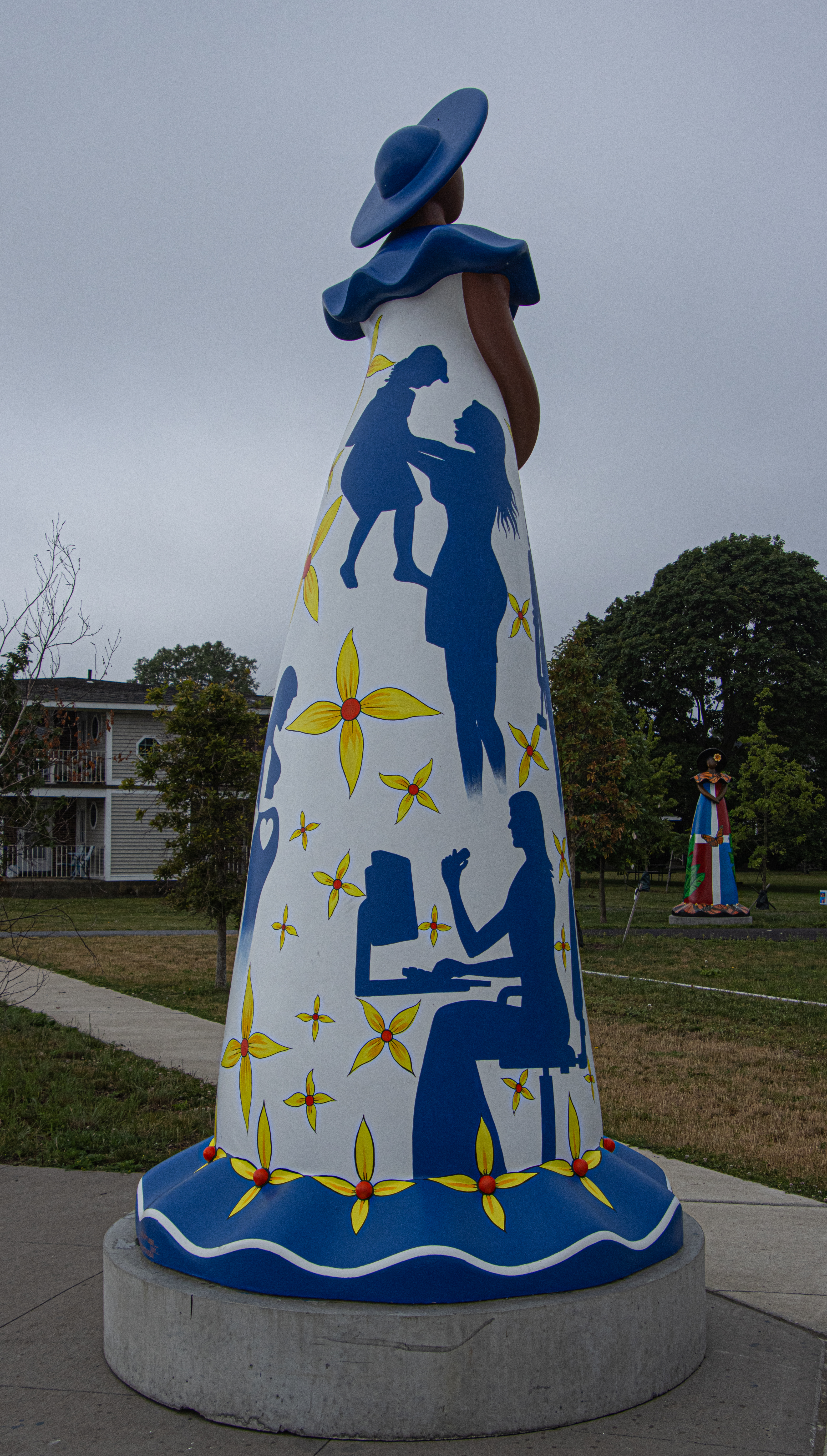
The first Muñeca Sin Rostro is fittingly called “Salem.” Created by painter and sculptor Ramon Santiago, a native of the city of Moca, Espaillat province in the Dominican Republic, “Salem” is a representation of the city bearing the statue’s name. Ramon said his work of art is dedicated to the hardworking people of Salem. Examples of the hardworking people of Salem can be found not only in elements of people working at a job, in their yards and, most importantly, with their families. The various bold colors are meant to represent how diverse and vibrant the city is.

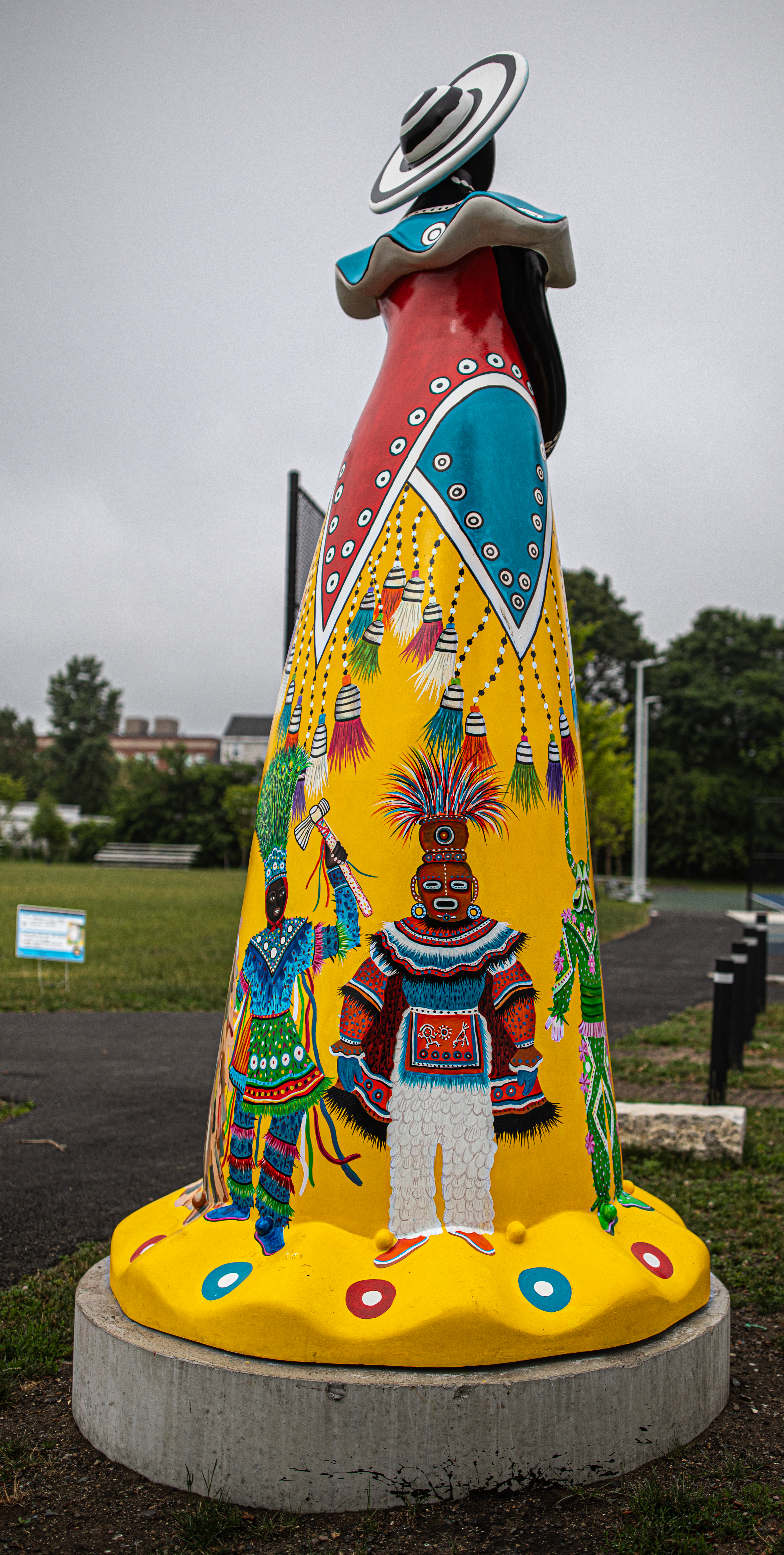
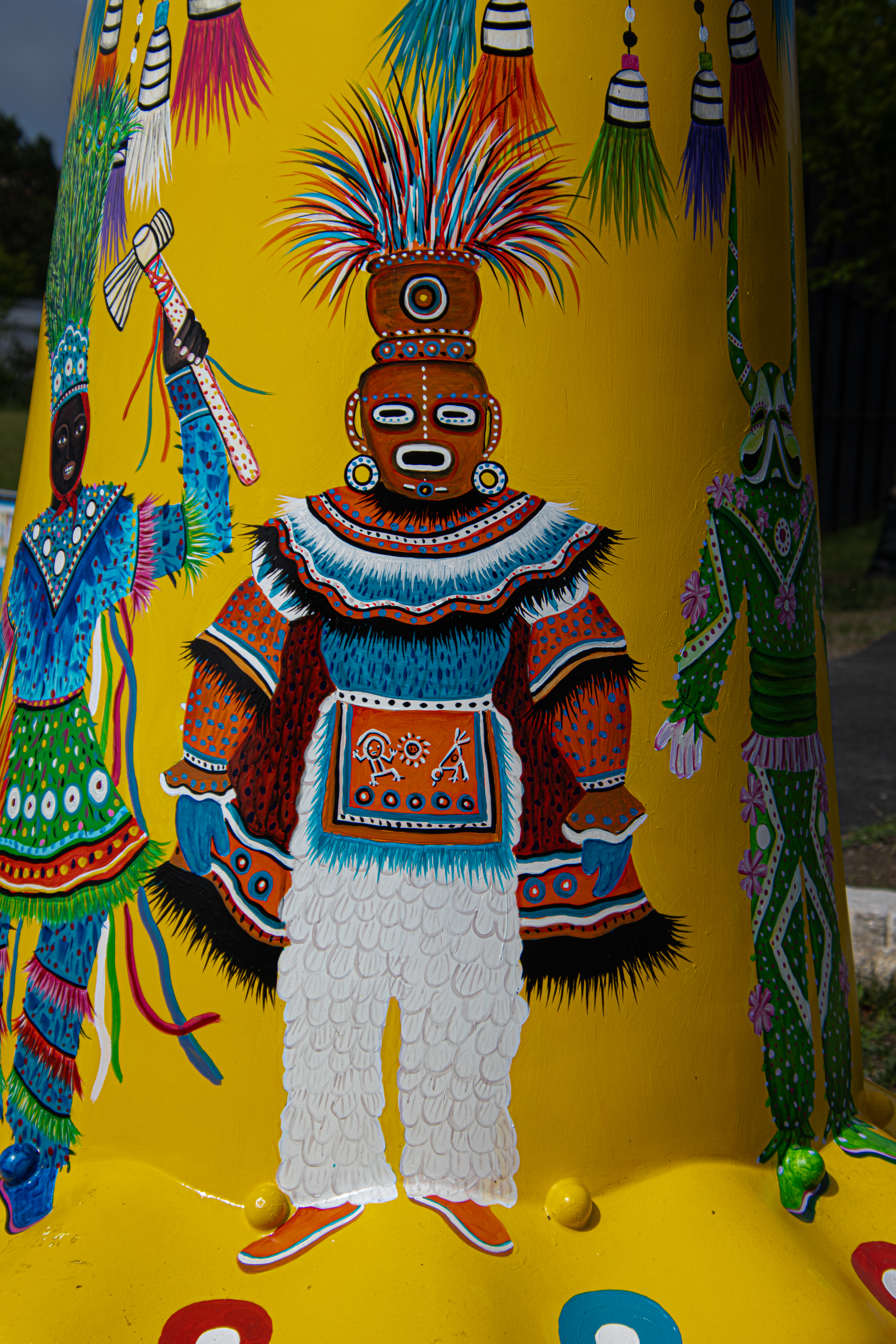
Los Ninos Y El Carnaval

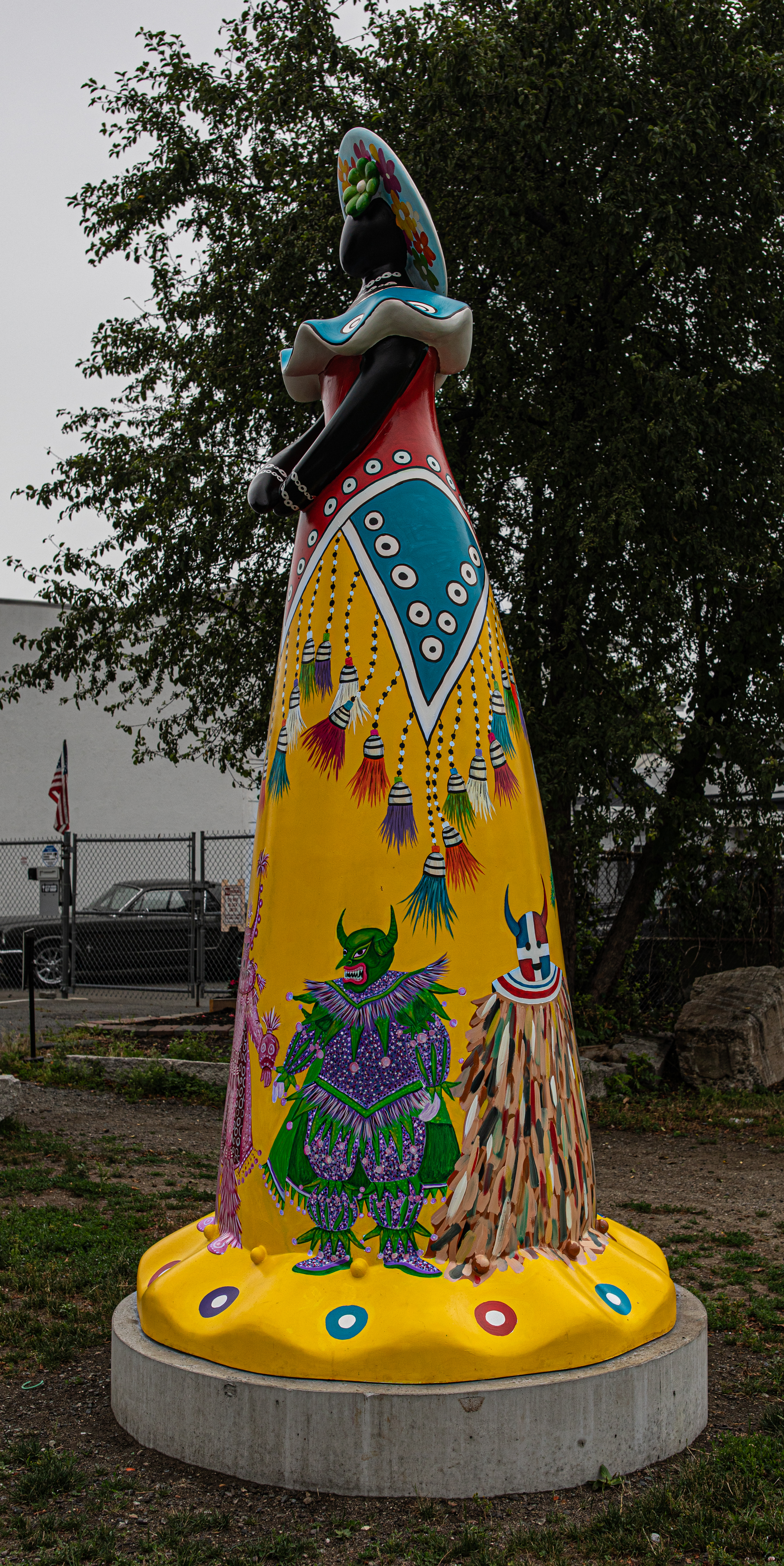
“Los Ninos La Carnaval” represents children and their participation in the Dominican Republic’s carnival. The statue, made by Luis Rivera, a native of San Cristobal, displays the most representative costumes from different regions of the country: the Lechones of Santiago, the Ecol Devils of San Cristóbal, the Devils of La Vega, the Plátanus of Cotuí, and the Taimácaros of Puerto Plata, among others. The flowers represent the joy of the Dominican people. The flowers symbolize the diversity and racial mix that define us as a nation which is a fusion of Indigenous, African, and Spanish heritage. A graduate of the Universidad Autónoma de Santo Domingo and the Escuela de Diseño de Altos de Chavón, Luis has developed a versatile artistic style that spans sculpture, stained glass, jewelry, and carnival costumes. Luis is the co-creator of Urbelconica, a project that has helped reimagine the traditional Muñeca sin Rostro, beloved Dominican symbol of resilience and shared heritage, into large-scale public sculptures brought to life through the talent of many Dominican artists.

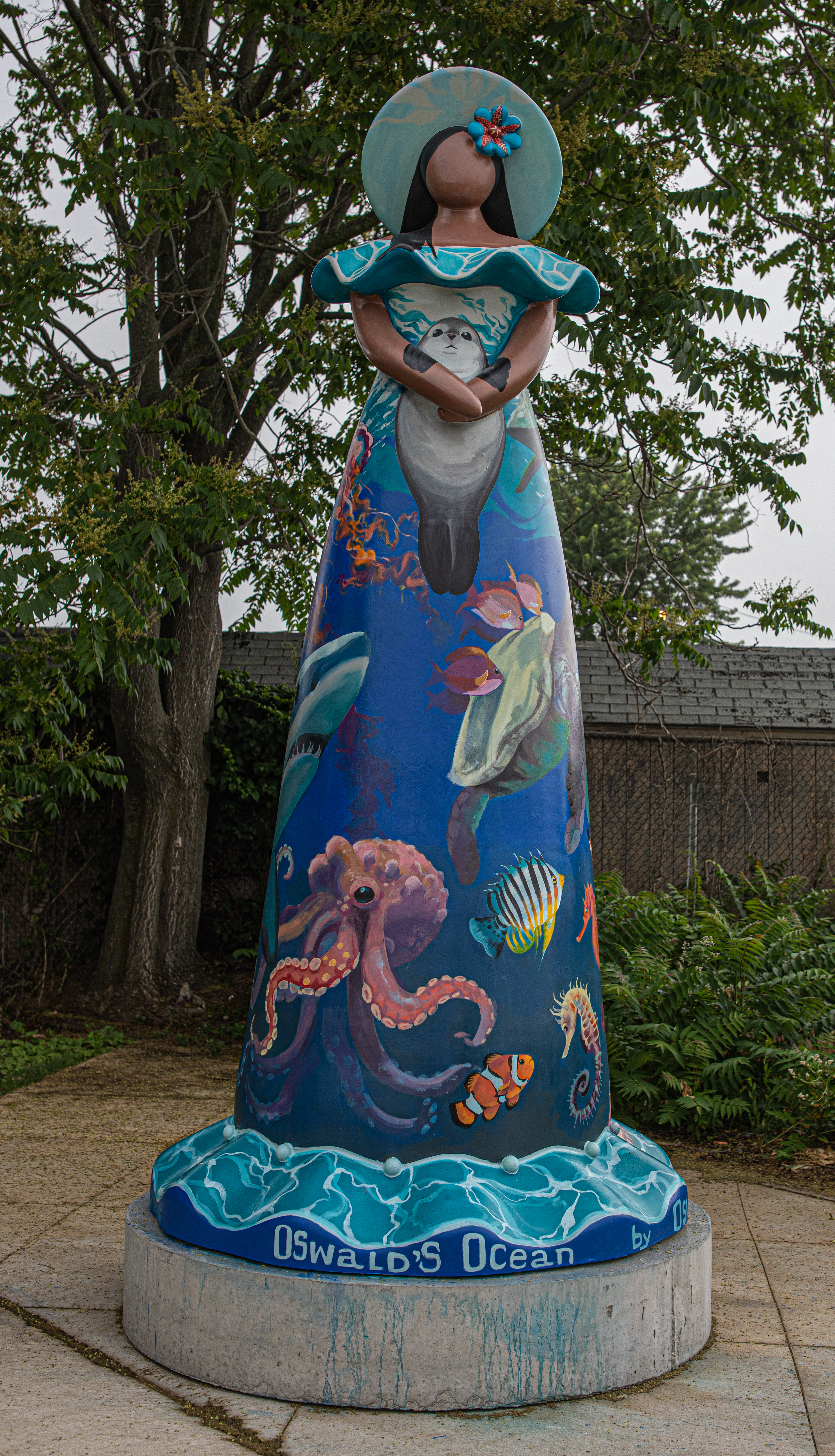
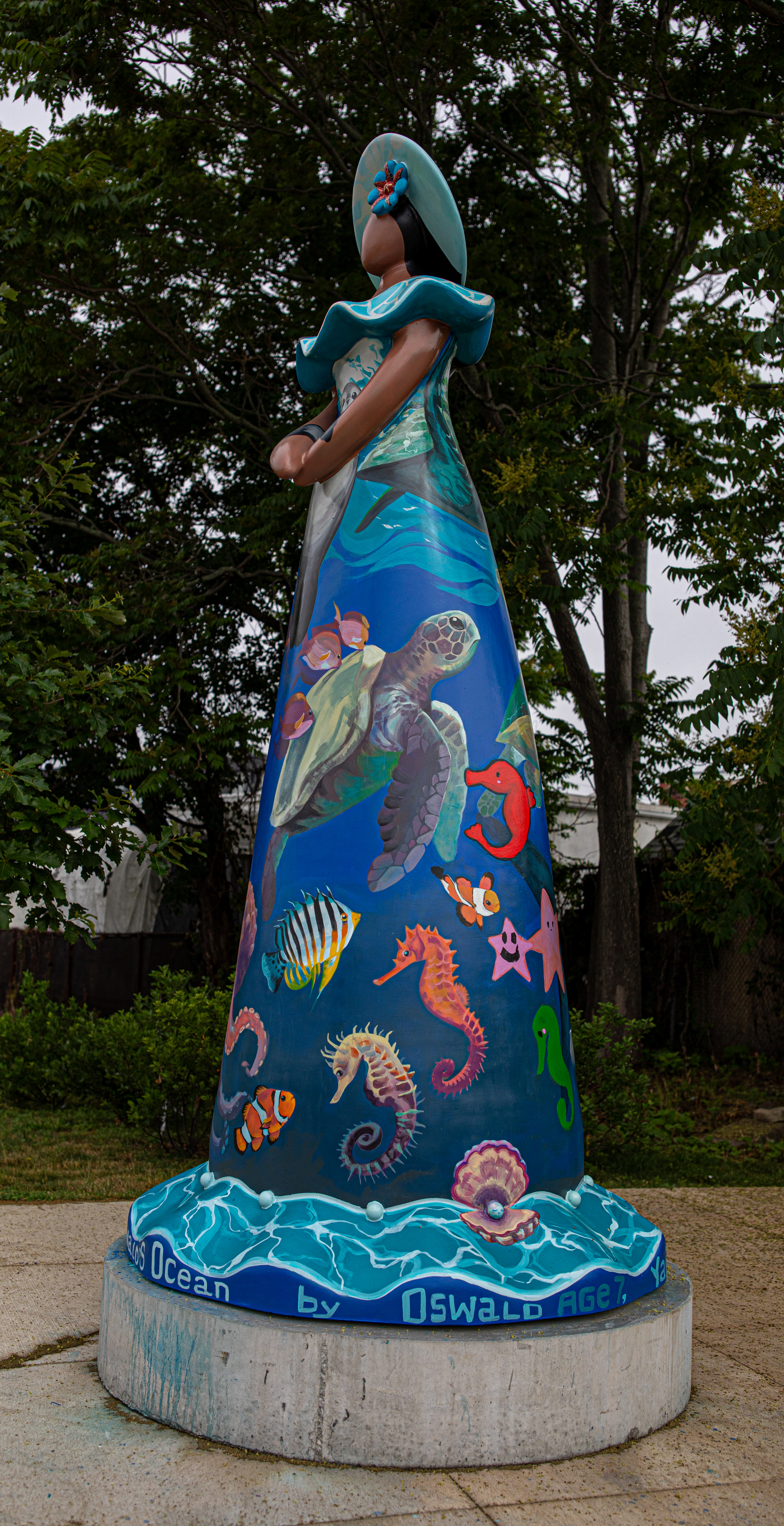
Oswald’s Ocean

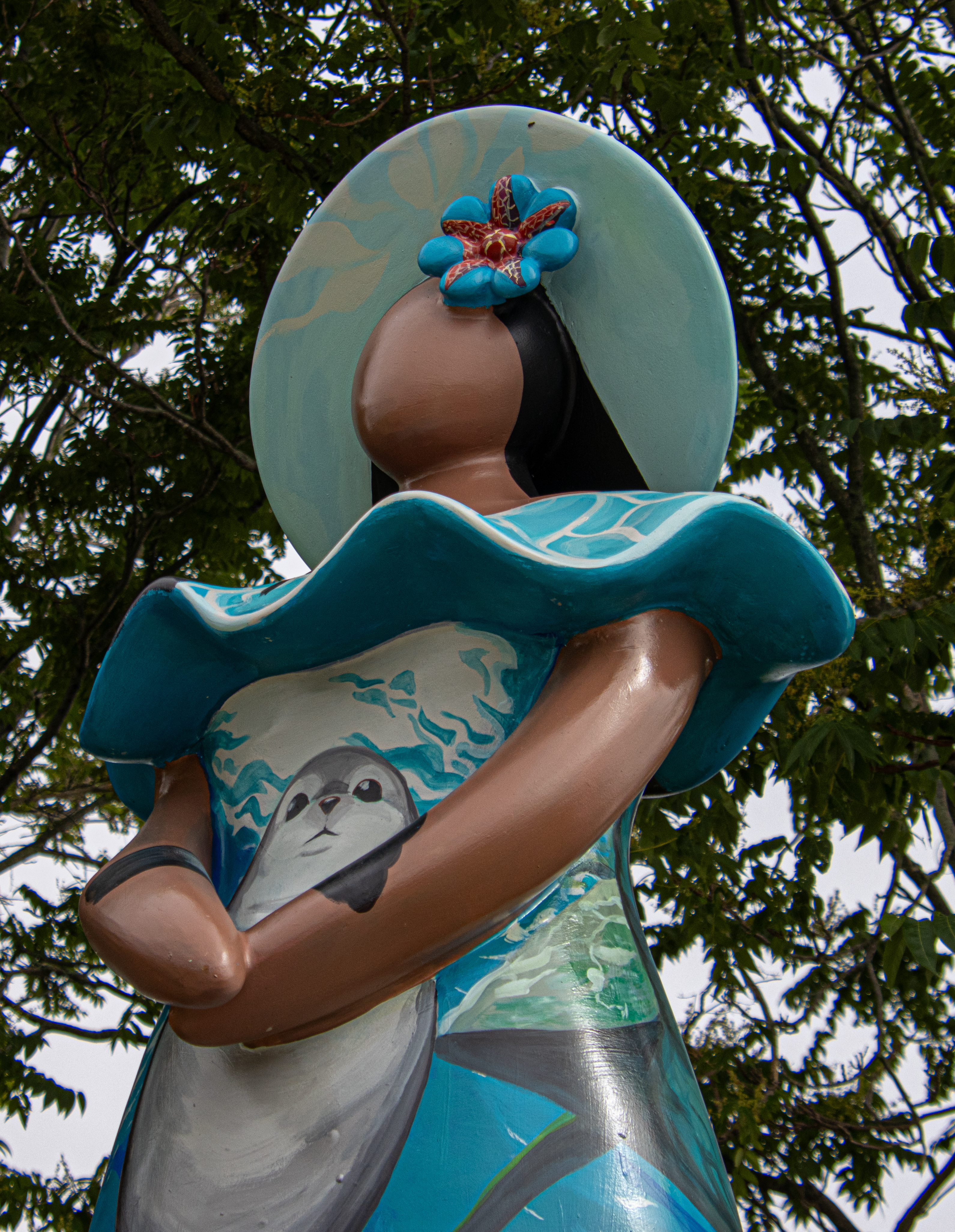
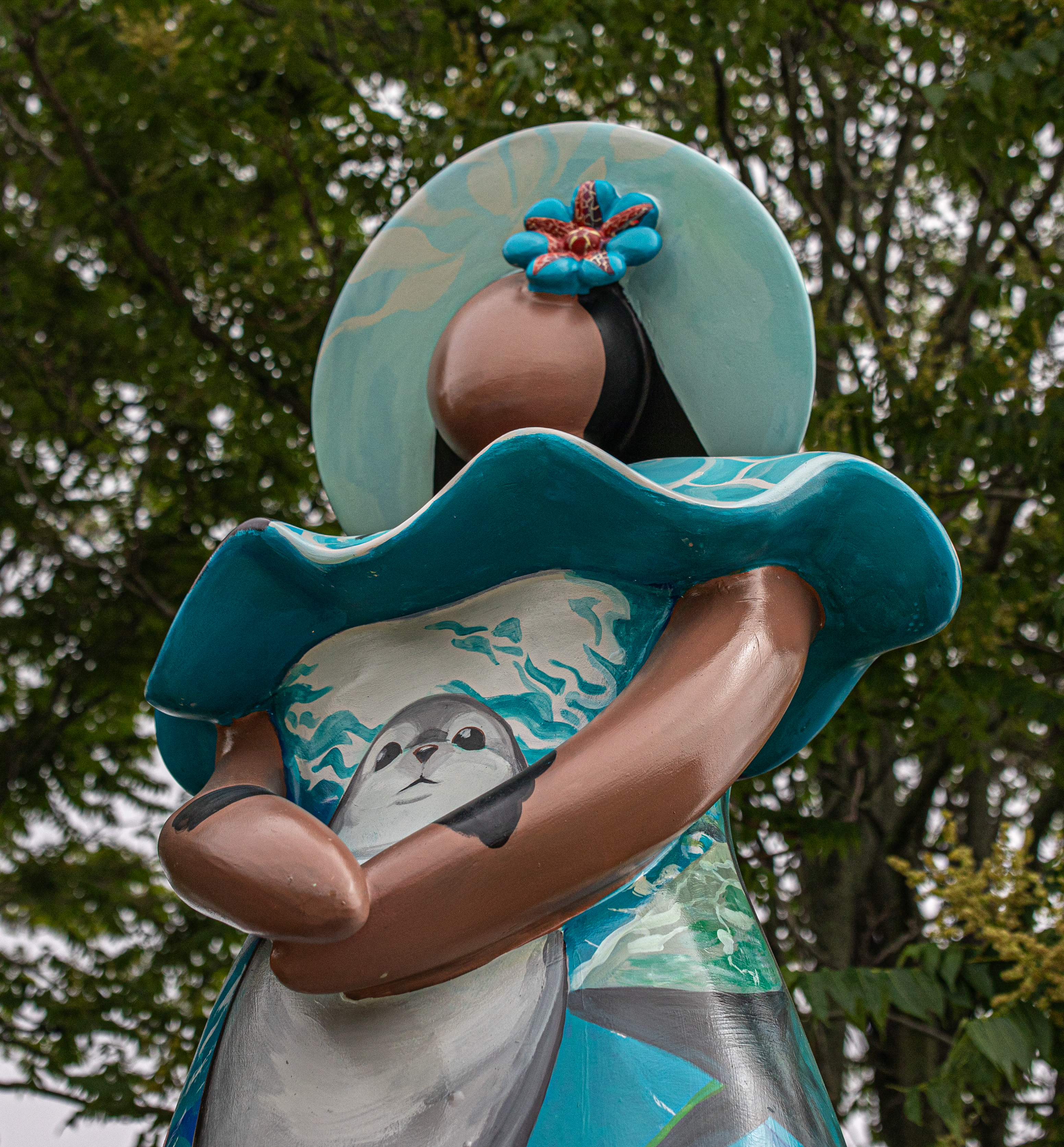
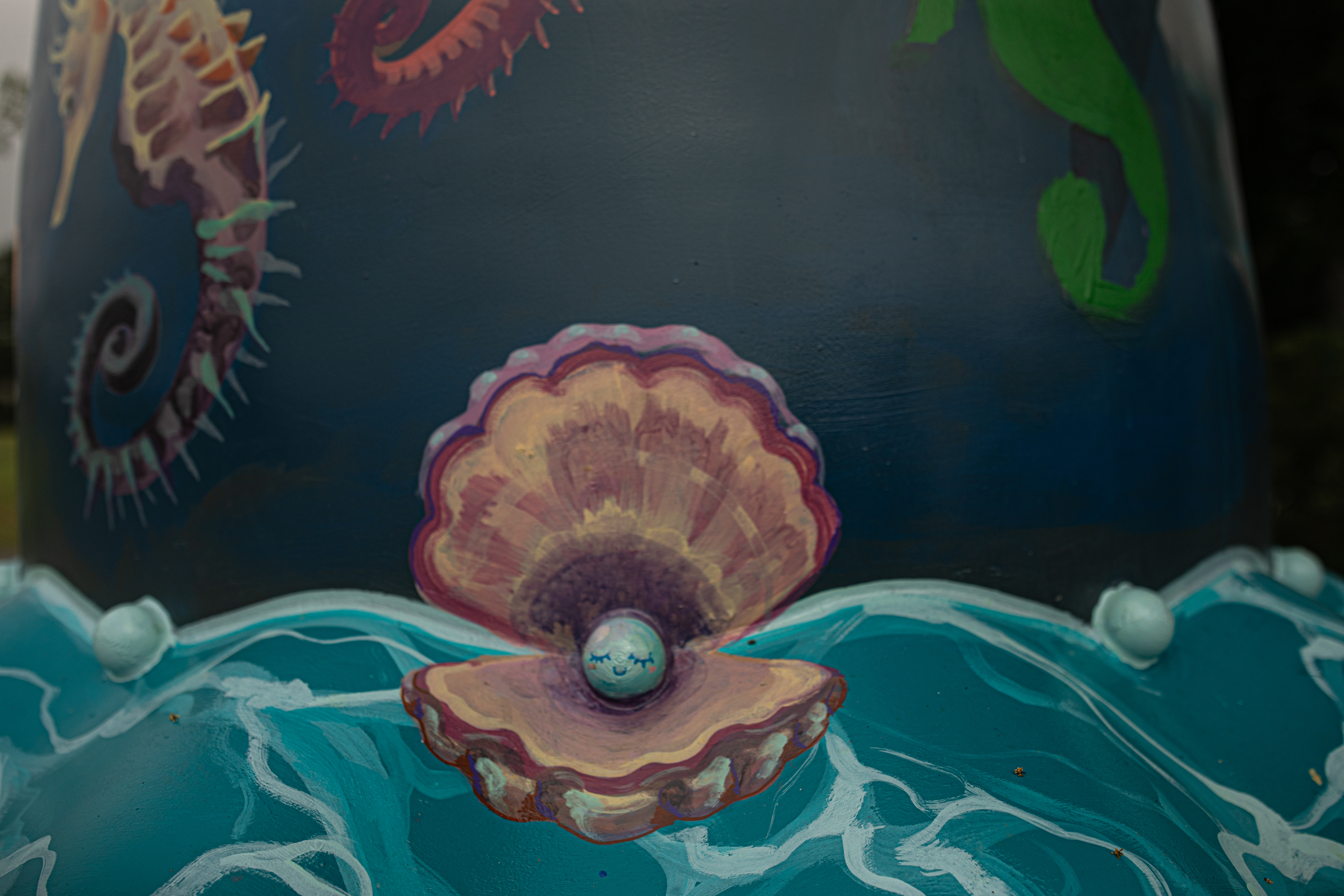
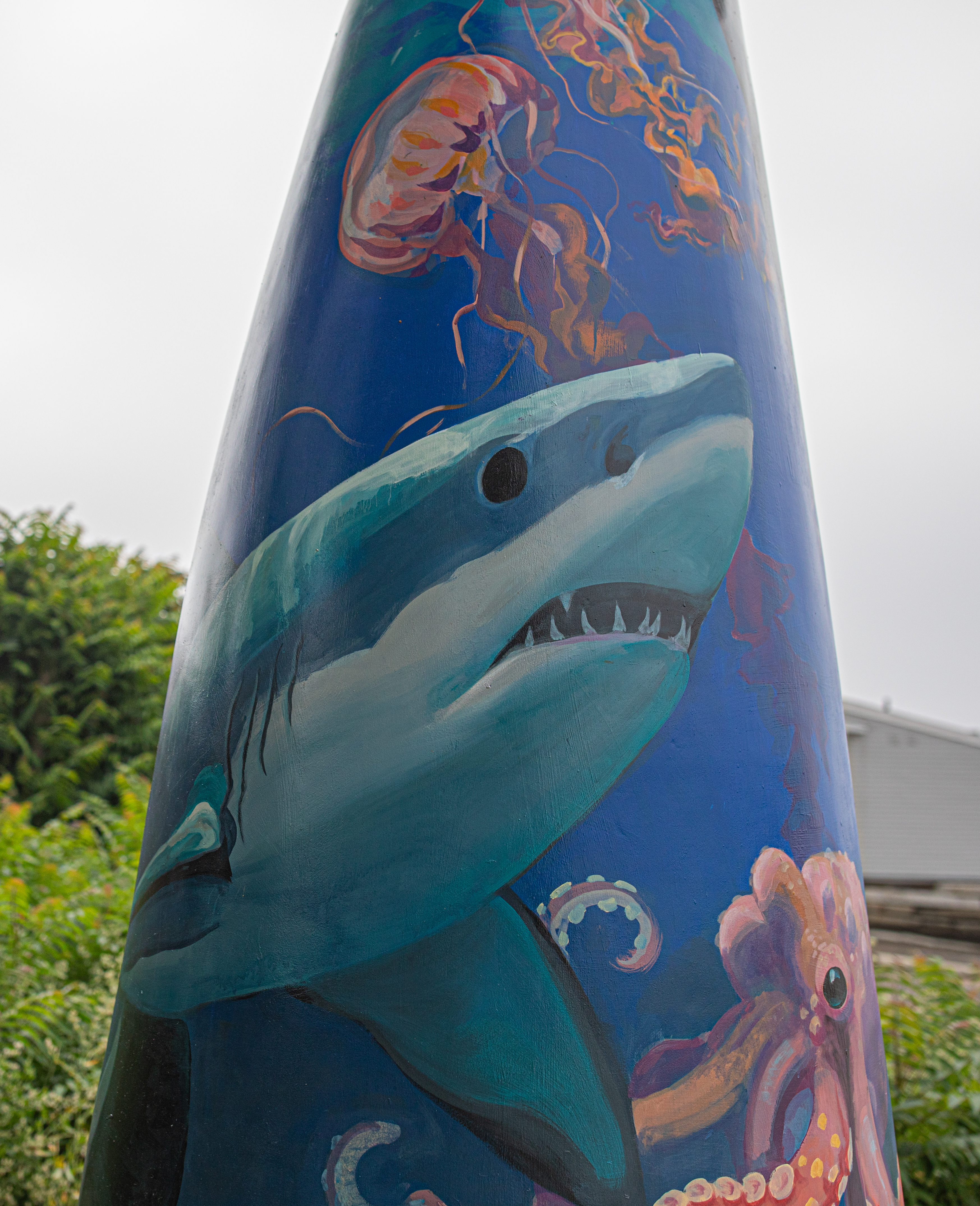
“Oswald’s Ocean” was created, or at least conceived, by a 4 year old; Oswald. The artist, Yixuan Zeng, was captivated while reading Oswald’s design for the doll. Yixuan said the faceless doll designs reminded him of Chinese porcelain figures. Yixuan was inspired by Oswald’s passion for the color blue and sea life. He enjoyed making the sea creatures Oswald had described and envisioned the dress as being a dynamic sea scene beneath the waves.

Oswald said he is 4 years old and loves the color blue and sea life. Oswald did contribute beyond designing it. He added blue glitter to the hat.

Mariposa Cibaeña

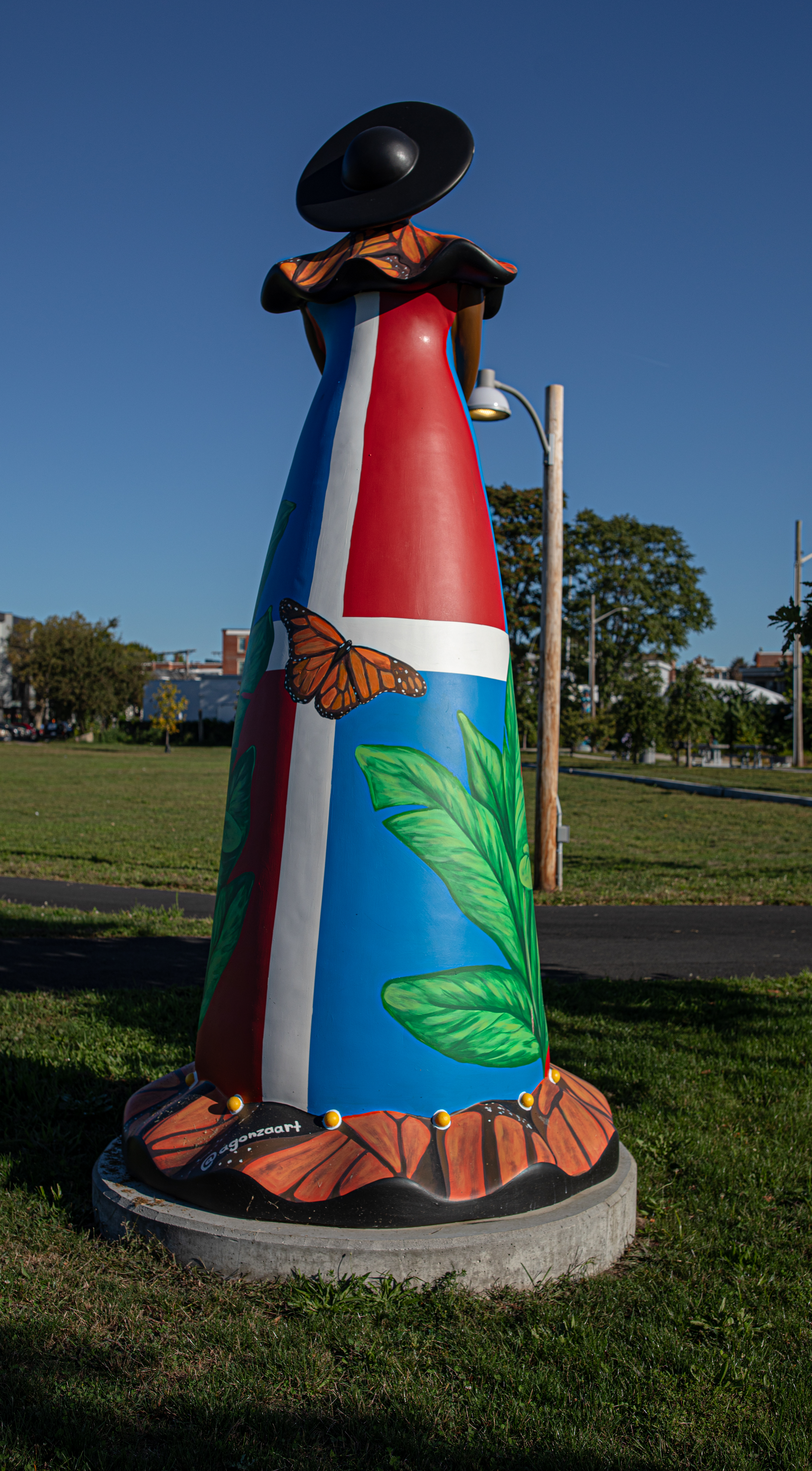
Angela Gonzalez, a Dominican artist, wanted to highlight Las Hermanas Mirabal (more commonly known as the “Butterfly Sisters”), the sisters who fought for women’s rights. They were the only women who stood up to the last Dominican dictator. Angela chose to feature the Dominican flag as the main background design. She also added the national plants and, of course, a butterfly.

Angela said her doll represents the flavors, music and nature of the Dominican Republic, The bottom of the dress is made from plantain leaves which were used to make pasteles en hojas, a leaf-wrapped plantain pocket. You may have to look closely, particularly at the bottom of the statue, to see other objects that represent the Dominican Republic such as tropical plants such as coconut, bananas, sugar cane and eggplant. Musical instruments and other foods are also included.

Harmony

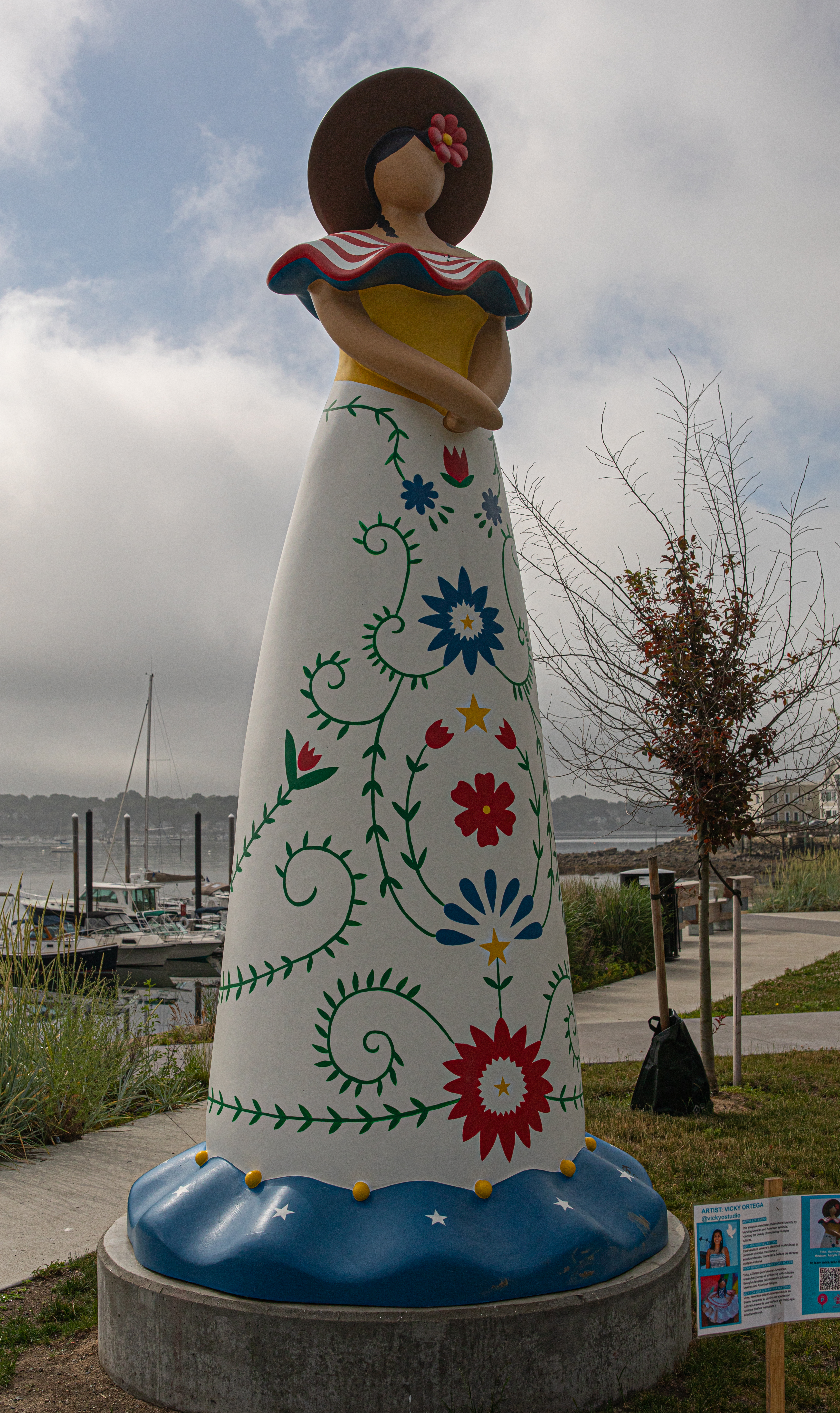
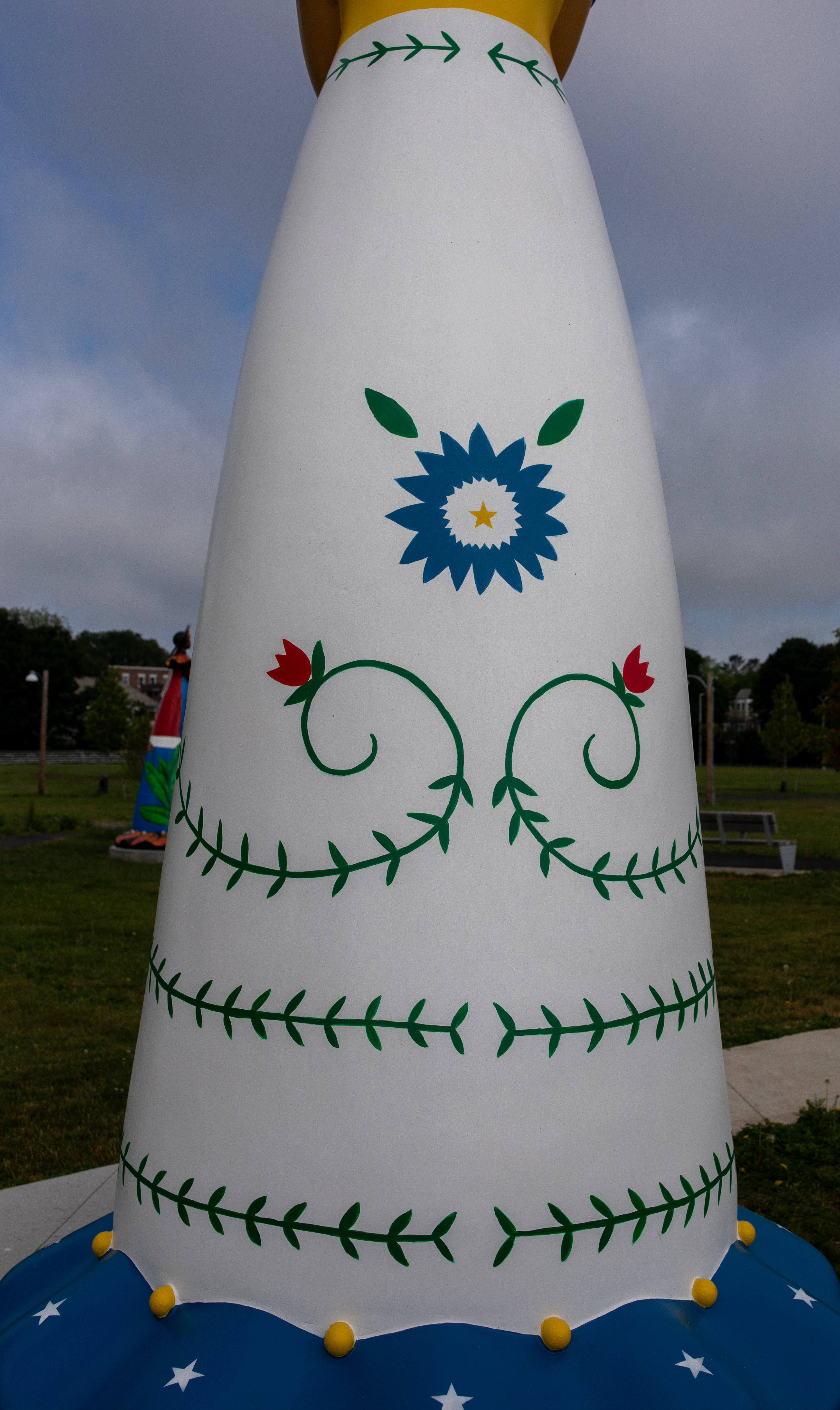
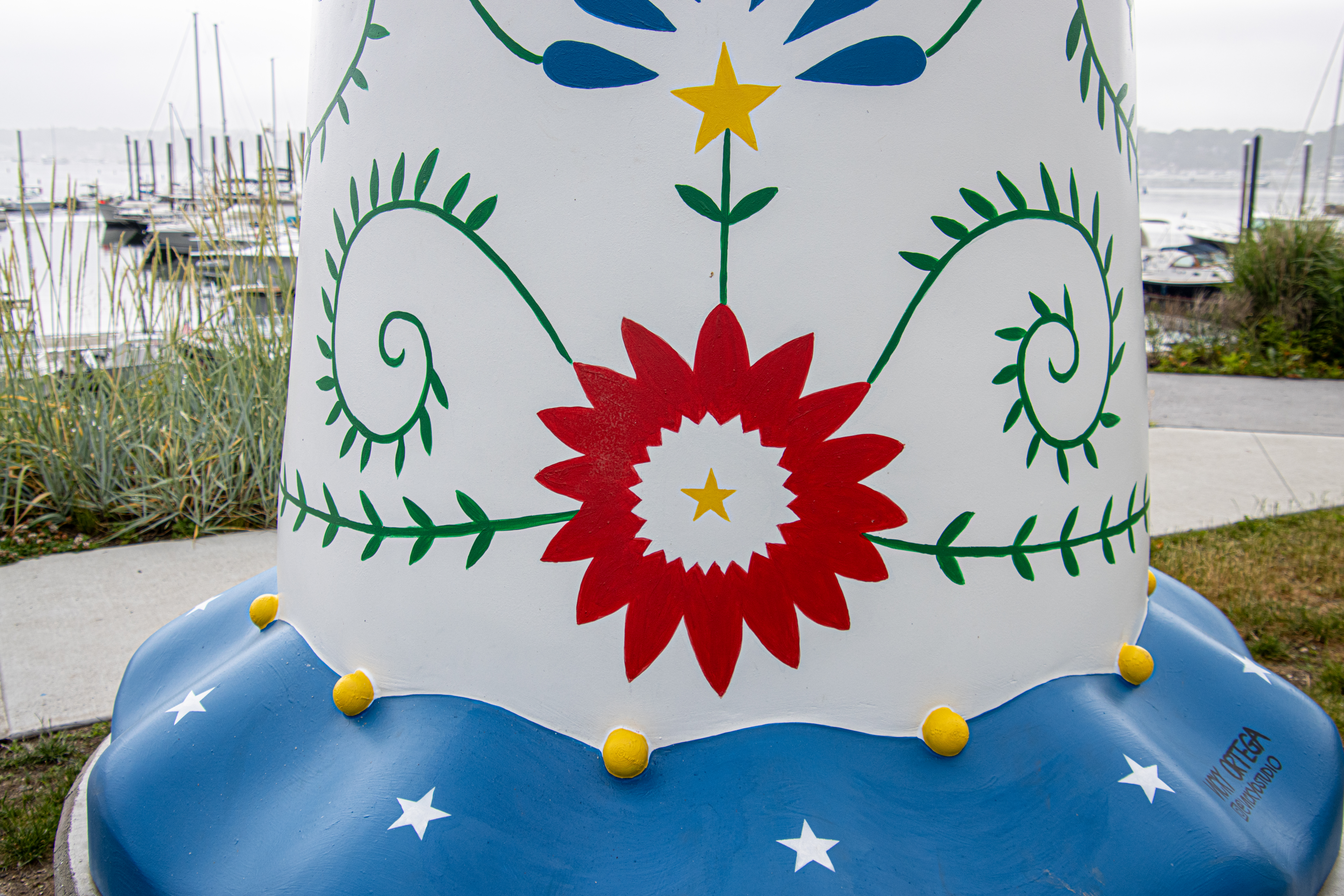
The artist for this statue, Vicky Ortega, said her doll was meant to serve as a celebration of those who represent the multiple cultures and as an homage to the strength of our multicultural community. The statue illustrates her own cultural blend by combining traditional Mexican dress embroidery with features of the American flag. Vicky wanted to express the strength of a new identity that draws from multiple traditions.

As a Mexican-American, Vicky often felt she didn’t belong in either culture. However, over time she learned to embrace both her heritage and nationality which helped shape who she is.

Lift Each Other Up

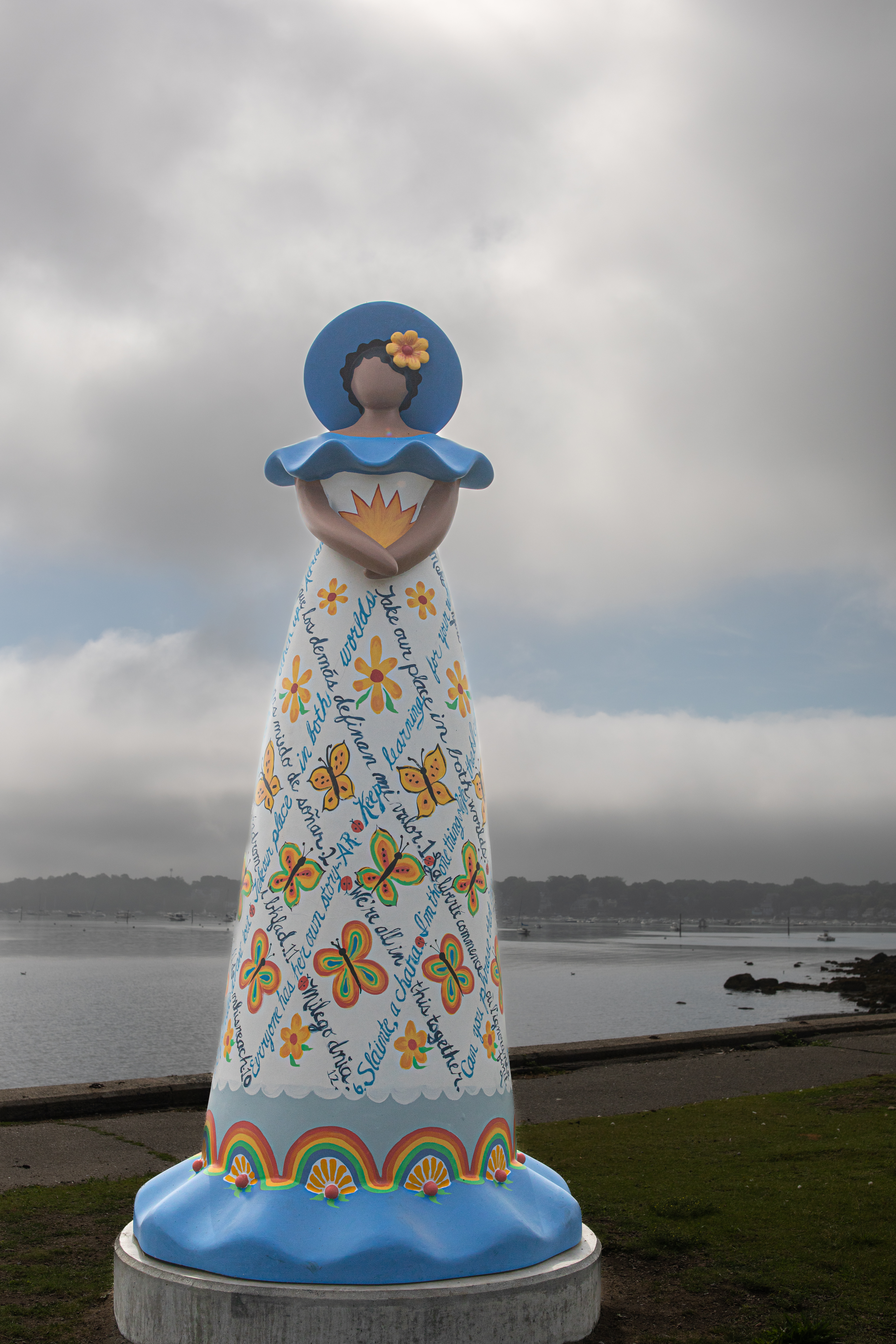
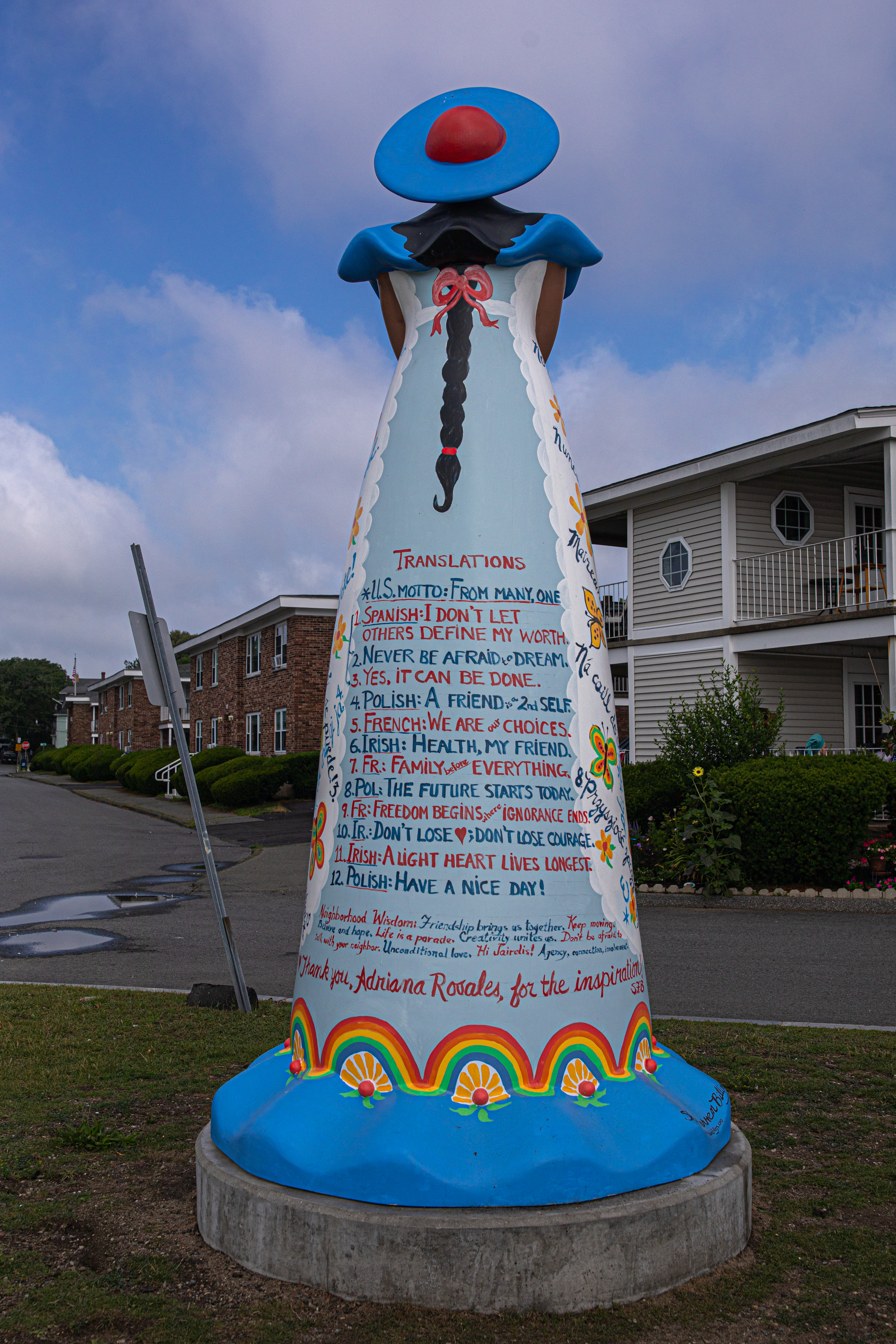
Created by Sheila Farren Billings, My Muñeca, “Lift Each Other Up”, is meant to express how language can either divide us or bring us together. Sheila says it is up to us to use language wisely and well. Sheila included quotes from remarks that neighbors made at a meeting about the project, with translations of course.

La Reyna De La Cosecha

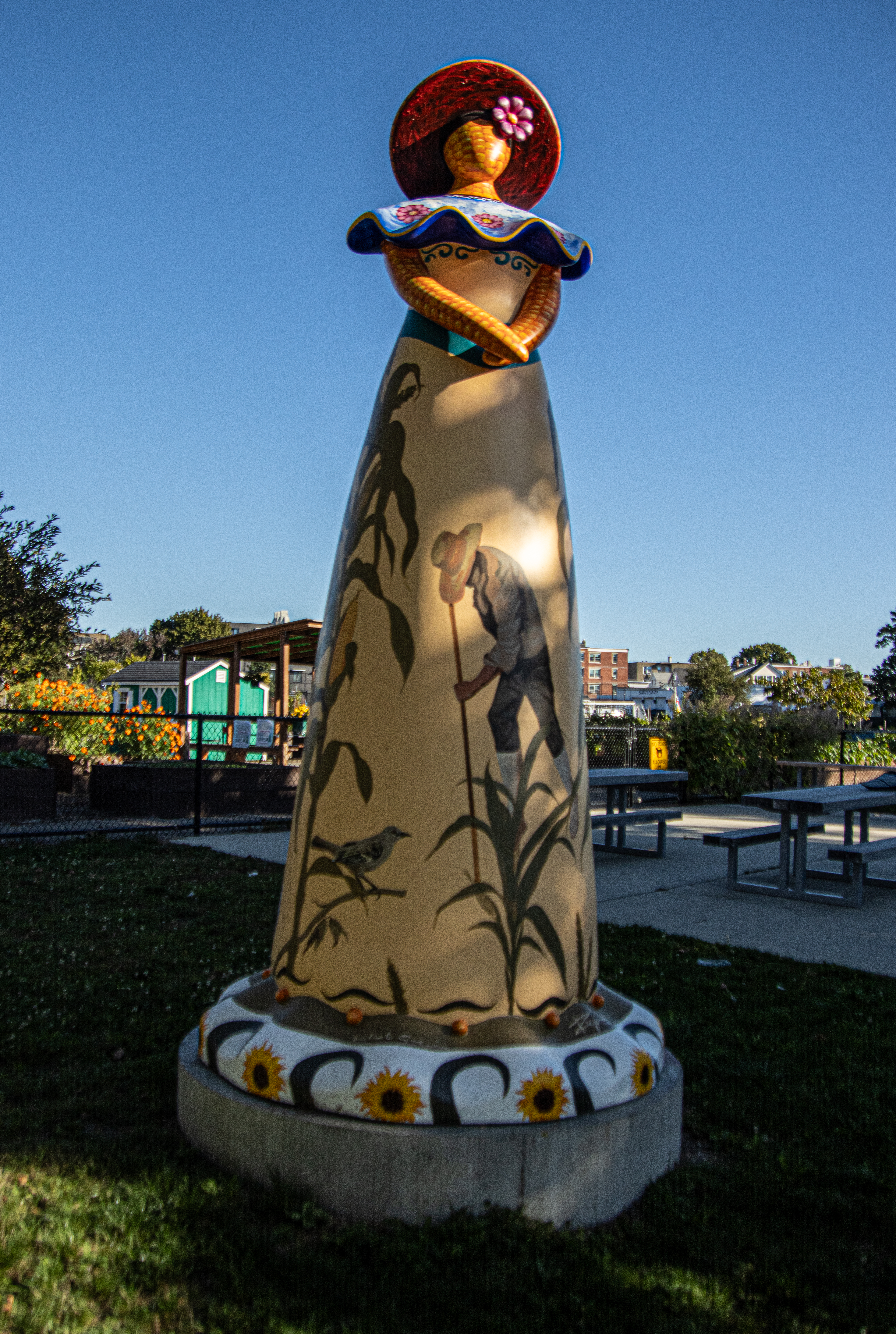
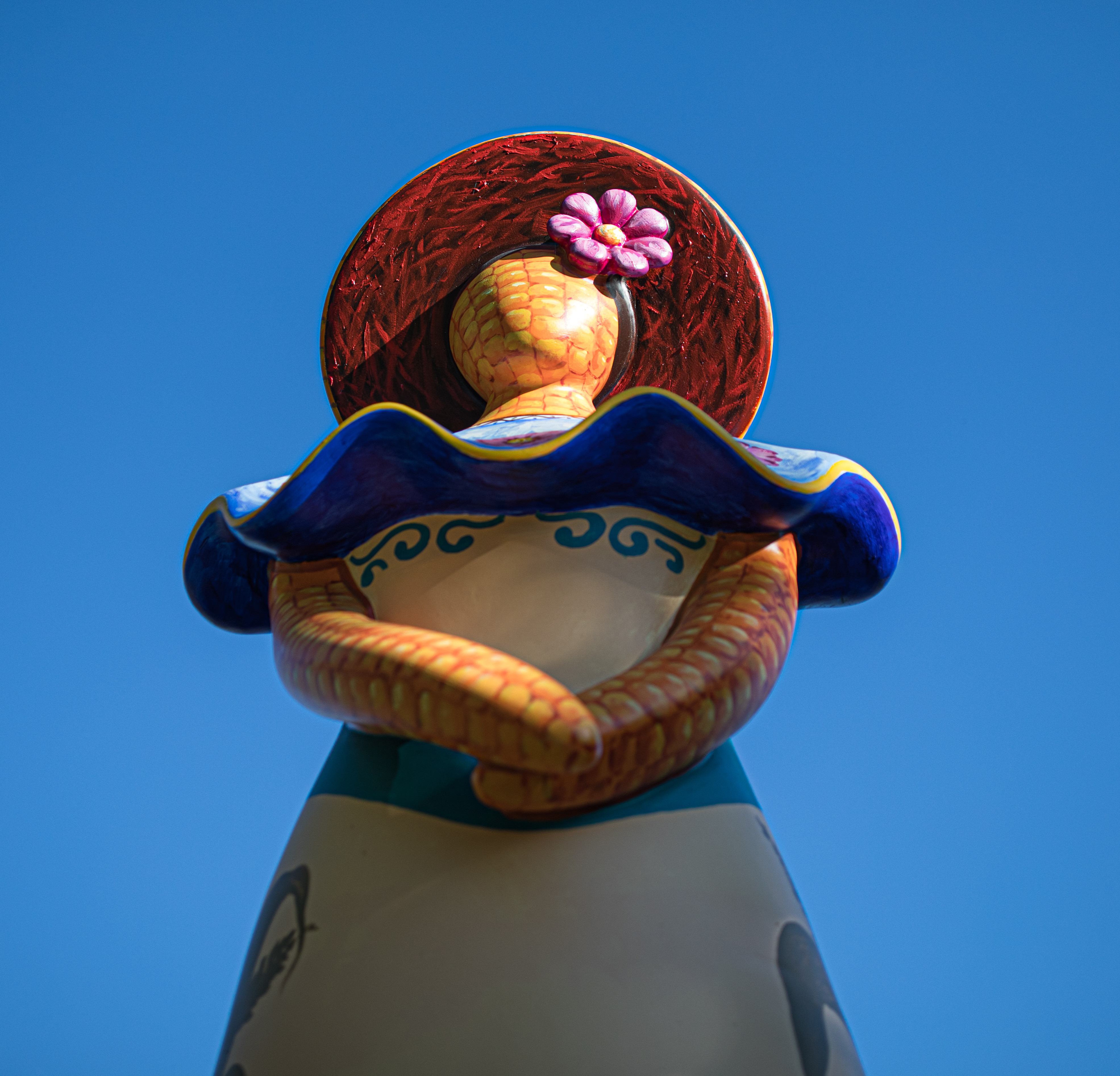
The artists for this statue (Rigo Peralta and Melanio Guzman), said this sculpture honors the deep roots of agricultural labor as well as the cultural legacy of muñecas de tusa, traditional Honduran corn husk dolls. They said the corn husk dolls, which Melanio’s grandmother used to make and sell at Honduras flower festivals, is a reminder of the hard worker of the field laborers. It was fittingly located by the community garden.

Along the newly paved walkway, there is a memorial remembering the 140 Salem residents who lost their lives from Covid-19. The walkway is meant to give people a space to wander, reflect and enjoy the statues and park. It also gives people an easier and more accessible way to enjoy the park. It’s hard to imagine the park was just all grass without paths to allow people an easier access to move around. Benches give visitors a chance to sit and reflect while they enjoy the scenic views of Palmer Bay Cove.